Freelance Illustrators in Sydney
Sign Up
Post a job
Sign Up
Log In
Filters
2
Projects
People
Sara Servan
pro
Sydney NSW, Australia
I design bold brands full of personality for small business
$25k+
Earned
8x
Hired
4.9
Rating
542
Followers
Top
Follow
Message
I design bold brands full of personality for small business
30
Jellybean Rebrand
30
261
10
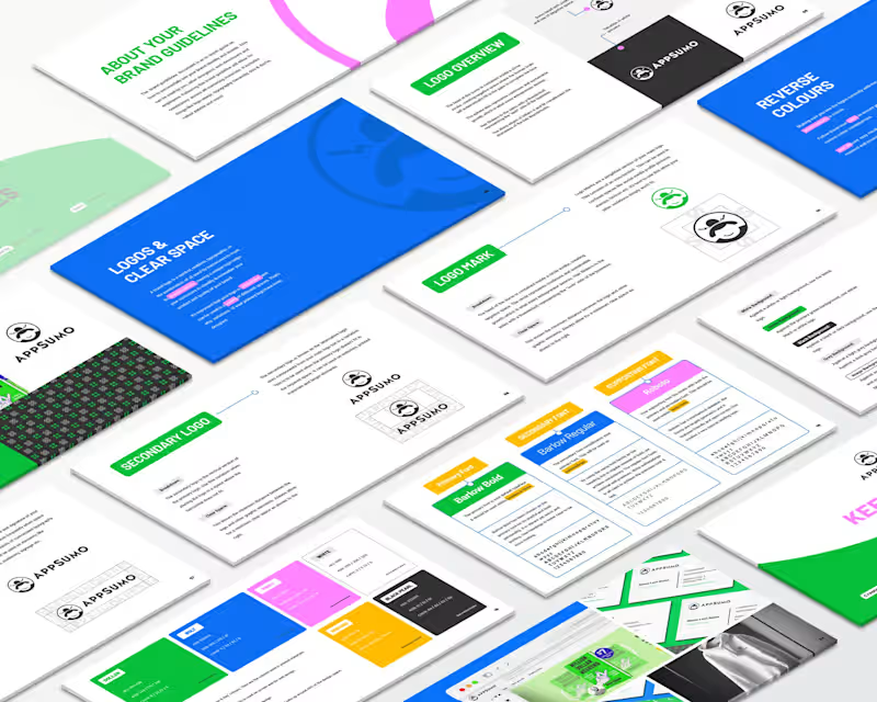
Appsumo Rebrand
10
124
2
Animation Work
2
384
0
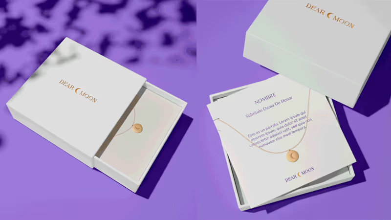
Dear Moon Re-Branding
0
119
Illustrator
(5)
Follow
Message
Emma Tamaoki
Sydney NSW, Australia
Full-Service Branding for Founders + Creatives
Top
Follow
Message
Full-Service Branding for Founders + Creatives
1
Cosmopolitan Australia + Middle East
1
31
0
Insight Social Media
0
18
0
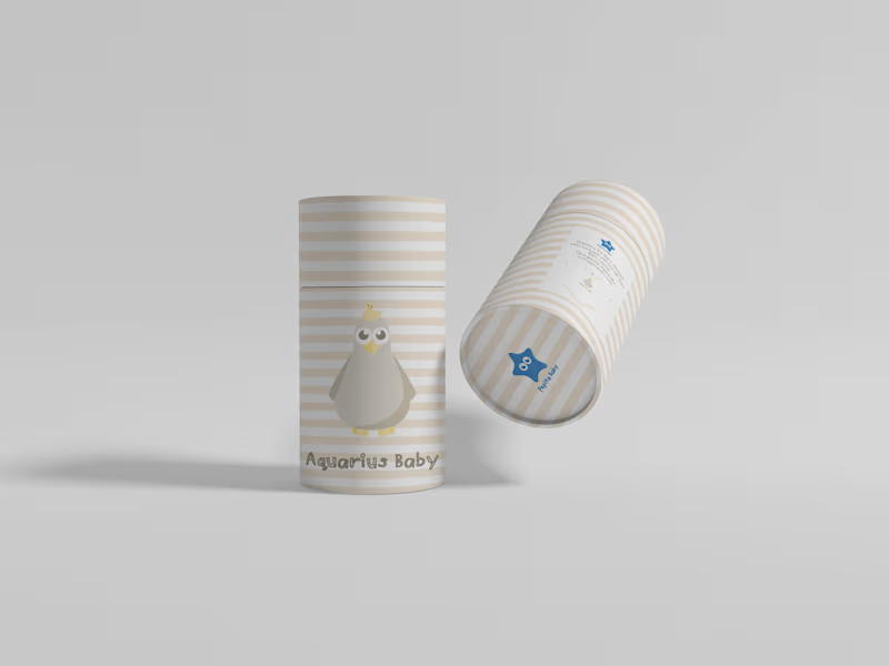
Pepita Baby
0
17
0
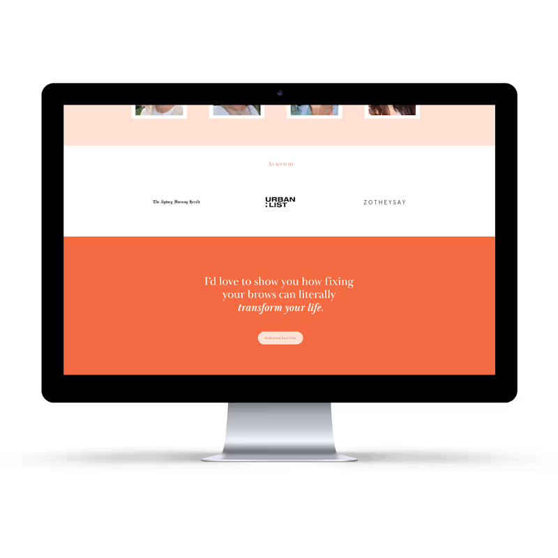
Brow Confidence
0
44
Illustrator
(3)
Follow
Message
Brandt Robinson
Sydney NSW 2000, Australia
Graphic Designer specialising in branding and illustration
1x
Hired
5.0
Rating
2
Followers
Follow
Message
Graphic Designer specialising in branding and illustration
0
Savo's Carpentry was a new brand identity completed for a startup. The main focus that the client wanted for this job, was that I include 'a deck in the branding'. Originally, he came to me with the request to have an illustration of the deck surrounding the business name and it's details, but after we went through the sketching stage, he was blown away with the solution of converting the deck into a minimal pictogram that could be used as the brand icon. This achieved the goal of both keeping the client happy, and finding a solution that had more legibility for branding.
0
95
0
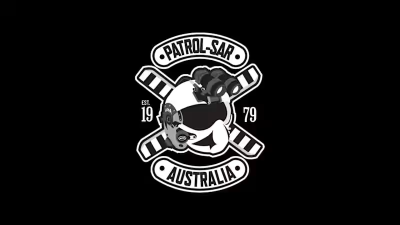
This was an Illustration for members of NSW Police, who wanted T-shirts for their unit in PolAir. They came to me after their previous designer cancelled the project. They wanted a logo that could be put on the back of their shirts that resembled a Jolly Roger. I illustrated the entire logo from scratch, using their crew helmets and rotor blades for reference.
0
91
0
This project was a brand refresh for our client. The main focus was that they wanted something modern, while retaining the spirit of their current logo. Originally, they only had a basic S letter mark inside a hexagonal container, so I combined the two, which gave them the letter mark in the shape of a hexagon. They also wanted the name to be shown in the branding, so the solution for such a long title was to place it inside a circular border, which provided them with a badge style logomark. Additionally, the logo was designed to represent an 'Impossible object', where the perspective is impossible to achieve in a 3D space. This is to display that SDCD can make the impossible, possible.
1
0
114
0
Benchmark Brickwork was a complete brand identity development. We took care of the name, logo and visual identity. Our client came to us with a request to brand their new startup, however they did not have anything in place except for a rough idea for a name. We worked together with our client to develop an identity that showcased their main keywords. They wanted a brand that communicated stability, organisation, and cleanliness. They wanted to stand out from the crowd, as they felt their competition focused too much on speed, without quality.
1
0
125
Illustrator
(6)
Follow
Message
Ali Mehdi ⚡️
Sydney NSW, Australia
Creative by nature, Designer by passion.
16
Followers
Follow
Message
Creative by nature, Designer by passion.
0
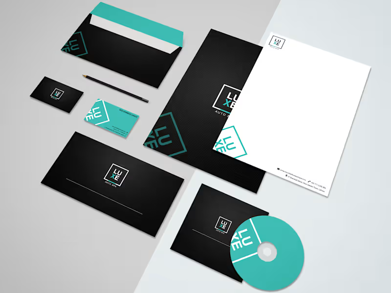
Brand Identity Design for LUXE Auto Spa
0
3
0
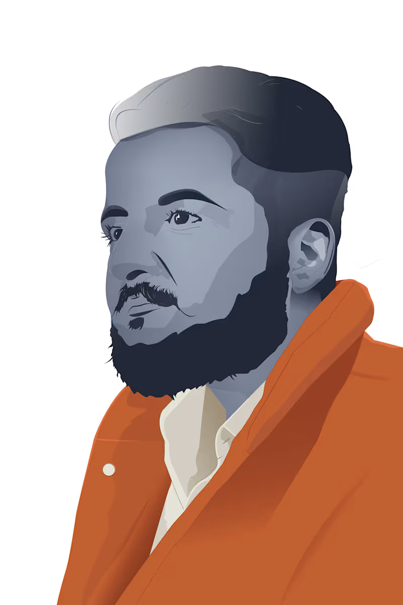
Self Portrait Illustration
0
3
0
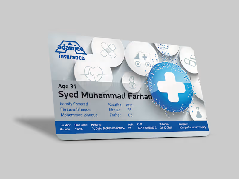
Adamjee Insurance Card
0
5
0
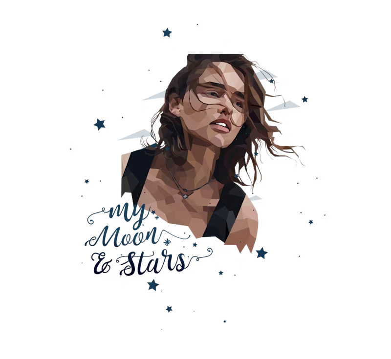
Khaleesi Polygonal Portrait - Game of Thrones
0
3
Illustrator
(4)
Follow
Message
kieryn hyde
Sydney NSW 2000, Australia
Motion and Graphic designer, VFX Artist and Video Editor
Follow
Message
Motion and Graphic designer, VFX Artist and Video Editor
0
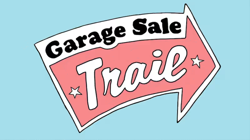
Garage Sale Trail
0
2
0
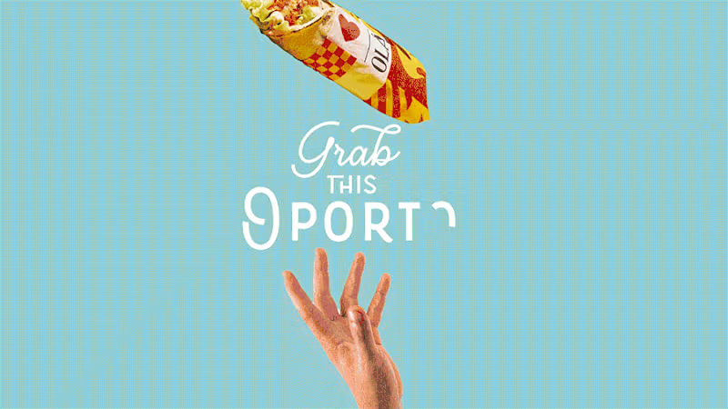
Oporto Project
0
6
0
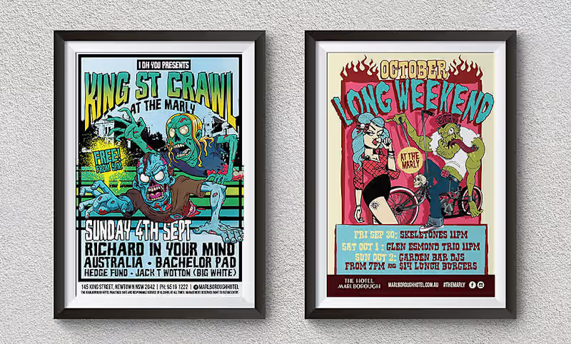
Posters Collection
0
4
0
Red Rooster Campaign
0
2
Illustrator
(5)
Follow
Message
P.D. Law
Sydney NSW 2000, Australia
Your one-stop shop for producing creative media.
Follow
Message
Your one-stop shop for producing creative media.
0
The Passage of Time
0
6
0
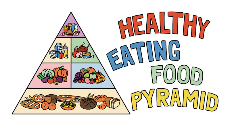
Healthy Eating Food Pyramid
0
5
0
Occupational Therapy Logo Rebrand
0
7
0
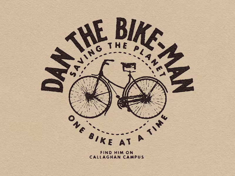
Dan the Bike Man
0
6
Illustrator
(2)
Follow
Message
Ron Chio
pro
Sydney NSW, Australia
Web Designer/Developer & Digital Marketing
1x
Hired
23
Followers
Follow
Message
Web Designer/Developer & Digital Marketing
1
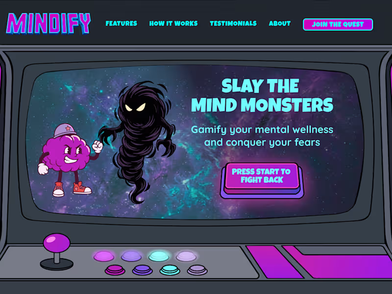
My first attempt to do a 2D character battle animation. Designed in Figma, animated with Rive and putting it all together using Framer. 3 of my favourite tools! Let me explain this conceptual hero section for a mental wellness site: Let's talk about mental health websites, shall we! They usually lean heavily on the same predictable clinical blues and soft pastels. When creating the hero section for Mindify, I wanted to completely ditch that standard 'play it safe' design. The goal was to tie together 2 totally out there concepts: mental wellness and a retro arcade vibe. And you might be thinking… WTF? Because tackling your mental struggles can genuinely feel like a massive boss battle. By gamifying the experience we turn abstract anxiety into a fun retro fight where you get to grab the joystick and conquer your inner mental monsters. Mental health design does not have to be a bore fest. You really have to think outside the box to build a project that is unique, engaging and packed with a massive wow factor. See the full case study here: https://cleverquokka.com/case-studies/mindify
1
133
2
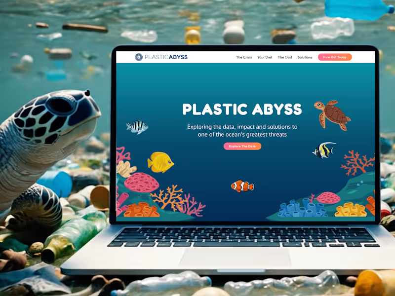
I absolutely love Framer! It allows me to incorporate my illustration/motion design into websites. Framer is great for educational websites and I’m happy to use it for a passion project I’m working on. Introducing, PLASTIC ABYSS, an educational website about plastic pollution in our oceans. This affects not just the environment, but humans and future generations.
1
2
142
3
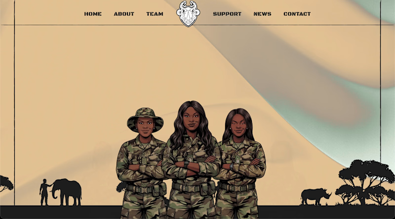
When I found out there was an all-women anti-poaching unit, I knew I had to make this my next side project. Presenting a hero section for the "Black Mambas", an all-women anti poaching unit. I turned some of the members into fierce illustrated characters. Designed in Figma, Built in Framer, animations in Rive.
3
143
0
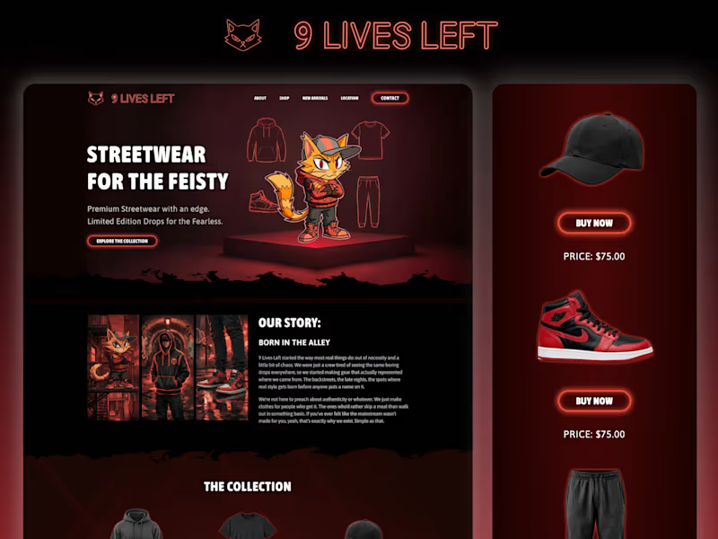
9 Lives Left
0
9
Illustrator
(2)
Follow
Message
Bearplus Fullstack Agency
Sydney NSW, Australia
Award-winning agency specializing in design and development.
5.0
Rating
36
Followers
Follow
Message
Award-winning agency specializing in design and development.
2
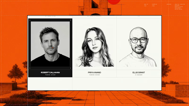
Team sections force a trade-off. Photography carries credibility, but it usually breaks a tightly drawn visual system. Heron's runs two states. The default is a crosshatched pen portrait, which keeps the section inside the same drafting language as the plans and elevations used across the site. On hover the card inverts to black, registration crosshairs appear at the corners, and the illustration resolves into a black and white photograph. The move also carries meaning for this audience. Drawing resolving into built reality is the basic sequence of architectural practice, so the interaction reads as native rather than decorative. At rest the grid holds as a system. On interaction it delivers the credibility a team section exists to provide.
2
2
123
3
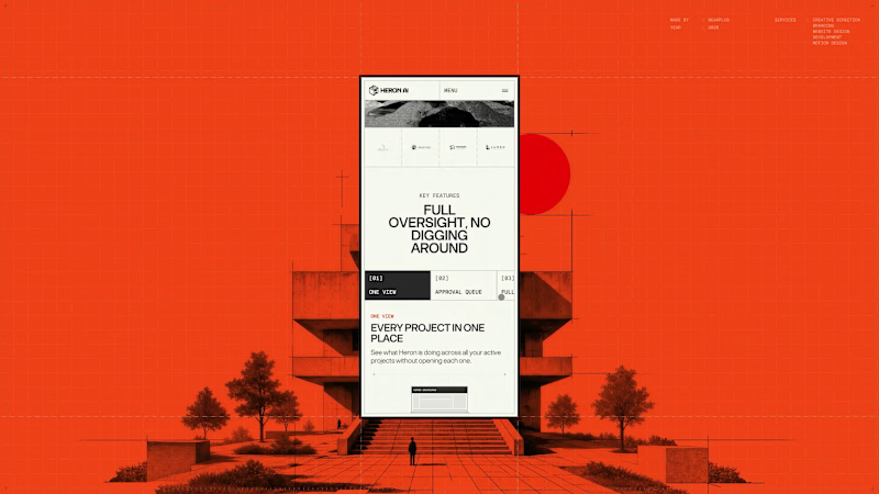
The Heron Dashboard page had to make an agent's work legible after the fact, which is a different job to explaining what the agent does. The hierarchy leads on time saved rather than activity volume. Heron's positioning rests on hours lost to repetitive modelling, so the product reports back in the same unit, supported by model health, active and pending item counts, and a feed of agent actions. The second half of the page covers contextual code questions, answered against a specific layout and occupancy rather than quoted in isolation. Mobile treated density as the core problem. The four headline figures are kept grouped so the summary survives a portrait screen, and tabular content is restructured into stacked cards rather than compressed into scrollable tables.
3
105
1
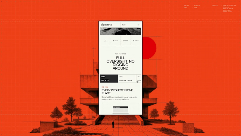
Very little of the Heron site is layout, which makes responsive a design problem rather than a build task. The hero depends on a cursor drag, the preloader on a datum line moving up a full elevation, the explanation on a four-beat scroll sequence, and the whole visual system on architectural linework that fails when scaled down. Each of those was re-solved for mobile. The hero interaction was rebuilt for touch and reframed to portrait. The scroll sequence was re-timed for shorter distances. Drawings were recropped so the relevant part of the plan is shown at a readable size instead of the whole drawing at an unreadable one. Motion weight was reduced to hold performance on mid-range devices without dropping any of the beats that carry the story. Since most traffic arrives on mobile, this version had to stand on its own rather than gesture at the desktop experience.
1
81
1
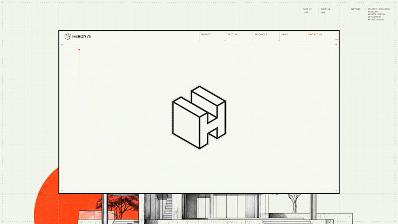
Page transitions on Heron are treated as view changes rather than document loads. Motion exits one page and continues into the next, with no hard reset and no white flash between states. The reasoning is product-led. Heron runs inside Revit, Rhino, ArchiCAD and SketchUp, where switching context means panels updating around a drawing that stays put. A site built to sell that experience shouldn't behave like a set of separate files. The transition also gives us somewhere to hide load time, which keeps the heavier interactive sections feeling immediate on slower connections.
1
1
122
Illustrator
(1)
Follow
Message
Explore people