
Brandt Robinson
Graphic Designer specialising in branding and illustration
- 1x
- Hired
- 2
- Followers

1
0
79
1
0
97
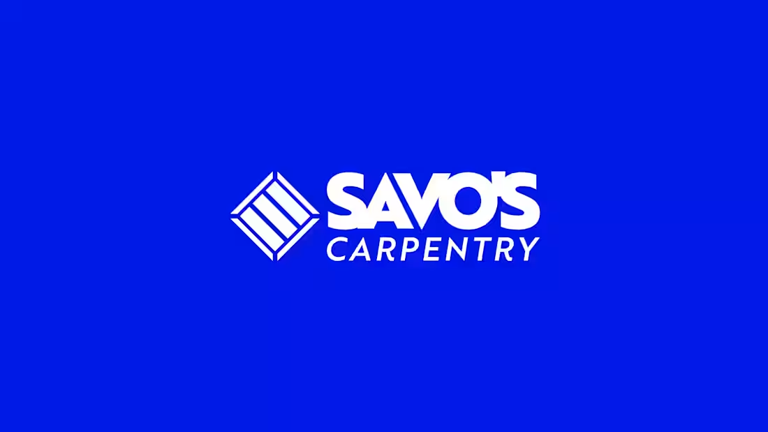
Savo's Carpentry was a new brand identity completed for a startup. The main focus that the client wanted for this job, was that I include 'a deck in the branding'.
Originally, he came to me with the request to have an illustration of the deck surrounding the business name and it's details, but after we went through the sketching stage, he was blown away with the solution of converting the deck into a minimal pictogram that could be used as the brand icon.
This achieved the goal of both keeping the client happy, and finding a solution that had more legibility for branding.
0
61
1
0
91
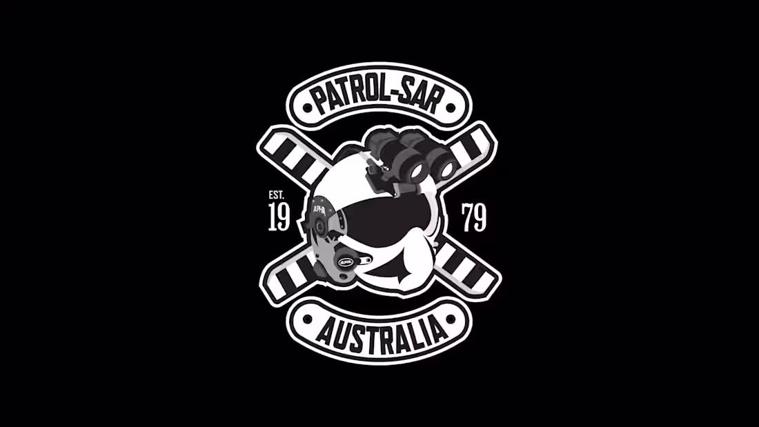
This was an Illustration for members of NSW Police, who wanted T-shirts for their unit in PolAir.
They came to me after their previous designer cancelled the project. They wanted a logo that could be put on the back of their shirts that resembled a Jolly Roger.
I illustrated the entire logo from scratch, using their crew helmets and rotor blades for reference.
0
60
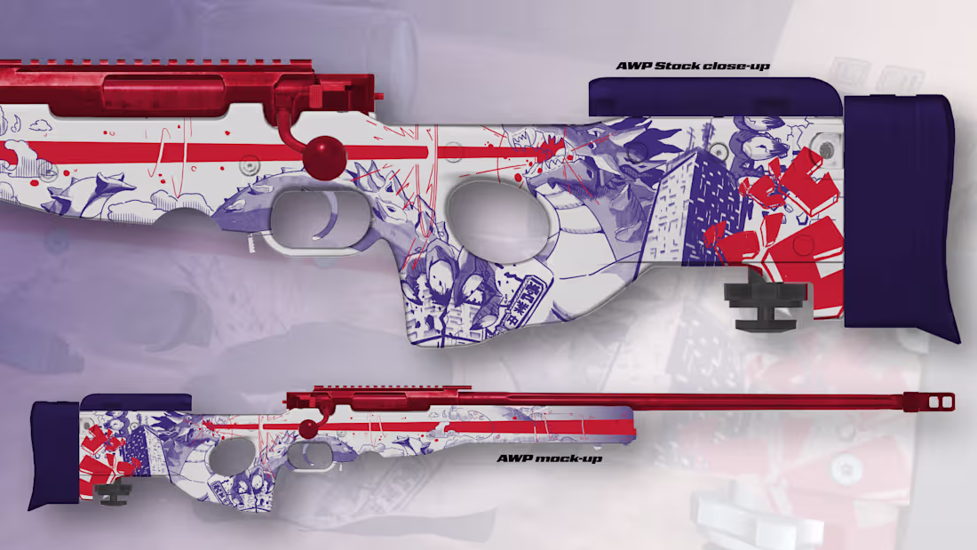
Pavlov Kaiju Sniper Skin
0
6