Projects using Barba.js in Sydney
Projects using Barba.js in Sydney
Sign Up
Post a job
Sign Up
Log In
Filters
2
Projects
People
Message
1
Bearplus Fullstack Agency
Page transitions on Heron are treated as view changes rather than document loads. Motion exits one page and continues into the next, with no hard reset and no white flash between states. The reasoning is product-led. Heron runs inside Revit, Rhino, ArchiCAD and SketchUp, where switching context means panels updating around a drawing that stays put. A site built to sell that experience shouldn't behave like a set of separate files. The transition also gives us somewhere to hide load time, which keeps the heavier interactive sections feeling immediate on slower connections.
1
1
139
Message
14
Bearplus Fullstack Agency
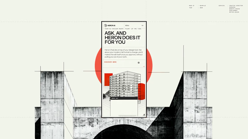
The Heron chat widget is the product's main touchpoint. It floats over the architect's design software, answers questions about the model, and executes changes once approved. Designing UI that lives inside another application changes the constraints. It has to hold legibility over dense linework, keep a small footprint, stay clearly branded without competing with the host software, and dismiss cleanly. The product page demonstrates rather than describes. The widget is shown over a real floor plan, mid-conversation about an HVAC clearance issue, with the affected room highlighted in the drawing behind it. The surrounding layout is kept deliberately quiet so the widget holds the visual weight.
8
14
1.3K
Message
13
Bearplus Fullstack Agency
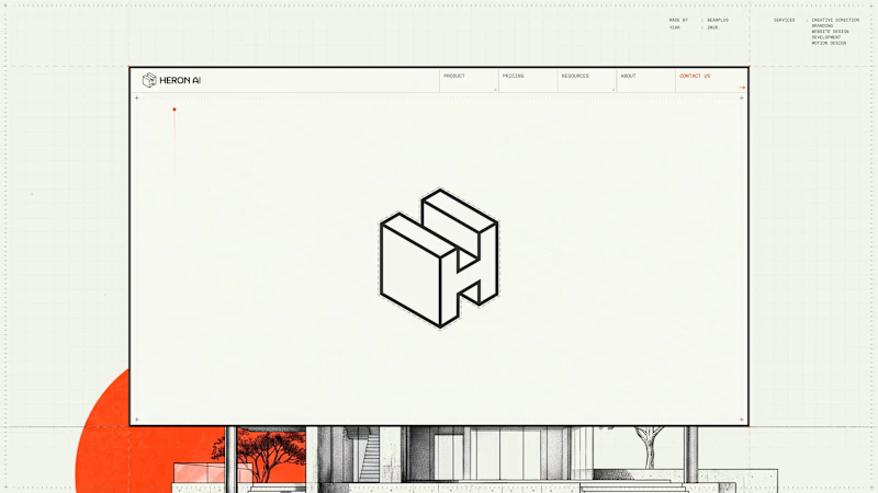
Heron runs inside Revit, Rhino, ArchiCAD and SketchUp, so the site had to read as an instrument rather than a brochure from the first frame. The preloader replaces the progress bar with a drawing in progress. A red datum line moves up an architectural elevation carrying the percentage value, and the building is drawn in line by line as loading completes. Supporting information sits in the margins in the same register: live cursor coordinates, a project spec card covering type, founding year, focus and location, and a numbered system boot sequence. Functionally it covers asset loading for the interactive hero, so the drag-to-reveal behaviour responds immediately once the page lands. Editorially it sets the frame before a single line of marketing copy appears.
8
13
700
Message
18
Bearplus Fullstack Agency
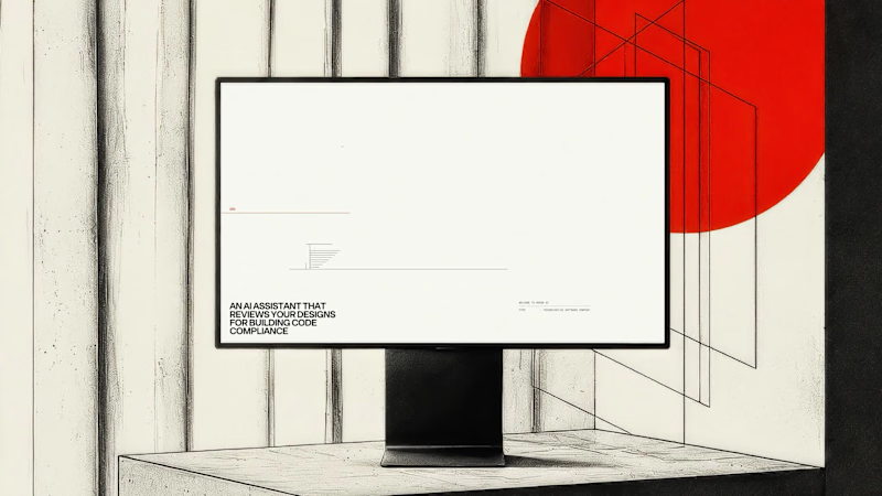
The category default for AI products is dark backgrounds and gradient glow. Heron's audience is architects, so we built the visual system out of their working material instead. Everything on the site is drawn as architectural line work. Plans, elevations, dimension strings, and annotation boxes styled like redline mark-ups, each one holding a genuine code reference rather than lorem text. The system does two jobs. It reads as native to someone who spends their day inside Revit, and it supports the product story, because Heron works inside the drawing rather than beside it.
7
18
755
Message
2
Bearplus Fullstack Agency
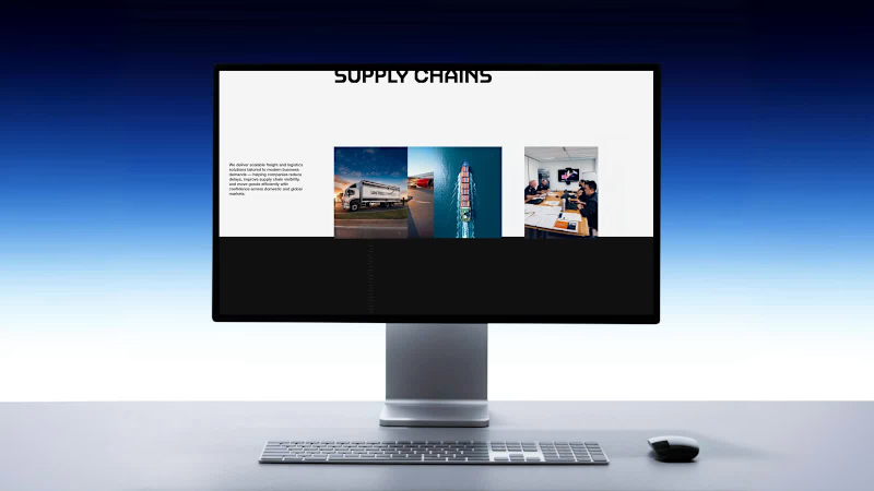
The services section is deliberately the most restrained part of the site. Everything before it is built to hold attention. This section is built to answer a question fast. Road freight, sea freight, air freight and warehousing are laid out with a clear hierarchy, consistent card structure and no motion competing with the content. For a considered B2B purchase, this is where the enquiry actually starts. Applying the same visual ambition here would have made it harder to use, so we pulled back on purpose.
2
176
Message
3
Bearplus Fullstack Agency
The About page had to carry years of operational history without becoming a wall of copy. We structured it as a paced scroll rather than a document. Type scale shifts, imagery breaks the rhythm at deliberate points, and white space is used to control reading speed. The result gives the company story the same sense of movement as the rest of the site, so it holds attention instead of asking for patience.
3
178
Message
2
Bearplus Fullstack Agency
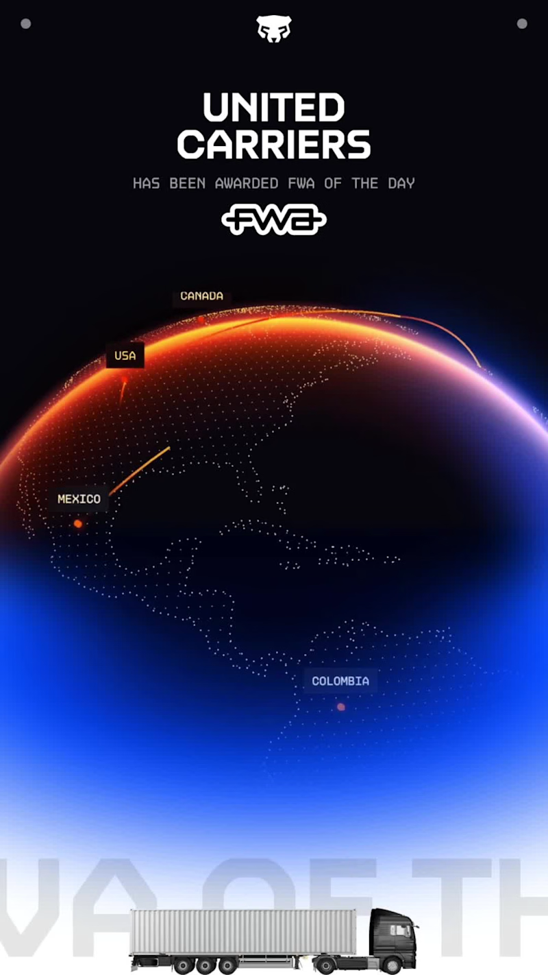
Excited to share a recent milestone: our latest project was awarded FWA Site of the Day. 🎉 The FWA recognizes the most creative and technically ambitious work on the web, and it’s a standard I hold my own work to. This recognition reflects a deep focus on craft — thoughtful UX, refined visual design, and interactions built to delight. Grateful to collaborate with a talented team at Bearplus and clients who value bold, high-quality design. Open to new projects and collaborations — let’s build something worth talking about. #WebDesign #UXUI #FWA #DigitalDesign
1
2
140
Message
2
Bearplus Fullstack Agency
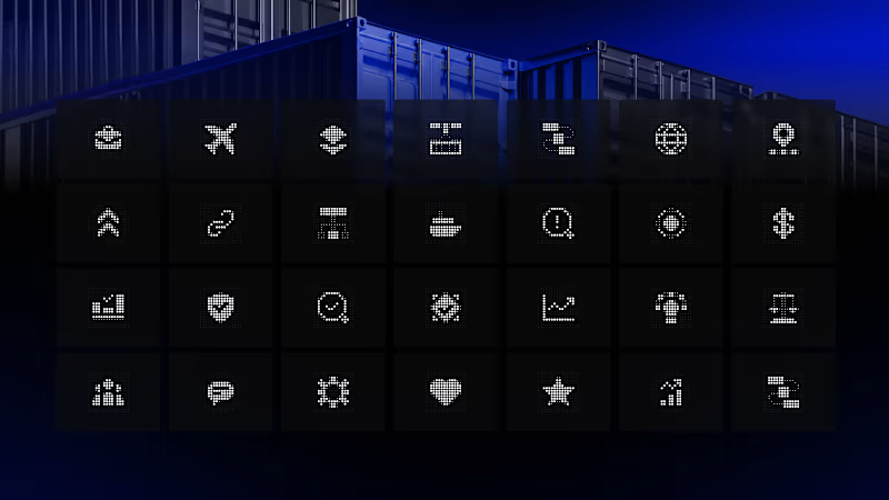
A custom icon set covering the full range of United Carriers' operations: road freight, sea freight, air freight, warehousing, customs and tracking. Everything is drawn on a shared grid with a fixed stroke weight and consistent rules for corners, angles and terminals. That consistency is what lets the set grow later without drifting. New services can be added years from now and still sit inside the same family. Unglamorous work, but it's the difference between a brand system that holds together and one that quietly falls apart.
2
137
Message
3
Bearplus Fullstack Agency
Loading screens are usually an apology. We treated this one as the first frame of the story. The United Carriers preloader introduces motion before any content arrives, so the user's first impression is of things moving rather than of waiting. It also does real work: assets for the opening scroll sequence are fetched behind it, which means the journey starts smoothly instead of stuttering on first scroll.
1
3
151
Message
4
Bearplus Fullstack Agency
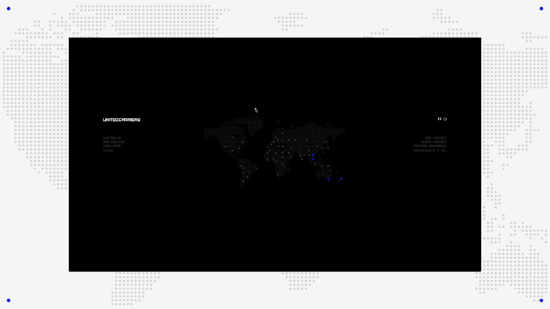
United Carriers move freight globally across road, sea and air. For the 2.0 redesign, the brief we set ourselves was simple: don't build a logistics website, build the journey. The homepage runs as one continuous sequence rather than a stack of sections. Cargo is loaded, moved by road, carried across water, then flown between continents, and the user travels with it. Everything else on the page, from typography to pacing, is built to keep that one thread unbroken.
4
144
Explore projects