The network for creativity
Join 1.25M professional creatives like you
Connect with clients, get discovered, and run your business 100% commission-free
Creatives on Contra have earned over $150M and we are just getting started
Back to feedPost
The category default for AI products is dark backgrounds and gradient glow. Heron's audience is architects, so we built the visual system out of their working material instead.
Everything on the site is drawn as architectural line work. Plans, elevations, dimension strings, and annotation boxes styled like redline mark-ups, each one holding a genuine code reference rather than lorem text.
The system does two jobs. It reads as native to someone who spends their day inside Revit, and it supports the product story, because Heron works inside the drawing rather than beside it.


Rejecting the dark-mode gradient-glow default for architects who actually think in plans and elevations is such a sharp insight. Did the client come to you already wanting to break from the typical AI product look, or did you have to convince them that going against category convention was worth the risk?

Appreciate it! They knew dark mode wasn't right, but feared the risk. We framed a light, plan-first UI as a functional precision tool for CAD users, not an aesthetic gamble and got instant sign-off.

Love this approach building the visual language from the architects’ actual working environment makes the whole experience feel instantly more relevant and credible. The redline/code-reference detail is such a smart touch 👏
Thank you!

Super thoughtful! 👍
Thank you!

Nice work!
The network for creativity
Join 1.25M professional creatives like you
Connect with clients, get discovered, and run your business 100% commission-free
Creatives on Contra have earned over $150M and we are just getting started



Related posts


Some concept work from the agency. Planning to share more of what we create, from clean interfaces to the little motion details that bring them to life.
Check out the website: https://urest.agency/


Simple ideas often make the best illustrations.
It had been a while since I last drew, and when I finally sat down, my mind went blank. When that happens, I pick something simple and a little cliché and see what I can do with it.
This time it was an apple. Then a worm popped out to say hi!


The pink worm against the green and blue is a great color pop. The apple with the missing center is a fun touch.

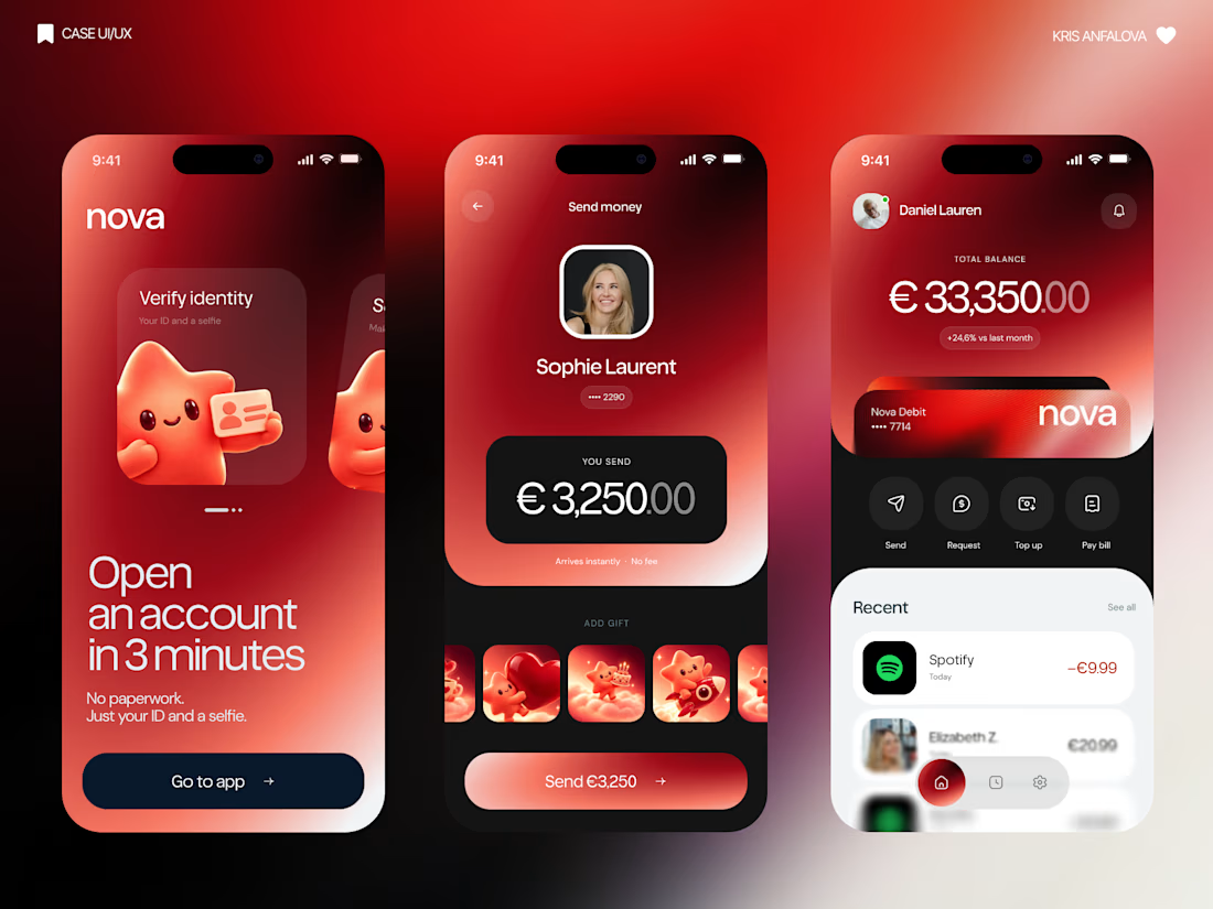
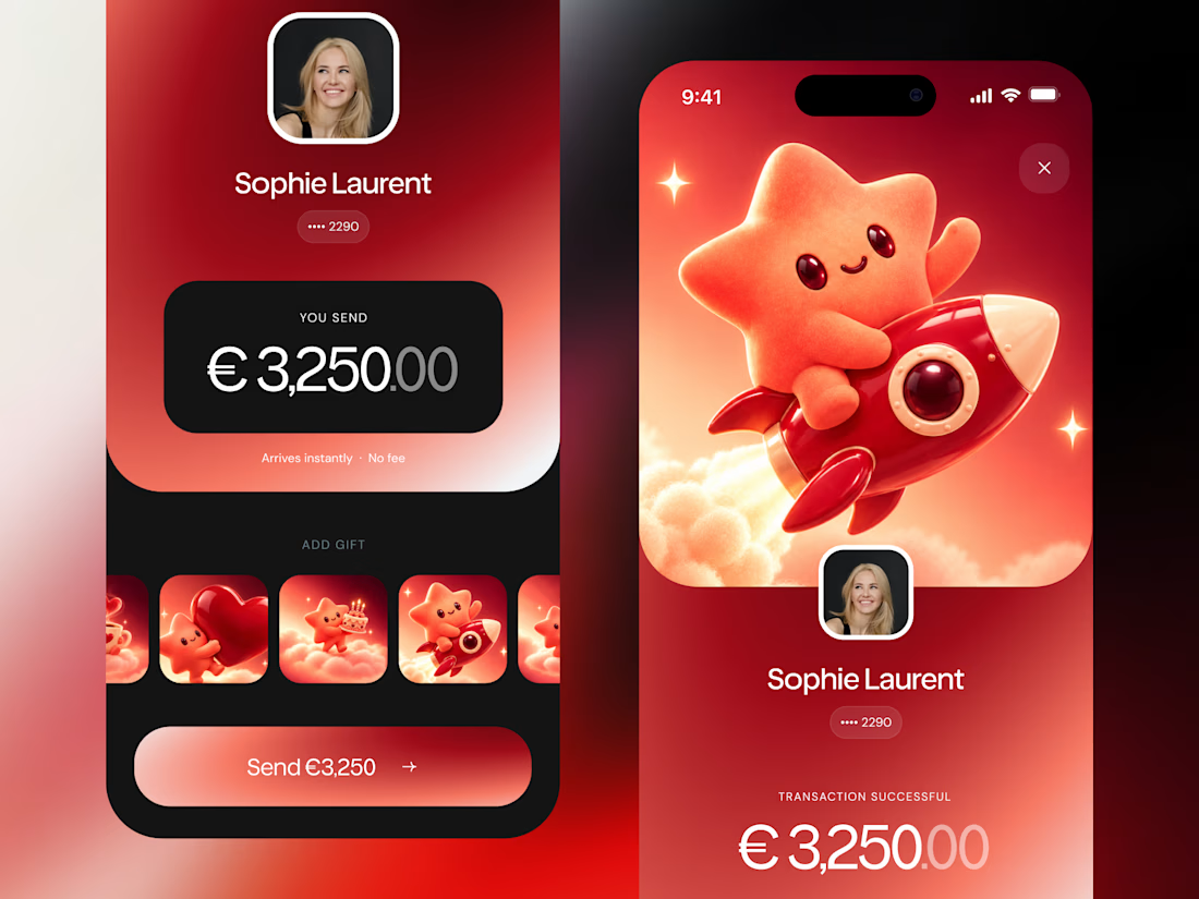
What if sending money felt a little more like giving a gift?
For Nova, I explored a banking app that brings payments, cards, and a bit of personality together. You can check your balance, browse recent transactions, send or request money, top up, and pay bills.
My favorite part is the digital postcard feature. Before sending a transfer, you can add a little illustrated card—a heart, a birthday greeting, or a playful character. A simple way to make birthday money or a thank-you feel more personal.
I carried that same 3D character into onboarding, pairing it with bold red gradients and large, clear payment details. There’s room for play, while the recipient and amount stay easy to check.
Would you add a postcard to a transfer? I’d love to know what occasion you’d use it for.