The network for creativity
Join 1.25M professional creatives like you
Connect with clients, get discovered, and run your business 100% commission-free
Creatives on Contra have earned over $150M and we are just getting started
Back to feedPost
The Heron chat widget is the product's main touchpoint. It floats over the architect's design software, answers questions about the model, and executes changes once approved.
Designing UI that lives inside another application changes the constraints. It has to hold legibility over dense linework, keep a small footprint, stay clearly branded without competing with the host software, and dismiss cleanly.
The product page demonstrates rather than describes. The widget is shown over a real floor plan, mid-conversation about an HVAC clearance issue, with the affected room highlighted in the drawing behind it. The surrounding layout is kept deliberately quiet so the widget holds the visual weight.


Thanks! It flags issues, advises on fixes, and applies approved changes directly in the model.

This is superb!
Thanks!

Very professional! 😃
Thanks!
The network for creativity
Join 1.25M professional creatives like you
Connect with clients, get discovered, and run your business 100% commission-free
Creatives on Contra have earned over $150M and we are just getting started





Related posts

Post
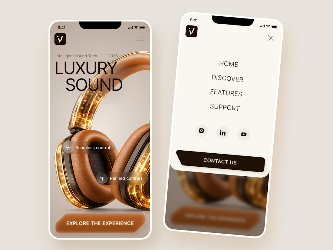
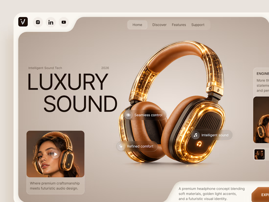
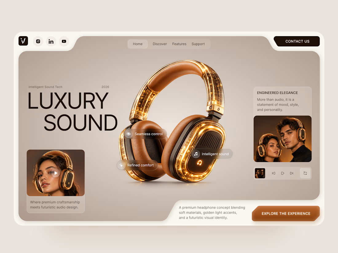
Luxury Sound — Premium Headphones Landing Page 🎧✨
A premium landing page concept for a luxury audio brand, built around a bold headphone design and a refined visual experience
The design combines warm neutral tones, glowing details, oversized product visuals, and minimal typography to create a futuristic yet elegant feel
Special attention was given to:
• Product-first composition
• Premium visual direction
• Feature highlights
• Lifestyle imagery
• Clear CTA placement
• Responsive mobile experience
The result is a clean, immersive product experience that makes the headphones feel like more than tech — they become part of the lifestyle 🔥



The amber glow on the headphones against that warm beige is lovely. How does the mobile menu handle the product image?

Before we move on to some client collaborations, a last post about the new LUCERRÁ digital experience to wrap it up.

I came across this Dora-designed site on X and I was amazed. 🤯
A Pokémon Sleep redesign where the Poké Ball intro opens into a cozy world of sleepy Pokémon, with smooth scroll transitions and bold typography. It feels playful and alive.
I think I need to start working on Dora too. What do you guys think? 👀
Big shout-out to @Howard for this one. The color, the motion, and the details are amazing.


This is nice