
Full Stack AI App Engineer


Full Stack AI App Engineer

Most people think a shadow is just a shadow.
Study a real sundial: the shadow isn't a drop shadow or a perspective projection. It has personality. It's alive in a way digital shadows never are.
time.connectio.com.au (http://time.connectio.com.au) uses real astronomical calculations to track the sun's position relative to you. Latitude, longitude, altitude. Shadow direction, length, softness, and colour temperature all shift exactly as they would in real life.
The numerals have weight. The penumbra is properly soft. The whole piece breathes with the day/night cycle. Sunlight on your wall by day. Moonlight mode at night.
Cast it to a 4K display and it becomes a meditative object in your home.
I built this to explore beauty and truth in digital mediums. And partly because I'm a little unhinged when something captures my attention.
3
18
527

Built an AI agent that edits FlutterFlow projects autonomously!
I recently shipped a free, open‑source web app that connects directly to FlutterFlow’s YAML layer so you can:
• Describe changes in plain English and have an AI update your project’s YAML safely
• Batch-edit theming, fonts, and repetitive UI props across pages in minutes instead of hours
• Review diffs, stage changes, and sync back to FlutterFlow with validation (no blind AI chaos)
This is for developers and teams who are hitting the limits of FlutterFlow’s visual editor and want a precise “YAML scalpel” instead of another chat bot.
Watch the 12‑minute walkthrough and see it in action: https://www.youtube.com/watch?v=nGIfg-qYrwE
26
380

If you build with FlutterFlow, you know the pain: custom code has to follow a rigid structure, limited data types, and a pile of restrictions that trip up even experienced Dart developers, let alone AI models.
I got sick of babysitting LLM output to make it FlutterFlow-compliant, so I built Custom Code Connect.
What it does:
• Describe any custom widget, action, function, or class in plain English
• Highly trained AI workflow generates FlutterFlow-compatible Dart code
• Automated compatibility review with a score and actionable fix notes
• One-click deployment to your FlutterFlow project — no copy-paste, no manual fixes
Custom Code Connect enforces FF's constraints at every step of the pipeline.
📺 Full tutorial: https://www.youtube.com/watch?v=aFTUqLSkAGY
🔗 Try it free: https://customcode.connectio.com.au/
1
15
512

Just shipped the most ridiculous thing i've built in a while.
A focus timer that creates custom motivational songs about LITERALLY any goal you want to spend an hour on. Yes, really.
AI has too much enthusiasm for mundane tasks and I'm here for it. Every 15 minutes you get a new banger. the results are slightly unhinged and always motivating.
You'll find it at all good app retailers, especially Apple's App Store: https://testflight.apple.com/join/TB3PTdUu
(https://testflight.apple.com/join/TB3PTdUu)and Google Play Store: https://play.google.com/store/apps/details?id=com.connectio.hourofpowe (https://play.google.com/store/apps/details?id=com.connectio.hourofpower)r
2
21
545


Marketing sites, ads & A/B for applied AI · CMD Play

Marketing sites, ads & A/B for applied AI · CMD Play


Introducing our latest project for KIS (Keep It Simple).
They came to us at a pivotal moment, transitioning from generic B2B reporting to becoming a specialised Odoo implementation partner.
We helped them own that niche with a brand that's as focused as their new direction.
Built on framer
0
710

📣 New project alert!!
Migrated PassEntry (https://passentry.com/)’s site from WordPress to Framer while preserving layout, CMS, SEO, and analytics. Includes easy content edits and technical layout updates. Deliverables: no-code Framer site, SEO/performance optimisation, analytics, and documentation.
3
37
1K


Award-winning agency specializing in design and development.
- 5.0
- Rating
- 39
- Followers
Award-winning agency specializing in design and development.

Team sections force a trade-off. Photography carries credibility, but it usually breaks a tightly drawn visual system.
Heron's runs two states. The default is a crosshatched pen portrait, which keeps the section inside the same drafting language as the plans and elevations used across the site. On hover the card inverts to black, registration crosshairs appear at the corners, and the illustration resolves into a black and white photograph.
The move also carries meaning for this audience. Drawing resolving into built reality is the basic sequence of architectural practice, so the interaction reads as native rather than decorative.
At rest the grid holds as a system. On interaction it delivers the credibility a team section exists to provide.
2
2
155
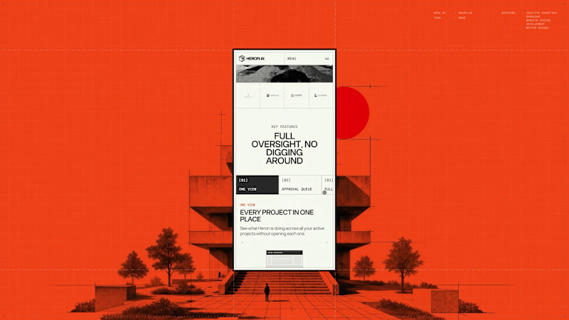
Very little of the Heron site is layout, which makes responsive a design problem rather than a build task.
The hero depends on a cursor drag, the preloader on a datum line moving up a full elevation, the explanation on a four-beat scroll sequence, and the whole visual system on architectural linework that fails when scaled down.
Each of those was re-solved for mobile. The hero interaction was rebuilt for touch and reframed to portrait. The scroll sequence was re-timed for shorter distances. Drawings were recropped so the relevant part of the plan is shown at a readable size instead of the whole drawing at an unreadable one. Motion weight was reduced to hold performance on mid-range devices without dropping any of the beats that carry the story.
Since most traffic arrives on mobile, this version had to stand on its own rather than gesture at the desktop experience.
1
136
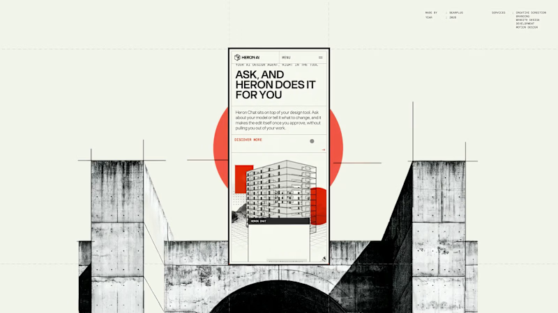
The Heron chat widget is the product's main touchpoint. It floats over the architect's design software, answers questions about the model, and executes changes once approved.
Designing UI that lives inside another application changes the constraints. It has to hold legibility over dense linework, keep a small footprint, stay clearly branded without competing with the host software, and dismiss cleanly.
The product page demonstrates rather than describes. The widget is shown over a real floor plan, mid-conversation about an HVAC clearance issue, with the affected room highlighted in the drawing behind it. The surrounding layout is kept deliberately quiet so the widget holds the visual weight.
8
14
1.4K
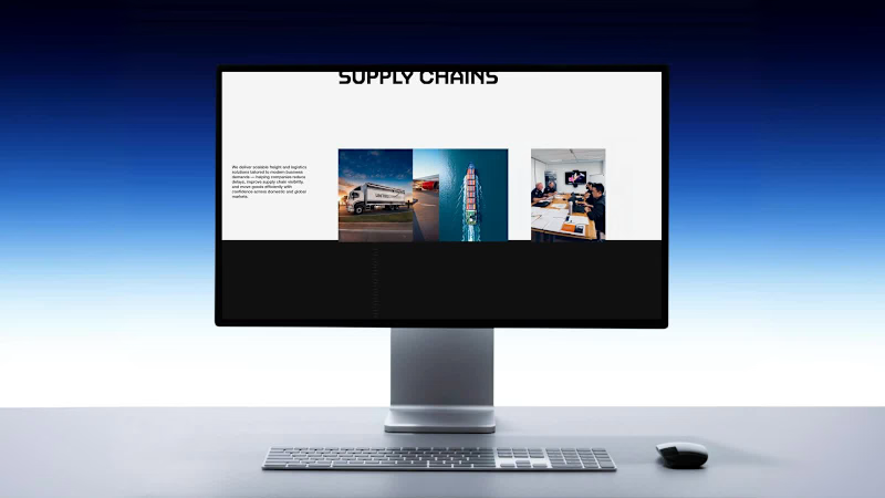
The services section is deliberately the most restrained part of the site.
Everything before it is built to hold attention. This section is built to answer a question fast. Road freight, sea freight, air freight and warehousing are laid out with a clear hierarchy, consistent card structure and no motion competing with the content.
For a considered B2B purchase, this is where the enquiry actually starts. Applying the same visual ambition here would have made it harder to use, so we pulled back on purpose.
2
209

Web Designer/Developer & Digital Marketing
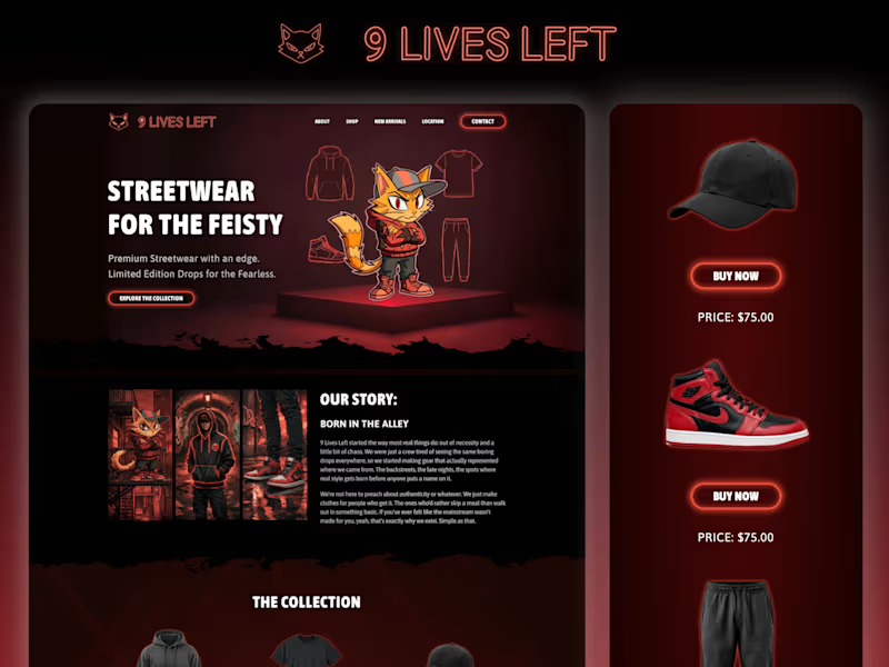


Brand, Ecommerce & Digital Experiences That Convert
Brand, Ecommerce & Digital Experiences That Convert


Beautiful & functional websites/apps built with soul & love!
Beautiful & functional websites/apps built with soul & love!


View more →

Frontend Engineer with Fintech Expertise
Frontend Engineer with Fintech Expertise


View more →

3D Web Developer | Three.js | Product Configurators | WebGl
3D Web Developer | Three.js | Product Configurators | WebGl


