Projects in SpringsProjects in SpringsHey Contra 👋🏽
Many of the challenges I participated in here pushed me to start experimenting with building tools and platforms.
One of those experiments slowly turned into something bigger.
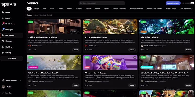
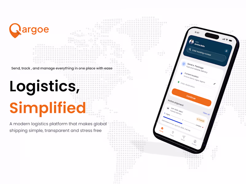
I’ve been building a social platform called Spaxis for creatives, and it’s now about 90% ready.
I realized something… as creators, our work often gets mixed in with everything else on traditional platforms,and as tools improve and creators level up, the quality of what we create is only getting better, but the platforms we use haven’t really evolved to support that. Everything still gets mixed, lost, or disconnected.
Spaxis is built for where creators are heading, a space where their work can live and connect, putting creators and their work at the center, so what we create can actually stay connected and grow.
Building it has been challenging, but now comes the interesting part, seeing how people interact with it.
The platform is currently optimized for web not mobile, and since Contra is full of curious creators who like trying new things, I figured this would be the best place to share it.
Huge thanks to Contra and YouWare for creating environments that push creators to explore, experiment, and build. This wouldn’t exist without that.
If you enjoy testing new things before they’re polished:
Explore Spaxis here:
https://www.spaxis.co/
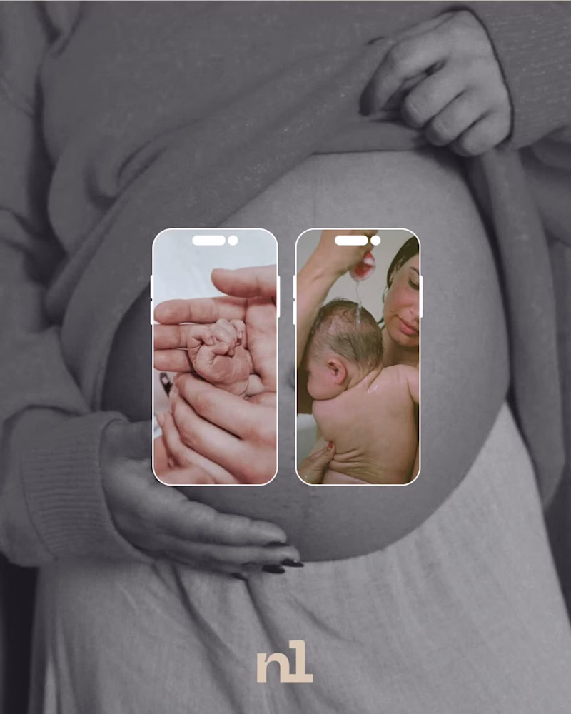
It’s early, so your feedback really matters here😊 A comprehensive branding and social media identity concept for Noula, a specialized midwifery and pregnancy care center focusing on complex medical and neonatological offerings. The design direction rejects cold, clinical healthcare aesthetics in favor of a warm, human-centric, and premium visual ecosystem. By pairing raw, editorial photography with an elegant typographic hierarchy, the brand identity establishes a deeply comforting and professional presence across digital platforms.
Key Design & Branding Elements
The Typography Strategy: Built around a soft, fluid, lowercase logotype with custom rounded geometry, capturing the natural themes of maternity and care. It features a subtle, floating circular emblem to signify a supportive environment.
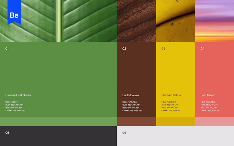
Color Palette Architecture: An intentional balance of organic warmth and medical trust. The primary hex tones include:
#F1D3BB: A soft, nourishing peach/cream background skin tone to represent intimacy and comfort.
#C3D5E8: A calming, modern powder blue to inject fresh, reliable medical credibility without looking sterile.
Deep plum/wine tones for high-contrast body copy and secondary iconography layout.
Editorial Art Direction: Utilizes authentic, documentary-style imagery (water births, maternal stretch marks, skin-to-skin touch) treated with soft film grain and desaturated tones. This approach builds instant emotional connection and transparency with expectant mothers.
Multi-Channel Digital Framework
Social Layout Mockups: Designed dynamic mobile frames showing how curated carousel posts bridge the gap between human storytelling and informative pregnancy resources.
Asset Versatility: Developed the "nl" sub-brand monogram system, engineered to scale perfectly down to a smartphone app icon or profile picture while maintaining legible high-end presence.
Brand Presentation Sheets: Asymmetric landscape layouts created to pitch the corporate identity alongside its clinical positioning statement smoothly.