SEO Writing Projects in SindhSEO Writing Projects in SindhContent Writing & Brand Copywriting
A curated content writing showcase created to demonstrate how strategic writing can shape a brand’s identity, communicate its value, and build a stronger connection with its audience.
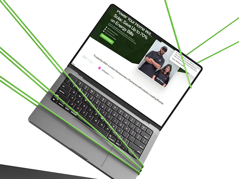
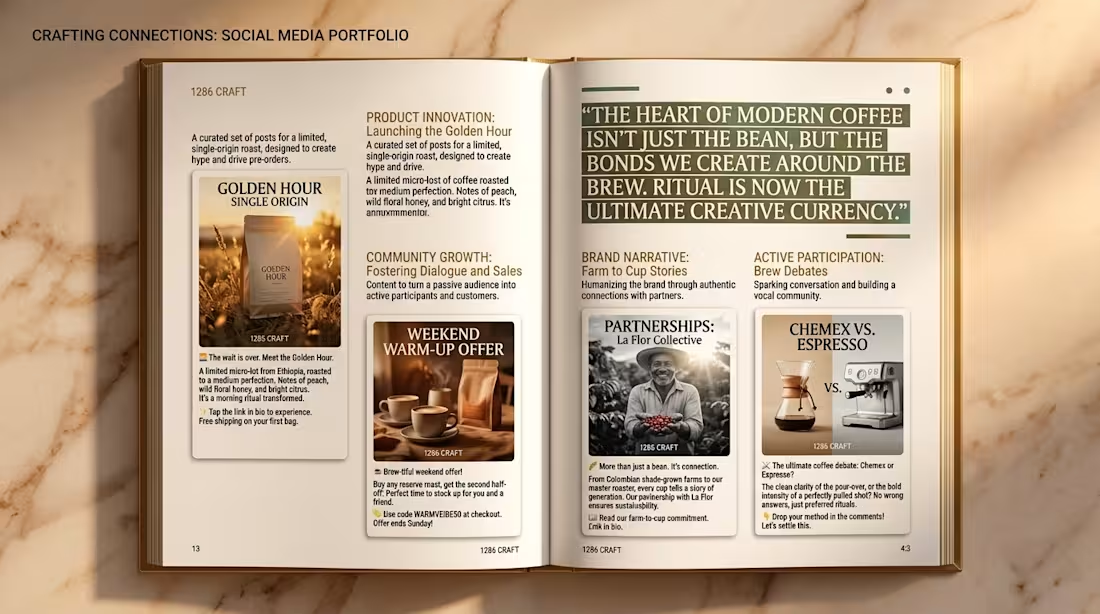
This collection explores four different areas of professional content writing — editorial and article writing, website and brand copy, social media storytelling, and luxury product copywriting. Each concept was developed with a different audience, tone of voice, and communication goal in mind.
From long-form editorial storytelling and informative brand narratives to concise social media messaging and persuasive product descriptions, the focus throughout the project was on creating copy that feels clear, intentional, engaging, and aligned with the personality of the brand.
The editorial piece explores structured long-form writing and thought leadership. The website concept demonstrates brand messaging, benefit-driven copy, and calls to action. The social media collection focuses on product launches, community engagement, storytelling, and promotional messaging, while the luxury fragrance concept explores emotional storytelling and premium product positioning.
The goal was not simply to fill layouts with words, but to demonstrate how thoughtful content can give a brand a recognizable voice and turn information into meaningful communication.
Writing, concept development, visual presentation, and creative direction created as an original portfolio showcase by 1286 CRAFT. Superlocal 2026 (Design Study)
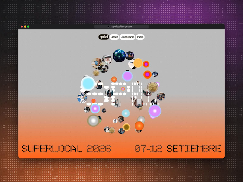
I studied and recorded this website for Superlocal, an international design festival in Uruguay, because it shows how a digital experience can carry a strong visual identity without losing clarity.
The site is built around a custom LED dot-matrix typeface that scrambles into place, giving headlines like "SUPERLOCAL 2026" and each day of the week a sense of live signage. A neutral grey base with a dotted grid is warmed by a vivid orange gradient and a glowing magenta orb, which makes the brand instantly recognisable.
Motion does real storytelling work. An image cluster bursts open to reveal the festival's community, and a spinning 3D coin carries the speaker lineup. Both feel playful but stay tied to the content.
The schedule is the standout. Each day has its own colour band (cyan, orange, yellow, lilac and olive), with the date in bold numerals and the weekday in dot-matrix type. Every talk and workshop sits in a clear grid showing time, speaker and venue, so a dense six-day programme becomes easy to scan.
The experience closes with simple ticket packs, a sponsor grid and a direct contact footer. It's a useful reference for how expressive typography and structured information can work together.