The network for creativity
Join 1.25M professional creatives like you
Connect with clients, get discovered, and run your business 100% commission-free
Creatives on Contra have earned over $150M and we are just getting started
Back to feedPost

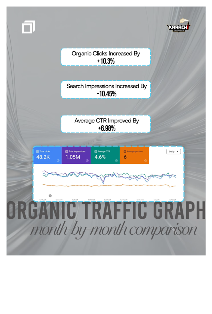
I worked alongside my team at GFX Square on the SEO of Karachi Vapers, an e-commerce website.
Google Search Console recorded the following performance during the reporting period shown:
• 48,200 organic search clicks.
• 1.05 million search impressions.
• A 4.6% average click-through rate.
• An average search position of 6.
This project was a shared effort, with my team playing an important role in supporting the website’s SEO and monitoring its performance.
The attached report documents the website’s organic search visibility and clicks during the selected period.


The network for creativity
Join 1.25M professional creatives like you
Connect with clients, get discovered, and run your business 100% commission-free
Creatives on Contra have earned over $150M and we are just getting started



Related posts

Webflow gives you good SEO controls. Six of them are easy to leave untouched on launch day.
• An SEO title and meta description on every page, plus an Open Graph image for sharing.
• The auto-generated sitemap switched on.
• Indexing of the webflow.io subdomain switched off, so the staging copy stays out of search.
• A global canonical URL set, and alt text on every meaningful image.
Which of these six have you never opened?
Follow for more videos: instagram.com/sellwrightstudio · youtube.com/@sellwrightstudio


Leaving the webflow.io subdomain indexed is such a common miss, good reminder to check before launch day.

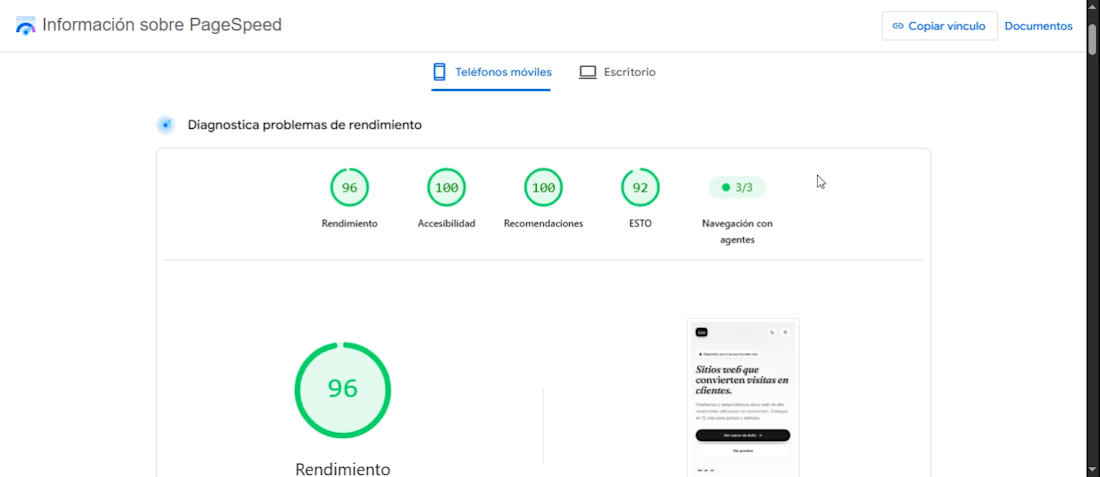
High-Performance Conversion Landing Page (96+ Lighthouse Score)
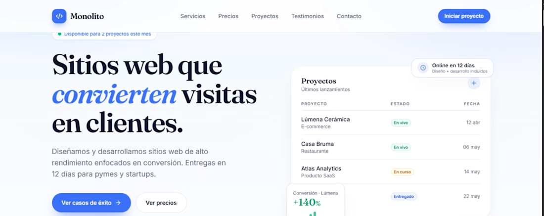
Why waste ad budget on a slow landing page that makes users bounce? I built and optimized this landing page from the ground up with an obsessive focus on speed, accessibility, and user experience. The result isn't just an aesthetic interface—it's a conversion engine validated by real-world performance audits under constrained network conditions. Audited Performance Metrics (Lighthouse / Mobile 4G): Performance: 96/100 – Lightning-fast initial load and First Contentful Paint (1.8s), ensuring visitors never drop off due to lag. Accessibility: 100/100 – Flawless semantic structure and strict adherence to WCAG standards, allowing 100% of your audience to navigate seamlessly. Technical SEO: 92+ – Fully optimized for organic search engine visibility from day one. Zero Blocking Time (TBT: 0ms) – Instant interactivity with zero main-thread freezing. What every project includes: Modern, clean UI/UX design strictly focused on conversion and user flow. Lean, high-performance code (no bloated plugins or unnecessary dependencies). Fully responsive, mobile-first architecture. Seamless integration of checkout flows, lead capture forms, or strategic CTA buttons. If you need a web asset that loads instantly, converts visitors into buyers, and outperforms your competitors, let's talk.


Which one could win here?
A/B testing for a Landing page for B2B search analytics platform.
For startups, converting users is extremely crucial.
Rather than judging on your own, let the numbers tell you which one can help you get more users.
#landingpage #abtesting #b2b #aisearch #businessanalytics
19 voted
44%
24 voted
56%
43 votes
Closed

Light blue. For a B2B analytics tool, showing the actual dashboard in the hero does the selling before anyone reads the copy. “Win in AI search” lands better with the product right beside it. Would be curious to see a second test on the CTA too, “Start Free Analysis” vs something tied to a result.