The network for creativity
Join 1.25M professional creatives like you
Connect with clients, get discovered, and run your business 100% commission-free
Creatives on Contra have earned over $150M and we are just getting started
Back to feedPost


Superlocal 2026 (Design Study)
I studied and recorded this website for Superlocal, an international design festival in Uruguay, because it shows how a digital experience can carry a strong visual identity without losing clarity.
The site is built around a custom LED dot-matrix typeface that scrambles into place, giving headlines like "SUPERLOCAL 2026" and each day of the week a sense of live signage. A neutral grey base with a dotted grid is warmed by a vivid orange gradient and a glowing magenta orb, which makes the brand instantly recognisable.
Motion does real storytelling work. An image cluster bursts open to reveal the festival's community, and a spinning 3D coin carries the speaker lineup. Both feel playful but stay tied to the content.
The schedule is the standout. Each day has its own colour band (cyan, orange, yellow, lilac and olive), with the date in bold numerals and the weekday in dot-matrix type. Every talk and workshop sits in a clear grid showing time, speaker and venue, so a dense six-day programme becomes easy to scan.
The experience closes with simple ticket packs, a sponsor grid and a direct contact footer. It's a useful reference for how expressive typography and structured information can work together.


The network for creativity
Join 1.25M professional creatives like you
Connect with clients, get discovered, and run your business 100% commission-free
Creatives on Contra have earned over $150M and we are just getting started





Related posts

Scared of the dentist? Meet Mola. Book your gentlest appointment in Bandung in under 60 seconds — no phone calls, no confusing forms.
Just tell Mola what's bothering you, and it guides you through choosing the right appointment, finding a doctor and time, entering your details, and getting booked.
The fun part? Mola also has a cute little mascot that acts like an AI agent, helping you through the booking process. And yes, I built the mascot and its animations in Lovable too.
I also designed the experience around real patient needs: progressive questions, easy editing, upfront pricing, emergency detection, WhatsApp-friendly details, reminders, and a clinic schedule on the other side.
💬 Tell Mola what’s going on in your own words, whether it’s a stubborn toothache, routine cleaning, or a quick check-up.
⏱️ Confirmed chair in under 60 seconds, pick your favorite dentist (Dr. Nadia, Dr. Raka, or Dr. Maya) and a time that fits your day.
🏷️ 100% transparent pricing upfront, know your estimated fee before you step foot in the clinic. No surprise bills.
📲 Hassle-free reminders sent straight to your WhatsApp, plus instant calendar and PDF passes.
Gentle, calm, and stress-free care starts before you even sit in the chair.
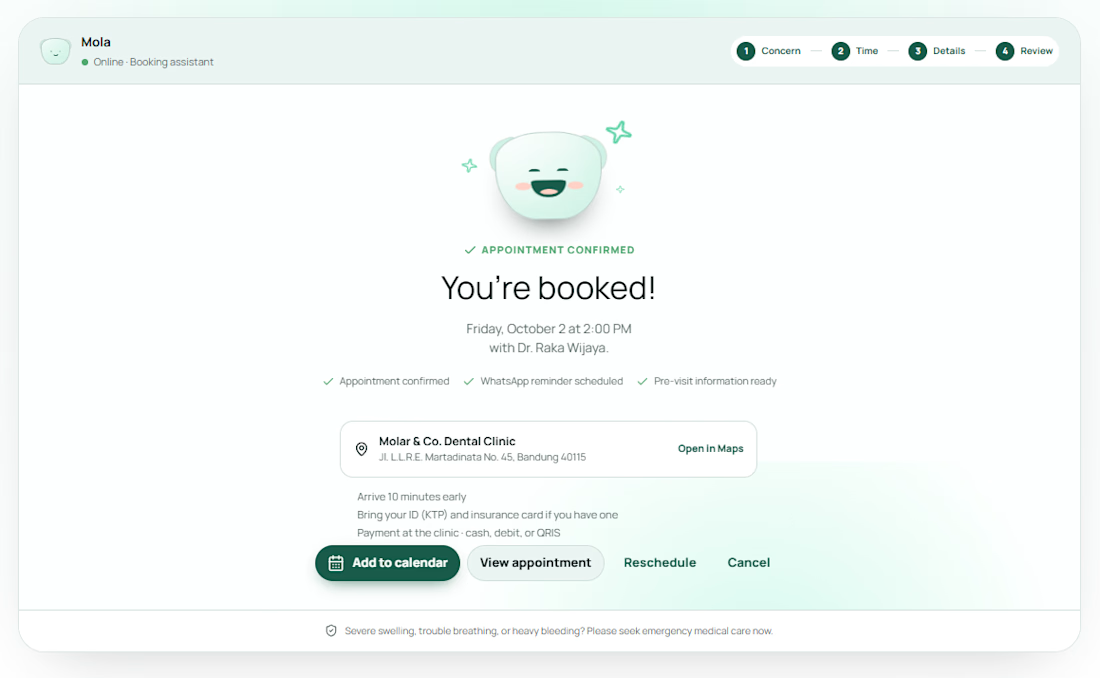
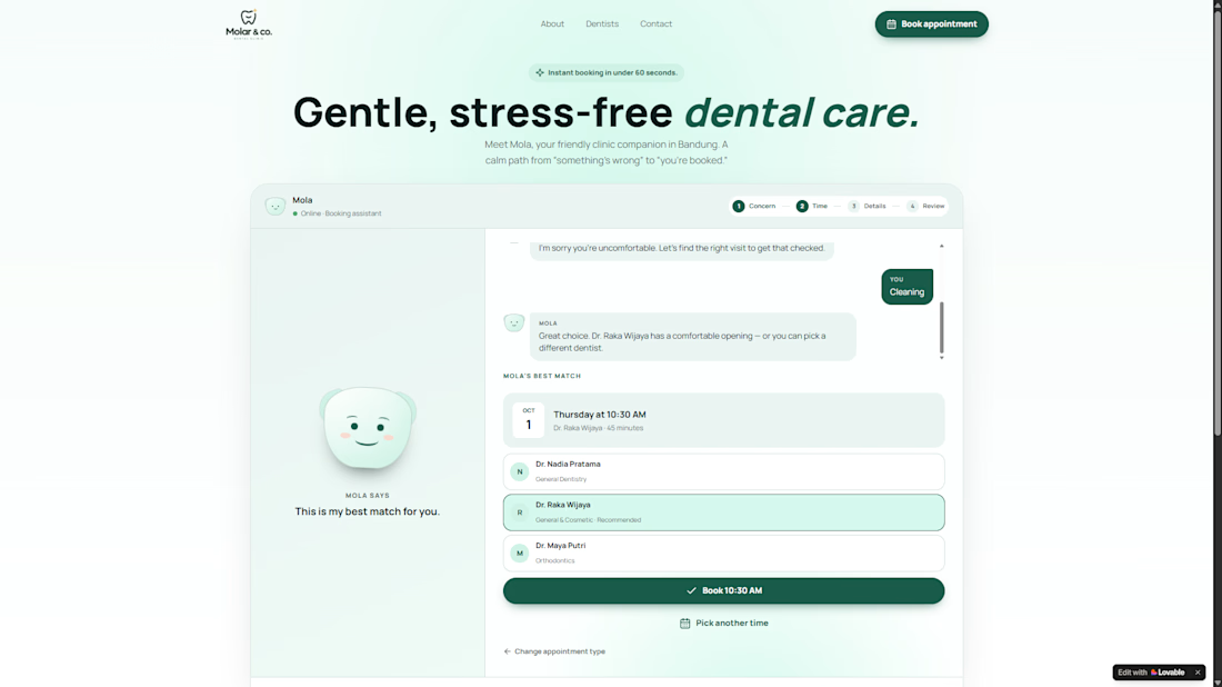
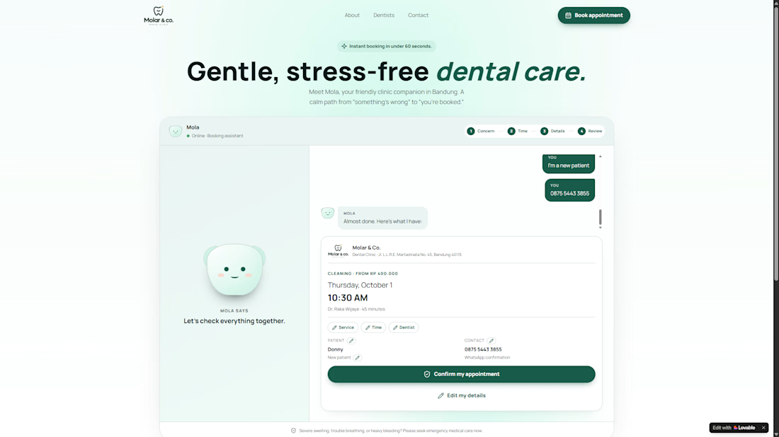

The combination of product design, character design, and animation here is 🔥. Mola feels like an actual little brand, not just a challenge submission.

I built this from scratch using vanilla HTML, CSS, and JavaScript, no build tools, no frameworks, no npm packages. It's a single-file static site that runs offline with zero dependencies, and it's meant to feel like a high-fidelity enterprise product page with a clean, engineering-focused aesthetic.
The visual language is called "Precision Grid", think white canvas with bone-gray accents and one electric-lime accent color (#DCF986) that pops like a circuit trace. The hero section features a dynamic SVG-based security console mockup that animates a live line chart using stroke-dashoffset, with pulsing status dots and count-up metrics that update without triggering any external libraries. The display type uses Clash Grotesk for headers and Satoshi for body, both chosen to match the tech-savvy, minimalist vibe.
Motion is subtle but intentional: staggered fade-and-rise on load, scroll-triggered reveals using IntersectionObserver, and a floating "real-time monitoring" pill that slides in with a slight bounce. I made sure to respect prefers-reduced-motion so it works for everyone, even those with accessibility needs.
The real engineering challenge? Making sure the SVG chart's animation stayed in sync with the scroll position while the page was being viewed. I had to manually track scroll velocity and adjust the stroke-dashoffset value based on a smoothed delta over time, using a simple exponential decay formula to prevent jitter. The fix was: currentOffset = previousOffset + (velocity * 0.05), a small but effective way to keep the animation fluid without overcomplicating it.
This project felt like a quiet victory, building something that feels like it's made for engineers, not for pixels. I love the precision, the calm tension, and the way the animations feel like they're breathing with the user's scroll.
🔥 😊


Banking Design | Digital Banking | Finance Website | Web Design
We designed a modern digital banking website focused on simplicity and flexibility.
Fragmented content and product ideas were transformed into a clear, human-centered experience.
Soft textures, bold typography, and modular account cards create a cohesive system, while custom motion adds a smooth, lightweight scrolling flow.


