



Webflow Expert & Designer


Productivity SaaS Web Design
Tascker is a productivity SaaS dashboard designed to help teams and individuals stay focused, organized, and on track — without the noise.
2
4
280

Financial clarity, designed to convert
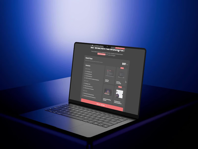
I just finished this high-conversion landing page concept for a financial SaaS brand. Clean layout, strong hierarchy, premium visuals, and a conversion-focused flow from hero to pricing.
Built with:
• Minimalist SaaS structure
• Strong CTA placement
• Trust-building sections
• Clear pricing cards
• Modern dark/light contrast
If you’re building a SaaS, fintech, or B2B product and want a website that feels premium and drives action, this is the kind of direction I love designing.
0
160

Architecture Studios & Interior Design — Your Website Deserves Better
Your portfolio deserves a website that showcases your projects beautifully. Most architecture studios have outdated websites that don't reflect their design quality.
Click below to see examples designed for architecture studios. Ready to upgrade your online presence? DM me!
0
176

Webflow Developer


All-in-one Web Designer - Webflow/Framer/Code

All-in-one Web Designer - Webflow/Framer/Code




Brand identity and websites for AI & Tech startups.
- $1k+
- Earned
- 3x
- Hired
- 76
- Followers
Brand identity and websites for AI & Tech startups.



Creative Designer and Developer, Technology Educator
- $10k+
- Earned
- 1x
- Hired
- 85
- Followers
Creative Designer and Developer, Technology Educator


✨ NEW PROJECT 🌐💥
→ https://animating-the-future-of-web.webflow.io
(https://animating-the-future-of-web.webflow.io)I had a lot of fun testing out and playing around with the new built-in Webflow 's Greensock Interaction dashboard.
Exploring new ways to create web animations and:
What the future of the web could look like in a world of AI.
P.S.: Not a line of Custom Code was used to create the animations; just built-in tools and CSS.
10
46
646

SLEEP WELL CREATIVES
→ https://sleep-well-creatives.com/
This Project explores how habits, environment, and rhythm influence our nightly rest and it's my submission for the #WebflowChallenge (https://x.com/hashtag/WebflowChallenge?src=hashtag_click) and Contra.
Sleep Well Creatives was born from that realization.
From too many nights debugging at 3 a.m., too many mornings running on autopilot.
I wanted to understand why sleep affects everything — from imagination to focus, from empathy to code quality.
And I wanted to make it visual, simple, and relatable — a place where information feels like a journey instead of a lecture.
Thank you for exploring this with me.
Let’s keep designing — but also keep dreaming.
113
159
2.8K


eCommerce Web Design for Design-led DTC Brands


Distinctive brands & high-end websites, designed and built
- 1x
- Hired
- 5.0
- Rating
- 18
- Followers
Distinctive brands & high-end websites, designed and built
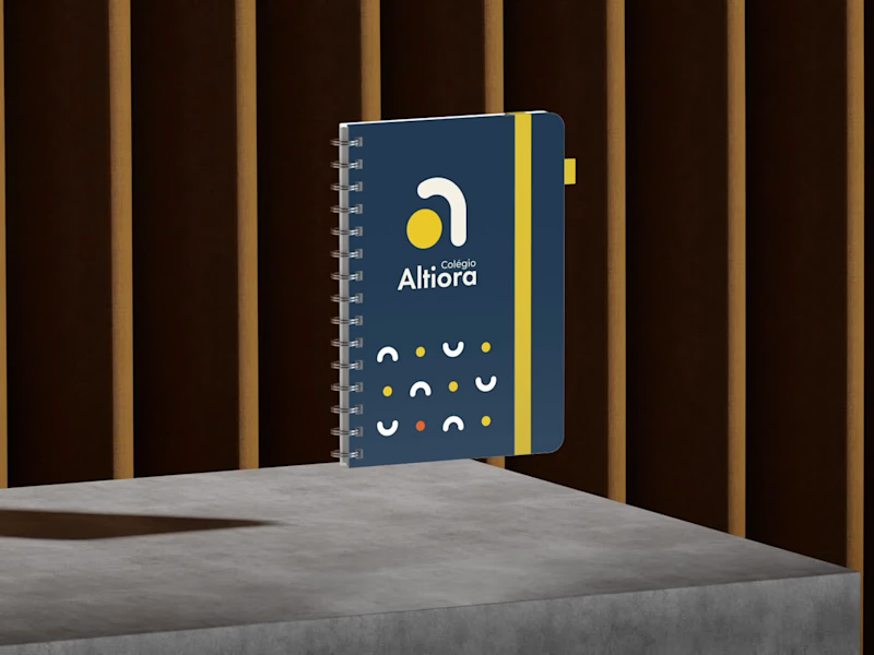
Torna-te quem tu és. Become who you are.
That is the motto of Colégio Altiora, and the whole identity starts from it. Altiora is Latin for "higher things", so the symbol is a small "a" built from two pieces, an arch that rises and a yellow ball.
From those two pieces came everything else. The patterns, the brand elements, the icons for the school app, the classroom signs and the uniform all share the same arch and the same ball.
A school for those who always reach higher.
7
23
1.2K
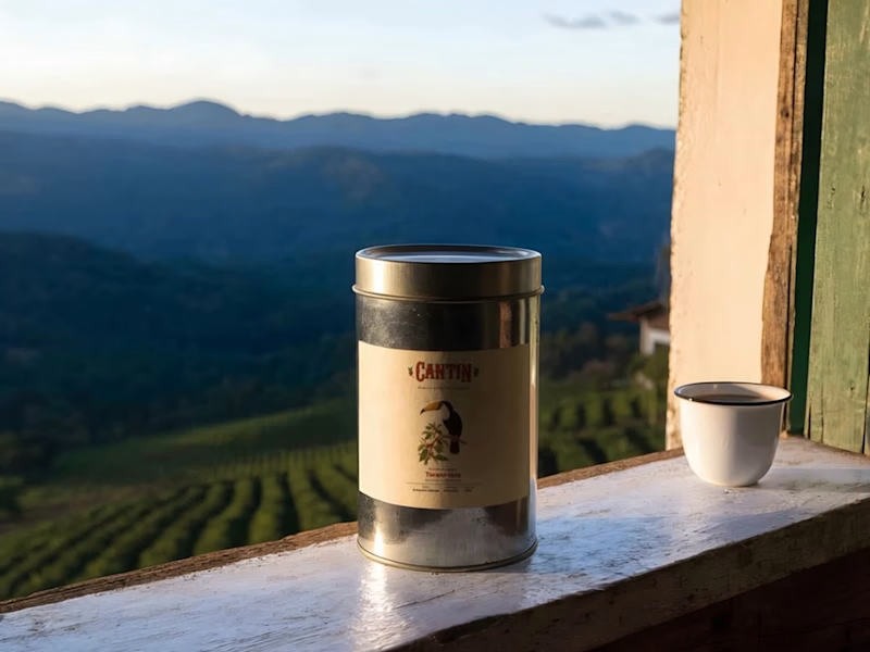
CANTIN | You know our coffee. Meet the neighbors.
I found John James Audubon's The Birds of America (1827–1838) on Wikimedia Commons and in the National Gallery of Art's open collection, hand-coloured engravings where every bird is drawn life-size on the plant it lives on. I cropped seven public-domain plates, without captions or plate numbers, and trained a Recraft V4 Style on them that I called Audubon Aves do Brasil. Audubon never painted Brazil, so I used his way of drawing on Brazilian birds that live around our coffee farms. To tie it together I created CANTIN, an invented Brazilian coffee brand with the campaign line "You know our coffee. Now meet the neighbors." That brand is the twist, since his plates now sell a 2026 coffee on the poster, the campaign seal, the labels, the tins and the kraft bags.
9
22
1.5K