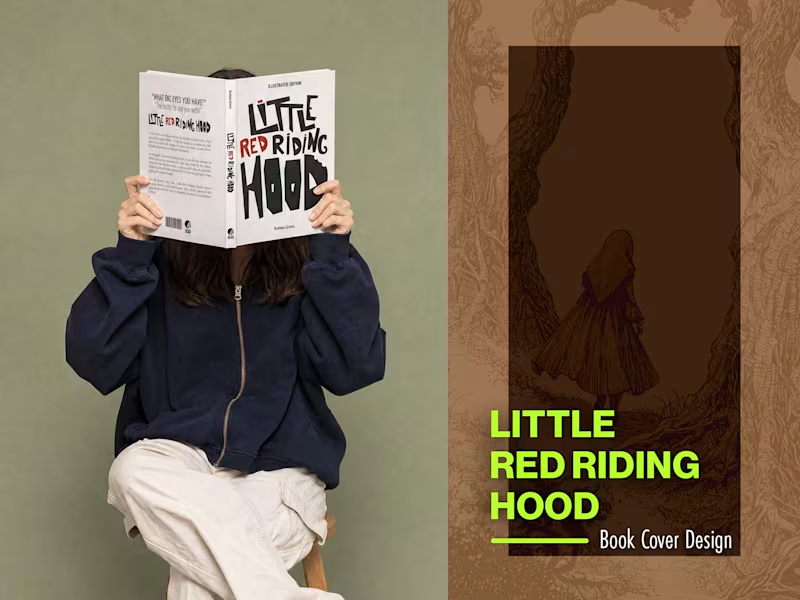
Little Red Riding Hood — Book Cover Design
Personal study in editorial book design for a reimagined illustrated edition of the Brothers Grimm classic. The typography was hand-lettered and treated as the primary narrative device — chaotic, unstable, with the danger of the story living inside the letterforms rather than in illustration.
2
342
Hot Birds is a brand identity study developed for a contemporary fast casual restaurant focused on hot chicken and bold flavors. The project explores the creation of a strong and recognizable visual system that reflects intensity, quality and personality.
Inspired by the culture of Nashville hot chicken and the warmth of Southern hospitality, the brand combines a vibrant color palette, bold typography and a playful yet confident visual language. The intention was to build a brand that feels approachable while still standing out in a highly competitive food market.
From logo design to real world applications, the identity was designed to be flexible and impactful across multiple touchpoints including packaging, social media and physical environments, ensuring consistency and memorability.
3
7
202
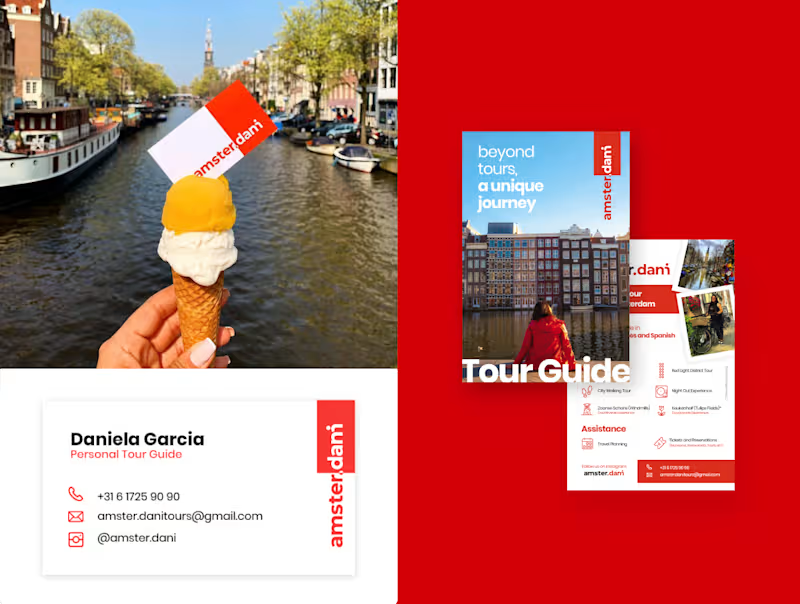
Dani approached me with a playful challenge: create a brand that felt unmistakably like Amsterdam while turning her nickname into the joke “Amster.dani.” Over a three‑week sprint using my own methodology, I designed the entire brand ecosystem, from concept and tone of voice to logo, symbol set, and key digital touchpoints.
At the center is a wordmark that can be read as both “amster.dani” and “amsterdam,” merging the city’s name with her story to signal a more intimate, local‑guided experience. Around it, I built a visual language that connects the city’s essence with Dani’s view as a resident, using clear typography, bold color blocks, and flexible icons for tour categories, so every interaction feels like “not just a tour, a unique journey.”
2
1
181


Person — Cheerful & Vibrant Brand Identity Design
This branding project was created for Person, a personalized products brand focused on delivering custom-made items with a fun, emotional, and visually engaging experience. The main objective was to develop a brand identity that felt joyful, memorable, and highly attractive to a younger and digital-oriented audience.
The visual system was built around playful graphic elements, expressive shapes, and a vibrant color palette combining soft pinks and fresh greens. The identity was designed to communicate creativity, customization, and emotional connection while maintaining a clean and professional structure.
1
96