
Web Designer | Webflow and Wordpress Developer


Forward Deployed Architect | AI, ERP & Platform Delivery
- $5k+
- Earned
- 1x
- Hired
- 5.0
- Rating
- 16
- Followers
Forward Deployed Architect | AI, ERP & Platform Delivery


Scaling eCommerce Conversions via Influencer-Led Campaigns
Scaling eCommerce Conversions via Influencer-Led Campaigns


View more →

20 yrs experience in web dev & creative design
20 yrs experience in web dev & creative design


I help brands grow on social media — and build the websites
New to Contra
I help brands grow on social media — and build the websites
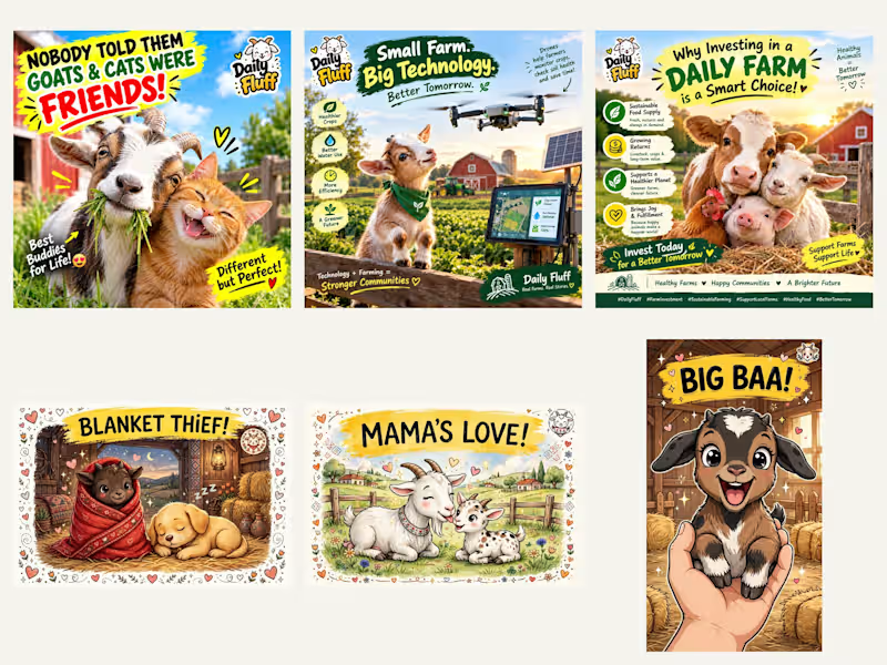
Thumbnail design for Reels and social media (sample work from my own page): bold cartoon-style and realistic farm thumbnails with big readable text, bright colors, and a clear focal point — designed to stop the scroll and lift click-through rate. Each thumbnail matches the video's hook in one second. The same thumbnail design process applies to your Reels, Shorts, and social media posts.
1
125

Adult E-commerce Product Page Conversion Specialist
Adult E-commerce Product Page Conversion Specialist
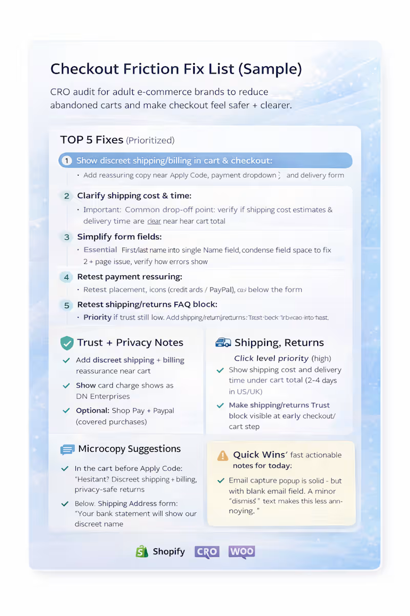
Checkout Drop-Off Fix List (Sample): Reduce Abandoned Carts
Most “product page” issues aren’t the only reason people don’t buy — a lot of shoppers drop at cart + checkout.
This is a sample 1-page checkout friction audit I deliver for adult ecommerce brands (Shopify/WooCommerce) to make checkout feel safer, clearer, and easier to finish.
6
90
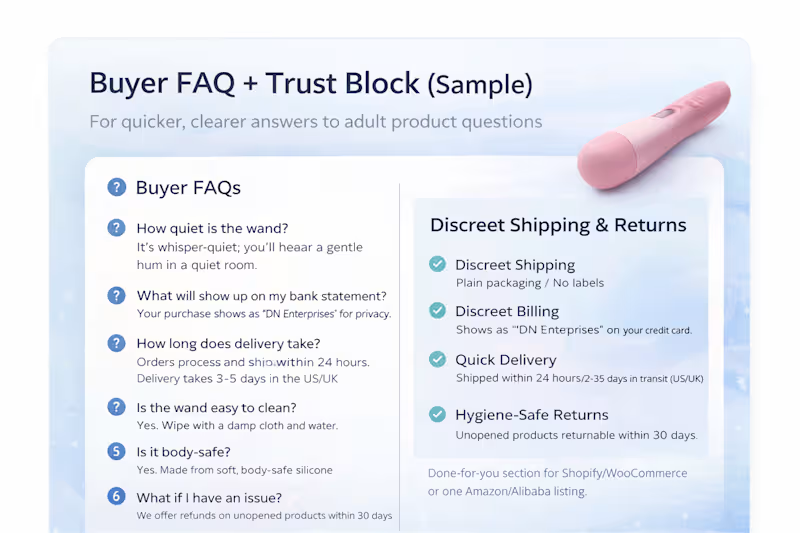
Buyer FAQ + Trust Block (Sample) — Adult Product Page
I create a short buyer FAQ + trust block for adult product pages so shoppers get clear answers fast.
This sample includes:
• 6–8 FAQs about use, safety, cleaning, and privacy
• a discreet shipping & returns paragraph in simple language
• wording you can paste directly into a Shopify/WooCommerce product page or a single Amazon/Alibaba listing.
22
188

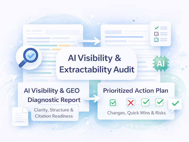

Website Designer | LMS, eCommerce & Digital Marketing
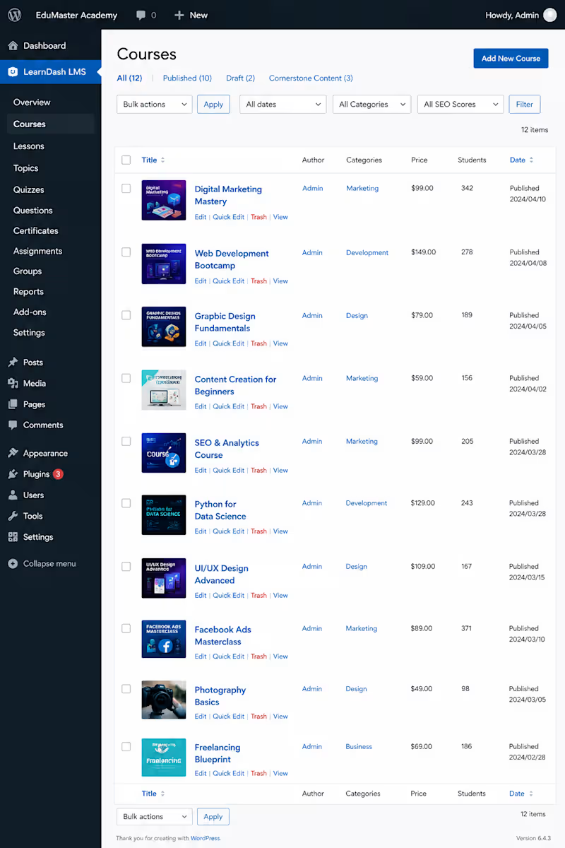
Developed a complete WordPress LMS website for an online learning platform, including course and lesson setup, student dashboards, quizzes, certificates, enrollment management, progress tracking, payments, and backend administration. I structured the system to make managing courses, students, and learning content simple while providing a smooth experience across desktop and mobile.
0
71
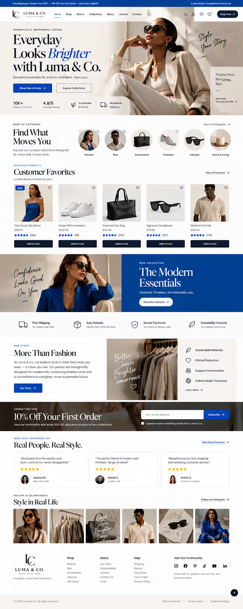
A beautiful e-commerce website is not enough. It needs to help people discover, trust, and buy.
For Luma & Co., I designed a premium e-commerce website concept where visual storytelling and conversion-focused UX work together.
The objective was simple: create an online shopping experience that feels like a fashion editorial while still making the customer journey clear, intuitive, and effortless.
What makes an e-commerce website convert?
A strong e-commerce experience should answer three questions quickly:
What do you sell?
The hero section immediately establishes the brand, product category, positioning, and primary shopping actions.
Why should I trust you?
Customer ratings, product reviews, secure payment messaging, easy returns, shipping information, and sustainability messaging are positioned throughout the experience to reduce hesitation.
Where do I go next?
Clear navigation, curated categories, featured products, strong calls-to-action, and strategically placed product discovery sections guide visitors naturally toward shopping.
The Luma & Co. approach
I created an editorial-inspired fashion e-commerce interface using a bold cobalt blue and warm neutral palette to balance energy with premium sophistication.
The homepage includes:
• High-impact fashion hero section
• Clear primary and secondary CTAs
• Category-based product discovery
• Featured products with ratings and pricing
• Add-to-cart interactions
• New collection promotion
• Brand story and sustainability section
• Shipping, returns and payment trust signals
• Customer testimonials
• Social proof and Instagram-style content
• Newsletter and first-order offer
• Structured e-commerce footer and navigation
• Responsive-first layout considerations
The goal wasn't to fill the page with design elements.
It was to create visual hierarchy so customers know what matters, where to look, and what action to take next.
The bigger lesson
Your website is often the first salesperson your customer meets.
If the design looks beautiful but the navigation is confusing, the product information is buried, the CTA is weak, or trust signals are missing, you're creating friction between interest and purchase.
Great e-commerce web design connects:
Brand → UX → Product Discovery → Trust → Conversion
That's the thinking I bring into every website project.
Project: Luma & Co.
Industry: Fashion / E-commerce
Design direction: Editorial · Premium · Conversion-focused
Services: E-commerce Web Design · Brand Identity · Responsive Web Design
2
125
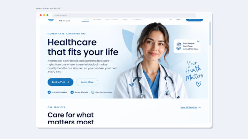
Healthcare Website Design That Builds Trust Before the First Appointment
A healthcare website needs to do more than look professional—it needs to build trust, explain the service clearly, and make the next step effortless.
I designed this Averelle Medical concept as a modern telehealth experience focused on clarity, credibility, and conversion.
The Goal
Create a healthcare website that feels:
Professional. Responsive. Clear. Easy to navigate.
The design uses a calm coastal blue + white palette, generous whitespace, rounded UI elements, and a clean visual hierarchy to create a trustworthy healthcare experience without feeling cold or overly clinical.
What I Designed
• High-impact healthcare hero section
• Clear service categories
• Simple 3-step “How It Works” journey
• Trust and credibility sections
• Patient testimonial section
• Mobile/app experience
• Strategic calls-to-action throughout the journey
• Responsive desktop-to-mobile design direction
• Complete footer and navigation system
The UX Thinking
Every section answers a question a potential patient may have:
What does this service offer?
Can I trust this provider?
How does it work?
What happens next?
The result is a website designed to move visitors from curiosity → confidence → action.
Design Philosophy
For healthcare and wellness brands, I believe great design sits at the intersection of:
Trust + Clarity + Experience + Conversion
That means beautiful visuals are only the starting point. The website also needs to communicate the right information, reduce friction, and guide users naturally toward taking action.
Looking for a healthcare website like this?
I help healthcare, telehealth, wellness, and service-based businesses create professional websites, landing pages, and digital experiences that are designed around both brand credibility and user experience.
Available for website design, redesigns, landing pages, and complete brand + website projects.
1
2
214
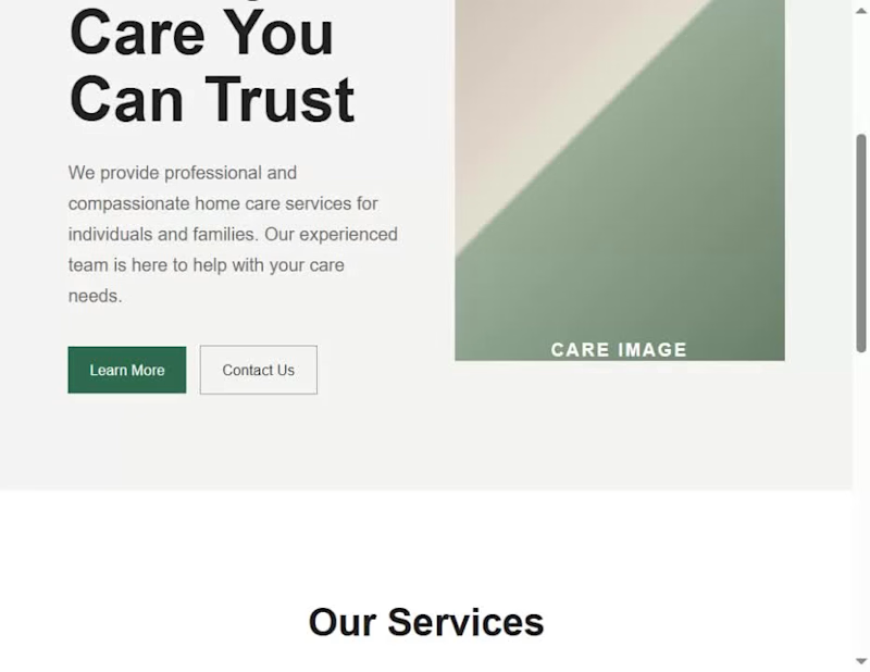
I built a complete care-service website for a fictional brand, HAVEN, to demonstrate a design principle I use in my real website-design workflow: the 5-second test.
When I review a website, I don't begin by asking whether it looks beautiful. I first ask whether a visitor can understand its purpose quickly. My test is built around three questions:
Who is this for? What do they get? What should they do next?
I started with a deliberately generic version of the HAVEN homepage. Although the structure was functional, the messaging was broad, the value wasn't immediately clear, and the page presented competing calls to action.
I then worked through the three questions before touching the visual polish.
First, I clarified who the website is for. Instead of a generic care statement, I positioned HAVEN around families looking for thoughtful support for someone they love.
Second, I clarified what the visitor gets. I replaced vague messaging with a more specific explanation of the in-home support HAVEN provides and the outcome it is designed to create.
Third, I clarified what the visitor should do next. I established a stronger primary call to action, “Explore care options,” and structured the rest of the page to support that decision.
Once the message and hierarchy were working, I moved into the visual design: typography, spacing, color, layout, responsive behavior, and subtle motion. These elements were used to reinforce the message rather than distract from it.
The final website is therefore not just a visual redesign. It demonstrates how I move from problem → decision → design, and how I use a simple test to decide what deserves attention before I spend time polishing a website.
The lesson I want another designer to take away is simple: before making a website more beautiful, make sure its purpose is obvious.
My 5-second test is:
Who is it for?
What do they get?
What should they do next?
If those three things aren't clear within a few seconds, I'm not finished designing
1
2
167