Freelancers using Figma in Rajshahi Division
Sign Up
Post a job
Sign Up
Log In
Filters
2
Projects
People
Md Toufic Ahmed Khan Badhon
pro
Natore, Bangladesh
Shopify, CRO, GoHighLevel Automation & Landing Page Expert
7x
Hired
5.0
Rating
35
Followers
expert
expert
Follow
Message
Shopify, CRO, GoHighLevel Automation & Landing Page Expert
0
Replo PDP Development for Gl-ME Subscription Product
0
21
0
Shopify One-Product Store Homepage Design Using Replo
0
10
0
Advertorial Page Design Using Instant.so
0
23
0
Figma Design + Replo Development For Ultra Liver
0
49
Figma
(9)
Follow
Message
Humaun Atelier
Natore, Bangladesh
Brand & UI/UX Designer — Design + Web Development
New to Contra
Follow
Message
Brand & UI/UX Designer — Design + Web Development
1
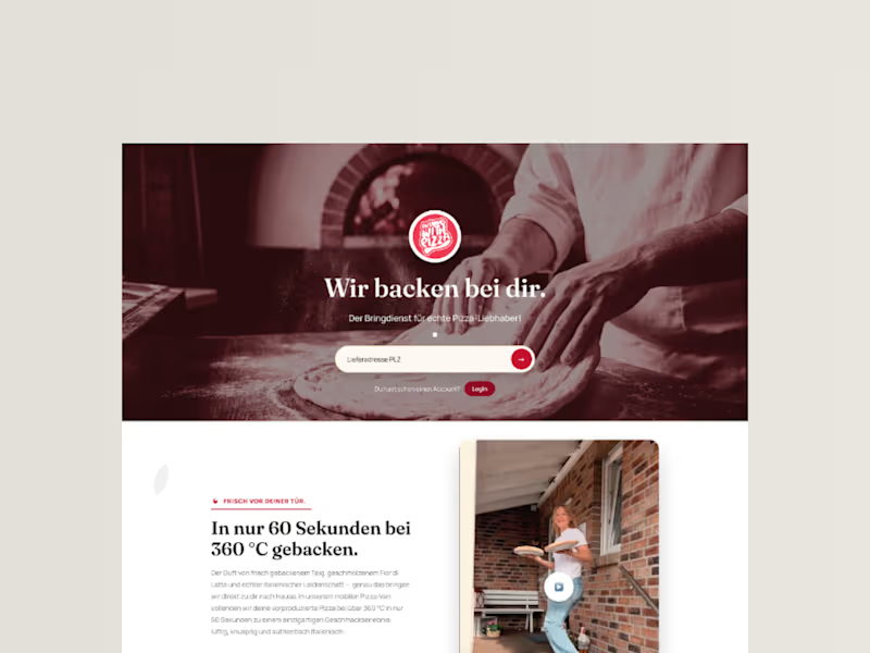
InLoveWithPizza Premium Landing Page Redesign
1
15
0
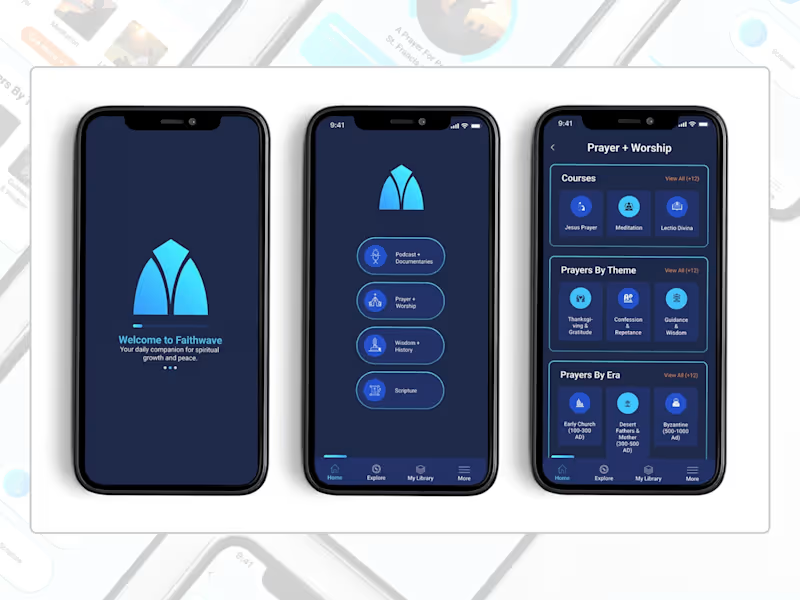
A full UI concept for FaithWave, a faith-based app designed to help users explore and deepen their Christian faith through meaningful learning, prayer, and customizable worship experiences. I designed three key screens—Home, Prayer & Worship, and a Customizable Item Page—that together demonstrate the app's core user journey. The Home screen features four main content sections (Podcasts, Prayer & Worship, Wisdom & History, Scripture) with a clean, intuitive bottom navigation. The Prayer & Worship page organizes a rich library of prayers by theme, era, courses, and meditations, making spiritual content easily discoverable. The Customizable Item page allows users to personalize their prayer experience by selecting narrator voices, background sounds, and volume controls—creating a deeply personal and immersive devotional experience. The design uses a calming blue gradient inspired by the brand's logo (cyan to deep blue), with thoughtful typography and ample whitespace to create a serene, focused atmosphere for prayer and reflection.
0
223
1
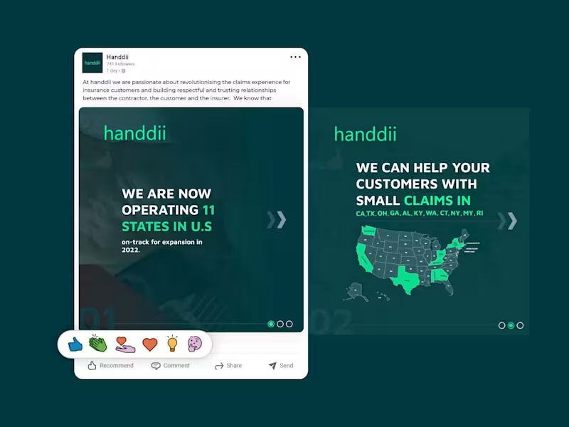
A LinkedIn carousel post designed for handdii, a company expanding across 11 U.S. states. The goal was to visually communicate their growth and service areas while maintaining their brand identity—using their signature green (#00FF99), supporting colors, and a clean, modern layout. I incorporated the 2-letter state abbreviations (CA, TX, OH, GA, etc.) into the design, creating a map-like visual that immediately conveys the company's reach. The carousel structure allowed me to present the key message—operating in 11 states with more expansion coming—across multiple slides, keeping each one clean, scannable, and on-brand. The design uses bold typography, consistent spacing, and a professional tone suitable for LinkedIn's audience, without relying on the logo since the post was published from the company page.
1
191
0
I designed a modern, clean, and uplifting website for The Creek Pub and Grill, a restaurant situated within a prestigious golf club community. The primary challenge was to transform their existing online presence into a vibrant, standalone digital storefront that captures the warmth and energy of a premium pub experience—rather than feeling like an overlooked amenity page attached to the golf club. To achieve the client's specific request for a 'clean and happy' aesthetic, I built the layout around a bright, airy framework with generous white space, allowing the content to breathe. I balanced warm, earthy tones with vibrant accent colors (such as fresh greens and sunny yellows) to evoke positivity and stimulate appetite appeal. While the client allowed the use of stock imagery, I carefully selected high-quality photos that showcase the restaurant's inviting ambiance, signature dishes, and craft beverages to establish an immediate emotional connection with hungry visitors. The user experience was prioritized throughout the design. I ensured that the menu, operating hours, and contact/reservation details are prominently positioned above the fold, minimizing friction for potential guests. The visual hierarchy was carefully structured to guide the eye smoothly from a welcoming hero banner down to the restaurant's key offerings, encouraging casual visitors to convert into confirmed diners. The final design successfully bridges the gap between a casual, energetic pub atmosphere and the refined expectations of a country club clientele. It positions The Creek Pub and Grill as a must-visit dining destination, packaged in a scannable, high-converting, and genuinely 'happy' visual layout.
0
171
Figma
(7)
Follow
Message
AI Sohan
Rajshahi Division, Bangladesh
Product Designer & Developer | AI Web & Mobile Apps | Figma
7
Followers
Follow
Message
Product Designer & Developer | AI Web & Mobile Apps | Figma
0
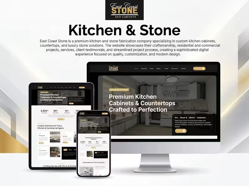
East Coast Stone & Cabinets Website Design & Development Overview East Coast Stone & Cabinets is a premium kitchen and stone fabrication business specializing in custom kitchen cabinets, countertops, and luxury stone solutions. The website presents the company's craftsmanship, services, and residential and commercial projects through a polished digital experience designed to build trust and encourage client inquiries. The Challenge The website needed to communicate the quality of premium kitchen and stone fabrication services while presenting project details and service offerings in a clear, professional format. The challenge was to balance visual appeal with practical business goals: showcasing craftsmanship, making services easy to explore, and helping potential customers take the next step toward a consultation. My Approach I focused on a modern, premium visual direction using a refined black, white, and gold color palette to communicate quality and sophistication. The layout emphasizes high-quality project imagery, clear service sections, strong typography, and prominent calls to action. Responsive layouts ensure the experience adapts to desktop, tablet, and mobile screens. Key Features Premium kitchen cabinet and countertop showcase Residential and commercial project presentation Dedicated service sections Responsive desktop, tablet, and mobile layouts Clear navigation and content hierarchy Prominent consultation and contact calls to action Brand-focused visual design My Role Website design and development, with a focus on presenting the brand professionally, structuring service information, and creating a responsive user experience. Specific responsibilities can be refined to reflect the work completed directly on this project. Tools & Technologies To be confirmed based on the actual project tools and technology stack. Outcome The project showcases a premium, responsive website concept that presents East Coast Stone & Cabinets' services and craftsmanship in a cohesive digital experience, with a clear path for prospective customers to explore services and make inquiries. Project Link https://ecstonemd.com Planning a website for your construction, interior design, or home improvement business? Send me a message on Contra.
0
129
1
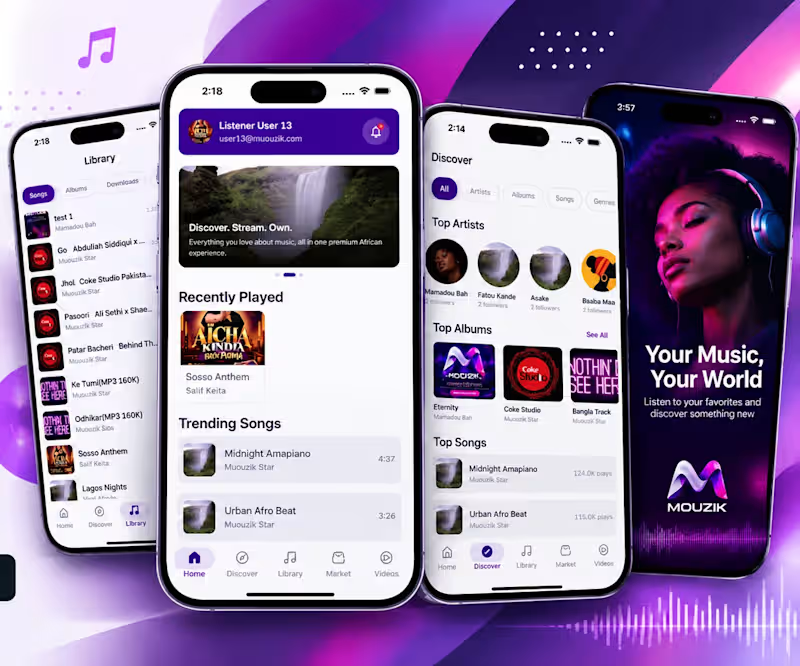
MUOUZIK — Music Streaming & Marketplace Mobile App Overview MUOUZIK is a music-focused digital platform designed to connect listeners with artists, songs, albums, and music videos in one mobile experience. The platform brings music discovery, personal libraries, and music marketplace functionality together to create an engaging experience for music enthusiasts. The Challenge The platform needed a cohesive mobile experience that would make discovering music, exploring artists, managing a personal library, and accessing marketplace content straightforward. The key design challenge was organizing multiple music-related experiences into a clear, intuitive interface while maintaining a consistent visual identity. My Approach I focused on a modern, mobile-first interface with a distinctive purple visual identity, clear navigation, and structured content discovery. The interface organizes the experience into dedicated sections for home, discovery, library, marketplace, and videos. Content cards, artist profiles, album artwork, and song lists help users explore the platform without unnecessary complexity. Key Features Music discovery across artists, albums, songs, and genres Home dashboard featuring recently played and trending songs Personal music library for songs, albums, downloads, and favorites Artist and album browsing Dedicated marketplace section Music video discovery Mobile-first navigation and content layouts My Role Product design and development contribution focused on the mobile music platform experience. The specific responsibilities completed by me and any team contributions can be detailed according to the actual project scope. Tools & Technologies To be confirmed based on the tools and technologies used in the actual project. Outcome The project showcases a mobile music platform concept that brings music discovery, library management, and marketplace navigation into a unified interface. The screenshots demonstrate the proposed user experience and visual direction. Project Link https://play.google.com/store/apps/details?id=com.afrikora.app Interested in building a music streaming platform, artist marketplace, or custom mobile app? Send me a message on Contra.
2
1
255
0
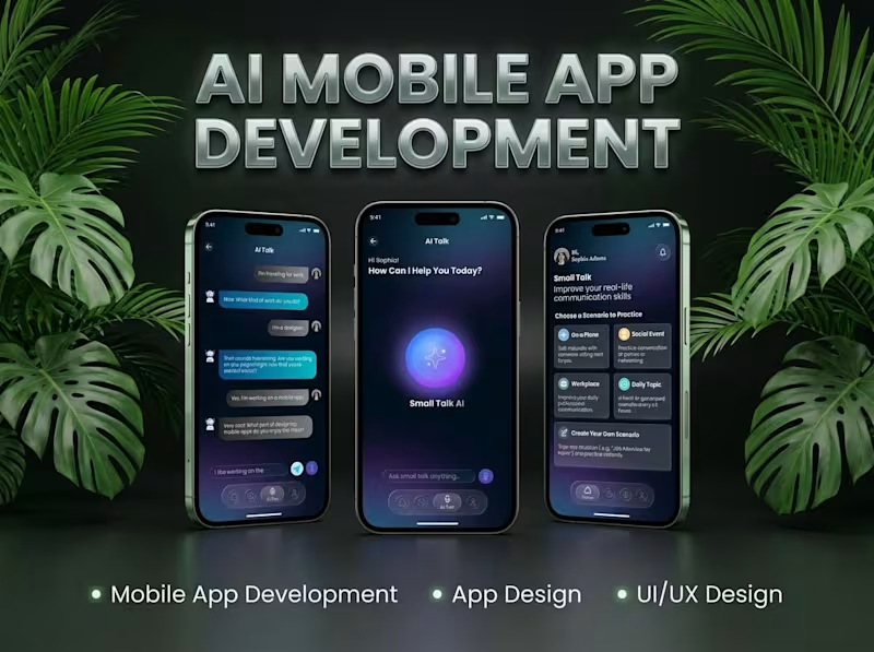
AI Small Talk || AI-Powered Mobile Communication App Overview AI Small Talk is a mobile communication app concept designed to make conversations more accessible, engaging, and natural through AI-powered interactions. It aims to help users practice everyday conversations, explore different topics, and improve their communication experience through an intuitive mobile interface. The Challenge Creating a conversational mobile experience requires more than a chat interface. The app needs to make interactions feel simple and approachable while helping users navigate conversations without unnecessary complexity. The key challenge is designing a user-friendly experience that encourages engagement and makes AI-assisted communication easy to access. My Approach The project focuses on a clean, user-centered mobile experience with an emphasis on intuitive navigation, accessible conversation flows, and a modern interface. The design and development approach prioritizes usability, clear information hierarchy, and a flexible foundation for AI-powered communication features. Key Features AI-assisted conversational interactions Simple and intuitive mobile communication interface Conversation-focused user experience Topic-based small-talk possibilities User-friendly navigation and interaction flows Mobile-first interface design My Role Product design and development, with a focus on translating the app concept into a practical mobile communication experience. Specific responsibilities and team contributions can be added to reflect the work completed on the project. Tools & Technologies To be confirmed based on the actual project stack. Only verified tools and technologies should be listed here. Outcome The project demonstrates a concept for making AI-assisted conversations more approachable through a focused mobile experience. The final outcome and current product status should be described according to the completed design, prototype, or live application. Interested in building a similar AI-powered communication app? Send me a message on Contra.
0
185
0
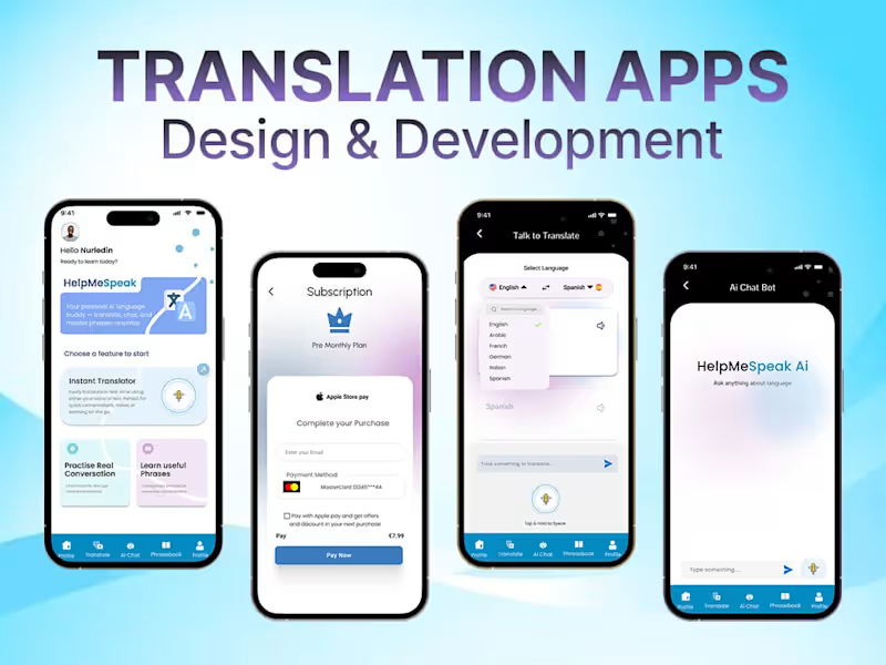
Building an AI translation app isn't just about translating words. The real challenge is understanding how people communicate. A good translation app should think about: Language context. Tone. Voice. User intent. And the situation where the translation is being used. For example, translating a business email is very different from translating a casual conversation. That's why, when I work on an AI translation app, I don't start with: “Which AI API should we use?” I start with: “What kind of communication are we trying to improve?” Then we decide the right AI model, API, app flow, UX, and architecture around it. AI is the technology. The product experience is what creates the value. My takeaway: Don't build an AI app just because AI can do something. Build it because AI can solve a real user problem better. #AI #ArtificialIntelligence #MobileAppDevelopment #AIApp #TranslationApp #ProductDevelopment #TechConsulting
1
0
256
Figma
(16)
Follow
Message
Ferdausur Rahman
Bogura, Bangladesh
B2B Website Designer | SEO, AEO & GEO Specialist
Follow
Message
B2B Website Designer | SEO, AEO & GEO Specialist
4
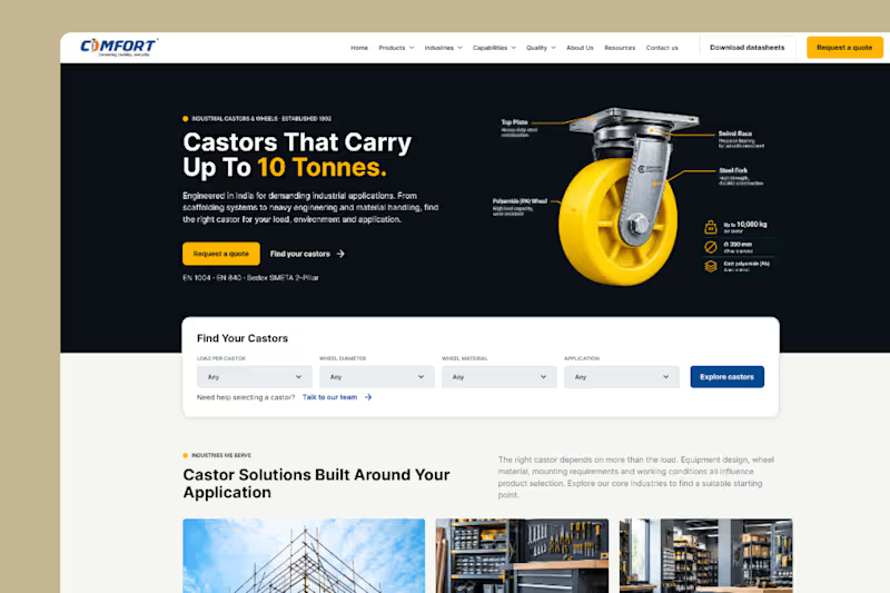
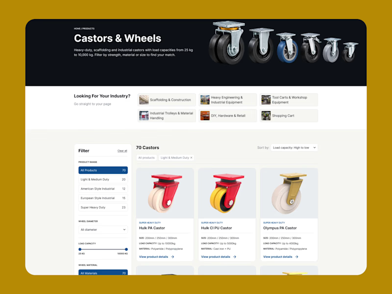
Most manufacturing websites are just PDFs in disguise. An engineer lands on your page with a real constraint: “I need a castor that holds 2 tonnes, survives a cast-iron floor, and fits a 150 mm wheel.” Then they scroll through 40 products, open 6 datasheets, and leave to ask a competitor who answers faster. I recently designed a Castors & Wheels catalogue page for an industrial castor manufacturer, and these are the principles I’d now apply to any B2B product catalogue: 1. Let buyers search by constraint, not by product name. Industrial buyers rarely know your model names. They know their load, their floor, their wheel size. So the filters are load capacity, wheel material, diameter and duty class. 2. Put the specs on the card. Size, load capacity and material are visible before the click. If someone has to open a page to find out whether a product is even relevant, the page has failed. 3. Offer a second way in. Some buyers think in products, others in industries. A “Looking for your industry?” row (scaffolding, heavy engineering, material handling) gets them to the right range in one click. 4. Let them sort by what matters. Defaulting to load capacity, high to low, matches how this buyer actually narrows things down. 5. Treat “we didn’t list it” as a lead. Most manufacturers can build custom, but the page never says so. A “Didn’t find your castor?” block turns a dead end into a quote request. 6. Make the enquiry form ask the right questions. Industry and application go in the form, so sales starts the first call already knowing what the buyer needs. 7. Design for export from day one. Language options, a separate export contact and a clear route to a quote matter when your buyers sit in a dozen countries. A catalogue page isn’t there to show everything you make. It’s there to get the right buyer to the right product faster than your competitor can. 👇 If you’re a manufacturer, what’s the one thing buyers keep asking your sales team that your website should already answer? And if you’re a buyer, what makes you close a supplier’s tab?
4
4
191
0
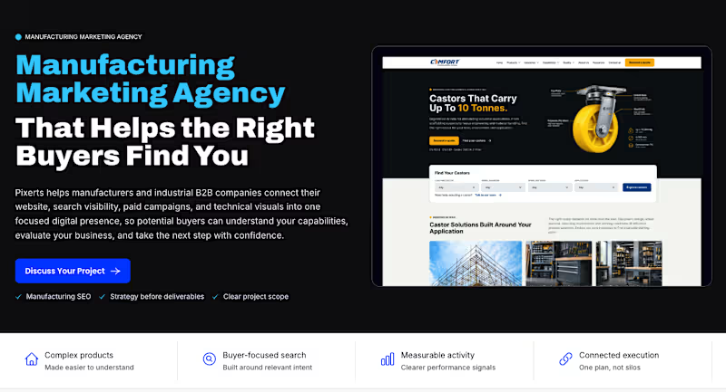
Most manufacturing websites explain the company. But do they help the right buyers choose it? That’s the problem I’m building Pixerts to solve. We help manufacturers connect their website, SEO, paid campaigns, and technical visuals into one focused digital presence. The goal is simple: make complex capabilities easier to understand, help the right buyers find you, and make requesting a quote the natural next step. Here’s a look at our landing page and how we approach manufacturing marketing. 🌐 https://pixerts.com If you're a manufacturer, what’s the biggest challenge with your website right now: visibility, explaining your capabilities, or generating qualified RFQs? #Manufacturing #B2BMarketing #ManufacturingSEO
0
69
1
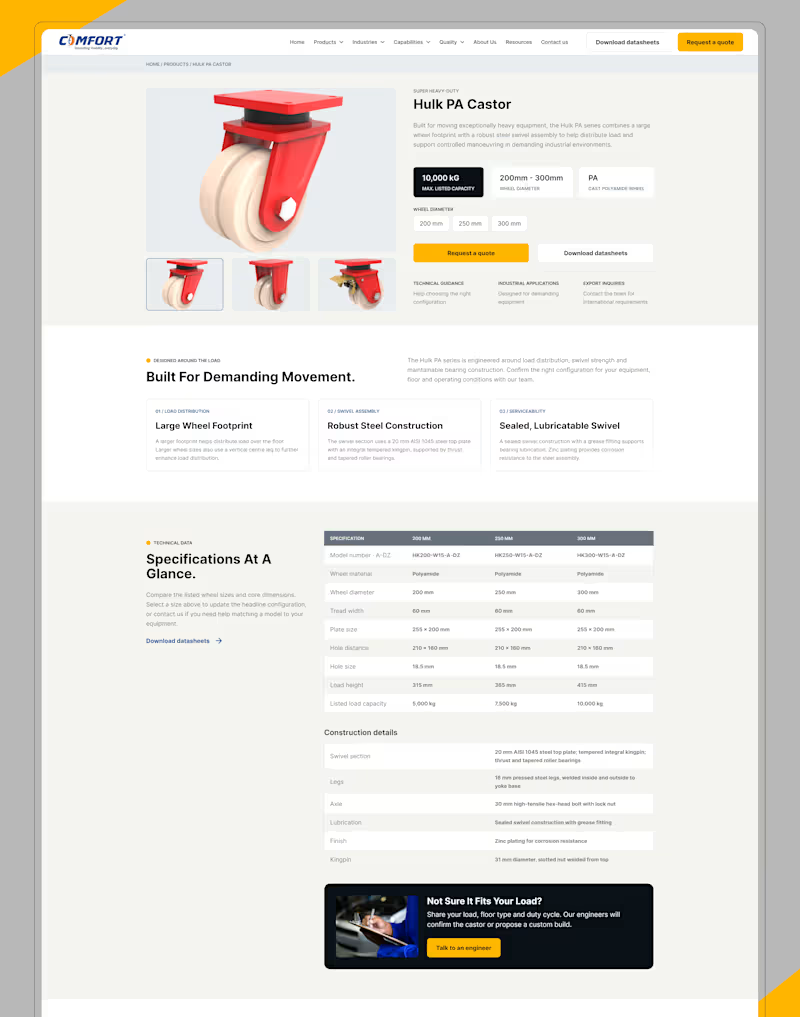
Your product might handle 10 tonnes. But can your website handle the buyer’s questions? When industrial buyers visit your website, they’re not just looking at products. They’re evaluating specifications, comparing options, and deciding whether to trust your business. If finding the right information takes too long, you’re creating friction before the conversation even begins. That’s the problem this product page concept aims to solve. We focused on three things: → Make technical details easy to find. → Make product comparisons easier. → Make requesting a quote the natural next step. Because in B2B manufacturing, a better website isn’t just about looking professional. It’s about making complex buying decisions easier. At Pixerts (https://www.linkedin.com/company/pixerts/), we design and build B2B manufacturing websites that turn technical information into better buyer experiences. Is your website helping buyers move forward, or making them work harder? #Manufacturing (https://www.linkedin.com/search/results/all/?keywords=%23manufacturing&origin=HASH_TAG_FROM_FEED) #UXDesign (https://www.linkedin.com/search/results/all/?keywords=%23uxdesign&origin=HASH_TAG_FROM_FEED) #B2BMarketing (https://www.linkedin.com/search/results/all/?keywords=%23b2bmarketing&origin=HASH_TAG_FROM_FEED) #IndustrialDesign (https://www.linkedin.com/search/results/all/?keywords=%23industrialdesign&origin=HASH_TAG_FROM_FEED) #WebDesign (https://www.linkedin.com/search/results/all/?keywords=%23webdesign&origin=HASH_TAG_FROM_FEED)
1
108
1
A manufacturing website should do more than look good. It should help buyers make decisions. Imagine searching for an industrial castor that can handle 10 tonnes. You need clear specs, the right materials, and the right product without wasting time. That’s what good UX makes possible. → Clear product positioning → Visual technical explanations → Easy product filtering → Simple quote requests At Pixerts (https://pixerts.com/), we design and build B2B manufacturing websites that combine UX/UI, WordPress, SEO, and AEO to turn product discovery into business opportunities. Does your website make it easy for buyers to find the right product and request a quote? #Manufacturing (https://www.linkedin.com/search/results/all/?keywords=%23manufacturing&origin=HASH_TAG_FROM_FEED) #UXDesign (https://www.linkedin.com/search/results/all/?keywords=%23uxdesign&origin=HASH_TAG_FROM_FEED) #B2BMarketing (https://www.linkedin.com/search/results/all/?keywords=%23b2bmarketing&origin=HASH_TAG_FROM_FEED) #WebDesign (https://www.linkedin.com/search/results/all/?keywords=%23webdesign&origin=HASH_TAG_FROM_FEED)
1
137
Figma
(9)
Follow
Message
Enamul Haque
Pabna, Bangladesh
Creative Product developer on Webflow and Framer
Follow
Message
Creative Product developer on Webflow and Framer
0
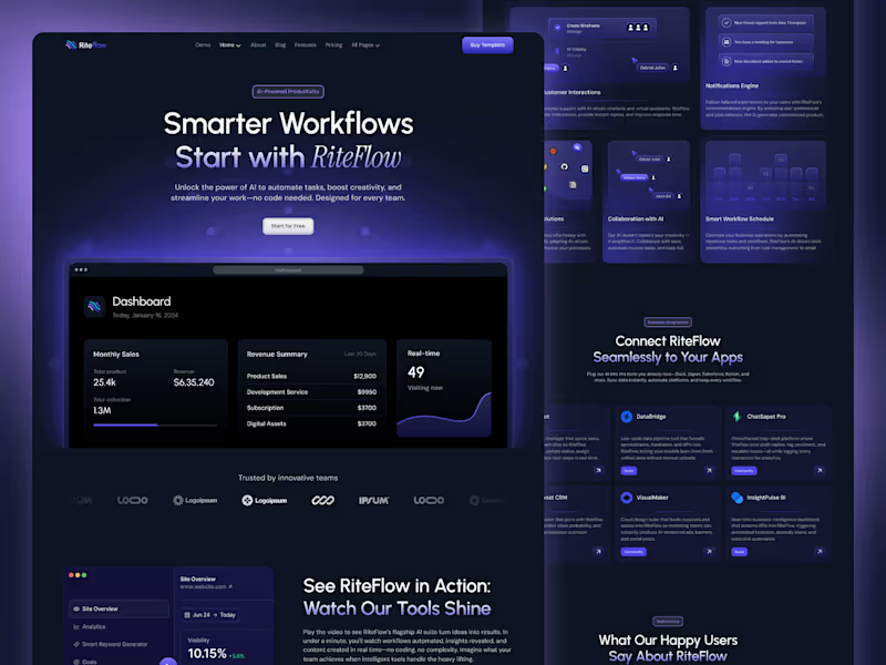
Riteflow – SaaS & AI Startup Design
0
6
0
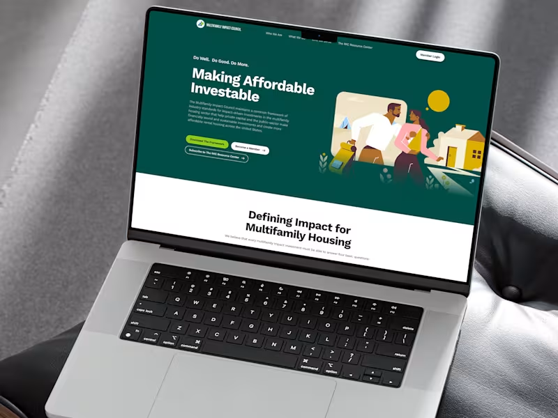
MIC — Web Design for Housing Finance
0
9
0
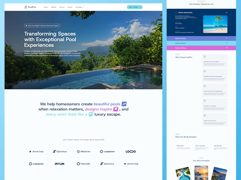
PoolPro - Luxury Website Design for a Premium Pool Brand
0
4
0
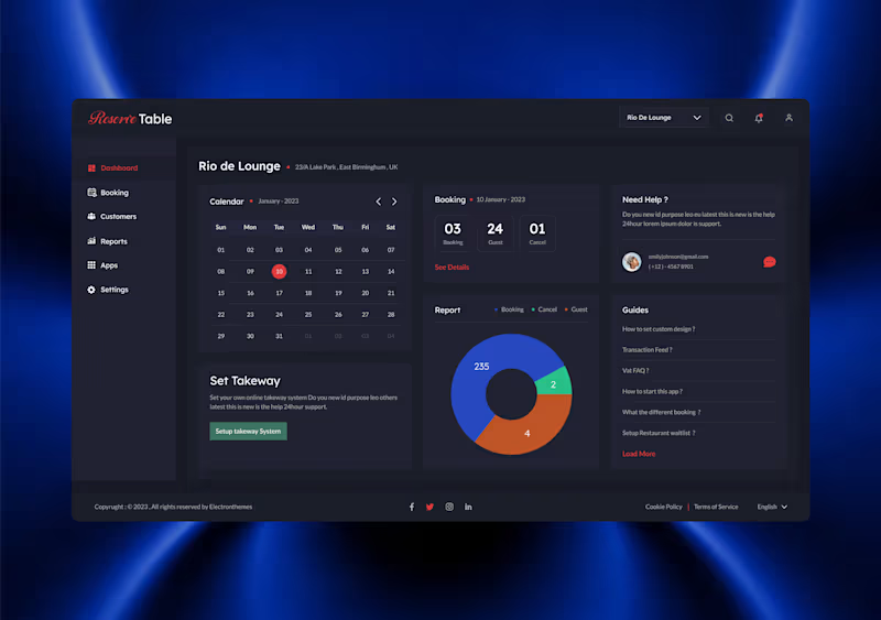
Restaurant Reservation Dashboard UI
0
9
Figma
(11)
Follow
Message
Syed Shihab
pro
Rajshahi, Bangladesh
Graphic Design, UI UX Design, (Webflow & Framer) Website
New to Contra
Follow
Message
Graphic Design, UI UX Design, (Webflow & Framer) Website

0
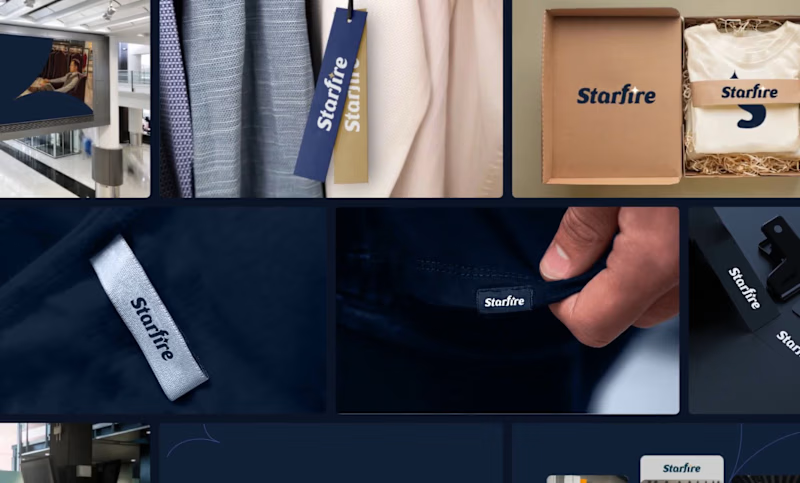
Graphic Design, Branding & Print Materials for Starfire.
0
0
0
Full Brand Identity Design for Edible Marker Cafe
0
0
0
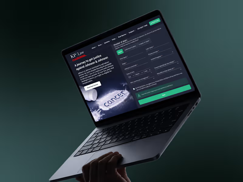
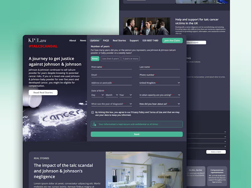
Dynamic Website Design for KP Law Firm
0
0
0
KP LAW (Legal Support) - Full Website Design
0
0
Figma
(12)
Follow
Message
Md Suman Ali
Rajshahi, Bangladesh
Brand Strategist & Identity Designer for Property Developers
11
Followers
Follow
Message
Brand Strategist & Identity Designer for Property Developers
1
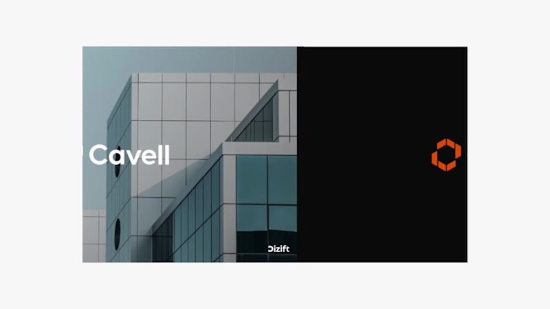
Cavell | Brand Identity Design for UK Property Development Modern, confident, and built for what’s next. Cavell is a UK-based real estate and property development company focused on creating high-quality commercial spaces for businesses and organisations. At Dizift Studio, we developed a modern visual identity that reflects Cavell’s focus on architecture, business growth, and long-term value. The identity combines a distinctive geometric brandmark, clean typography, and a bold orange-and-black color palette to create a professional and recognisable presence. What We Designed: → Custom geometric logo and brandmark → Primary and secondary color palette → Typography system → Brand identity guidelines → Business stationery → Signage and environmental branding → Marketing and promotional applications Every element was designed to work together, creating a consistent identity across digital and physical touchpoints. Brand Message: Built for What Next. Creative Direction: Modern, Minimal, Architectural, Professional.
2
1
26
1
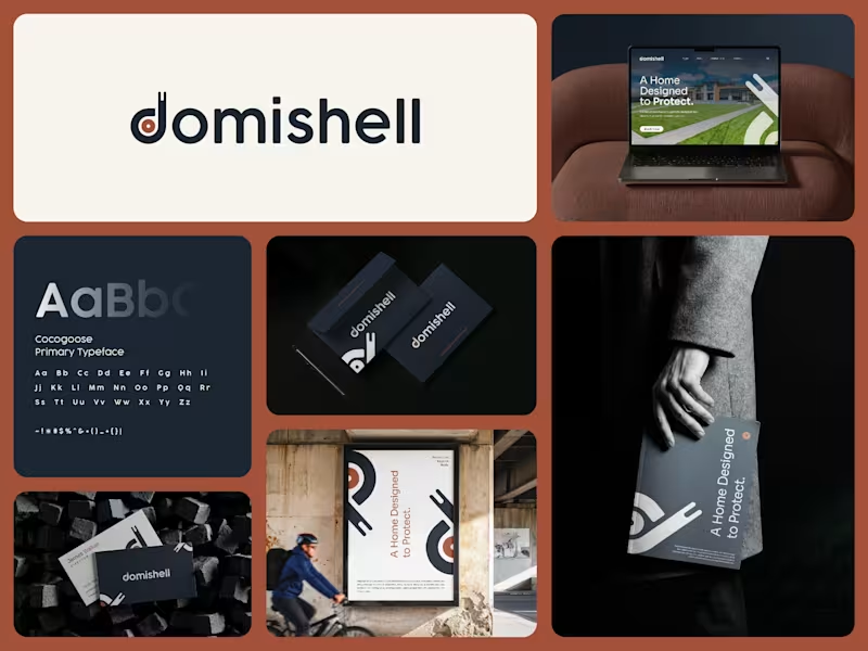
Domishell | Real Estate Brand Identity & Logo Design
1
3
3
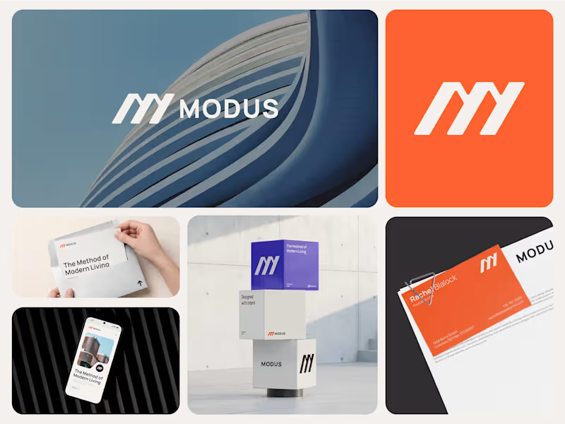
MODUS — Brand Identity for a Contemporary Architecture Studio. How do you build an identity that feels as considered as the spaces it represents? That was the starting point for MODUS, a contemporary architecture studio focused on creating purposeful spaces for modern life. The brand itself is built around the same principles MODUS brings to architecture: form, function, precision, and human experience. I wanted the identity to feel architectural without falling into the usual clichés. The symbol uses simple geometric forms to create a distinctive M, giving the brand a sense of structure, movement, and progression. From there, the visual language expands through bold typography, generous layouts, architectural imagery, and a confident orange and violet palette. The result is a system designed to work across everything from stationery and digital experiences to social media and environmental applications. At the heart of the identity is one simple idea: The Method of Modern Living. MODUS is about more than how a space looks. It’s about thoughtful planning, architectural precision, and creating spaces that feel intentional and timeless. I'd love to hear what you think.
1
3
205
2
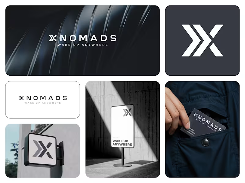
Rejected, but not forgotten. 👀 This was an unused identity direction created during our exploration for XNOMAD. Bold symbol. Strong movement. Simple application. It didn’t become the final identity, but that doesn’t mean the idea has to disappear. Would you have picked this direction? The concept is now available for purchase and can be adapted for a new brand. #LogoDesign #BrandIdentity #UnusedLogo #BrandDesign #LogoDesigner
2
119
Figma
(10)
Follow
Message
Sujon Mahmud
pro
Sirajganj, Bangladesh
Webflow Solution Expert, 4+ Years of Experience
Follow
Message
Webflow Solution Expert, 4+ Years of Experience
1
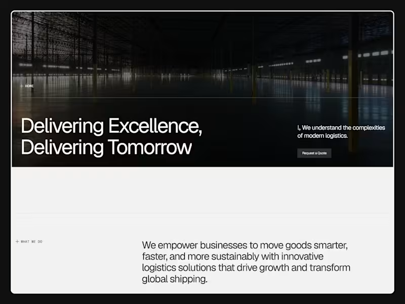
Saudi Platinum Gate – Smart Logistics Website Design in Webflow
1
12
1
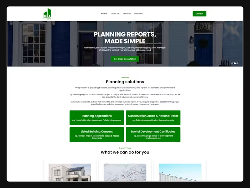
My Planning Reports - UK Planning Consultancy Webflow Website
1
2
1
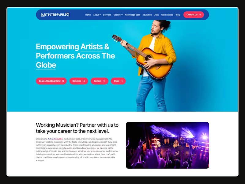
Artist Republic – Music Management Website Design in Webflow CMS
1
3
1
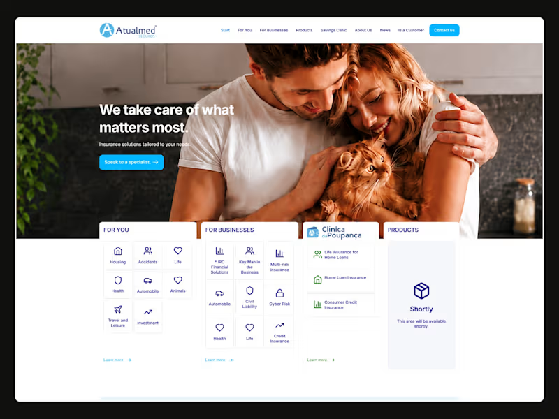
Atualmed - Insurance Brokerage Website Redesign in Webflow
1
6
Figma
(9)
Follow
Message
Explore people