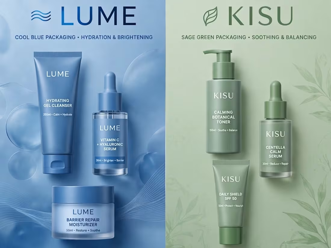
💥 DUAL CASE STUDY - LUME + KISU Skincare | Side-by-Side Brand Comparison
Premium e-commerce brand identity showcase - How strategic color psychology 2x'd conversions for DTC skincare!
🔵 LUME - COOL BLUE PACKAGING
Focus: Hydration & Brightening
Strategy: Clean, clinical, trust-building
Palette: Cool blue = freshness, reliability, hydration
Target: Hydration-seeking millennial skincare users
Results: +120% Add to Cart, +95% Checkout Completion, +60% Brand Recall
🟢 【entity-KISU¦canonical_name=KISU】 - SAGE GREEN PACKAGING
Focus: Soothing & Balancing
Strategy: Calm, natural, wellness-oriented
Palette: Sage green = calm, clean, botanical, sustainable
Target: Sensitive skin, eco-conscious consumers
Results: +110% Conversion Rate, +85% Repeat Purchase, +70% Social Engagement
SIDE-BY-SIDE COMPARISON:
LUME: PERFORMANCE & TRUST
【entity-KISU¦canonical_name=KISU】: CALM & NATURAL WELLNESS
This is how I help D2C brands grow with strategic rebrands. Which concept do you prefer - Blue or Green? Comment below! 👇
Want me to rebrand your skincare/e-commerce brand for 2x growth? Let's talk - contra.com/w/nagdak
#DualBrand #CaseStudy #LUME #KISU #SkincareBranding #BrandRefresh #EcommerceGrowth #ConversionOptimization #BrandIdentity #DTCBrand #PackagingDesign #BrandComparison #GraphicDesign #BrandDesigner #USABrand
2
49

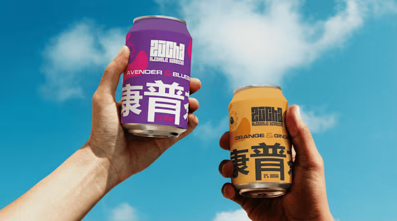
Zucha a brand built on clarity, precision, and quiet confidence.
The objective was simple: remove the unnecessary and let the identity speak with intent.
The wordmark is crafted with balanced proportions and subtle refinements, creating a presence that feels modern yet timeless. Every curve and cut is deliberate not decorative.
In line with the brand philosophy, the visual system leans on minimal elements, allowing space, typography, and structure to do the work. No noise, just clarity.
Typography plays a key role a refined primary typeface paired with a functional secondary font ensures both elegance and adaptability across platforms.
The overall identity is designed to be flexible yet consistent, making Zucha instantly recognizable in every interaction.
~
P.S If your audience needs effort to understand your brand, your identity isn’t working — it’s confusing.
0
13

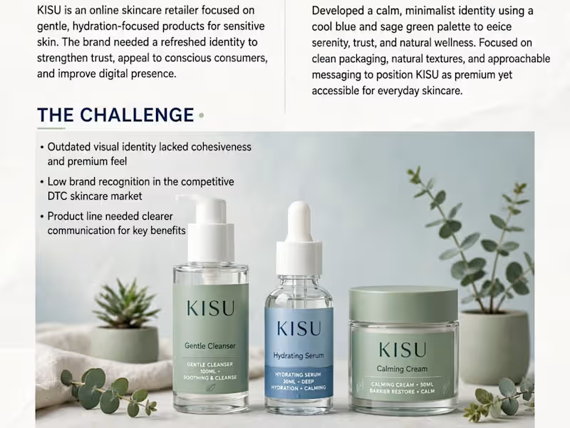
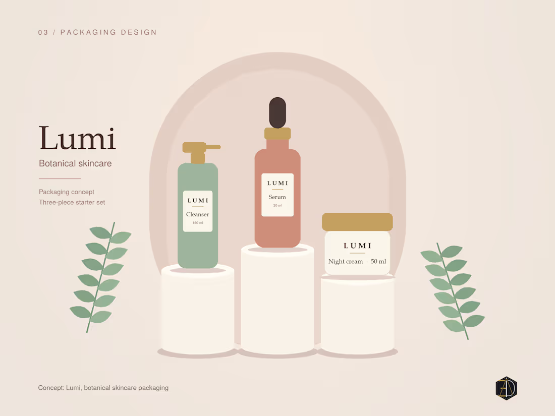
🍃 CASE STUDY - 【entity-KISU¦canonical_name=KISU】 Skincare Brand Refresh | Clean, Calm, Conscious
【entity-KISU¦canonical_name=KISU】 is an online skincare retailer focused on gentle, hydration-focused products for sensitive skin. The brand needed a refreshed identity to strengthen trust + improve digital presence.
MY APPROACH:
Developed a calm, minimalist identity using cool blue + sage green palette to evoke serenity, trust, and natural wellness. Focused on clean packaging, natural textures, approachable messaging.
THE CHALLENGE:
Outdated visual identity lacked cohesiveness
Low brand recognition in competitive DTC market
Product line needed clearer communication
VISUAL IDENTITY:
Cool Blue #6B9ACA - Trust, Calm
Sage Green - Natural, Balanced
Neutral Sand - Warm, Clean
RESULTS:
🚀 68% Increase in Conversion Rate
🚀 42% Lift in Brand Recall
🚀 3.2K Preorders in First Month + 4.9★ Avg Rating
Typography: Clean modern sans-serif
Photography: Natural, soft, botanical style
I create skincare brands that feel premium yet accessible. Want similar for your brand? DM!
Portfolio: contra.com/w/nagdak
#KISU #SkincareBranding #BrandRefresh #CaseStudy #MinimalistDesign #EcommerceBranding #PackagingDesign #GraphicDesign #CleanBeauty #BrandIdentity #DTC
3
87
Your brand can quickly start to feel pieced together when decisions are made without a clear direction. Small changes here and there may solve short-term needs, but over time they weaken the overall identity.
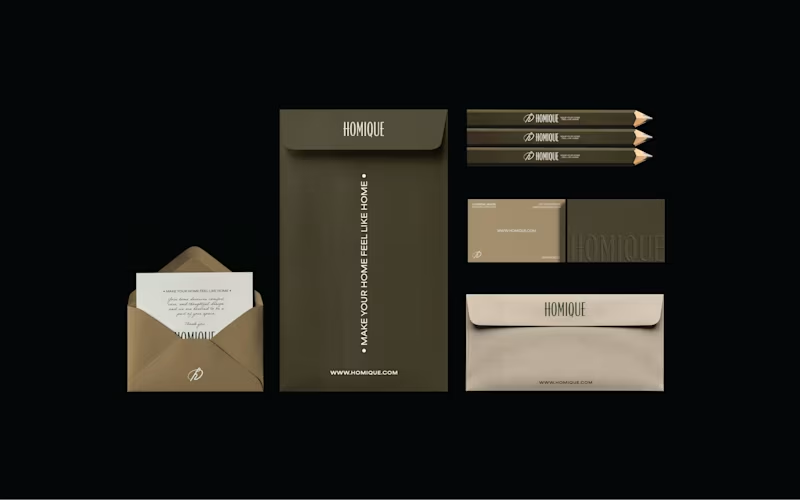
This case study for Homiqe explores the importance of building a clear identity system — one that helps a brand remain intentional, consistent, and recognizable.
Homiqe is a brand focused on modern living and thoughtful home solutions. The goal was to create a visual identity that reflects simplicity, comfort, and a sense of belonging.
The direction centered on a clean, structured wordmark paired with a minimal symbol. The design language emphasizes balance, clarity, and modern aesthetics, aligning with the brand’s idea of creating smarter and more refined living spaces.
By developing a consistent identity system, the brand gains flexibility across packaging, digital platforms, and communication while maintaining a unified visual voice.
0
13

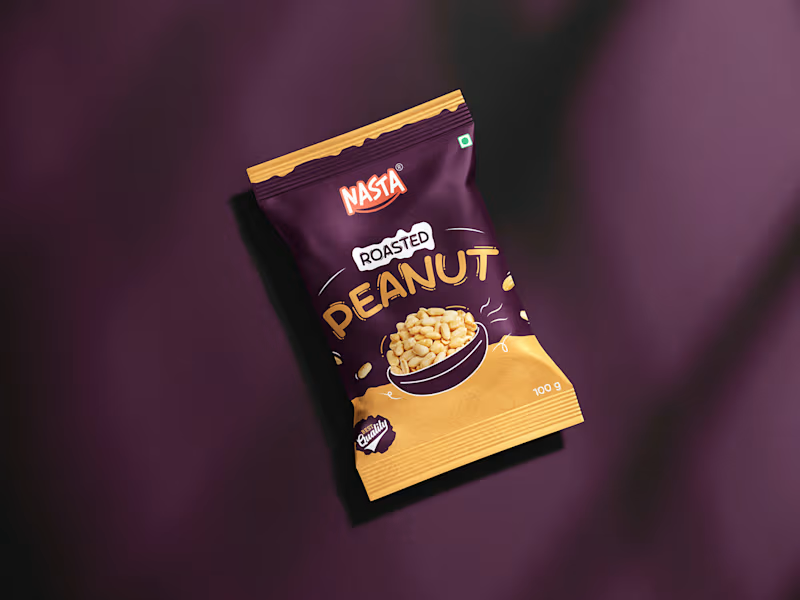
In 2025, packaging design evolved from a functional layer into a strategic brand asset. Consumers didn’t just buy products; they connected with stories, values, and experiences delivered through thoughtful design. Minimalism became sharper, sustainability became non-negotiable, and clarity outperformed clutter. The brands that won attention were the ones that treated packaging as a silent salesperson-building trust, driving recall, and influencing decisions at the shelf and on screens. As we step into 2026, packaging is no longer an afterthought; it is the first conversation between a brand and its customer.
1
2
443
