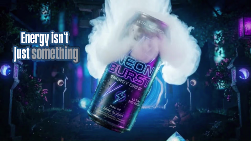
AI Ad creative specialist - UGC & Ecommerce ads
- 1x
- Hired
- 17
- Followers
AI Ad creative specialist - UGC & Ecommerce ads
Social Media Growth Manager and Content Specialist.
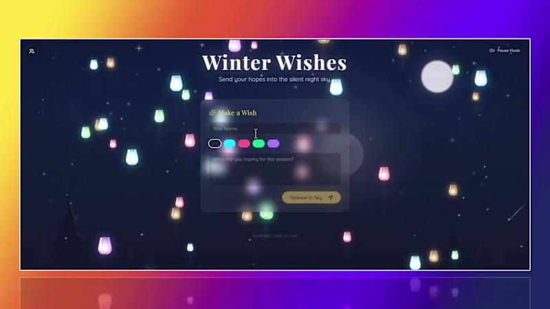
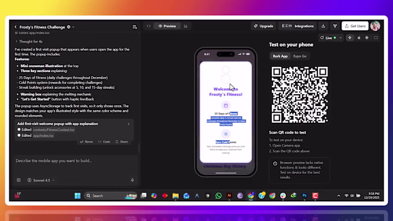
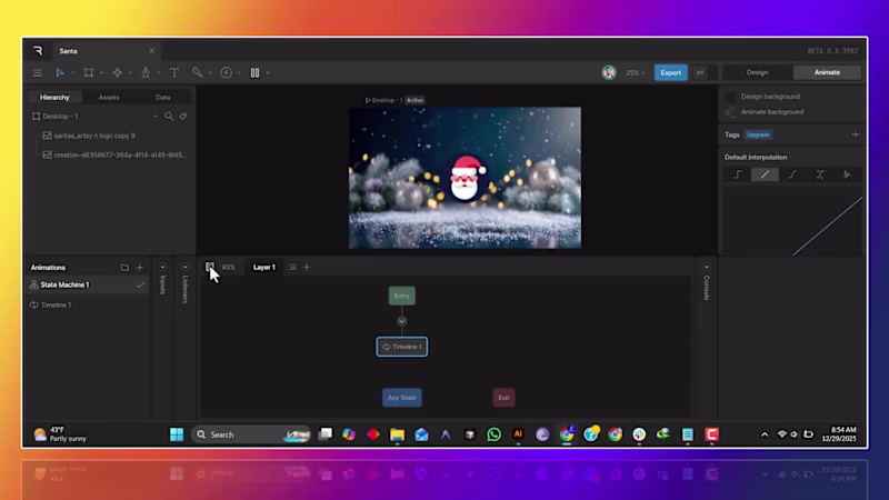
Builder of End-to-End AI Apps | Sr. Graphic Designer
Builder of End-to-End AI Apps | Sr. Graphic Designer
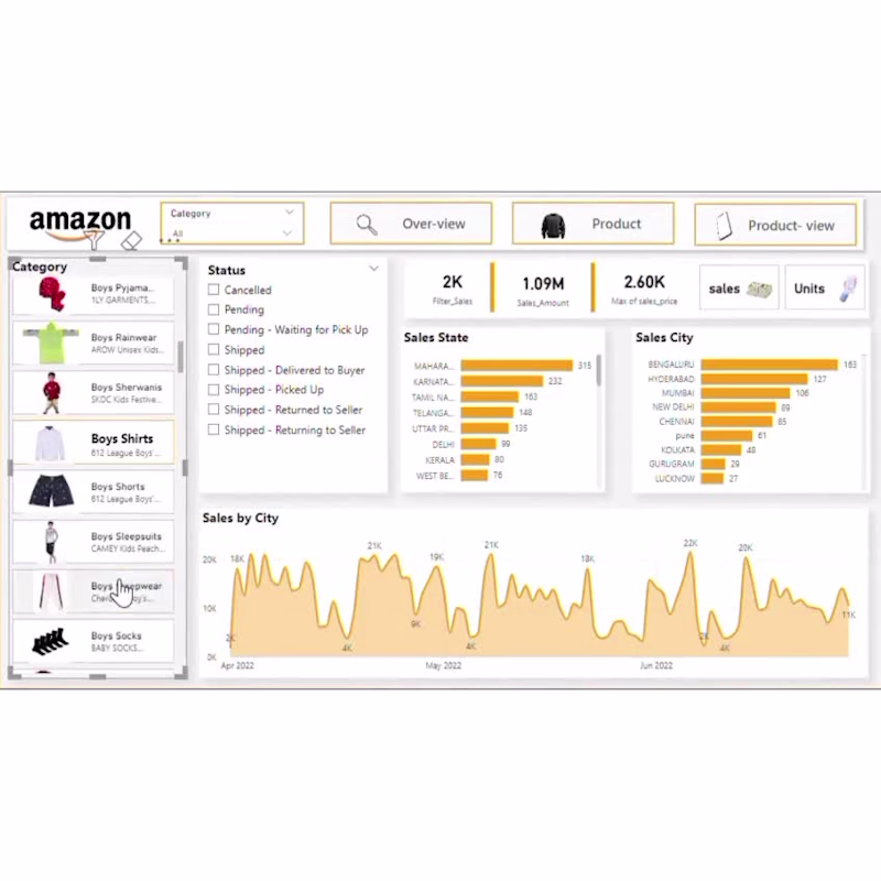
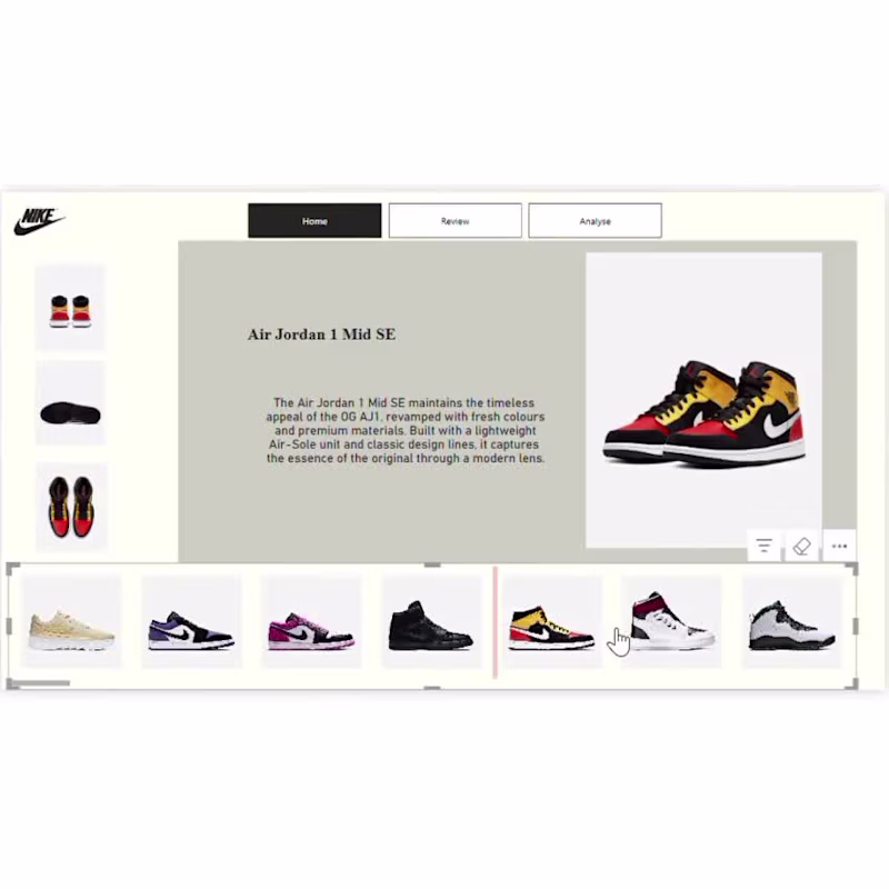
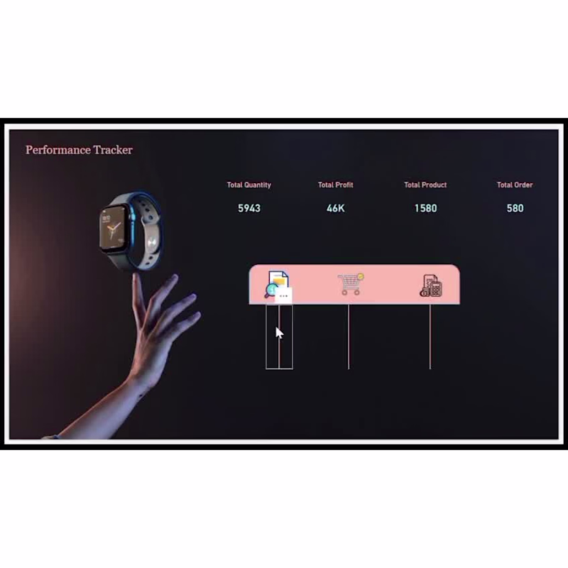
Data Analyst | Logo Design | Video Editing | Frontend Dev |
New to Contra
Data Analyst | Logo Design | Video Editing | Frontend Dev |
Instagram & LinkedIn Growth Strategist
Self-Taught Designer for Unique Presentations
Self-Taught Designer for Unique Presentations
View more →
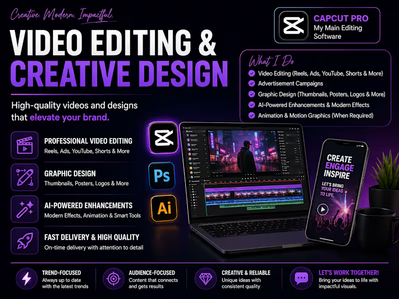
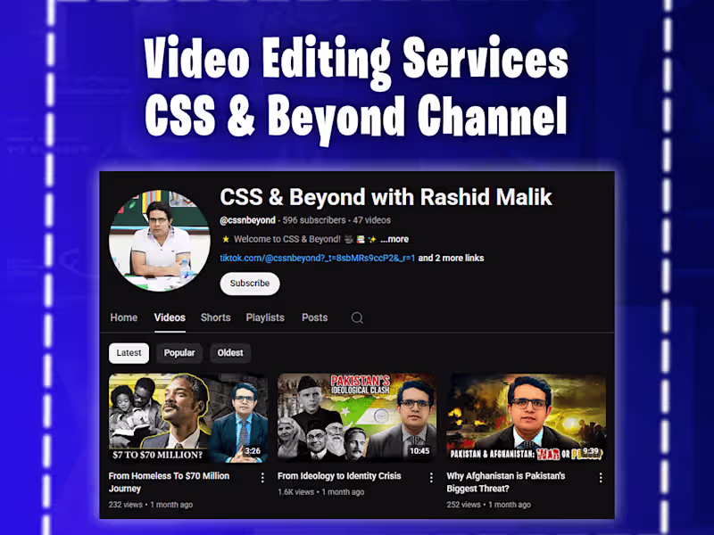
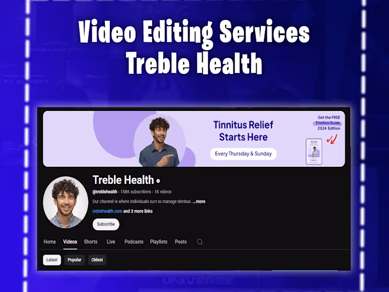
Expert Video editor
Expert Video editor

View more →
Your one stop destination for digital marketing!
Your one stop destination for digital marketing!

View more →