Graphic Design Projects in Radomir
Graphic Design Projects in Radomir
Sign Up
Post a job
Sign Up
Log In
Filters
2
Projects
People
Message
0
Mim Yo
Landing Page, Brochure and Banner Ads
0
5
Message
1
Albena Devedjieva
Handpan Orchestra | Brand Design; Visual Identity Design
1
10
Message
0
Dimitar Dimitrov
Neurology in Clinical Cases
0
4
Message
0
Gloria Shugleva
pro
Graphic Design and Development icon pack
0
6
Message
0
Ilijana Takashmanova
Graphic Design | Branding
0
5
Message
0
Georgi Valkov
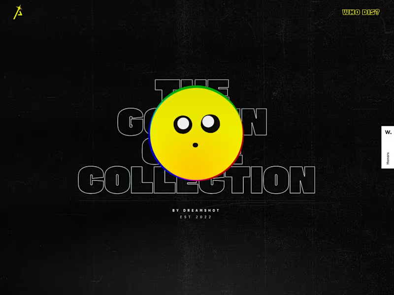
The Golden Code Collection - Website/Store
0
7
Message
0
Salman Mustafa
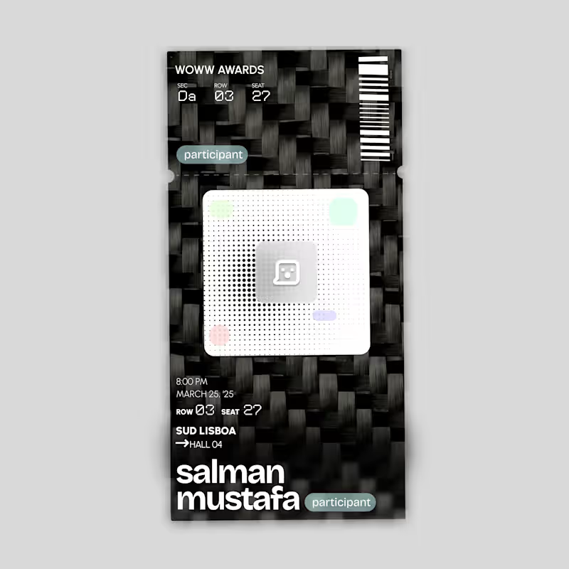
Ticket Design - Event/Movie Ticket
0
6
Message
3
Alex Mileva
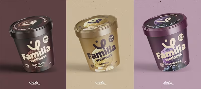
I've reimagined the Familia Wellness brand to bridge the gap between peak performance and everyday family joy. The new matte, minimalist aesthetic transforms ice cream into a post-workout recovery staple that looks as good as it feels. This design celebrates the "real" side of fitness unfiltered, joyful, and shared with the people who matter most. DM or book a meeting at alexm.life (https://alexm.life)
2
3
65
Message
2
MONO BO
“izivizi Digital Marketing Website — Anti-Navigation, Bold”
2
16
Message
0
Alex Mitov
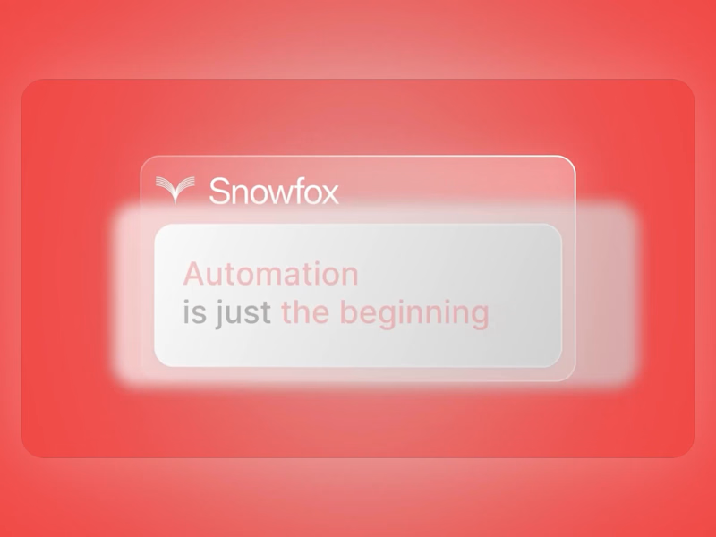
Feature explainer video for an AI Invoicing SaaS SnowfoxAI
0
2
Message
0
David Kirilov
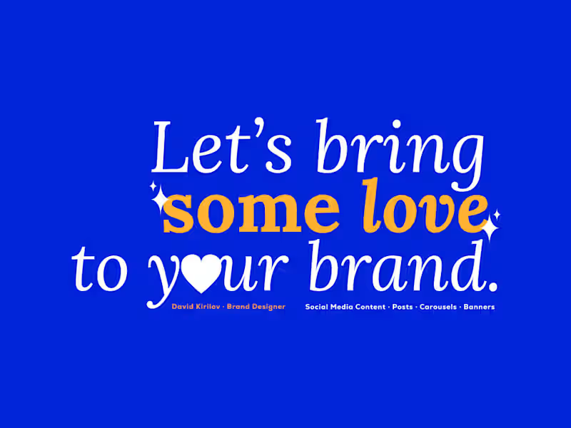
Social Media Content Design
0
7
Message
1
Daniel Simeonov
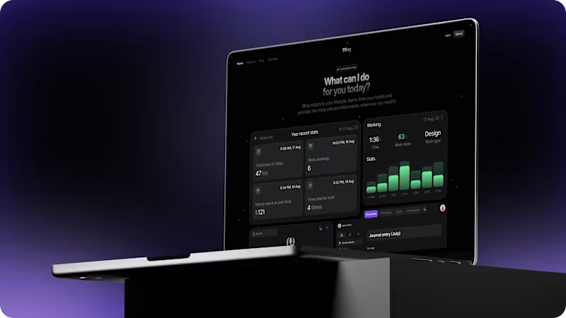
Bling: a new era for your wellbeing | Landing page
1
35
Message
0
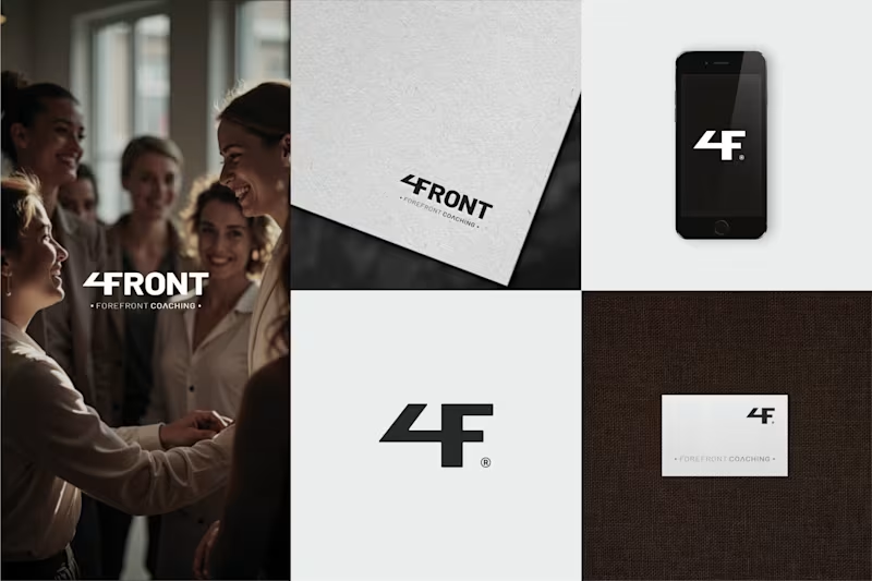
E. Veselinova - Brand Designer
Modern Premium Logo Design for Forefront Coaching.
0
49
Message
0
Georgi Georgiev
Social Media Creatives
0
2
Message
22
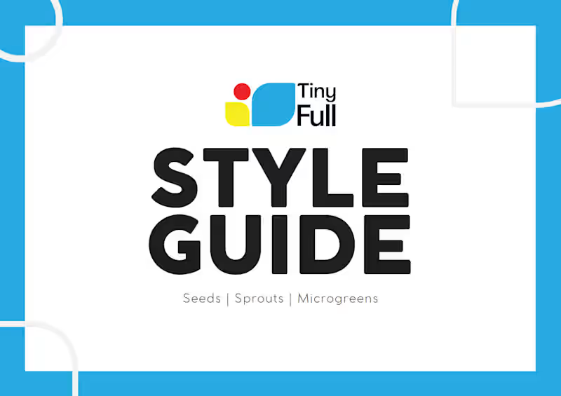
Mila Terziyska
I'm thrilled to share that I've finished a client's project - a Brand Guidelines for a micro greens producer! The client is super happy with the result - and so am I! #photoshop #illustrator
2
22
176
Message
17
Nikolay Byutyunev
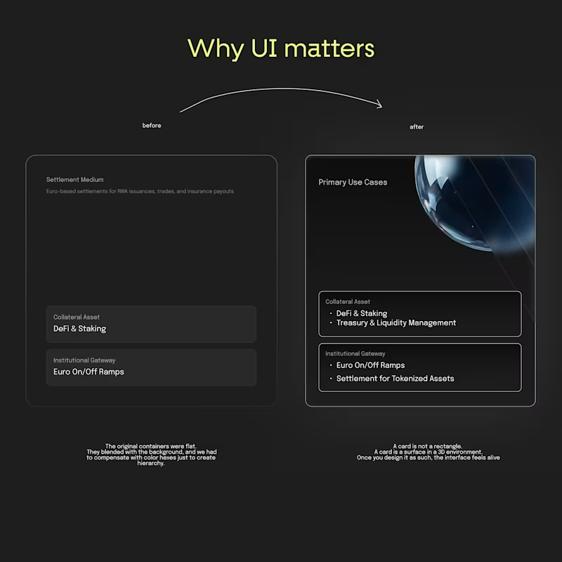
Progress thinking is the new UI design. You know how sometimes you build something fast to get moving? That was us with Real’s first UI components (you know the cards, blocks, etc.) It looked clean, it worked, and honestly, it was perfect for v1. They blended too much into the background. No depth. No hierarchy. No sense of what matters more. So we rebuilt the whole thing. We added light, subtle gradients, a bit of glow, and brought in the 3D sphere that’s part of Real’s identity. And the funny part? Same content… totally different experience. Now the cards lift off the page. They feel intentional. You immediately know where to look. It’s like giving the interface a bit of personality. Developers usually bring logic. Designers add feeling to that logic. We at 2x22 studio call it the sweet spot.
2
17
108
Explore projects