Pitch Deck Designer | Packaging Design | Branding | Web


Pitch Deck Designer | Packaging Design | Branding | Web
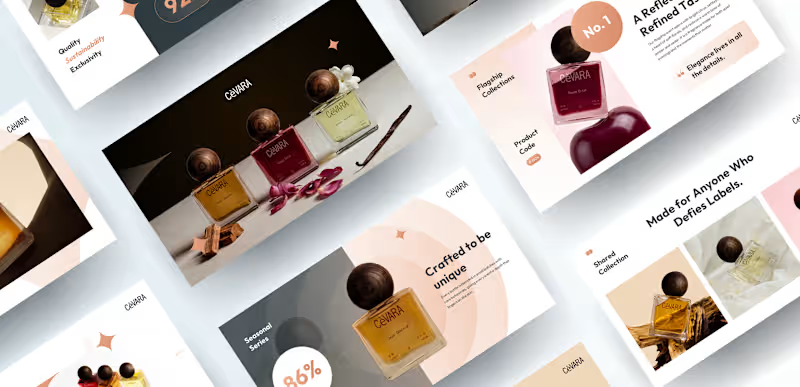
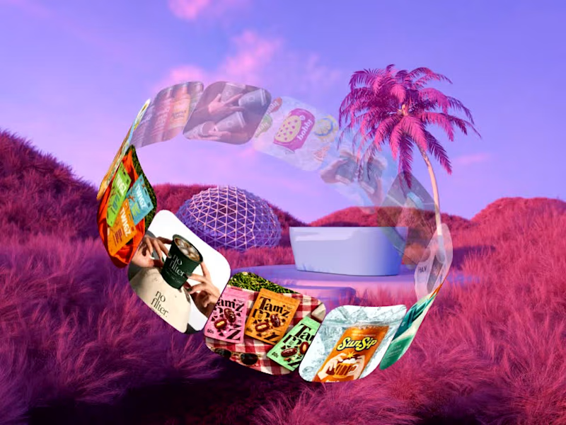
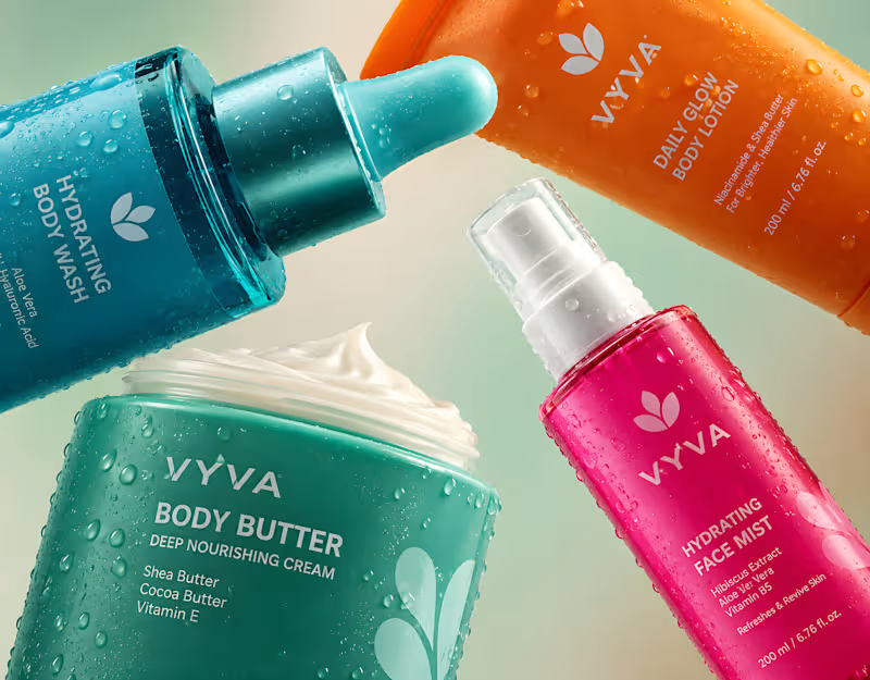


Crafting timeless indentity systems for Web3 & AI

Crafting timeless indentity systems for Web3 & AI
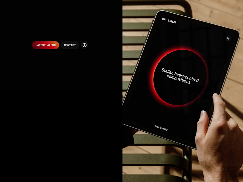


Video Editor & Content Enhancer | Ads, Promos, Reels, Shorts
- $25k+
- Earned
- 17x
- Hired
- 5.0
- Rating
- 94
- Followers
Video Editor & Content Enhancer | Ads, Promos, Reels, Shorts



Brands, Visual Identity & Digital Design
- $•••••
- Earned
- 2x
- Hired
- 5.0
- Rating
- 28
- Followers
Brands, Visual Identity & Digital Design


AI Automation & Business Systems Expert | Make.com, Zapier

AI Automation & Business Systems Expert | Make.com, Zapier



Logo Designer for Businesses Ready to Scale
- $•••••
- Earned
- 5x
- Hired
- 5.0
- Rating
- 105
- Followers
Logo Designer for Businesses Ready to Scale
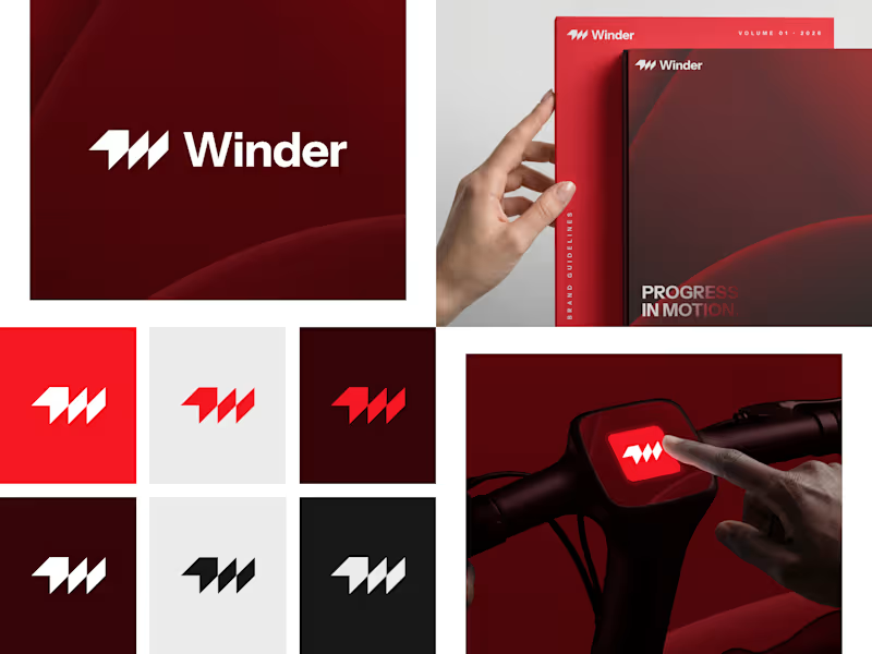
Winder is a bold brand identity built around a geometric W-inspired symbol, combining sharp angles and forward movement to represent progress, speed, and direction.
The identity uses a striking red and deep burgundy palette, supported by clean typography and a consistent visual system across brand guidelines, digital applications, and product mockups.
Progress in Motion.
76
100
5.9K
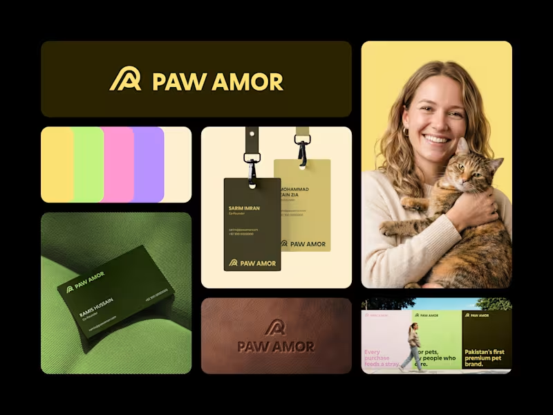
Paw Amor Brand Identity
A premium pet accessories brand concept from Pakistan, designed around the idea of connection between pets and their owners.
The PA monogram represents two forms coming together, inspired by warmth, closeness, and a subtle embrace.
I wanted the identity to feel premium and refined without becoming overly cute or playful, while still feeling warm and approachable.
Logo, color system, business cards, tags, packaging, and campaign applications.
2
4
567
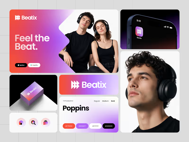
Music is all about emotion, rhythm, and movement. I wanted Beatix to capture that feeling in a simple, memorable identity.
The logomark combines a stylized letter B with play buttons and forward arrows, creating a distinctive symbol that represents music, playback, discovery, and continuous movement. Paired with a vibrant gradient system, the identity feels energetic, modern, and built for a digital-first music streaming experience.
From the app icon to the UI and brand applications, every element was designed to create a cohesive experience that users instantly recognize.
Would you download an app with this identity? What's your favorite element? 🎧
2
397

A recent brand identity exploration for Sivox, a digital marketing agency focused on helping ambitious brands grow faster online.
The logomark combines the letter S with forward-moving arrows, creating a clean geometric symbol that represents growth, momentum, and measurable results. Every element was designed to communicate progress while keeping the identity modern, bold, and highly recognizable.
From the logo and typography to the social assets and brand applications, the goal was to create a system that feels consistent, scalable, and ready for a digital-first business.
What's your favorite application in this identity: the logo, hoodie, social post, or smartwatch? 👀
6
5
599

Branding and Marketing Strategist
- $1k+
- Earned
- 3x
- Hired
- 5.0
- Rating
- 25
- Followers
Branding and Marketing Strategist