Freelancers using Adobe Photoshop in Pakistan TownFreelancers using Adobe Photoshop in Pakistan Town
Video Editor & Content Enhancer | Ads, Promos, Reels, Shorts

$25k+
Earned
16x
Hired
5.0
Rating
88
Followers
Video Editor & Content Enhancer | Ads, Promos, Reels, Shorts

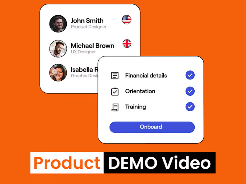
SaaS Explainer Video | Product DEMO Video | Motion Graphics
$1k+
Earned
3x
Hired
5.0
Rating
17
Followers
SaaS Explainer Video | Product DEMO Video | Motion Graphics
Product Designer for SaaS & MVPs
5.0
Rating
25
Followers
Product Designer for SaaS & MVPs
Brand Designer - Solving visual identity challenges

5.0
Rating
29
Followers
Brand Designer - Solving visual identity challenges

Graphic Design |Android Developer | Brand & UI/UX Specialist
6
Followers
Graphic Design |Android Developer | Brand & UI/UX Specialist
UI/UX Designer · SaaS · Healthcare · Fintech · Ecommerce
5.0
Rating
25
Followers
UI/UX Designer · SaaS · Healthcare · Fintech · Ecommerce
Cover image for Repair vs Replace
Landing Page Design
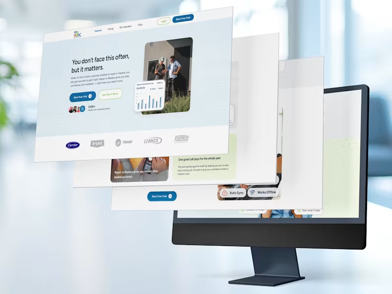
Repair vs Replace Landing Page Design for P3 HVAC Software’s Standalone Decision Tool That single line, the hero headline of the Repair vs Replace landing page, does more work than most paragraphs. It names the emotional reality of the HVAC technician’s most difficult conversation: the one where a homeowner needs to decide whether to spend money repairing a system that might fail again, or invest in a replacement they’re not sure they can afford. My job was to build a page around that moment. PROBLEM: The Rare Conversation That Has to Go Right Repair vs Replace is not a decision that comes up on every job. It’s not even one that comes up every week. But when it does arise, when a homeowner’s 12-year-old unit stops working mid-July and a technician is standing in their living room with a diagnostic result in hand, that conversation is everything. Get it wrong and the technician looks like they’re upselling. Get it right and they become the most trusted person in the room. The challenge the landing page had to solve was communicating all of that in a product that most technicians would need exactly once every few months. SOLUTION: Every Section Answers a Question the Visitor Is Already Asking The design philosophy for this landing page was built on a simple premise: a visitor reading down the page is having a silent conversation with the product. Each section needed to answer the next most likely question in their mind before they consciously formed it. The page was structured as a continuous argument, not a collection of sections. MY IMPACT: What I Contributed to This Project My work on this project spanned the full design lifecycle of the landing page, from initial layout strategy and content hierarchy through to the final, handoff-ready UI. What this project taught me: Designing for a low-frequency, high-stakes use case is a genuinely different discipline from designing for a tool people use every day. When a visitor arrives knowing they won’t use the product often, every section of the page has to work harder to answer the implicit question: “is this really worth it for the three times a year I’ll need it?” The design answer is to make the value of those three moments feel so large that the monthly fee becomes irrelevant. That framing drove almost every layout decision I made on this project.
0
58
Children's Book Illustrator | Cover & Character Design
New to Contra
Children's Book Illustrator | Cover & Character Design

Brand Identity Specialist | Startup Logo & Visual Systems
34
Followers
Brand Identity Specialist | Startup Logo & Visual Systems