




Framer Landing Page
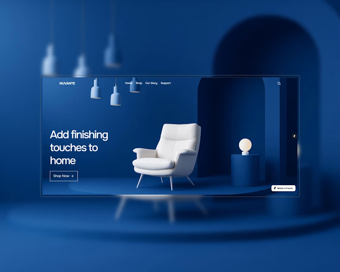
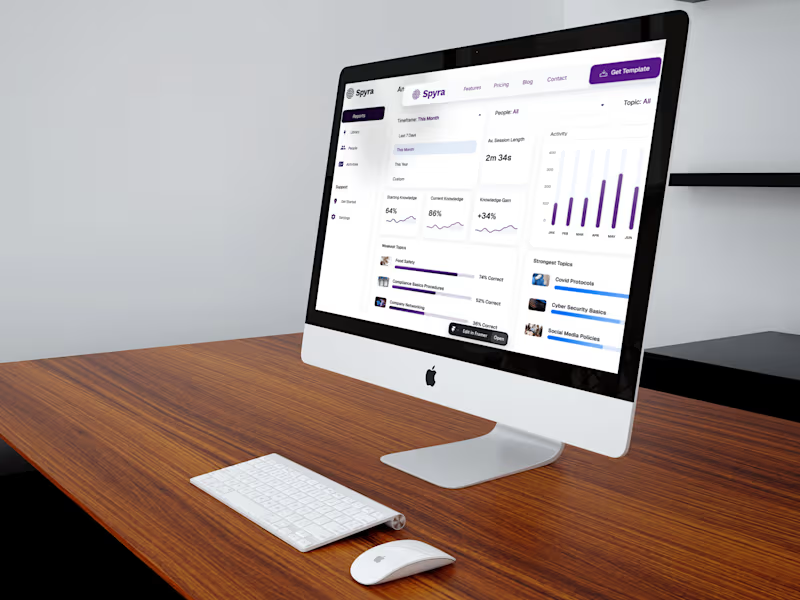
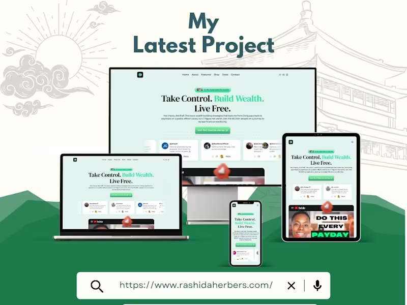
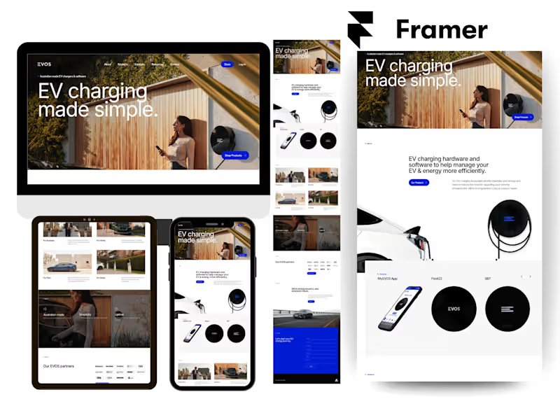
Designed and developed a custom Framer landing page for VEC, a platform that helps creators and educators build scalable digital businesses. This Framer website was created with a conversion-focused strategy, combining modern UI design, intuitive UX, responsive layouts, and smooth interactions to deliver a seamless browsing experience across all devices.
The project included custom Framer website design, responsive development, engaging animations, structured content hierarchy, and SEO-friendly page architecture to improve usability and communicate the platform's value clearly. Built using Framer's powerful design and development capabilities, the website emphasizes performance, accessibility, and user engagement while maintaining a clean, professional visual identity.
Framer Designer, Framer Developer, Framer Expert, Framer Website Design, Framer Website Development, Framer Landing Page, Responsive Framer Website, Custom Framer Website, High-Converting Landing Page, SEO Optimized Website, Modern Website Design, UI Design, UX Design, Interactive Website, Framer Animations, Framer Components, Framer CMS, Startup Website, SaaS Website, Business Website, Marketing Website, Figma to Framer, Framer Website, Framer SaaS Website
0
71

Building a brand-first Shopify store: Shoprecoverly
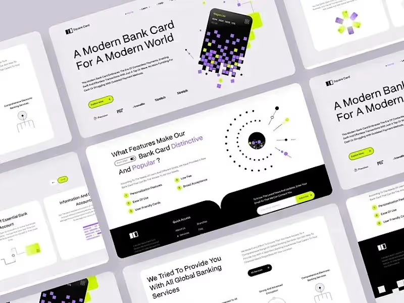
Here's how I approached building Shop recoverly a Dropshipping store brand.
Starting with positioning, not templates
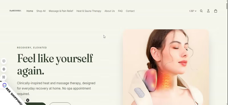
Most stores in this category default to a clinical, "medical supply" look white backgrounds, blue accents, generic product shots. I wanted Shoprecoverly to feel like a self-care brand people are proud to buy from, not just a functional product page.
Design decisions:
Typography: paired Cormorant Garamond with Jost — a serif/sans combo that gives it an editorial, elevated feel instead of the usual ecommerce default
Palette: ivory and bronze instead of the typical white/blue pharmacy tones
Custom homepage layout designed around the brand story, not just a product grid
Logo design built to match the overall aesthetic
Where it stands
Homepage is live, with product photography and variant setup currently being refined as we prepare the store for traffic.
This is the part of the job I enjoy most — taking a category that usually looks the same everywhere and giving it an identity people actually connect with.
4
3
214