
Product Designer, UI/UX / Web and Mobile App Designer
- 5.0
- Rating
- 24
- Followers
Product Designer, UI/UX / Web and Mobile App Designer

Making you the obvious choice for your dream audience.
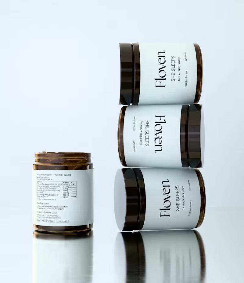
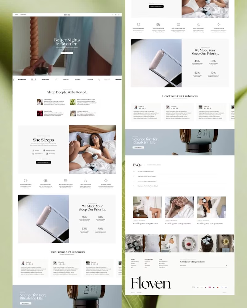
Floven is a women’s supplement brand rooted in science-backed botanicals and hormone-conscious formulation. The objective was to create a digital experience that felt clinically credible, emotionally resonant and aligned to their audience's creative preference.
From initial wireframes through to full Shopify development. The structure was designed to guide customers through education, reassurance, and ritual.
Alongside site strategy and development, we created bespoke 3D product renders and AI-generated ingredient imagery, helping to maintain aesthetic cohesion across the digital ecosystem.
Services Completed:
3D Renders, AI Imagery, Shopify Design, Shopify Development, Website Strategy
Tools, Apps & Platforms Used:
Blender, Figma, Firmhouse, Instafeed, Judge.me (http://Judge.me), Klaviyo, Microsoft Clarity, Shopify
1
287
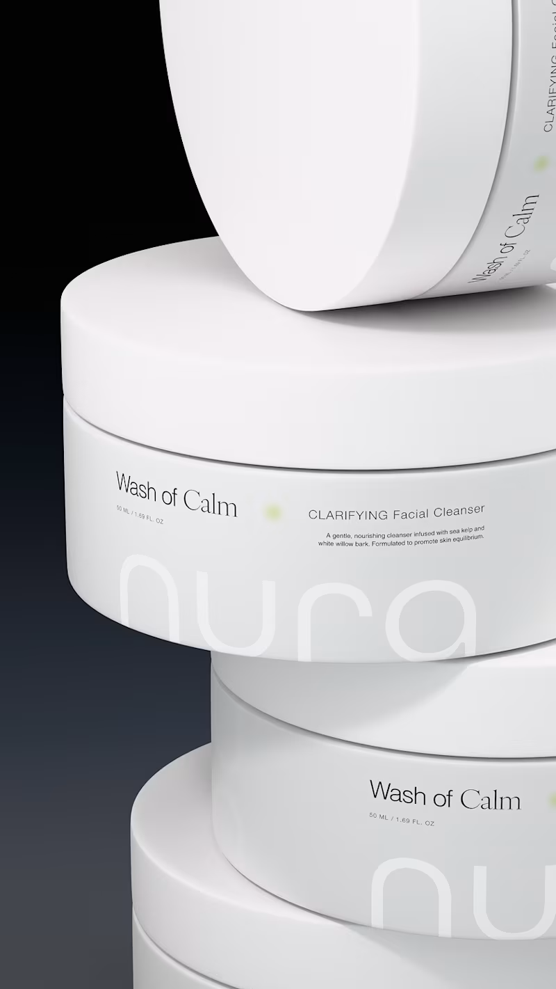
Nura - a skincare brand built around calm, quiet and clarity. 3D render work alongside the design created for Nura’s Wash Of Calm cleanser - translating the packaging into visuals designed for digital rollout before development.
scope of work:
• brand identity
• packaging concept + design
• 3D product rendering
2
432




Seriously playful design.
- $1k+
- Earned
- 2x
- Hired
- 5.0
- Rating
- 91
- Followers
Seriously playful design.
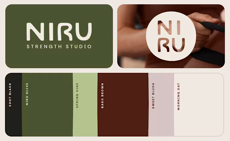
NIRU Strength Studio Brand Identity by FLM Studio (https://www.flm.studio)
NIRU is a modern Pilates and strength studio created to feel more like a boutique hospitality space than a traditional gym. FLM Studio built the brand around calm, connection and intentional movement, creating a space where strength feels grounded, accessible and quietly empowering.
Strength meets softness. Warm, tactile and considered. The identity balances a premium wellness aesthetic with an approachable sense of community and connection.
A complete brand identity spanning strategy, creative direction, visual identity, art direction, social templates, signage and physical studio touchpoints.
#branding #branddesign #brandidentity #wellness #fitnessbranding
:::
1
3
218
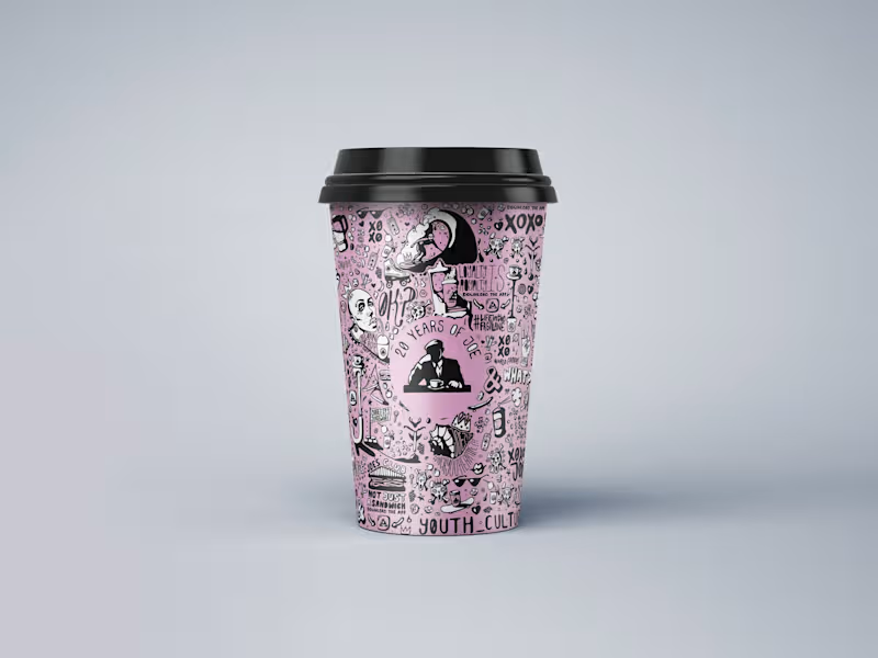
JOE & THE JUICE 20th Anniversary Artwork by FLM Studio (https://www.flm.studio)
To celebrate 20 years of JOE & THE JUICE, FLM Studio created a bold, hand-illustrated artwork celebrating two decades of energy, flavour and community, while staying rooted in JOE’s distinctive visual world.
Hand-drawn. Playful. Unapologetically indie. Packed with JOE-themed motifs, expressive characters and playful concepts, the artwork was designed to feel vibrant, energetic and unmistakably JOE.
A bespoke illustration created for JOE’s signature pink cups, with applications across packaging, social media and limited-edition merchandise.
#branding #branddesign #illustration #packaging #foodandbeverage
2
2
227
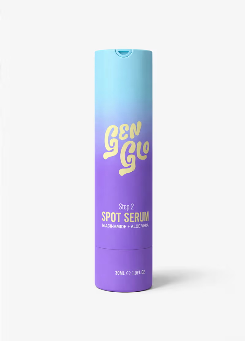
GenGlo (https://www.genglo.co.uk) Skincare Brand Identity by FLM Studio (https://www.flm.studio )
GenGlo is redefining early skincare for ages 8–14 with gentle, dermatologist-guided formulas and a confidence-building approach. FLM Studio built the brand from the ground up, creating a world that speaks to young skin without feeling childish.
Sunshine yellow. Soft gradients. Playful illustration. Big-sis energy. The identity was designed to feel bright, approachable and uplifting, turning everyday skincare routines into moments of joy.
A complete brand identity, custom illustration system, full packaging design across three products and comprehensive brand guidelines.
#branding #branddesign #brandidentity #packaging #skincare
1
1
203
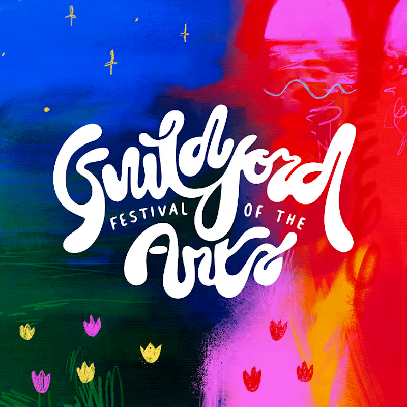
Guildford Festival of the Arts (https://www.guildfordfestivalofthearts.co.uk) Brand Identity by FLM Studio (https://www.flm.studio )
Guildford Festival of the Arts is a brand new, grassroots celebration of visual arts, created to champion local and emerging artists. For its inaugural 2025 edition, FLM Studio built the visual identity from the ground up.
Bold colour. Bespoke typography. Playful energy. The identity was designed to feel accessible, expressive and rooted in the local creative community.
A complete brand identity, bespoke logo, custom typeface, event materials and a full suite of merch and products.
#branding #branddesign #brandidentity #typography #graphicdesign
1
1
176

Translating brands into unique digital experiences. UX + UI
- 49
- Followers
Translating brands into unique digital experiences. UX + UI
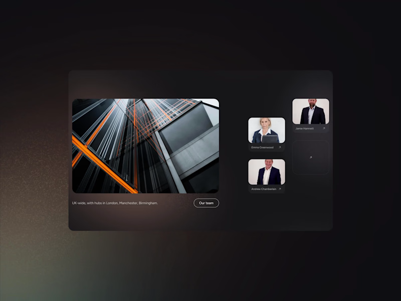
Been a white guys, I've been busy. 🚀
A little look at a recent web project for a law firm where we wanted something that felt premium, distinctive, and clear.
Dark UI layered with soft light leaks and subtle noise, the coloured accents pair with the photography and stop the dark from feeling too cold or corporate.
We used candid, documentary style shots to bring a real sense of authenticity. Typography is key here too, a restrained, modernist system that establishes tight hierarchy and guides the user through the site.
8
13
910
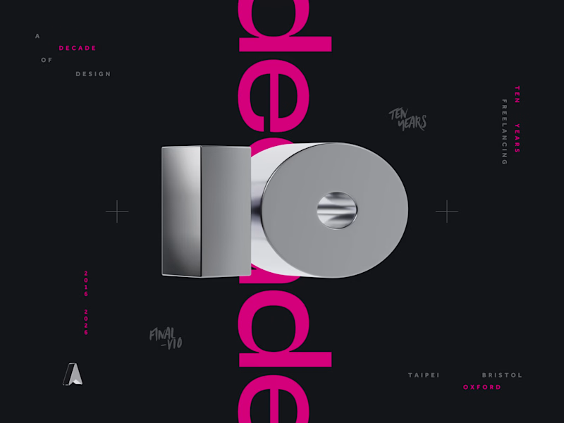
Just like that... 𝘁𝗲𝗻 𝘆𝗲𝗮𝗿𝘀 𝗳𝗿𝗲𝗲𝗹𝗮𝗻𝗰𝗶𝗻𝗴, 𝗮 𝗱𝗲𝗰𝗮𝗱𝗲.
I'm officially old, cough, experienced now...
Three cities, four laptops, countless projects, married, house, baby, same cat. 🐅
Deepest thanks to all the incredible clients and agencies that I've worked with.
I count myself very lucky to have a job working with such a varied client base, from solving deep UX problems and building systems, to pushing creative boundaries and everything in between. It's a wild ride.
I’m immensely grateful to the brilliant teams and individuals I’ve worked with over the years. Thank you.
To everyone else who has liked, followed, recommended, or reposted along the way, you're awesome. 🔥
14
19
1.2K
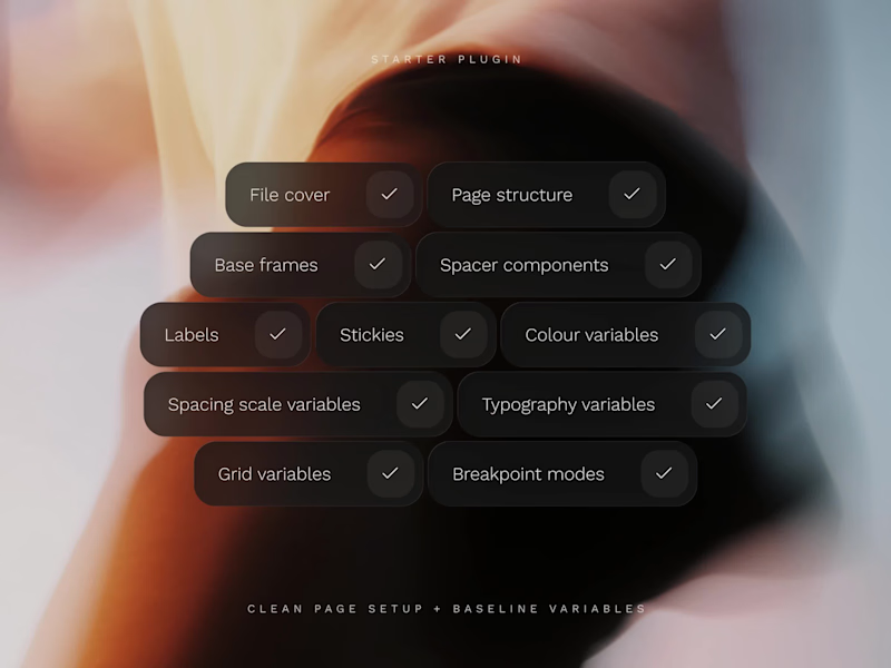
Every new Figma file starts the same way.
Variables. Page structure. Base frames. Annotation components. Cover slide.
Twenty minutes of setup before a single design decision gets made. If you're a product designer, you'll know exactly what I mean.
𝗦𝗼 𝗜 𝗯𝘂𝗶𝗹𝘁 𝗮 𝗽𝗹𝘂𝗴𝗶𝗻. Meet Starter, one click, and your entire foundation is ready.
→ Core variables: Typography, grids, spacing, and colours
→ Page structure: A clean, organised file hierarchy
→ Base frames: Pre-configured frames hooked up to your grids
→ Helper components: Sticky notes and status labels for quicker documentation
→ Base cover: A customisable project thumbnail
https://www.figma.com/community/plugin/1616860142658349536/starter?q_id=1e2ab7fb-d8fc-40f5-a2db-72164930f2df
28
32
1K
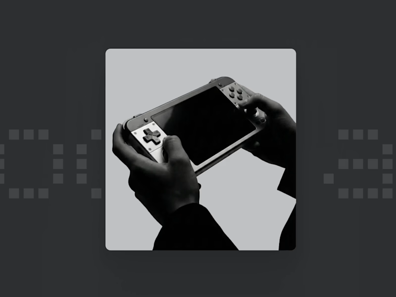
Diving into the world of industrial-led UI with Modoplay. This project is a fictional exploration into the intersection of customisable hardware and a stripped-back, tactile interface.
The goal was to create a design system that feels as rugged modular, and technical as the device itself. Swipe to see the initial layout and hardware integration.
All visuals were created with Nano Banana.
Graphics created with craft.
2
213

Creating clean, high-converting Framer websites

Double Whammy of FREE Framer Components.
Meet the Animated Icon Fly Away Button (catchy name, I know) : A playful, motion-driven component that turns a simple hover into a delightful moment of interaction.
Fully customizable (upload your own PNG!) and guaranteed to boost engagement..😊
https://www.framer.com/marketplace/components/icon-fly-away-button/
17
182

Delighted to share my second component has been approved on Framer. It's a Looping Polaroid Ticker that scrolls horizontally across the screen and speeds up as you scroll down. Lots of customisation options.
Free to use on the Framer Marketplace - https://www.framer.com/marketplace/components/polaroid-ticker/
15
169

Hope everyone is having a great weekend! 🙌
I built this component in Framer and it's FREE on the workshop - https://www.framer.com/marketplace/components/photo-gallery-tilt/
3
16
164

Fresh off the court, the design court! 🎾
Thrilled to share a sneak peek of my latest web design project, as a new hobby I have created a vibrant and interactive website for a Padel Club.
I focused on bringing the dynamic energy of padel to life through custom mini-interactions, like the subtle ball roll animation on button hover, making every click feel like part of the game! It's all about an immersive experience that gets users excited to join the club.
20
186

Founder Eulio. Design, Creative & Product Director.
Founder Eulio. Design, Creative & Product Director.


Creative product designer using 3D printing and software
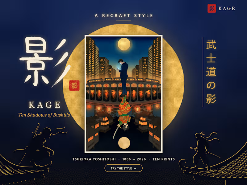
Kage (影): the woodblock prints of Tsukioka Yoshitoshi, the artist who watched the samurai disappear, brought back to draw Japan in 2026.
I wanted to look at the samurai, not for the swords, but for what they stood for: loyalty, discipline, respect. And then ask where those values went in Japan today.
Digging through The Met, the Art Institute of Chicago and Mia, I found Tsukioka Yoshitoshi, an artist who watched the samurai era end in real time. One of his prints from 1865 literally shows a samurai watching a steamship arrive, and that became the whole idea.
I built a Recraft Style from his moonlit prints and called it Kage (影), which means shadow or reflection. In every piece, someone from modern Japan is followed by the samurai version of what they're doing: a salaryman's bow, a delivery rider's sense of duty, a kid putting his phone down so the water can finally go still.
The values didn't disappear. They just changed shape.
(Generated with the Kage Style in Recraft V4.1, colour refined with Recraft's Edit tool, two prints animated in Recraft Studio.)
3
328
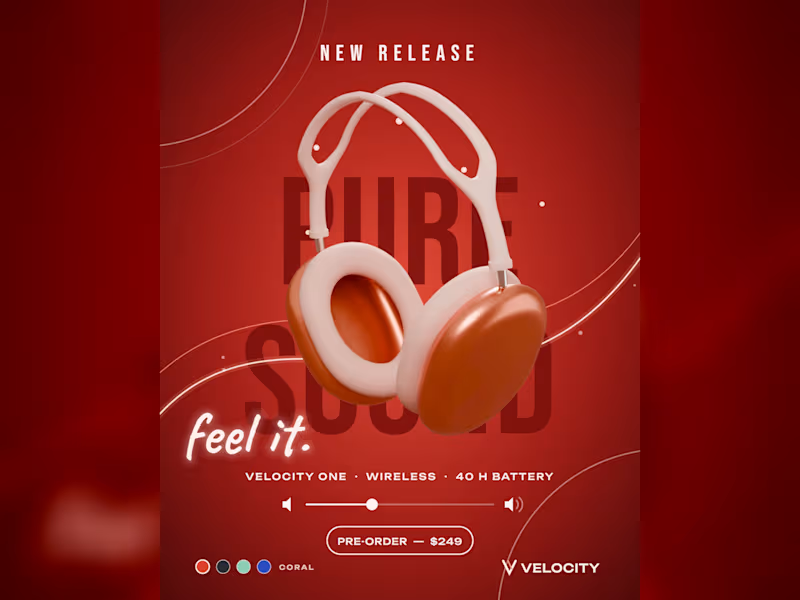
VELOCITY turns a single drop of water into a hero launch for audio products. Built using the SVGator MCP and designing the products manually with Blender, the template pours water onto any headphone image and floods it into shape, because water takes the form of whatever it fills. That fluidity is the point: creators can swap the product render, brand colours and copy while the animation stays the same, making it ideal for product drops, colourway launches and pre-order campaigns.
6
6
1.1K
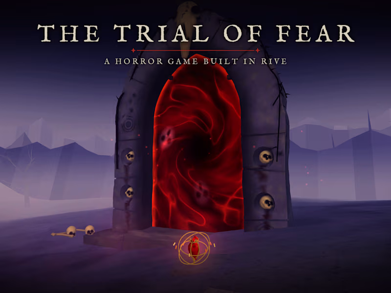
The Trial of Fear is a short first-person horror game I made in Rive for the Halloween challenge.
I wanted to build a game that creates and builds genuine fear within the player, adding twists and turns throughout the game to make it feel exciting but horrifying.
How I built it:
I came up with the ideas and used Claude Code with the Rive CLI to build it. The scene is written in RML and the game runs on Luau scripts. All the 3D stuff (the fog, candlelight, moonlight, the portal and the creatures) is custom WGSL shaders on the GPU Canvas. Data binding and state machines handle the fear and oil meters, the captions and the title. After that I went into the Rive Editor and did some parts by hand. I changed how the lantern glow flickers, made the line under the title draw itself, and added the stars under it.
I'm going to keep working on it after the challenge, with more polish, fixes and hopefully more trials, so there are updates coming.
The narrator voice is from ElevenLabs and many of the character models were made using Blender and Fusion 360 as well as from Tripo and TRELLIS.
0
298