Freelancers in OsogboFreelancers in Osogbo
Google Ads & Shopify Growth Specialist
$1k+
Earned
3x
Hired
5.0
Rating
5
Followers
Google Ads & Shopify Growth Specialist
AI Developer | Building AI Web and Mobile Apps For Growth
$5k+
Earned
7x
Hired
5.0
Rating
12
Followers
AI Developer | Building AI Web and Mobile Apps For Growth
Expert Framer Developer, Framer Designer and Web Designer
5.0
Rating
6
Followers
Expert Framer Developer, Framer Designer and Web Designer
CMS & Frontend Developer | Fast, Modern Websites
33
Followers
CMS & Frontend Developer | Fast, Modern Websites

Cover image for Beauty & Cosmetics E-commerce Website
Overview
I
Beauty & Cosmetics E-commerce Website Overview I designed and developed a modern e-commerce experience for a beauty and cosmetics brand, focused on creating a clean shopping journey while making products, categories, promotions, and offers easy to discover. The Goal The goal was to create a premium-looking online beauty store that feels trustworthy, visually engaging, and easy to navigate — while giving customers a clear path from discovering a product to shopping. What I Built Modern beauty-focused homepage Product discovery and category navigation Best-selling product section Product cards with ratings, pricing, discounts, and CTAs Skincare, makeup, hair care, fragrance, nail care, and body care categories Promotional and seasonal offer sections Featured deals and discount sections Responsive e-commerce layout Clear shopping CTAs throughout the experience Newsletter and customer-focused footer sections My Approach I focused on combining strong visual hierarchy with a simple shopping experience. Products and promotions are given enough visual space to stand out, while the navigation and category structure make it easy for customers to explore the store. The design also uses promotional sections strategically to draw attention to discounts and featured collections without making the interface feel cluttered. Result The final result is a polished beauty e-commerce interface that brings together product discovery, promotional content, categories, and shopping actions in one cohesive experience. Live website: https://dam-beta.vercel.app/ Tools & Skills Web Design · E-commerce · UI/UX Design · Responsive Design · Frontend Development · Vercel
5
11
272
Cover image for Damyestate — Premium Real Estate
Damyestate — Premium Real Estate Website (Framer) A luxury real estate platform built in Framer to turn listing discovery into advisor inquiries — curated properties, clear process, and premium brand experience. Overview: Damyestate is a premium real estate website designed and built in Framer for luxury home buyers, sellers, and investors. The site presents curated listings, property categories, advisory pricing, resources, and a clear path from browsing to contacting an advisor. Live site: https://realestatew.framer.website/ Brand: Damyestate Tagline: Find Your Dream Property Built by: DAMGREAT BRAND The site covers the full buyer journey — discovery, filtering, trust-building, and inquiry — in a polished, editorial layout suited to high-end property brands. Purpose: The goal was to create a credible, conversion-focused real estate presence that: Positions the brand as premium and trustworthy, not a generic listing portal Helps users discover luxury properties quickly with strong visuals and clear details Guides visitors from browse → trust → inquiry with structured CTAs Supports buyers, sellers, and investors with dedicated content and advisory messaging Works as a portfolio-ready Framer build demonstrating multi-page systems, CMS-ready structure, and SEO metadata Primary conversion goal: Move visitors from property browsing to “Talk to an Advisor” / “Inquire” actions. Problem: Most real estate templates feel interchangeable — cluttered grids, weak hierarchy, and no clear story from search to closing. For a luxury brand, that creates specific issues: Low trust — Listings look unverified; photography and copy don’t feel curated Weak conversion path — Users can browse but don’t know what to do next (tour, inquire, close) No premium positioning — Layout and typography don’t match high-ticket property expectations Fragmented experience — Properties, pricing, process, and support live on disconnected pages Hard to scale content — No clear structure for categories, articles, FAQs, or new listings The brief: build an original, premium real estate brand in Framer — not a clone of Zillow or Compass — with a site that could pass as a real advisory firm. Solution I designed and built Damyestate as a multi-page Framer website with a consistent layout, premium visual language, and a funnel built around advisor-led buying. Design approach Clean, editorial layout with strong typography and spacious sections Luxury property photography as the hero of each listing card Clear hierarchy: eyebrow → headline → supporting copy → CTA Trust signals: ratings, verified listings, stats, testimonials, FAQ Repeated CTAs: Browse Properties, Talk to an Advisor, Inquire User journey Discover — Hero + featured properties + categories Evaluate — Listing cards with price, type, rating, and short description Trust — Process steps, testimonials, FAQ, stats Convert — Contact page, pricing packages, email CTA Technical approach (Framer) Multi-page site with shared navigation and footer SEO titles and descriptions per page Structured sections (hero, grid, process, social proof, CTA) CMS-ready listing and resource patterns for easy updates Process Phase 1 — Strategy & positioning Defined the brand (Damyestate), audience (luxury buyers/sellers/investors), and primary CTA (advisor inquiry). Mapped the sitemap and core user flows before design. Phase 2 — Information architecture Planned 7 pages and home sections: Home, Properties, Categories, Pricing, About, Resources, Contact Home: hero, featured listings, categories, process, testimonials, FAQ, newsletter, articles Phase 3 — Visual design Applied a premium real estate aesthetic: strong headlines, card-based listings, category grids, and advisory-focused copy. Prioritized readability, whitespace, and high-quality imagery. Phase 4 — Framer build Built all pages in Framer with: Reusable navigation and footer Listing cards (type, title, description, price, Preview/Inquire) Category grid with property counts 4-step “How it works” process Testimonials, FAQ, pricing tiers, and resource articles Phase 5 — Content & polish Added sample listings (Skyline Residences, Harbor Villa, Noir Estate, etc.), FAQ copy, pricing packages, and blog-style resources. Set page metadata for SEO. Phase 6 — Publish Published to Framer hosting at realestatew.framer.website (http://realestatew.framer.website) for live portfolio and client review. Deliveries: Hero — “Find Your Dream Property” + dual CTAs Trust bar — 500+ Properties, Verified Listings, Expert Agents, etc. Featured Properties — 6 luxury listings with ratings and prices Categories — Browse by lifestyle/type Value blocks — Craft, buying support, workflow benefits How it works — 4 steps (Choose → Customize → Close → Grow) Stats — 100+ properties, 5,000+ downloads, 4.9★ rating Testimonials — 3 client quotes FAQ — 8 questions (viewings, fees, support, financing, etc.) Newsletter signup Pricing teaser — From $79 advisory Latest articles — 3 resource previews Footer CTA — “Let’s build something great” Listing system 6+ featured properties with: type, name, description, price, rating Category tags (Apartment, Villa, Estate, Penthouse, Loft, etc.) Preview + Inquire actions per listing Categories page 12 property types (Apartments, Luxury Villas, Waterfront, Penthouses, Investment, etc.) Count badges and links to filtered properties Pricing page Buyer Advisory (seller-covered) Seller Concierge Investor Desk Resources / blog 3 articles: luxury home buying, coastal investment, staging tips Contact “Talk to an advisor” hero SEO & metadata Page titles and descriptions on all main routes Published August 7, 2026 Platform Designed and built in Framer Live URL: https://realestatew.framer.website/ Responsive, publish-ready Outcome: A live, portfolio-ready premium real estate website that: Communicates luxury and trust from first scroll Structures the full buyer journey from discovery to inquiry Demonstrates multi-page Framer development, IA, and conversion design Can be extended with CMS collections, custom domain, and lead forms
1
3
3
76
Cover image for Cloudy Galaxy — luxury wearables
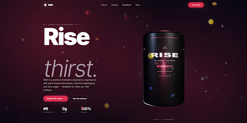
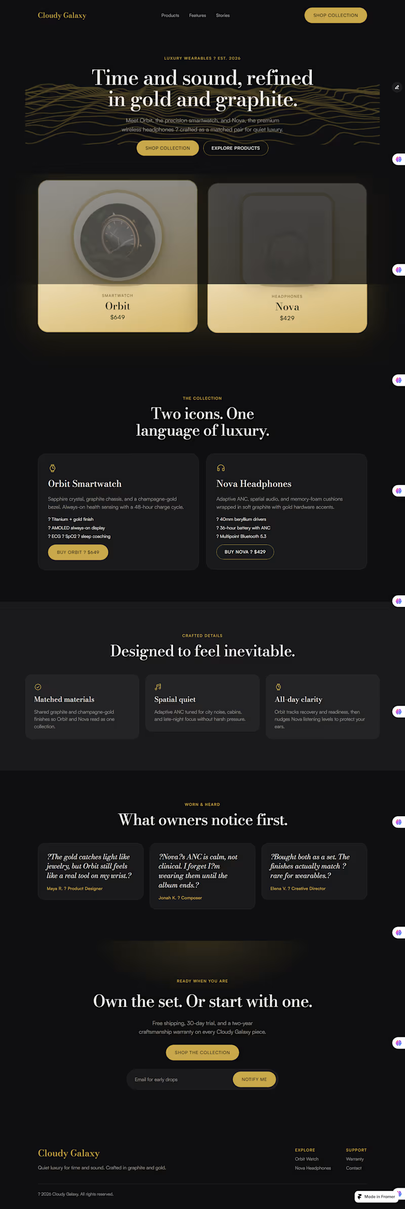
Cloudy Galaxy — luxury wearables landing page (Framer). Design process — Cloudy Galaxy (Framer) 1. Brief Luxury wearables brand. Two products: Orbit (smartwatch) and Nova (headphones). Palette locked early: gold + graphite. Goal was a product landing page that felt premium and still converted. 2. Direction Dual-product hero (both SKUs visible up front). Standard page depth: hero → products → features → stories → CTA. Built reusable pieces first — buttons, nav/footer layout — so the page stayed consistent. 3. System Set color tokens and type before layout. Bodoni Moda for headlines, Satoshi for UI/body. Gold for accents and CTAs, charcoal for the page, muted grey for secondary text. 4. Structure Mapped the page as one scroll story: Hero with both products Collection detail cards Three craft features Testimonials Final CTA + email capture Nav links jump to each section so it feels usable, not just pretty. 5. Hero polish First pass had black products disappearing into the dark background. Fixed that by putting products on light cream–gold stages, gold borders, and soft glow so the cards actually read on the page. Added float/tilt motion so they feel a bit more 3D without overdoing it. 6. Build in Framer Designed and built directly in Framer: layout template for nav/footer, button components, desktop + tablet + phone breakpoints, form on the CTA. Kept client-safe editing in mind — layout locked, content editable later if needed. 7. Check Reviewed contrast, mobile stacking, and scroll targets. Tweaked card elevation and product framing until the hero felt clear at a glance.
1
3
9
292
Professional Web App & Website Developer
34
Followers
Professional Web App & Website Developer
Cover image for Many WordPress store owners invest
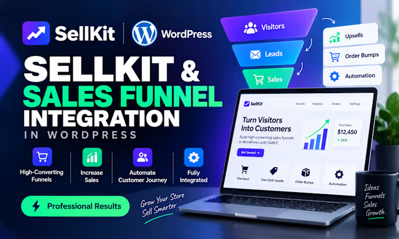
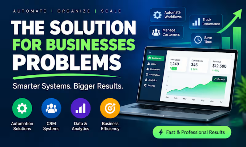
Many WordPress store owners invest heavily in driving traffic, yet struggle to convert visitors into paying customers. The problem isn't always the product, pricing, or traffic source. In many cases, the real issue is a lack of a structured sales funnel. Common challenges I see include: • Visitors abandoning their carts before checkout • Low conversion rates despite steady website traffic • No upsell or cross-sell strategy in place • Poor lead capture and follow-up processes • Complicated customer journeys that create friction This is where SellKit for WordPress becomes a game changer. By integrating a well-designed SellKit sales funnel, store owners can create a smoother buying experience through: ✅ High-converting checkout pages ✅ One-click upsells and order bumps ✅ Cart abandonment recovery workflows ✅ Lead generation funnels ✅ Personalized customer journeys ✅ Better tracking and optimization opportunities The result? Higher conversion rates, increased average order value, and more revenue from the traffic you're already paying for. A sales funnel isn't just a marketing tool—it's a growth system that guides potential customers from interest to purchase while maximizing every opportunity along the way. If you're running a WordPress store and feel like you're leaving money on the table, it may be time to evaluate your funnel strategy rather than spending more on traffic. What's the biggest conversion challenge you're currently facing with your WordPress store?
0
52
Cover image for Why Your Website Isn't Ranking
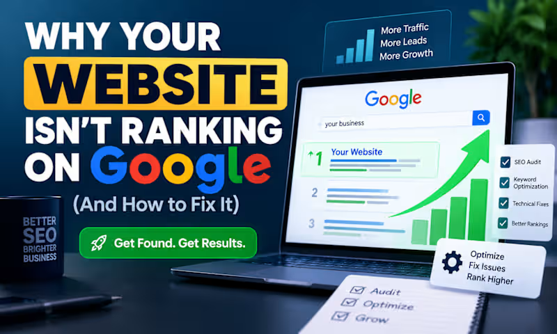
Why Your Website Isn't Ranking on Google (And How to Fix It) Many business owners invest time and money into building a beautiful website, only to discover that it barely receives traffic from Google. The reality is that a great-looking website does not automatically rank well in search results. If your website isn't attracting organic visitors, one or more SEO issues may be holding it back. Common SEO Problems That Hurt Rankings 1. Poor Keyword Targeting Many websites target keywords that are either too competitive or unrelated to what potential customers are searching for. For example, a local HVAC company may try to rank for "air conditioning" instead of more targeted phrases like "HVAC repair in Dallas" or "emergency AC service near me." 2. Slow Website Speed Page speed is a ranking factor and a major user experience factor. A slow website often leads to: Higher bounce rates Lower conversions Reduced search visibility Common causes include oversized images, unnecessary plugins, and poor hosting infrastructure. 3. Weak On-Page SEO Search engines rely on page structure to understand content. Missing elements such as: Optimized title tags Meta descriptions Header tags (H1, H2, H3) Internal linking can make it difficult for Google to understand and rank your pages. 4. Lack of Quality Content Google prioritizes websites that provide useful, relevant, and authoritative information. Many businesses have only a few pages and rarely publish content that answers customer questions or addresses industry challenges. 5. Technical SEO Issues Technical problems can prevent search engines from properly crawling and indexing your site. Examples include: Broken links Duplicate content Missing XML sitemaps Poor mobile optimization Crawl errors 6. Low Domain Authority Even with good content, websites often struggle to rank if they lack quality backlinks from trusted websites. Backlinks remain one of the strongest ranking signals in Google's algorithm. The Solution: A Structured SEO Optimization Strategy Improving rankings requires a systematic approach. Step 1: Conduct a Full SEO Audit Identify technical, on-page, and content-related issues affecting performance. Step 2: Optimize Website Structure Improve: Site architecture Internal linking Navigation Mobile responsiveness Step 3: Perform Keyword Research Target keywords with: Strong search intent Real business value Achievable competition levels Step 4: Create Helpful Content Develop content that solves real customer problems and answers common search queries. Step 5: Improve Technical Performance Focus on: Faster loading speeds Core Web Vitals Mobile usability Crawlability Step 6: Build Authority Earn quality backlinks through: Guest posting Digital PR Strategic partnerships Valuable content assets Final Thoughts SEO is not about tricking search engines. It's about creating a technically sound website that delivers value to users while making it easy for search engines to understand your content. Businesses that consistently improve their website performance, content quality, and authority typically see long-term growth in organic traffic, leads, and revenue. The websites that rank highest are usually not the biggest companies—they are often the ones with the best SEO strategy and execution.
1
1
154
Brand Strategist, E-commerce & Shopify Expert
26
Followers
Brand Strategist, E-commerce & Shopify Expert
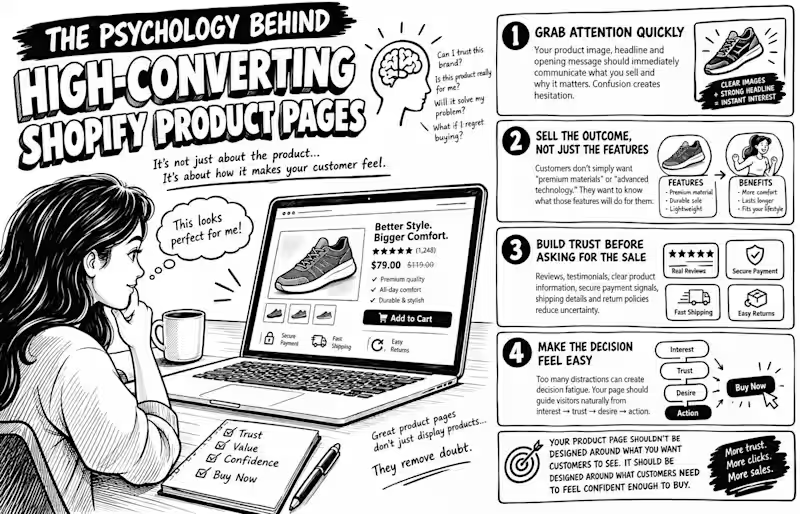
Cover image for Absolutely. Here’s a ~1,200-character version
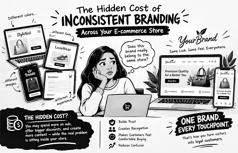
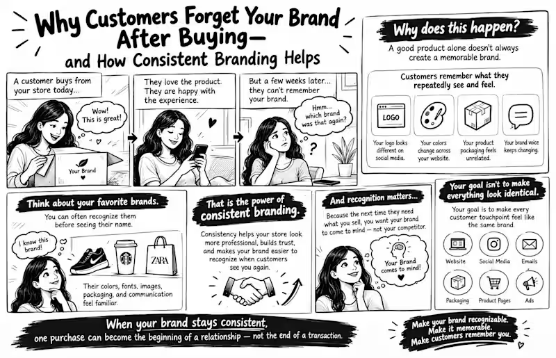
Absolutely. Here’s a ~1,200-character version written to make store owners stop, think, and keep reading. The Psychology Behind High-Converting Shopify Product Pages Why do some Shopify product pages make you want to click “Buy Now”, while others make you leave, even when the product is good? It’s not always about price. It’s psychology. Before customers buy, their brains are quietly asking: Can I trust this brand? Is this product really for me? Will it solve my problem? What happens if I regret buying it? A high-converting product page answers these questions before the customer has to ask. 1. Grab attention quickly. Your product image, headline, and opening message should immediately communicate what you sell and why it matters. Confusion creates hesitation. 2. Sell the outcome, not just the features. Customers don’t simply want “premium materials” or “advanced technology.” They want to know what those features will do for them. 3. Build trust before asking for the sale. Reviews, testimonials, clear product information, secure payment signals, shipping details, and return policies reduce uncertainty. 4. Make the decision feel easy. Too many distractions can create decision fatigue. Your page should guide visitors naturally from interest → trust → desire → action. And here’s the biggest mistake: Your product page shouldn’t be designed around what you want customers to see. It should be designed around what customers need to feel confident enough to buy. Because great product pages don’t just display products. They remove doubt. If you want, I can also turn this into a 1400 × 900 black-and-white comic/sketch illustration concept that visually explains the psychology behind the post.
1
64