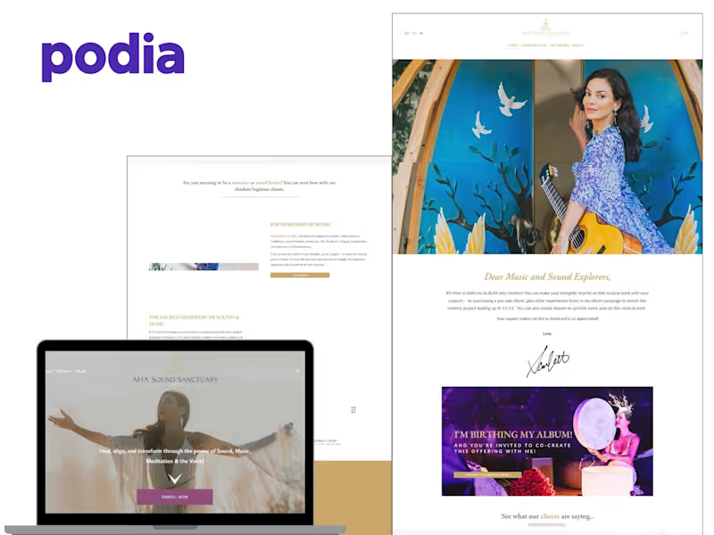
Projects using Podia in NigeriaProjects using Podia in NigeriaI designed and built a professional Podia website and online course ecosystem for Jodi White, a therapist, coach, author, and specialist in love addiction and codependency. The project focused on creating a clear, trustworthy, and engaging digital experience that could bring together her personal brand, educational content, coaching and therapy services, online courses, resources, and audience-building initiatives in one centralized platform.
The challenge was to create a website that could serve different types of visitors while keeping the user journey simple. Someone discovering Jodi for the first time needed to quickly understand who she is, what she specializes in, and how her work could help them. At the same time, existing followers needed an easy way to access her courses, resources, free workbook, and other offers.
I structured the website around education, trust, and clear pathways to action. The experience guides visitors from learning about love addiction and codependency, to understanding Jodi's expertise and approach, and then toward the most relevant next step—whether that is exploring therapy, coaching, enrolling in a course, downloading a resource, or joining her email community.
Within Podia, I focused on creating a cohesive website structure, organizing the content and offers, presenting the educational and course experience clearly, and maintaining a consistent visual identity throughout the site. I also incorporated strategic calls-to-action and resource sections to support audience engagement and lead generation.
The final result was a centralized digital home that connects Jodi's expertise, services, educational content, courses, and resources into one professional experience. Rather than functioning as simply an informational website, the platform was designed to support the full journey from discovering her work to engaging with her educational products and services. Most course websites don’t fail because of bad content…
They fail because of bad structure.
I’ve seen so many course creators build beautiful websites that still don’t convert visitors into students.
Here’s why 👇
A course website is not just a place to display your program.
It should do 3 important things:
Capture attention immediately
If your homepage doesn’t clearly explain who the course is for and the result it delivers within a few seconds, people leave.
Build trust fast
No testimonials, no student results, no clear instructor story = low credibility and low sales.
Guide visitors to take action
If your website has too many distractions, unclear buttons, or no smooth flow, users get confused and drop off.
A high-converting course website is not about how “nice” it looks…
It’s about strategy, structure, and user flow.
When I build course websites, I focus on one thing: turning visitors into paying students through clear messaging and intentional design.
If your course website is not converting the way you want, I can help you fix that and turn it into a system that actually sells.
#CourseCreation #OnlineCourses #WebsiteDesign #WebDesign #LandingPageDesign #FunnelBuilding #DigitalMarketing #InstructionalDesign #Elearning #Kajabi #Podia #LearnWorlds #GoHighLevel #ContentCreator #CoachBusiness Thinkific Online Course Website Setup for Scalable Science Learning Platform

This project involved designing and building a full online course website using Thinkific for a science-focused digital learning academy. The goal was to create a modern, structured, and conversion-optimized online course platform that allows users to explore, preview, and enroll in educational content seamlessly while maintaining a premium and engaging learning experience.
Thinkific was used as the core learning management system (LMS), allowing the platform to host, structure, and deliver multiple online courses efficiently. As a cloud-based course platform, Thinkific enables creators to build, market, and sell courses while maintaining full control over branding and student experience . The platform was configured to support structured course delivery, student engagement, and scalable growth for the academy.
The homepage was designed with a strong visual hierarchy and clear messaging, immediately introducing the value of the platform and guiding users into course exploration. The hero section highlighted the academy’s positioning, while call-to-action buttons such as “Preview Courses” and “Explore Courses” were strategically placed to improve user flow and increase engagement.
The course catalog section was structured to showcase multiple science-based courses in a clean, grid-based layout. Each course card was designed to clearly communicate the course topic, value, and outcome, making it easier for users to browse and select relevant content. This structure improves usability and aligns with how successful online course platforms present educational content for better discovery.
Content sections were organized to highlight different learning categories such as critical thinking, health science, neuroscience, and quantum physics. This segmentation helps users quickly navigate the platform and find courses aligned with their interests, improving overall user experience and reducing friction.
The platform also included video-based learning previews, allowing users to engage with course content before committing. This is a key conversion strategy for online course websites, as it builds trust and demonstrates value before purchase.
An additional key feature implemented was the email capture system for lead generation. The “Stay Updated” section was designed to collect user emails and support ongoing marketing efforts. This allows the platform to nurture leads, promote new courses, and build a long-term audience.
The website also included testimonial sections to reinforce credibility and improve trust. Social proof plays a critical role in online course sales, and displaying learner feedback helps potential students feel more confident in enrolling.
From a user experience perspective, the design focused on clarity, simplicity, and engagement. The layout, typography, and color scheme were optimized to create a premium educational feel while maintaining readability and ease of navigation.
Overall, this Thinkific-based online course platform was built to support course discovery, improve student engagement, increase conversions, and provide a scalable system for delivering high-quality digital education. The final result is a clean, professional, and fully structured course website designed to help the academy grow its audience and revenue. Louise needed a clean, premium website that could clearly present her courses and events, promote her books, and showcase her 1:1 shamanic therapy and mentorship services in a way that feels modern, trustworthy, and easy to navigate. The challenge was that the content was broad (courses, books, therapy, teachings, earth chakras, events) and without a strong structure, visitors would get overwhelmed, bounce early, or miss the right next step.
I rebuilt the website structure and page experience so the brand looks high-end, the message is clear, and every page leads visitors to a simple action: view courses, buy books, or work with her.
The Challenge
The website needed to solve real conversion and UX problems:
Too many offerings without a clear content structure
Visitors could not quickly find courses, events, books, or services
Weak homepage flow, unclear calls-to-action (CTA)
Needed a premium look that matches a high-trust personal brand
Needed clean navigation, consistent typography, and mobile-friendly layout
Needed a course website feel, not a regular brochure website
The Solution I Built
I created a structured, conversion-focused course creator website with clear sections, strong UI consistency, and a simple path for users.
Website architecture and navigation
Clean top navigation for Courses & Events, Pilgrimages, Books, Shamanic Therapy, Earth Chakras, About, Contact
Clear page hierarchy so every offer has a home and a purpose
Consistent layout patterns so users do not get lost
Homepage design and conversion flow
Premium hero section with brand identity and positioning
Clear brand message and trust-building layout
CTA blocks that guide users to the right path (Courses, Buy the Books, Work With Me)
Balanced whitespace, typography, and visual rhythm for a luxury feel
Sales focused section layouts
Courses and services sections built to support conversion
Strong headings, clear section labels, and button structure
Trust elements (testimonials, credibility lines, clarity messaging)
UX improvements for scanning, readability, and decision-making
Design consistency and polish
Clean typography pairing and spacing system
Color consistency and visual hierarchy
Image placement and alignment fixes for a refined look
Mobile responsiveness checks and layout stability improvements
The Big Picture
This project was about building a real course business website experience, not just “making pages look nice.” The website now supports course discovery, course sales, service inquiry, and product browsing with a clear structure. It feels premium, organized, and brand-aligned, so visitors can confidently take the next step.
Outcome
Clearer structure across courses, books, and services
Improved user experience (UX) and navigation clarity
More professional course creator website presentation
Stronger conversion flow with clean CTAs and section layout
Premium visual design that matches a high-trust personal brand
Tools Used
Website builder/CMS setup, page layout design, UX structuring, responsive design checks, on-page formatting and polish, image optimization, navigation and menu configuration.