The network for creativity
Join 1.25M professional creatives like you
Connect with clients, get discovered, and run your business 100% commission-free
Creatives on Contra have earned over $150M and we are just getting started
Back to feedPost

Louise needed a clean, premium website that could clearly present her courses and events, promote her books, and showcase her 1:1 shamanic therapy and mentorship services in a way that feels modern, trustworthy, and easy to navigate. The challenge was that the content was broad (courses, books, therapy, teachings, earth chakras, events) and without a strong structure, visitors would get overwhelmed, bounce early, or miss the right next step.
I rebuilt the website structure and page experience so the brand looks high-end, the message is clear, and every page leads visitors to a simple action: view courses, buy books, or work with her.
The Challenge
The website needed to solve real conversion and UX problems:
Too many offerings without a clear content structure
Visitors could not quickly find courses, events, books, or services
Weak homepage flow, unclear calls-to-action (CTA)
Needed a premium look that matches a high-trust personal brand
Needed clean navigation, consistent typography, and mobile-friendly layout
Needed a course website feel, not a regular brochure website
The Solution I Built
I created a structured, conversion-focused course creator website with clear sections, strong UI consistency, and a simple path for users.
Website architecture and navigation
Clean top navigation for Courses & Events, Pilgrimages, Books, Shamanic Therapy, Earth Chakras, About, Contact
Clear page hierarchy so every offer has a home and a purpose
Consistent layout patterns so users do not get lost
Homepage design and conversion flow
Premium hero section with brand identity and positioning
Clear brand message and trust-building layout
CTA blocks that guide users to the right path (Courses, Buy the Books, Work With Me)
Balanced whitespace, typography, and visual rhythm for a luxury feel
Sales focused section layouts
Courses and services sections built to support conversion
Strong headings, clear section labels, and button structure
Trust elements (testimonials, credibility lines, clarity messaging)
UX improvements for scanning, readability, and decision-making
Design consistency and polish
Clean typography pairing and spacing system
Color consistency and visual hierarchy
Image placement and alignment fixes for a refined look
Mobile responsiveness checks and layout stability improvements
The Big Picture
This project was about building a real course business website experience, not just “making pages look nice.” The website now supports course discovery, course sales, service inquiry, and product browsing with a clear structure. It feels premium, organized, and brand-aligned, so visitors can confidently take the next step.
Outcome
Clearer structure across courses, books, and services
Improved user experience (UX) and navigation clarity
More professional course creator website presentation
Stronger conversion flow with clean CTAs and section layout
Premium visual design that matches a high-trust personal brand
Tools Used
Website builder/CMS setup, page layout design, UX structuring, responsive design checks, on-page formatting and polish, image optimization, navigation and menu configuration.



The network for creativity
Join 1.25M professional creatives like you
Connect with clients, get discovered, and run your business 100% commission-free
Creatives on Contra have earned over $150M and we are just getting started
Trending

Claude
Claude has entered the design space. How are you using it?

Contra University
Learn from expert creatives how to earn more using next-gen AI tools.
Brand Design
The best brand designers are on Contra. Scroll to see what's trending in brand design. What are you building?
creativeaiflow
Creative AI workflows are evolving. What tools do you use, and what are their strengths and weaknesses?
freelancerlife
Freelancer life is wins, pivots, and everything in between. What’s yours right now?



Related posts

Nothing says a brand launch went well quite like selling out!! 💚
I had so much fun bringing the dreamiest girly, minimal matcha brand, Mind & Leaf, to life from the website design and social media graphics to the creative direction for the photography.
It was such a fun and cute project to build, but seeing the brand sell out upon launch made it even sweeter. That’s when you know the vision worked.


how exciting, this design is so refreshing & reads overall as super relatable!

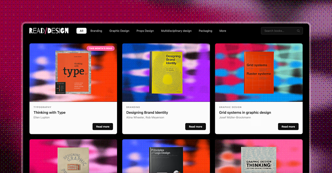
Read/Design is a personal project that started as a way to keep my curiosity about design alive. Think of it as a digital library built from the books I've collected over the years. The idea is to share, every month in an Instagram post, the insights that stuck with me the most, with the goal of spreading knowledge and encouraging the reading of physical books.
Since sharing your process is the thing now, here's how this came together: I designed the graphics and website myself in the old-fashioned way, but the site itself was built in Claude Code with a Notion database behind it. Huge respect for developers. This build cost me two migraines and way too many tokens.




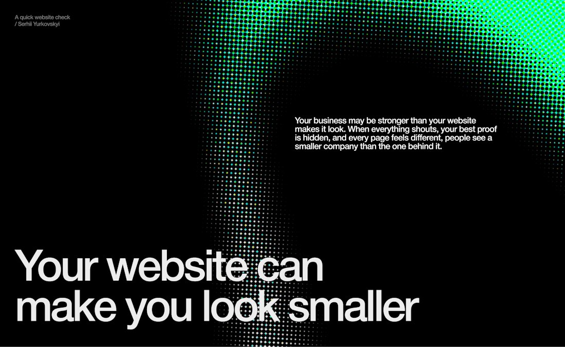
A company can be doing serious work and still look surprisingly small online.
Here are three signs your website might be creating that impression:
1) Everything is fighting for attention
Every service, feature and message feels equally important. When there’s no clear hierarchy, visitors don’t know where to look or what to remember.
2) Your best proof comes too late
Client names, results and real examples of your work are buried near the bottom of the page - long after most visitors have already formed an opinion.
3) Every page feels disconnected
The layouts change. The spacing changes. Even the way you explain your offer changes. Instead of showing versatility, the website starts to feel inconsistent.
The tricky part is that none of this necessarily looks “bad.” Your team may be experienced. Your work may be excellent. Your offer may genuinely stand out.
But new visitors can only judge the business through what the website communicates.
And when the website feels uncertain, the company often does too.



Well said. A website shapes perception within seconds. Clear visual hierarchy, early social proof, and a consistent user experience can make an established company feel as credible online as it is in the real world.