
Technical Content Writer | AI, IT, EdTech & SaaS
Technical Content Writer | AI, IT, EdTech & SaaS

So I wrote a deep newsletter on:
“Why Most AI Content Sounds the Same (And How to Break It)”
Inside this, I did not give surface-level advice like:
“Use better prompts” or “humanize your content.”
I addressed the actual problems creators keep searching for daily:
• Why AI writing feels emotionally empty
• Why LinkedIn posts now sound identical
• Why audiences instantly detect robotic writing
• Why “viral formatting” is slowly damaging originality
• Why creators lose personality after using AI too much
• Why over-polished content creates emotional distance
• Why fake storytelling no longer builds trust
• Why audiences are getting tired of motivational writing patterns
I also openly broke down repetitive patterns AI tools repeatedly generate, including:
• Fake depth through contrast writing
• Predictable motivational endings
• Dramatic one-line paragraph addiction
• Generic emotional vocabulary
• Overexplaining simple ideas
• “Smart sounding” intellectual tone
• Recycled thought leadership structures
And more importantly, I explained how strong writers and content strategists can actually fix these problems without sounding robotic or overly optimized.
This was not written as another “AI vs humans” debate.
It was written for creators, strategists, freelancers, and writers who want their content to feel psychologically real again.
Because honestly, the internet does not have a content shortage anymore.
It has a perspective shortage.
Newsletter link (https://www.linkedin.com/pulse/why-ai-content-keeps-repeating-itself-rizwana-khan-bgm4c/)
#ContentWriting #LinkedInTips #AIContent #ChatGPT #PersonalBranding #ContentStrategy #Copywriting #LinkedInCreators #SEOContent #WritingTips #DigitalMarketing #ContentMarketing #BrandBuilding #Newsletter #Freelancing
0
83

A few days ago, someone asked me:
“Why does ChatGPT give everyone the same boring content?”
I asked them to show me the prompt.
It was:
“Write a LinkedIn post about productivity.”
That explained everything.
Most people are not getting weak output because the tool lacks capability.
They are getting weak output because the instructions lack clarity.
The difference between average and strong AI-generated writing often comes down to:
• context
• audience clarity
• emotional direction
• refinement
So I decided to break this down properly.
In my latest newsletter, I shared 7 mistakes most people make while using ChatGPT, (https://linkedin.com/pulse/7-mistakes-most-people-make-chatgpt-rizwana-khan-gwldc/?lipi=urn%3Ali%3Apage%3Ad_flagship3_detail_base%3BA4hU7WKbRsCBmuyFD45sIA%3D%3D)along with real prompt examples, real writing scenarios, and practical fixes that actually improve the output.
If you use ChatGPT for:
• content writing
• LinkedIn posts
• newsletters
• freelancing
• brainstorming
• marketing work
this might save you hours of trial and error.
Read the full newsletter and share your opinions.
0
119

Everyone suddenly became an “AI expert.”
But honestly? Most people are just typing random prompts and hoping for magic.
AI is easy to access now.
The real skill is knowing what to ask, how to guide it, and how to turn raw output into something people actually want to read.
Prompt engineering is less about commands and more about clarity of thought.
That’s the difference.
0
121

In this newsletter: I Was Using ChatGPT All Wrong… Until I Fixed This, (https://www.linkedin.com/pulse/i-using-chatgpt-all-wrong-until-fixed-rizwana-khan-rps8c/?trackingId=W2qad%2FbbNqLyYzRxhSQzlw%3D%3D)
I share what changed and the system I now follow to fix it.
You will learn:
How I set my audience before writing
How I build a clear outline first
How I use AI for support, not full writing
How I rewrite to keep my own voice
How I add experience and data to improve content
This is not about avoiding AI or depending on it fully.
It is about staying in control while using it wisely.
If you write with ChatGPT, this will help you keep your thinking and originality intact.
0
113

Interactive websites, web apps & Rive motion for startups
- $5k+
- Earned
- 1x
- Hired
- 38
- Followers
Interactive websites, web apps & Rive motion for startups
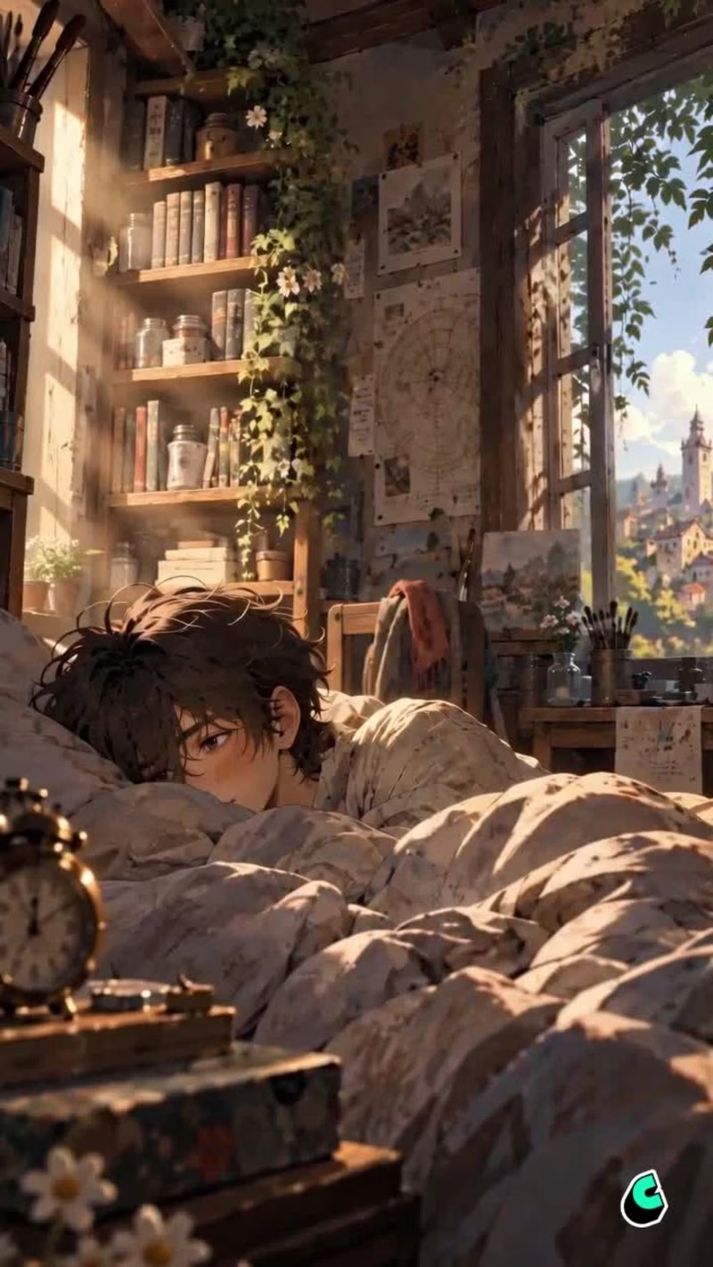
🖼️ What if a painting could capture what a photograph never could?
Not a photograph.
Not exactly what happened.
But the way it felt.
In a quiet lakeside town, there’s a little shop where people bring the things that hold the memories they’re afraid of forgetting.
A photograph.
An old letter.
A childhood keepsake.
And behind the canvas is Elias.
🎨 THE MEMORY PAINTER
Elias listens to what people can't quite say, then turns what they remember into a painting.
For this 120-second pilot, I built the world from the ground up in Cantina — Elias, his shop, the characters, environments, dialogue, sound, and the entire cinematic story.
But this isn't really a story about painting other people's memories.
Because eventually, Elias finds one of his own.
A memory he had spent years avoiding.
And just when he begins to face it...
Someone arrives at his door.
He looks up.
So... what's your story?
And that's where the real story begins.
🌌 I wanted The Memory Painter to feel like the first episode of a much larger world — where every visitor brings a different memory, a different story, and perhaps another piece of Elias's past.
A quiet lakeside town of old trains, photographs, paintings, and memories worth preserving.
Built in Cantina.
A small shop. A lot of memories.
This is only the beginning. ✨
Character: https://cantina.com/i/7o1yi
Pilot: https://cantina.com/i/1wqy5
23
27
3.8K
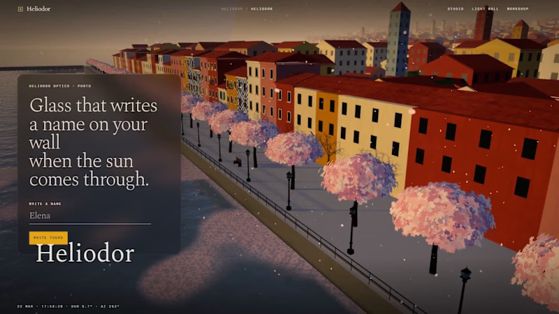
☀️ The glass is blank. The wall isn't.
Hold it up to a window and there's nothing on it.
No print. No paint.
Then the sun comes through,
and a face lands on the wall.
That's a caustic lens.
Clear acrylic, its surface shaped so precisely that sunlight draws a picture.
They're beautiful, and almost nobody sells them.
Every single one needs its own optics solve.
🔆 HELIODOR
A studio that writes a name, or a face, in sunlight.
Type a name, or drop in a photo.
Your browser solves the lens. No server, no AI credits.
A ray-traced proof shows the light before anything is cut.
Then it checks the glass.
The portrait in the video: 3.3° slope, 3.6 mm deep, match 0.80.
Ready to cut.
From your city and your window, it finds every day the light is sharp
and adds them to your calendar.
Photos were the hard part.
A full-contrast face came out 7.1 mm deep, over the 6 mm cut line.
So every photo now keeps a soft base glow.
Behind it runs a real workshop.
Orders move through each stage on the Workshop board.
Today's lenses nest onto one acrylic sheet.
Approved pieces hang on the public Light Wall.
One photo.
One beam of sun.
Zero AI credits.
So whose face goes on your wall?
The sun does the rest. ✨
🛠️ Built in Base44: the app, the data, the sign-in and the hosting.
Make yours 👇
HELIODOR (https://heliodor-971f1b5c.base44.app)
6
4
683
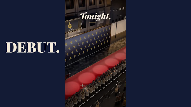
🎬 DEBUT
A launch-day ad that rolls out the red carpet for your product.
Friday, October 20. Premiere night.
A limo glides up to the carpet.
A perfume takes the spotlight.
"Who are you wearing?"
It was wearing the night.
Saturday, a skateboard walked the same carpet.
"Can you do it again?"
It landed it.
Sunday, a soda can cracked open in front of the press.
"What's the flavour?"
Nobody would say.
None of them were real.
All of them got a premiere.
🎟️ Every launch deserves a red carpet.
Most of them get a story post.
So I built the whole premiere.
The marquee. The press pen. The fans. The limo.
A rooftop across the street to watch it all from.
I had way too much fun with this one.
Built the street in Blender, then rolled the cameras in SVGator with the MCP.
Six premieres.
One template.
Zero redraws.
Swap the logo and the product.
Every marquee, wall and shot follows.
Retype the headline, the date and what the press shouts.
Every word is live text. Every layer has a name.
The cameras never change.
So who's walking the carpet next?
The flashes never stop. ✨
🛠️ Built in SVGator with the MCP, staged in Blender. 1,429 named layers, 3,917 keyframes.
Use the template 👇
DEBUT · Red-carpet launch ad (https://app.svgator.com/editor#/84c59716958942ceb33024ae5ae4688e)
13
11
2.3K

📰 FRONT PAGE
A launch-day ad that puts your product on the front page.
Tuesday, October 14. Late City Edition.
A blood orange soda came back.
Shelves cleared in eleven minutes.
Officials urged the public to remain calm.
Friday morning, a phone outlived the news cycle.
Its charger was reported missing, presumed retired.
Saturday, 12:01 a.m.
Cold brew hit the shelves.
Nobody went home.
None of it happened.
All of it made the front page.
🗞️ Every launch wants to be news.
Most of them get a banner.
I couldn't find a single newspaper in SVGator's template gallery.
So I built one.
The Bellbird Times.
The Kestrel Herald.
The Nightjar Post.
Three papers.
One template.
Zero redraws.
Retype the headline, swap the photo and the logo.
Every word is live text. Every layer has a name.
The motion never changes.
So what's your headline?
The press never stops. ✨
🛠️ Built in SVGator with the MCP. 1,038 named layers, 8,440 keyframes.
51
57
8.5K

"AI Brand Commercial Creator"
"AI Brand Commercial Creator"

CASE STUDY: Creating a Cinematic Brand Ad with Limited AI Resources
Overview
This project started with a simple challenge to myself : create a visually compelling advertisement by combining existing footage, static posters, AI-generated visuals, and professional post-production techniques into a cohesive brand story.
While my initial vision was to create a fully AI-generated commercial, budget and credit limitations made that approach impossible. Instead of compromising on quality, I shifted the focus toward creative editing, storytelling, colour grading, and sound design to achieve the desired impact.
The result was a cinematic advertisement built from multiple visual sources, unified through careful research, creative direction, and post-production.
The Challenge
The primary challenge was creating a premium-looking advertisement without access to the amount of AI generation credits required for a complete video production.
The available assets included:
Two existing video clips
Two promotional posters
AI-generated panther footage
Additional visual references and research material
The objective was to transform these disconnected assets into a single narrative that felt intentional, immersive, and professionally produced.
Creative Direction
The concept centered around performance, adventure, and perspective.
One of the strongest visual ideas was introducing a panther as a symbolic character representing focus, agility, confidence, and instinct.
To make the sequence feel more believable and immersive, I developed the idea that the panther footage was being captured through Oakley Meta smart glasses worn by a cyclist.
This perspective-driven approach helped create a sense of realism while connecting the AI-generated visual with the rest of the footage.
Research & Storyboarding
Before opening the editing software, I spent time researching:
Brand advertising styles
Action sports cinematography
POV camera storytelling
Colour palettes used in premium lifestyle campaigns
Visual transitions that could connect unrelated footage
Based on this research, I created a storyboard outlining:
Introduction of the visual atmosphere
Establishment of movement and energy
Panther POV sequence
Product and brand integration
Final emotional payoff
This planning stage became crucial because the footage originated from different sources and required a strong narrative structure to feel connected.
Post-Production Process
Editing
The edit focused heavily on rhythm and pacing.
Since the footage was not originally created as part of a single production, every cut had to be carefully chosen to maintain continuity and emotional momentum.
Key editing goals included:
Maintaining viewer attention
Creating smooth transitions between assets
Building tension and release
Supporting the narrative through visual progression
Colour Grading
One of the most important aspects of the project was colour grading.
The source materials varied significantly in terms of:
Exposure
Contrast
Saturation
Overall visual tone
To solve this, I developed a unified cinematic look that helped all footage feel like it belonged in the same world.
The grading process focused on:
Matching shots from different sources
Enhancing mood and atmosphere
Increasing visual consistency
Supporting the premium feel of the advertisement
The final grade played a major role in making the project appear as a single production rather than a collection of separate assets.
AI Integration
AI was used strategically rather than excessively.
Instead of relying on AI to generate the entire commercial, I used AI-generated visuals where they could create the most impact.
The panther sequence became a narrative device that added personality, symbolism, and visual intrigue to the advertisement.
This approach demonstrated how AI can enhance storytelling when combined with strong creative direction and traditional editing skills.
Sound Design
To strengthen the emotional impact, I designed the audio experience around movement, energy, and immersion.
The sound design included:
Environmental layers
Motion-based effects
Transition accents
Atmospheric textures
Each sound element was selected to support the visuals and increase viewer engagement.
The goal was not simply to add audio, but to create a cinematic experience that elevated every cut and transition.
Constraints & Problem Solving
One of the most valuable aspects of this project was working within limitations.
Rather than seeing limited AI credits as a setback, I treated them as a creative constraint.
This led to a stronger emphasis on:
Storytelling
Visual consistency
Editing craftsmanship
Colour grading
Sound design
The final result proves that compelling advertisements are not created solely through expensive tools or unlimited AI generation. They are created through creative thinking, problem-solving, and strong execution.
Key Contributions
Creative Direction
Concept development
Visual storytelling
Storyboarding
Research
Advertising references
Visual style exploration
Narrative structure planning
Post-Production
Video editing
Colour grading
Asset integration
Visual consistency
AI Production
AI visual integration
Concept enhancement
Audio
Sound design
Atmosphere creation
Impact enhancement
Final Takeaway
This project became an exercise in creative adaptability.
What began as a vision for a fully AI-generated advertisement evolved into a hybrid production that relied on editing, colour grading, storytelling, sound design, and strategic AI integration.
The experience reinforced an important lesson:
Great advertising is not defined by the tools available—it is defined by how effectively those tools are used to tell a compelling story.
3
238
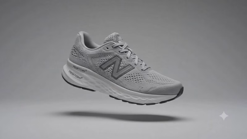
Every great product begins long before the final reveal.
For this concept, I wanted to tell the story of a running shoe from the inside out—starting with the threads that form the engineered knit upper, building layer by layer through the cushioning and outsole, until every component comes together as one.
Rather than showcasing the shoe immediately, the storyboard highlights the craftsmanship, technology, and precision behind its construction.
A clean, minimal approach inspired by modern product films.
#CreativeProcess #Storyboard #Footwear #IndustrialDesign #ProductAnimation #NewBalance #TechDesign #CGI #DesignConcept #VisualDevelopment
4
71

Every great day starts with something pure.
That's why we created Neutromo — a milk brand built on freshness, quality, and goodness in every sip.
Check out our first ever animated commercial and let us know what you think!
What if your brand could have a professional animated commercial without a big production cost?
I used AI tools to bring Neutromo Milk to life with a full cartoon commercial — and I'm now open to helping other brands do the same.
Here's why animated AI commercials work for brands:
They grab attention instantly
They perform great on social media
They cost a fraction of traditional video production
They can be made fast
3
156
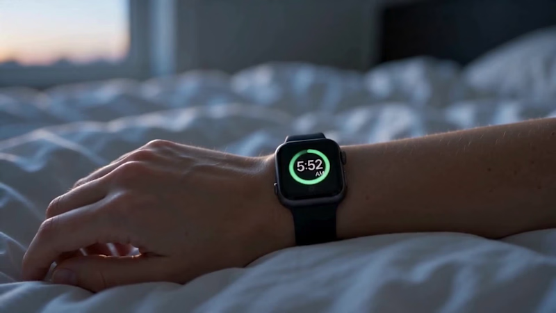
Every moment, quietly connected.
This smartwatch ad tells the story of one complete day — from the first quiet moment in the morning to the final peaceful moment at night. The film focuses on simplicity, wellness, and everyday connection without using loud messaging or forced product selling.
The watch becomes a silent companion throughout the day: helping her wake up, track her health, stay focused, manage stress, receive important updates, and end the day with a sense of completion. Each scene is soft, cinematic, and natural, showing how the smartwatch fits into real life without interrupting it.
The visual style is premium and minimal, using warm morning light, calm bedroom moments, outdoor movement, and a peaceful night ending. The final scene, where she removes the watch, places it on charge, and goes to sleep, gives the ad a complete emotional circle: the day is finished, the user rests, and the watch prepares for tomorrow.
The overall feeling of the ad is calm, modern, personal, and human — showing that technology can support life quietly, beautifully, and effortlessly.
1
1
283

Delivering Quality Work On Time
Delivering Quality Work On Time


View more →

Copywriter who brings organic traffic with touch of devotion
Copywriter who brings organic traffic with touch of devotion


Creative Strategist
Creative Strategist


Creative Marketing with Data-Driven Storytelling
Creative Marketing with Data-Driven Storytelling



Expert Blog Writer for Immigration & Govt Schemes
Expert Blog Writer for Immigration & Govt Schemes


View more →