


Hello Contra 👋 - I spent the past year collaborating with Dynaplus, a fastener brand, to improve consistency, messaging and visual identity across their brand. The result is a wide range of print- and digital works!
To go into detail, the previous system relied on decorative elements that distracted from the information. We stripped those away and replaced them with brand photography, showing the product in use instead of scattering complex shapes around each design. This made it a far more coherent visual style!
Heading into 2026 we're working on redesigning all the packaging used for products which will lead to less plastic use and more sturdy packaging.
15
415

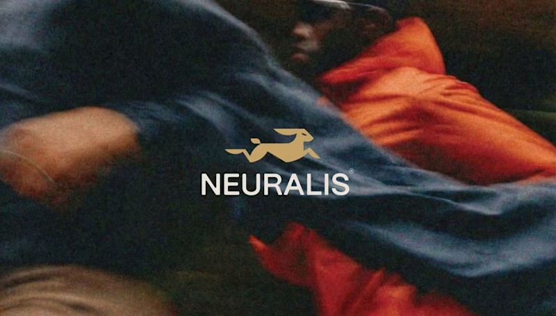
Neuralis – Brand Identity & UI/UX Design for an Urban Run Club
Services: Brand Identity, UI/UX Design, Art Direction, App Design, OOH (Out of Home) Design
About the Project
For Neuralis, I had the opportunity to design the complete brand identity and app interface. Neuralis isn't just another running app; it's a premium, community-driven platform that connects and motivates athletes in cities like London, Amsterdam, and Berlin. The brand's mission is clear: elevate performance through the power of the pack.
The Challenge
The challenge was to create a visual language that feels high-end and minimalist, yet exudes the raw, athletic energy of urban street running. The brand needed to breathe a performance-oriented mindset while remaining deeply connected to a tight-knit community.
The Solution & Design Choices
The Logo & Mark: The core of the identity is the stylized, geometric golden hare. This symbolizes speed, agility, and relentless forward momentum. The logo is designed on a strict grid, ensuring perfect balance and scalability across all formats.
Color & Typography: I opted for a bold, high-contrast palette. The base consists of deep dark gray and black, creating a 'stealthy' and premium feel. The gold adds a touch of exclusivity, while the bright action red is used for interface elements and key typography to instantly grab attention. The sleek, sans-serif typography gives the overall design a modern, urban aesthetic.
UI/UX App Design: The iOS app interface is designed with a strict focus on clarity during workouts. By using striking, floating widgets (like the red 'Outdoor group run' card), users can check their route, fellow runners, distance, time, and calories burned at a single glance.
Copywriting & Campaign: To reinforce the community's mindset, powerful slogans were integrated into the brand identity: "Forward is the only way", "PACE DICTATES THE PACK", and "WE RUN TOGETHER". These elements come to life across striking billboards, urban posters, and merchandise like tote bags.
Deliverables
Concept & Art Direction
Logo & Brand Guidelines
Mobile App Design (iOS Interface)
Merchandise (Tote Bags)
OOH Campaign Assets (Billboards & Posters)
2
3
172