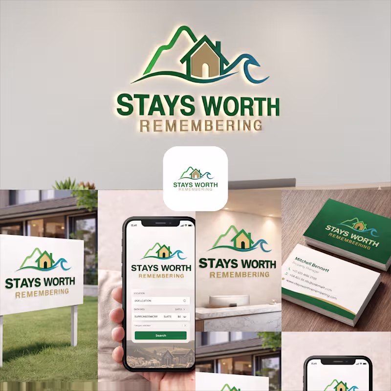
Projects using Adobe Illustrator in NaogaonProjects using Adobe Illustrator in NaogaonStays Worth Remembering Travel Company Logo Design 2026.
The idea behind this logo was to create a visual identity that instantly communicates comfort, memorable experiences, and destination-based stays in a clean and meaningful way.
The mountain element represents travel, adventure, peaceful escapes, and beautiful destinations. It gives the brand a sense of exploration and unforgettable journeys. The house placed in the center symbolizes comfort, hospitality, safety, and the feeling of being “at home” no matter where someone travels.
The wave element was added to represent relaxation, premium vacation experiences, and destinations connected to nature, lakes, beaches, or peaceful environments. Together, the mountain, home, and wave create a complete story of travel and memorable stays.
For the typography, I used a bold and clean font to make the brand look professional, trustworthy, and easy to recognize across both digital and physical platforms. The word “REMEMBERING” uses a softer gold tone to create a warm emotional feeling and reinforce the idea that these stays are not just accommodations, but experiences people will remember for a long time.
The green color palette represents nature, growth, relaxation, and trust, while the blue wave adds freshness, calmness, and a travel-inspired feeling. Overall, the logo was designed to feel welcoming, modern, memorable, and versatile for signage, branding materials, business cards, websites, and mobile applications. Automotive Inventory Platform – B2B SaaS for Tire & Auto Service Businesses
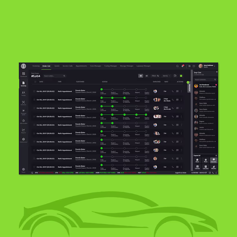
Designed for an automotive service enterprise. This platform lets teams manage inventory, billing, purchases, and reports — all in one clean, enterprise-grade web app. I created a sidebar-driven UX with intuitive navigation, role-based modules (Dashboard, Invoicing, Inventory, PO, Bills, Check-in), and filterable tables to streamline complex workflows and reduce cognitive load. A modern dark interface, clear visual hierarchy, and strong spacing support users who aren’t tech specialists while boosting operational efficiency and decision-making.
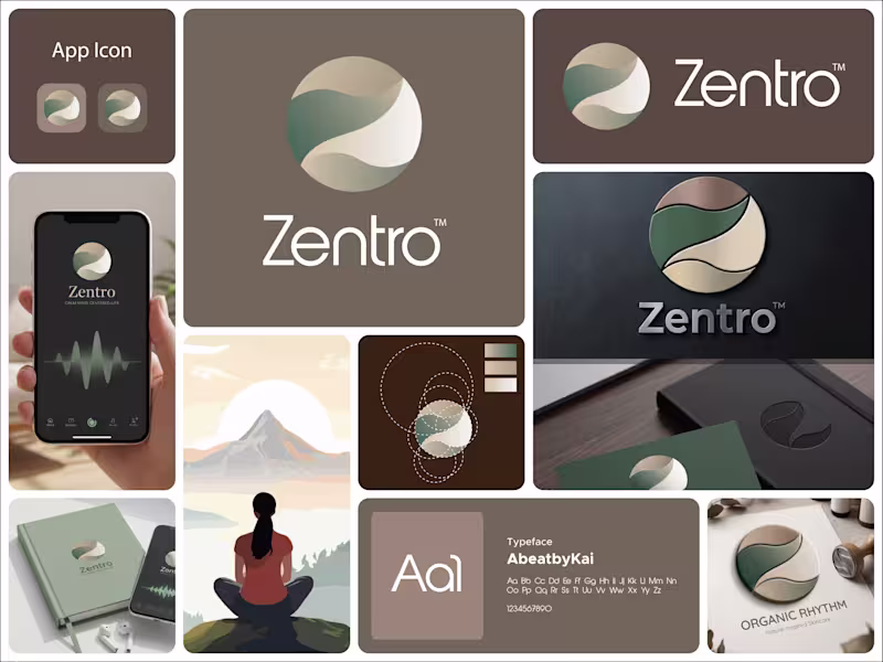
Available for freelance opportunities. Schedule a call at rifatuxd@gmail.com (mailto:rifatuxd@gmail.com) This logo for Zentro is built around calm, balance, and centered living.
The symbol is a circular form, representing wholeness, unity, and completeness. It reflects the idea of being centered, both mentally and emotionally, which aligns perfectly with a meditation or mindfulness-focused brand.
Inside the circle, the flowing shapes create a soft, continuous movement. These curves feel natural and organic, almost like a gentle path or breath flow. They subtly guide the eye through the mark, reinforcing a sense of calm and balance rather than tension or sharp direction.
There’s also a quiet suggestion of a path or journey within the form. It hints at self-discovery and inner alignment without being literal, keeping the design minimal but meaningful.
The color palette plays a big role here. The muted greens and earthy beige tones bring a grounded, natural feeling. Green connects to growth and harmony, while the warm neutrals add softness and stability. Together, they create a peaceful and reassuring visual tone.
The typography is clean and modern, providing contrast to the organic symbol. It keeps the identity clear and professional while letting the icon carry the emotional and conceptual weight.
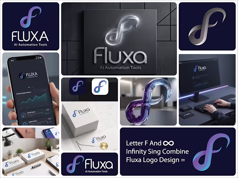
Overall, the logo communicates a simple idea: Zentro is about finding balance, staying centered, and moving through life with calm and clarity. This logo for Fluxa – AI Automation Tools is built around the idea of continuous flow, adaptability, and intelligent systems.
The symbol is the core of the identity. It takes on an infinity-like form, representing endless processes, automation loops, and systems that keep running without interruption. At the same time, the shape subtly hints at an “F,” tying it directly back to the brand name.
The smooth, flowing curves communicate flexibility and evolution. Nothing feels rigid. This reflects how AI systems adapt, learn, and optimize over time rather than staying fixed.
The gradient blend of blue and violet adds depth and a sense of movement. Blue brings trust and technology, while the shift into violet introduces innovation and forward-thinking. Together, they create a modern, intelligent feel.
The typography is clean and minimal, allowing the symbol to carry the concept. It keeps the brand grounded and professional, making it suitable for tech platforms and scalable across different use cases.
The spacing and simplicity also reinforce clarity, which is key for a brand focused on automation and efficiency.
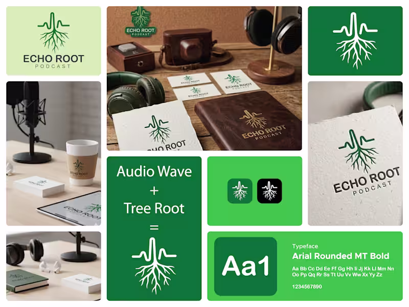
Overall, the logo communicates a clear message: Fluxa is about seamless, continuous systems that evolve, adapt, and work effortlessly in the background. This logo for Echo Root Podcast is built around a strong, meaningful dual concept—sound and origin.
At the top, the waveform represents audio, voice, and storytelling. It instantly connects to the idea of a podcast, where conversations, ideas, and messages are constantly flowing. The waveform is clean and controlled, suggesting clarity and well-structured content.
As the line moves downward, it transforms seamlessly into roots. This transition is the core idea of the logo. It visually communicates that every voice, every story, and every idea has a deeper origin. The roots symbolize depth, foundation, and connection to something real and meaningful.
The vertical flow from waveform to roots creates a sense of direction. It feels grounded, as if the content isn’t just surface-level noise but something that goes deeper and resonates.
The green color reinforces this idea. It represents growth, authenticity, and natural connection, aligning with the concept of rooted stories and organic conversations.
The typography is simple and stable, allowing the symbol to carry the concept. The spacing in “PODCAST” adds a bit of air and rhythm, subtly echoing the idea of sound waves.
Overall, the logo communicates a clear message: this is a platform where voices don’t just speak, they connect back to something deeper.