The network for creativity
Join 1.25M professional creatives like you
Connect with clients, get discovered, and run your business 100% commission-free
Creatives on Contra have earned over $150M and we are just getting started
Back to feedPost
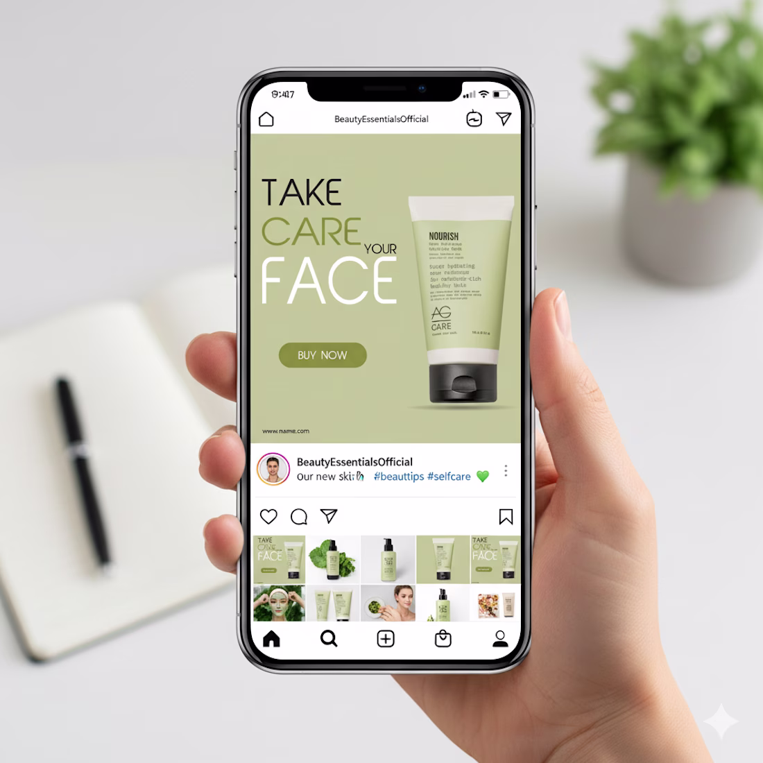
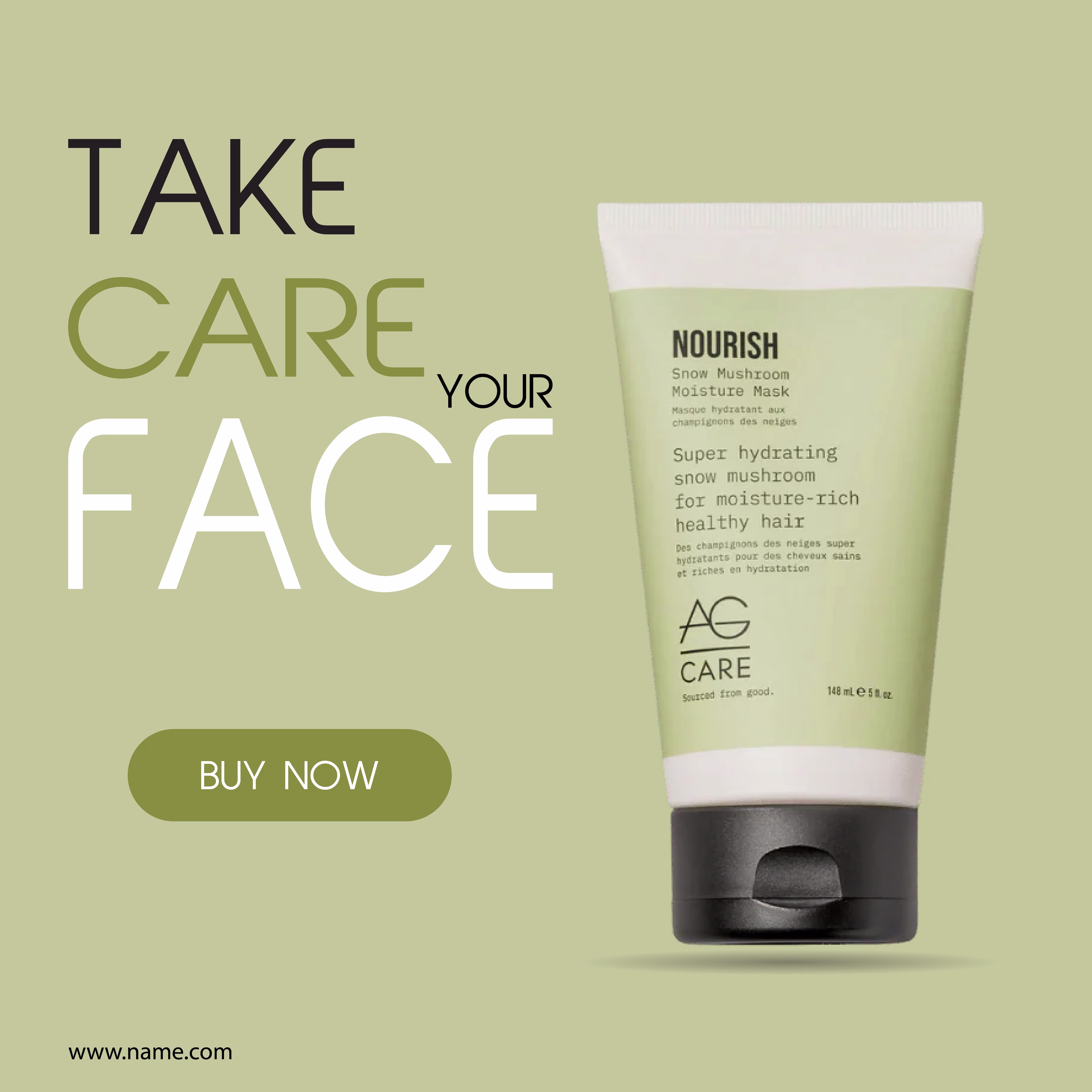
This design focuses on calm, care, and clarity, which fits perfectly with a skincare product.
The soft green background immediately communicates freshness, nature, and hydration. It creates a soothing mood and helps the product feel gentle and trustworthy. Nothing feels loud or aggressive, which is important for beauty and self-care brands.
The typography hierarchy is very intentional.
“FACE” is large and bold to grab attention while scrolling.
“TAKE CARE YOUR” stays lighter so it supports the message without overpowering it. This balance keeps the layout readable and visually clean.
The product is placed on the right with plenty of breathing space. That negative space makes the packaging feel premium and keeps the focus exactly where it should be. The subtle shadow adds depth without making it look heavy or artificial.
Web Banner DesignAdobe IllustratorskincarebrandinstagrampostdesignposterdesignGraphic DesignPrint Design
The network for creativity
Join 1.25M professional creatives like you
Connect with clients, get discovered, and run your business 100% commission-free
Creatives on Contra have earned over $150M and we are just getting started
Related posts
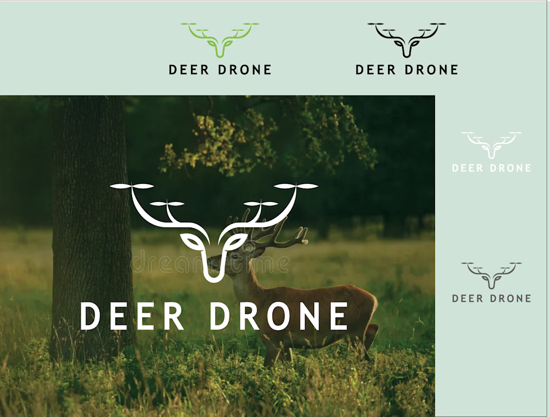
One unused concept.
Before choosing a logo direction, we like to see how it behaves as a complete brand system.
Motion, UI, app icon, visual language—every application helps us understand whether the idea is strong enough to build a brand around.
One of the unused directions we explored for Muzim
Super Classy! 👌✨️
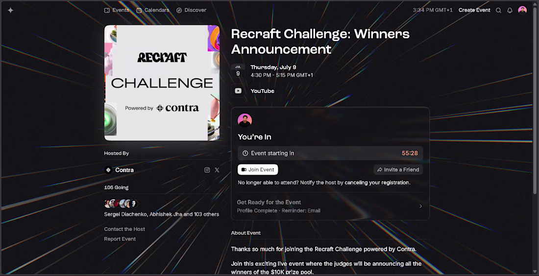
Today is the Recraft Challenge Winners Announcement! 🎉
I'm grateful to have been part of this challenge alongside so many incredible creators.
Thank you to Contra and Recraft for building opportunities that inspire designers and creatives to share their best work.
Wishing the best of luck to everyone participating.
Looking forward to celebrating everyone's amazing work and the winners! 💜✨
#Recraft #Contra #RecraftChallenge #CreativeCommunity #GraphicDesign #BrandIdentity #Illustration #DigitalArt #DesignChallenge #Creators
Best of luck! Your work is always top tier, you definitely deserve to win this
Beautifully crafted. Great job!
Challenges
View allTrending
Claude
Claude has entered the design space. How are you using Claude Design?
Contra University
Learn from expert creatives how to earn more using next-gen AI tools.
fifaworldcup2026
The World Cup is here and the whole world's watching. How are you designing for the world stage?
creativeaiflow
Creative AI workflows are evolving. What tools do you use, and what are their strengths and weaknesses?
freelancerlife
Freelancer life is wins, pivots, and everything in between. What’s yours right now?