The network for creativity
Join 1.25M professional creatives like you
Connect with clients, get discovered, and run your business 100% commission-free
Creatives on Contra have earned over $150M and we are just getting started
Back to feedPost
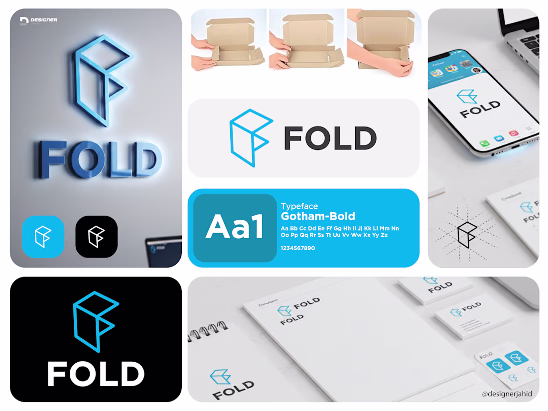
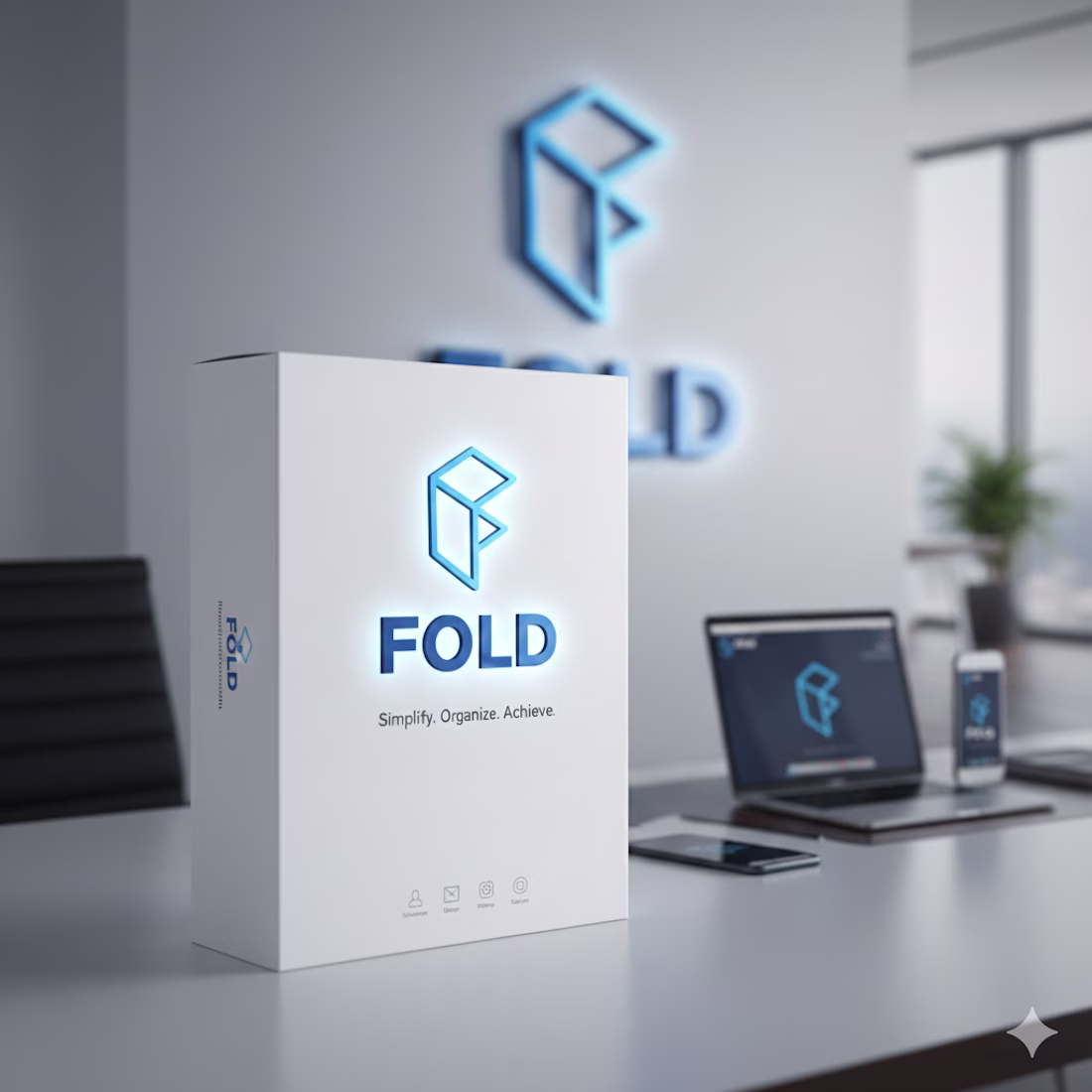
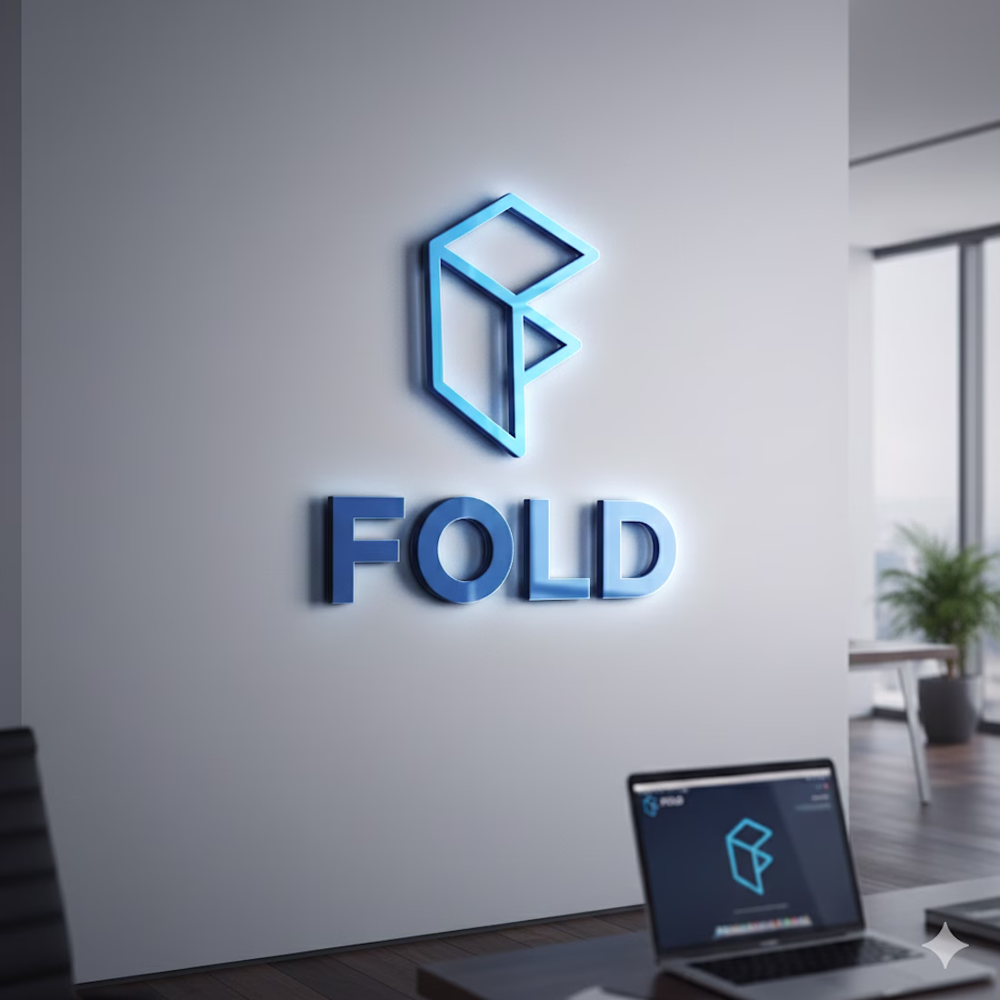
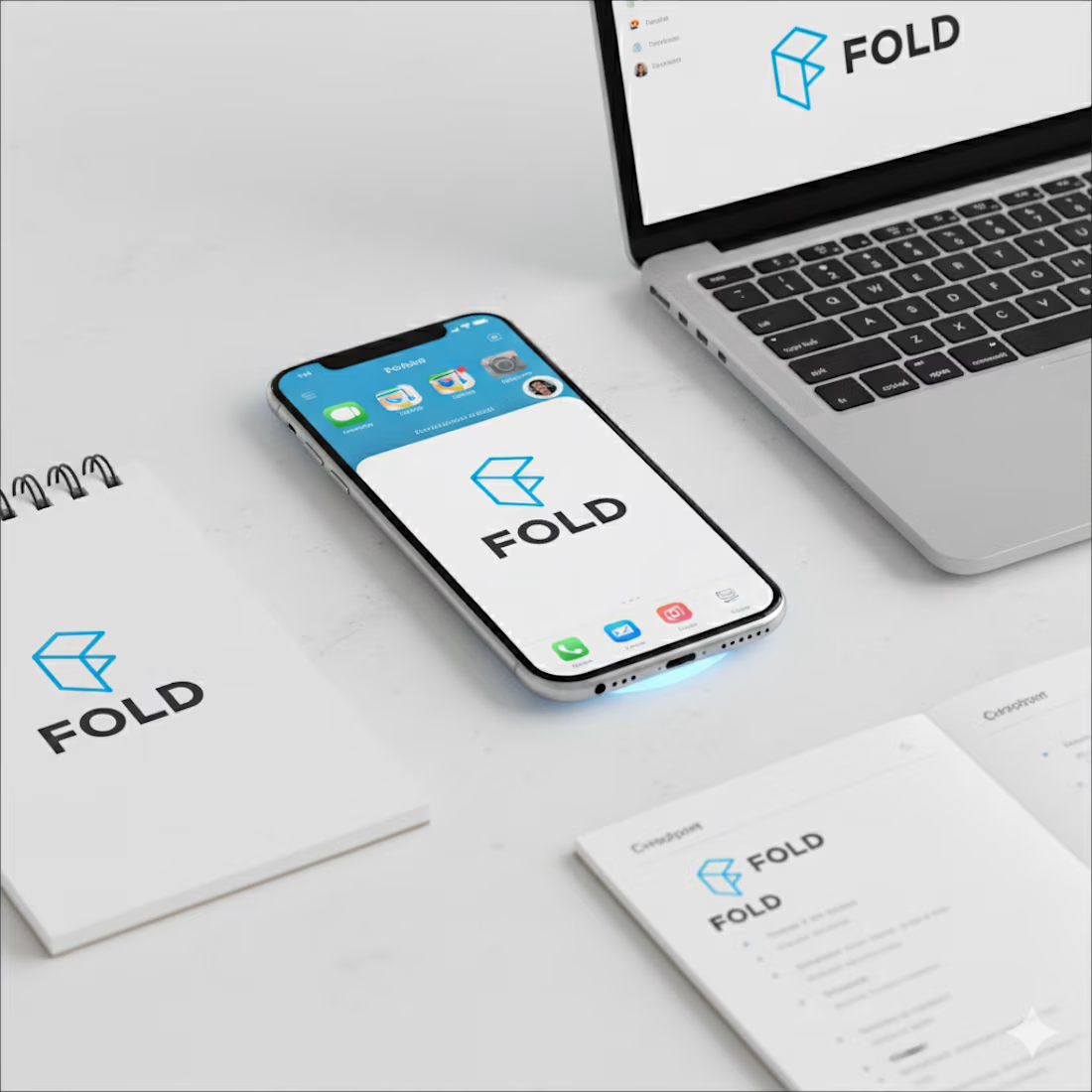
Logo Explanation: FOLD
The FOLD logo is built around the idea of structure, simplicity, and transformation.
The symbol is a geometric mark derived from folded planes, forming an abstract “F”. Its shape is inspired by the physical act of folding, referencing efficiency, organization, and smart use of space. This directly aligns with the brand’s focus on productivity and clarity.
Sharp edges and clean angles give the mark a modern, tech-forward feel, while the balanced proportions keep it simple and memorable. The design avoids unnecessary detail, allowing the logo to remain strong and recognizable at any size.
The typography is bold and minimal, chosen for clarity and confidence. The wordmark complements the icon without competing with it, reinforcing a sense of stability and focus.
The network for creativity
Join 1.25M professional creatives like you
Connect with clients, get discovered, and run your business 100% commission-free
Creatives on Contra have earned over $150M and we are just getting started
Trending
Runway
AI video generation is exploding. What are you dreaming up in Runway?
Contra University
Learn from expert creatives how to earn more using next-gen AI tools.
creativeaiflow
Creative AI workflows are evolving. What tools do you use, and what are their strengths and weaknesses?
portfolioreview
The best portfolios tell a story, not just show a grid. Share yours for feedback.
freelancerlife
Freelancer life is wins, pivots, and everything in between. What’s yours right now?