

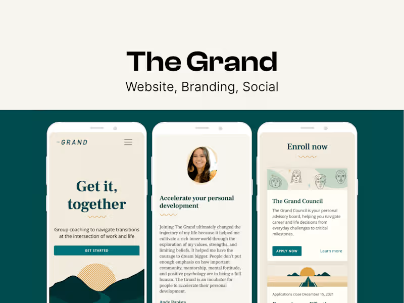
🔔 Contra's display options are a bit limited, so I've linked direct previews below to give you a full view of my ux research, branding, and web design work at The Grand: https://miracelso.webflow.io/works/the-grand
Research & Ideation: It all started with user research. To guide our design decisions, I dove deep into understanding the primary personas who used our legacy products. I analyzed user feedback and observed how people were interacting with these tools in real-world settings. Collaborating with the product team, I led the ideation and development of what would become The Grand Council.
We kicked things off with a brainstorming workshop that sparked some great ideas, and I carefully mapped out the user journey to make sure the experience was intuitive and seamless.
Marketing & Design: I also played a key role in the lead-up to our big product launch. Partnering closely with a marketing team, we rolled out a comprehensive social media campaign designed to drive potential users to our freshly updated website that I had spearheaded.
Our efforts paid off. We converted an impressive 30% of members within the first month of launch. It was a powerful reminder of how effective product design not only enhances usability but can also amplify marketing impact.
Beta Launch: To validate our approach, we ran extensive testing with two small user groups, and the feedback was incredibly encouraging. Those insights helped us refine the product and ultimately led to the successful launch of The Grand Council.
Design System: Before we started scoping out the Member Platform and Coach Platform, I strongly advocated for creating a design system. The goal was to standardize components and design patterns to create a cohesive and high-quality user experience. This evolution aimed to make the platform more adaptable, scalable, and user-friendly, ensuring it meets the needs of both current and future product developments.
0
48
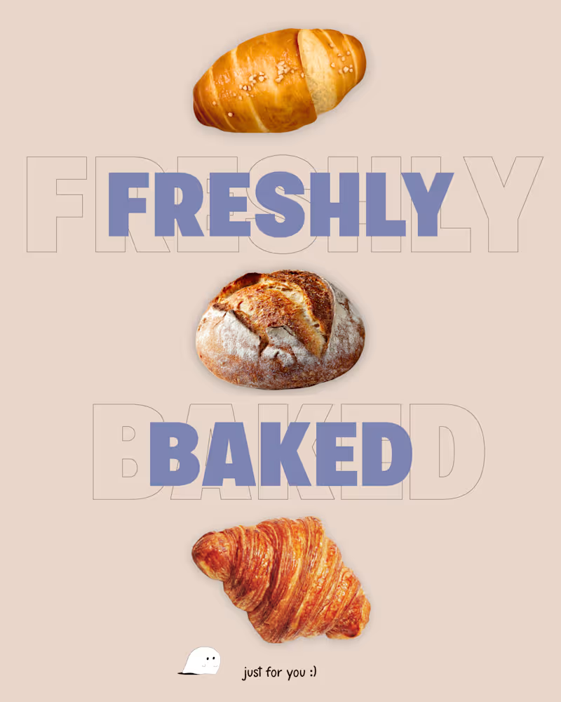
Paper Crumbs — Social Media Design
A promotional social media series for Paper Crumbs, a conceptual café brand built around warm coffee, buttery bakes, and everyday little messes.
I paired bold typography and appetizing food imagery with handwritten accents, playful copy, and a palette of chocolate brown, cream, and lavender. Small appearances from the brand’s ink-born mascot bring its illustrated personality into the posts.
The series covers product highlights, seasonal favourites, and weekly offers, balancing clear promotional messages with a consistent, recognizable brand identity.
0
21
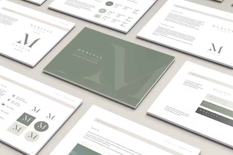
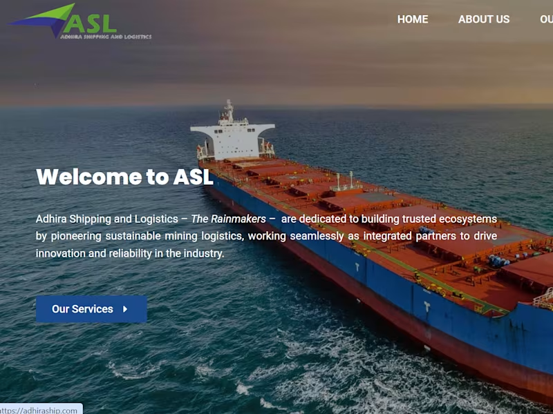
Redesigned and developed a high-performance corporate website for Adhira Ship, a logistics and shipping company.
The Challenge: The client needed a professional digital presence that established trust with international partners and ranked for competitive industry keywords.
The Solution: I delivered a complete digital overhaul, including:
Custom Web Development: Built a responsive, fast-loading site with a custom CMS for easy team updates.
Visual Identity: Designed professional graphics and layouts to reflect the reliability of the logistics sector.
SEO Optimization: Implemented a comprehensive technical SEO strategy, optimizing site architecture and meta-data to drive organic traffic.
0
94


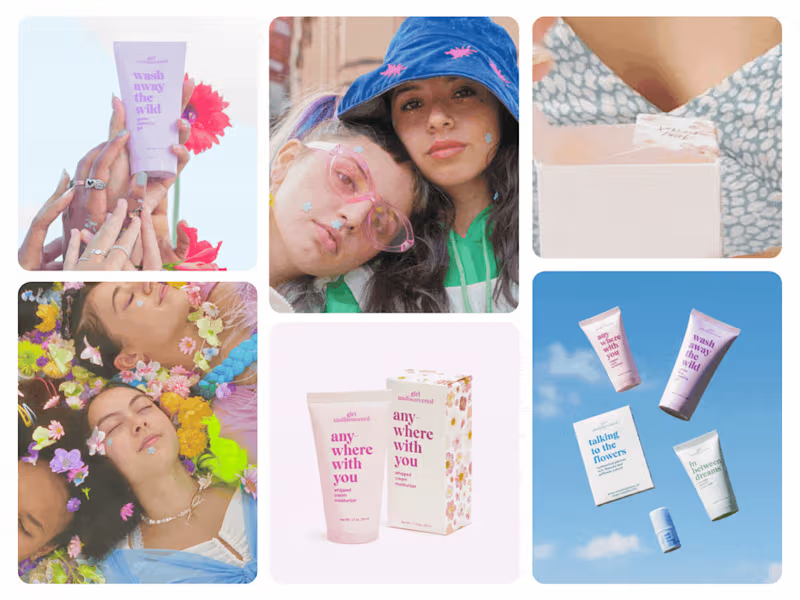
A look back at my work for Girl Undiscovered, created in 2020–2021.
Created for Gen Z, Girl Undiscovered pairs gentle skincare with an exploration of new ingredients and a message of self-discovery. Beyond skincare, the brand encourages young women to embrace their individuality, find strength within themselves and feel free to define who they are on their own terms.
The project involved refining the existing brand identity and iconography, designing the product packaging, and extending the refreshed visual direction into the website and app through design and development.
Expressive typography, soft pastel tones and playful details reflect that youthful, independent spirit. A clear visual hierarchy gives each product its own character while making the collection feel connected across packaging and digital experiences. The result is an approachable, expressive identity that makes room for both skincare education and personal exploration.
Role: Brand identity revision · Packaging design · Iconography revision · Website & app design and development
1
1
54