

Product Designer | Motion & Design Systems


Design Studio with Line, Badges & Typography focus.

Design Studio with Line, Badges & Typography focus.


Design, build, and elevate your brand
- 1x
- Hired
- 5.0
- Rating
- 16
- Followers
Design, build, and elevate your brand


Multidisciplinary Designer ✳︎ We're ready to serve you


Multidisciplinary Designer ✳︎ We're ready to serve you


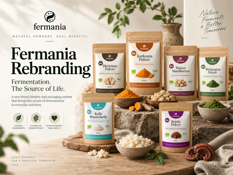
FMCG Packaging Designer for Consumer Brands
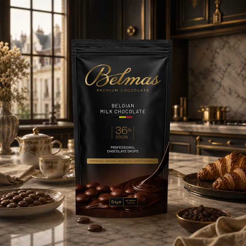
Belmas — Premium Chocolate Packaging
Belmas is a premium chocolate packaging concept designed for professional chocolatiers, bakers, and pastry makers.
The challenge was to create a packaging identity that could communicate quality and craftsmanship while giving the product a distinctive, premium presence.
The visual direction combines a deep matte-black foundation with refined metallic gold typography, creating a sophisticated and contemporary expression of Belgian chocolate craftsmanship.
The information hierarchy was intentionally kept clean and structured, allowing key product credentials — Belgian Milk Chocolate, 36% Cocoa, and Professional Chocolate Drops — to communicate clearly without compromising the premium aesthetic.
Rich chocolate photography and flowing chocolate forms anchor the lower section of the pack, adding appetite appeal while visually connecting the packaging to the product itself.
The result is a premium, sophisticated, and commercially focused packaging system designed to elevate Belmas within the professional chocolate category.
Role: Brand & Packaging Designer
Services: Packaging Design · Visual Direction · Art Direction · 3D Mockup
Category: FMCG / Food & Beverage / Chocolate
2
280

Market-Oriented Packaging & Print Designer
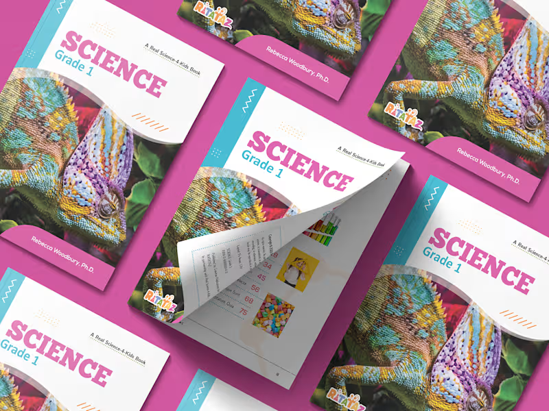
Long before I designed packaging for consumer goods, I spent nine years working in educational publishing. During that period I helped transform science teaching materials into full textbook series for a private educational foundation in Indonesia, producing books across six grade levels through multiple revision cycles. The experience eventually inspired a line of Science textbook templates that sold worldwide through marketplaces for years.
Ratataz Science Textbook brought me back to that field through a direct client collaboration. Unlike the self-initiated templates, this project was developed around a real educational product, combining years of textbook production experience with a brighter, more contemporary visual approach.
This finely crafted essential template contains 14 unique pages in a facing-page format. It was created in US Letter size with 3 mm bleed on all sides for print production. The source files were built in Adobe InDesign using CMYK color mode for professional output. Yes, it's bright! The idea was simple: bring a vibrant color scheme to the textbook and create a more cheerful learning experience.
Certain design elements, including stock photos and illustrations, are not included in the deliverable and were sourced from licensed marketplace assets for presentation purposes.
0
732
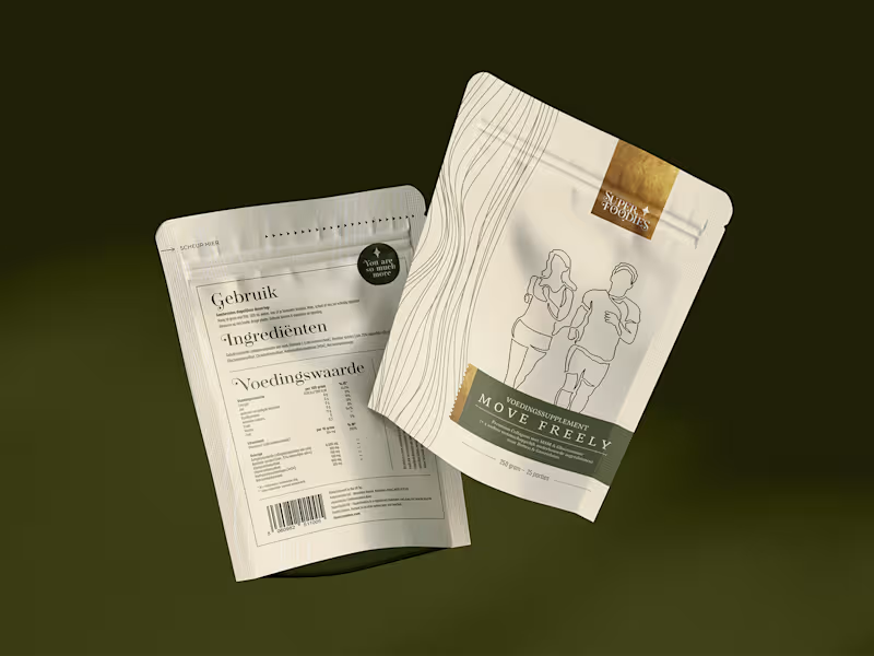
Designing packaging is fun. The space is limited, but the challenge is not. With no more than six panels to work with, every section must earn its place and communicate information as clearly as possible while complying with various regulatory requirements. Clear constraints actually make the creative process more structured. Product names, net quantity statements, ingredient lists, nutritional information, and directions for use must all be placed precisely without sacrificing readability or aesthetics.
Superfoodies pouch design reflects a modern, minimal, and serious aesthetic with a touch of luxury. Carefully laid out with generous white space to ensure clarity and avoid visual clutter, the pouch is rendered in a beige material measuring 240×160 mm, with a 3 mm bleed on all sides. The project involved developing the front panel design and reorganizing a partially completed back panel into a single, cohesive layout. Source file precisely crafted with Adobe InDesign in CMYK color mode.
A moment when editorial software found its way onto a packaging production line.
0
947
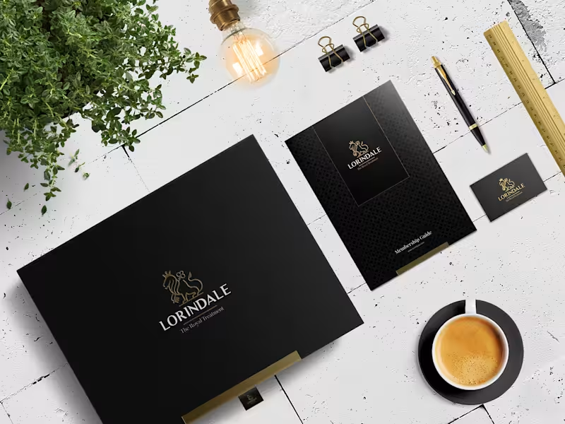
Building a Luxury Print System for Lorindale
Some projects begin with a single deliverable and eventually evolve into a broader collection of printed brand materials.
Back in 2017, Lorindale, a concierge services company serving executives and high-net-worth individuals, commissioned a luxury membership guide as part of its client onboarding materials. The brief called for a black-and-gold visual direction aligned with the company's website and premium service positioning. Produced on black stock with gold foil and embossing, the booklet introduced Lorindale's services and membership packages through a clean editorial layout.
The project later expanded into a membership welcome box designed to hold the guide, membership card, and supporting materials. The same visual language was carried into the packaging to maintain consistency throughout the membership experience. A stationery package followed, completing a collection of printed materials built around the same typography, finishes, and design principles.
Across the project, Playfair Display and Questrial were used to match the company's existing website. Combined with black paper stock, gold foil accents, and embossed details, the materials formed a consistent visual identity across multiple formats.
0
1.3K
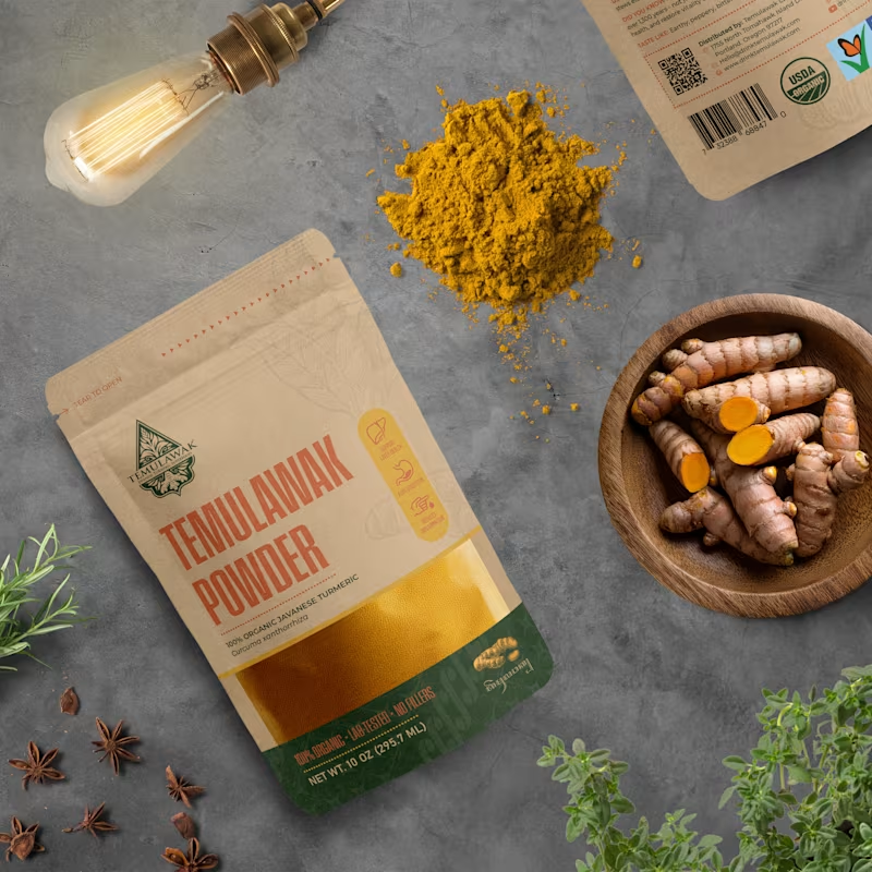
Curcuma zanthorrhiza and the Search for Authenticity
Temulawak’s elegant packaging concept marks my first time that botanical science and cultural heritage come together in its creation. The initial approach was simple: observing the morphological characteristics of Curcuma zanthorrhiza and applying binomial nomenclature—where the Latin name is italicized with the genus capitalized and the rest in lowercase. In the publishing world, a similar writing convention is known as sentence case, but for scientific names, both words remain italicized.
The second approach led me to revisit prior knowledge of Javanese script only to realize my initial understanding was flawed. Not to translate the entire draft from English, but simply to ensure the correct rendering of 'Temulawak.' The first online script translator failed, producing an overly long translation for a five-character base. The second attempt was no better, as it inserted a Latin character for 'e' in 'Temu.' Finally, the third translation tool yielded a more accurate result, rendering the script as ꦠꦼꦩꦸꦭꦮꦏ꧀ for 'Temulawak.'
Beyond Javanese script, I sought to incorporate another cultural element into this packaging: Batik. A true heritage of Nusantara, Batik is the perfect fusion of art and cutting-edge technology from its time. While this is neither hand-drawn nor stamped Batik, its motif is seamlessly embedded into the design to emphasize the cultural essence. For the context behind the choice of Javanese script and Batik, you might find a deeper story waiting on the back of the packaging.
One last note: this packaging was developed as a conceptual submission and was not the design ultimately selected for production. Even so, the research behind Curcuma zanthorrhiza, Javanese script, and Batik made it one of the most memorable projects in my portfolio. Certain decorative elements, including botanical illustrations and cultural motifs, were sourced from licensed marketplace assets for concept presentation purposes.
2
2
1.8K

Social Media and Print Design | Adobe & Canva Expert
Social Media and Print Design | Adobe & Canva Expert
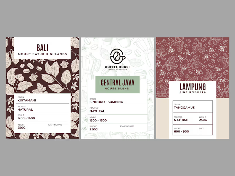
Minimalist Whole Bean Coffee Packaging & Identity
A premium design concept engineered to solve a real business challenge: standing out on crowded specialty coffee shelves. This project features a cohesive packaging system seamlessly integrated with a bespoke logo concept, designed specifically for whole bean coffee lines.
💡 The Solution-Driven Approach
- Integrated Logo: The central logo acts as a sophisticated seal of quality, anchoring the minimalist layout.
- Multi-Origin Hierarchy: Clear visual coding using distinct botanical illustrations for different origins (Bali, Central Java, Lampung) while maintaining a unified brand vibe.
- Flat Blueprint Precision: Clean typographic layout for maximum legibility of roast dates, elevation, and flavor notes.
- Free 3D Concept Preview: Realistic mockups provided completely free for visualization purposes, ensuring total clarity before printing.
🛠️ Deliverables Tailored to Your Workflow
I believe in frictionless collaboration. For this project and any future work, clients have the ultimate flexibility to choose their preferred master software based on their manufacturer's needs:
- Adobe Illustrator (.AI) for crisp vector precision.
- Adobe Photoshop (.PSD) for rich texturing.
- Canva for easy, independent text editing post-delivery.
Looking for a beautiful, shelf-ready packaging system for your product? Let’s collaborate!
1
129
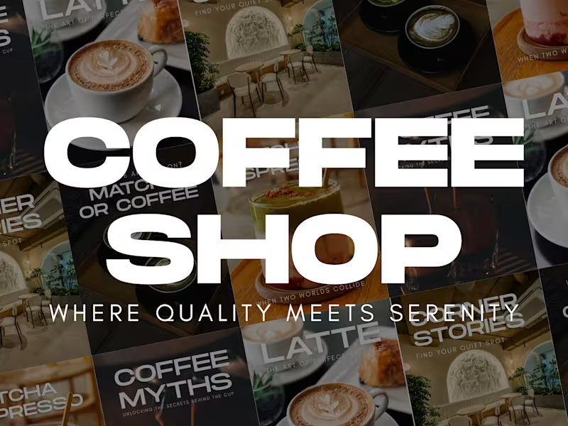
Modern Coffee Shop Instagram Grid — "The Quiet Ritual" Concept
A premium social media design solution engineered to elevate F&B brands from ordinary feeds to high-end digital experiences.
The Problem:
Many coffee shops struggle to reflect their physical premium ambiance onto their digital touchpoints, resulting in a disconnected brand image.
The Solution:
A minimalist, clean, and modern Instagram grid layout that structures content effortlessly while maintaining a luxurious aesthetic.
Design Highlights:
Aesthetic & Clean: Strategic negative space that allows product photography to breathe and stand out.
Bold Hierarchy: Contemporary heavy typography for instant readability and strong visual identity.
Premium Tone: Muted, warm earthy color palette reflecting comfort and sophistication.
Perfect for F&B brands looking to streamline content creation and instantly boost digital brand value.
0
123
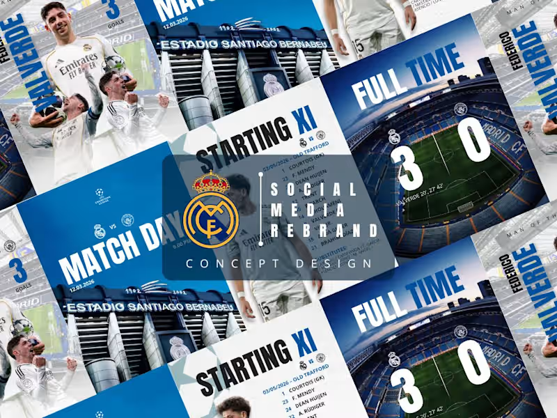
Stop posting basic updates. Your fans deserve club-standard visuals.
When fans open social media on Matchday, they should feel the raw energy of the club through their screens.
Here is my visual identity concept for Real Madrid and the Indonesia National Team, focused on creating a seamless digital ecosystem:
- High-Impact Feed: Custom player posters with advanced photo manipulation.
- Seamless Carousels & Stories: Layouts structured to deliver stats and lineups without breaking the aesthetic rhythm.
- Unified Grid UI: Fully optimized designs to make any team's profile look like a world-class brand.
Whether your team needs flexible templates in Canva or high-end layouts in Adobe Photoshop/Illustrator, I craft assets designed to dominate the feed.
I am currently open for select freelance contracts, part-time design roles, and project-based collaborations with sports brands and creative agencies. Let's work together to bring club-standard visuals to your digital space!
3
3
311

Custom Children's Book Illustrator 🎨
Custom Children's Book Illustrator 🎨


View more →