

Web Designer. Framer Expert and Partner.


Web Designer. Framer Expert and Partner.


Design partner for growth-stage B2B tech companies.

Design partner for growth-stage B2B tech companies.

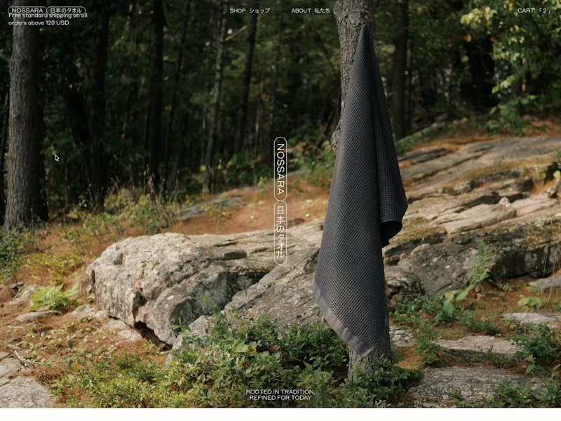
Most online stores lose sales for a dumb reason:
They turn buying into an exam.
Long forms, pop-ups, unnecessary steps, hidden buttons…
Every extra click between the visitor and "pay" is money walking out the door.
That's why I built my new template obsessed with one single metric: the conversion rate of whoever uses it.
One-click add-to-cart. Frictionless checkout. No distractions.
You don't sell more with more design. You sell more by removing obstacles.
2
9
828


Fullstack Developer & Framer Expert
Fullstack Developer & Framer Expert


Unforgettable Web & Brand Design for SaaS Products
Unforgettable Web & Brand Design for SaaS Products


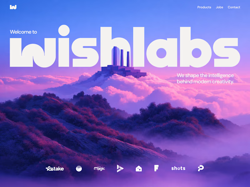

Brand & Web Designer | Gold Laus Award | Ex-FutureBrand
Brand & Web Designer | Gold Laus Award | Ex-FutureBrand
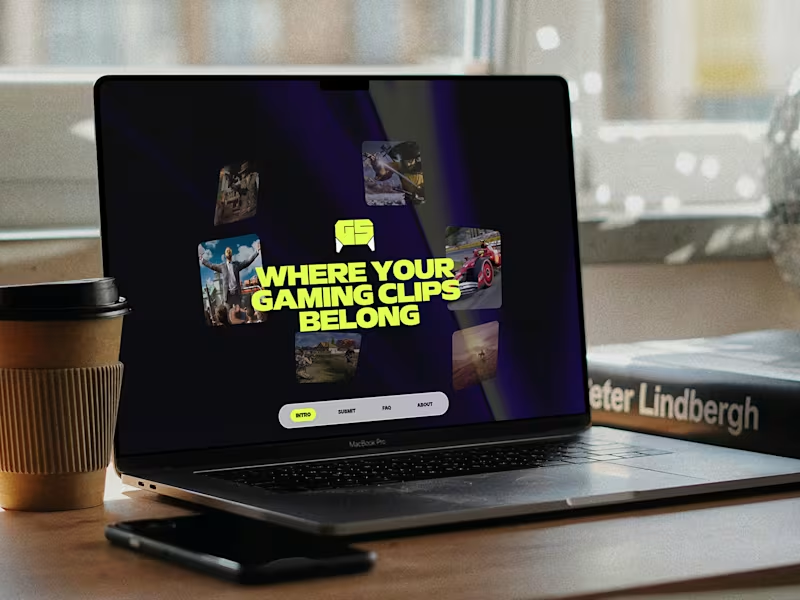




Expert Webflow Developer & Framer Designer
Expert Webflow Developer & Framer Designer


Brand & Product Design ✍️
Brand & Product Design ✍️


UX Designer & No Code Developer


