
Full-Stack AI Architect | Rapid MVPs & Production-Ready Apps
- 12
- Followers
Full-Stack AI Architect | Rapid MVPs & Production-Ready Apps


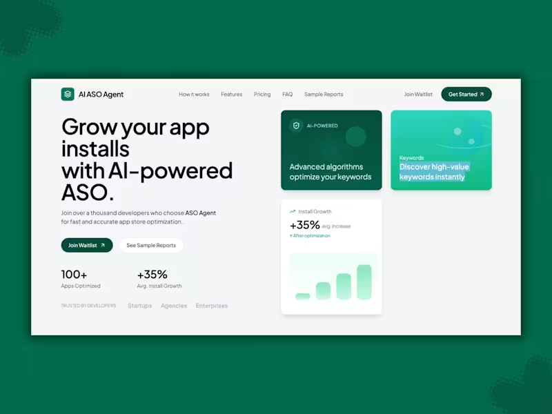


Product Designer specializing in AI tools that balance intel
Product Designer specializing in AI tools that balance intel


View more →

Product Designer • SaaS & Mobile Apps

Color contrast isn’t enough on its own, so I’m trying out textures as a second cue to improve accessibility.
What are the best practices for using patterns to support users who can’t rely on color alone without making the chart feel busy or distracting?
2
18
281

A community-powered app built on trust.
Many immigrants in the U.S. regularly send care packages home, medicine, comfort foods, and small reminders of love. But shipping is slow, expensive, and often unreliable.
My client saw families struggling with this and imagined a simpler path: travelers already fly with unused luggage space…
What if that space could help someone send something meaningful home, while the traveler earns money in return?
This vision shaped our UX approach:
• Reduced friction by standardizing luggage sizes, fixed pricing, and simple packing rules.
• Strengthened trust through ID verification, clear policies, and plain-language guidelines.
• Empowered users with easy reporting tools and transparent expectations that keep the community safe.
21
337

Several designers had contributed to the product over time, each building on the previous work, which naturally created some inconsistencies and gaps.
And my role was to bring everything together, aligning, filling missing states, removing redundancy, and providing clear annotations to support the dev team.
Problem
People want to turn their closet into cash, but selling is tedious. Writing descriptions, comparing prices, and managing multiple listings takes more time than it’s worth, so great pieces end up sitting in the closet.
Solution
CNTRL removes the friction. Users snap a photo or search the item, and AI creates the description, shows pricing trends, and recommends the best platforms. The app cross-posts automatically and delists everywhere once the item sells, helping users make money faster with far less effort.
4
28
409

Hi fellow designers 👋
Sharing one of my favorite MVPs I designed with an amazing client and team.
ChartSync: Patient-Owned Medical Records
Problem: When patients switch insurance or move states, their medical history often gets lost, leading to endless PDF searches, duplicate tests, and having to retell their story because their records are scattered everywhere.
Solution: We designed a mobile app that lets patients capture files, medications, vitals, and auto-organize their records, and instantly send or receive medical files via QR code with any practitioners without downloading the app.
Now in Beta:
https://play.google.com/store/apps/details?id=com.chartsync.chartsync&hl=en_US
Open to any design or case-study showcase tips from this community. ✨
2
20
330

Branding specialist, copywriter, and designer on retainer
New to Contra
Branding specialist, copywriter, and designer on retainer
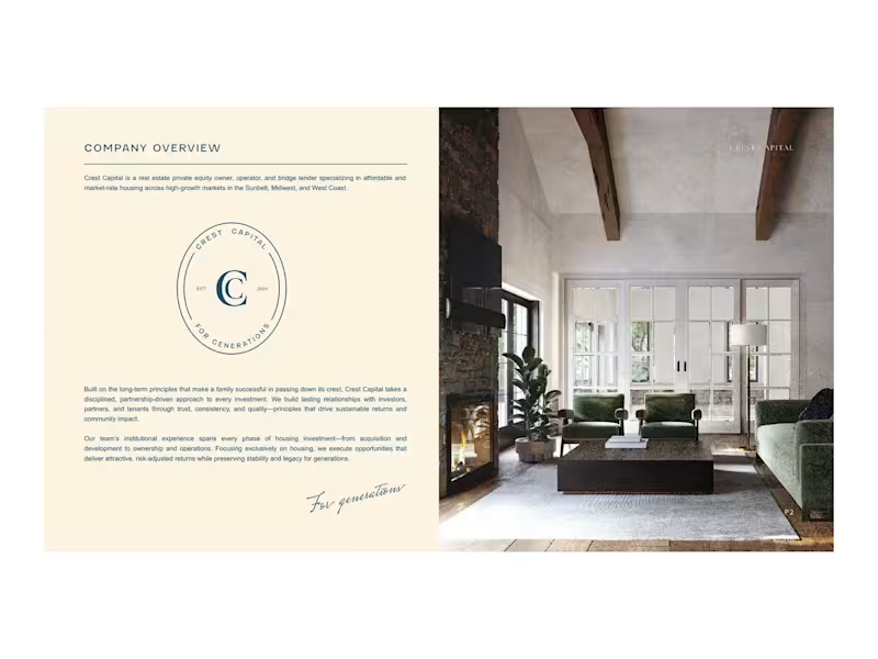
Investor decks designed to impress and written to persuade. Your team brings the numbers and the substance; I make it clear and beautiful, turning complex financials into a story that's easy to follow. Shown with sample content to protect client confidentiality.
0
95
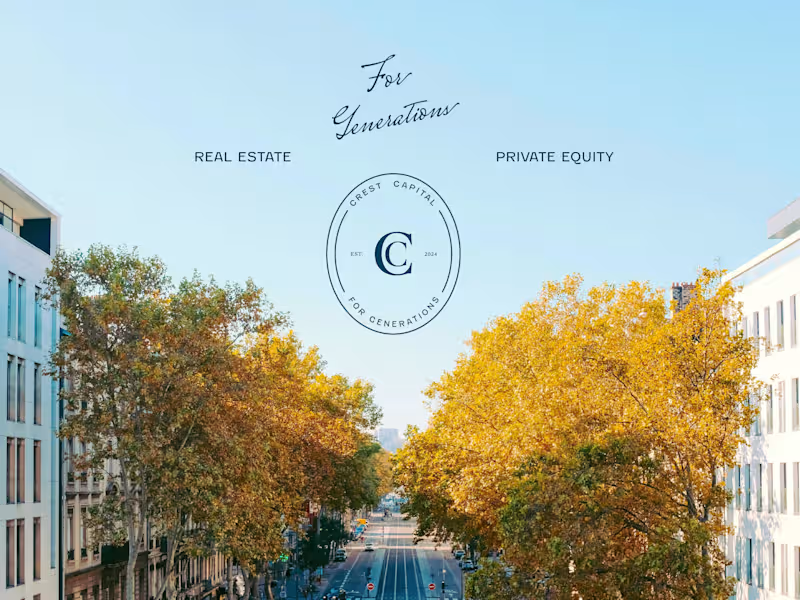
A new real estate private equity firm needed a full brand identity. I named Crest Capital and built the brand around a family crest passed down through generations, which shaped everything from the logo and the tagline "For Generations" to the website (https://www.crestcapitalre.com) and investor decks. I was Crest's creative partner from its founding to ~$250M in assets under management, helping the firm establish an institutional presence.
0
92
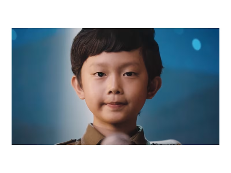
Humane Society International Vietnam needed a one-minute film to help reduce demand for rhino horn. I wrote and co-produced the PSA, which played on every Vietnam Airlines flight for four years.
1
1
65
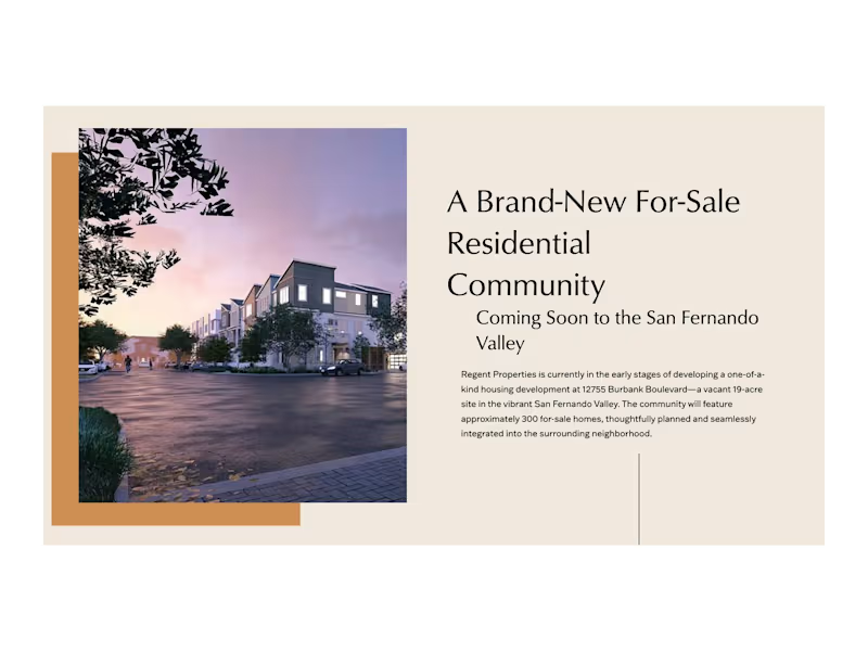
A 303-home community in the San Fernando Valley needed to share its plans with its future neighbors. For Regent Properties, I helped shape a warm, welcoming website (https://www.12755burbankblvd.com/) that introduces the project: I planned the structure, wrote the copy, and selected the imagery, then coordinated the external agency that built it.
0
36

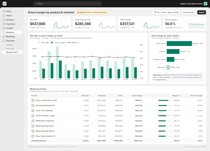
Dashboards and spreadsheet cleanup for small businesses
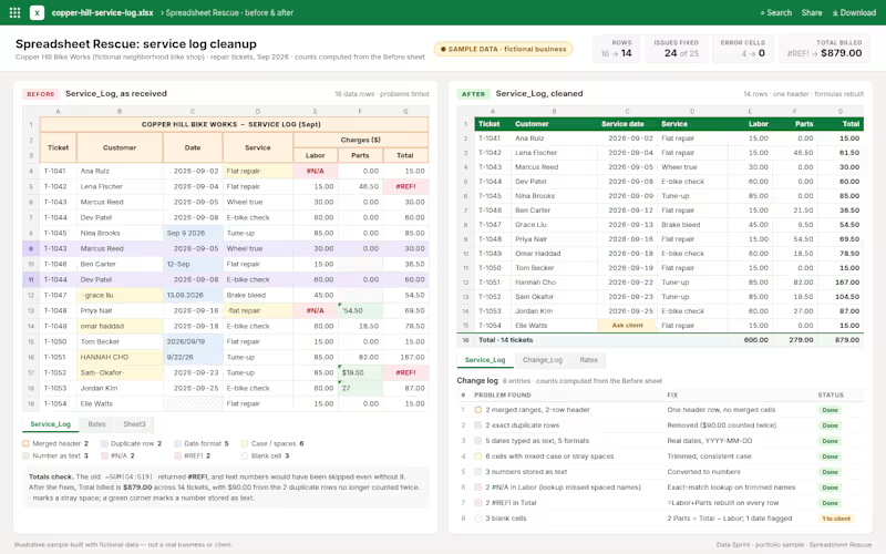
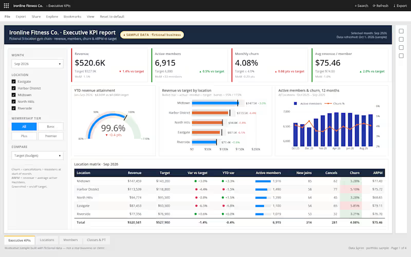
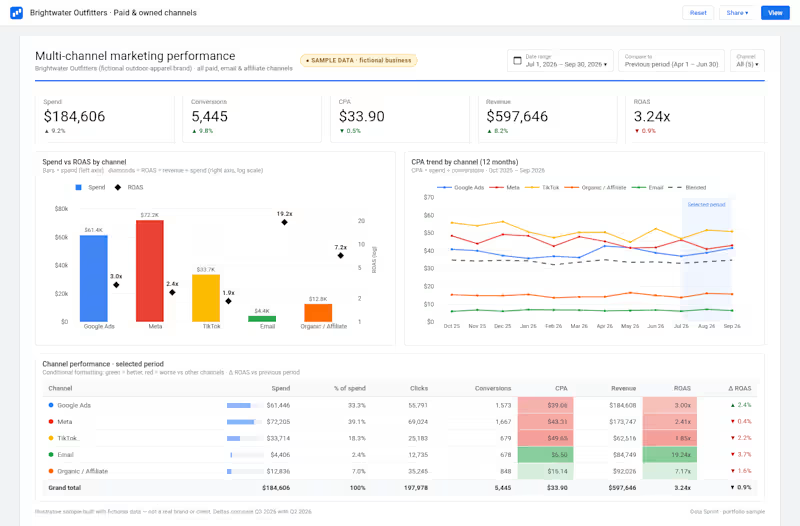

working through spatial narrative and playful stories
- $1k+
- Earned
- 4
- Followers
working through spatial narrative and playful stories

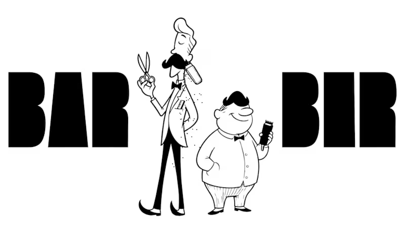
BAR & BER, Branding for a Local Barber Shop
I created a barber shop landing page where the UI itself becomes the product.
Starting from the idea of creating a duo—Bar and Ber—using iconic references, I used Fuser’s image tools to develop playful barber characters. With the Compositor Node, I shaped the overall visual theme, built the brand identity, and created graphic T-shirt mockups.
For the interaction, I used GPT to refine prompts for the Claude Coding Node, then implemented everything through the Creative Code Node. Using Three.js, I built a pixel-based particle system to simulate falling hair fragments.
In this system, users can shave the interface in real time—playing with the surface and revealing hidden messages underneath.
The whole point was to transform a static brand into something fun and interactive.
LINK : https://app.fuser.studio/view/ef8561fd-f3e1-4c54-9ff4-99148a2bda08
#fusercocreate @fuserstudio @contra
1
394


Unlocking Insights with Data
Unlocking Insights with Data

View more →

Data consultant with 10 years in SQL, BI, and storytelling
Data consultant with 10 years in SQL, BI, and storytelling


View more →