Results that are similar to your search
Similar results

Graphic Designer | Packaging Design | Amazon Listing Images
- 5.0
- Rating
- 6
- Followers
Graphic Designer | Packaging Design | Amazon Listing Images



Print-Ready Packaging Designer | Skincare, Food, Supplement
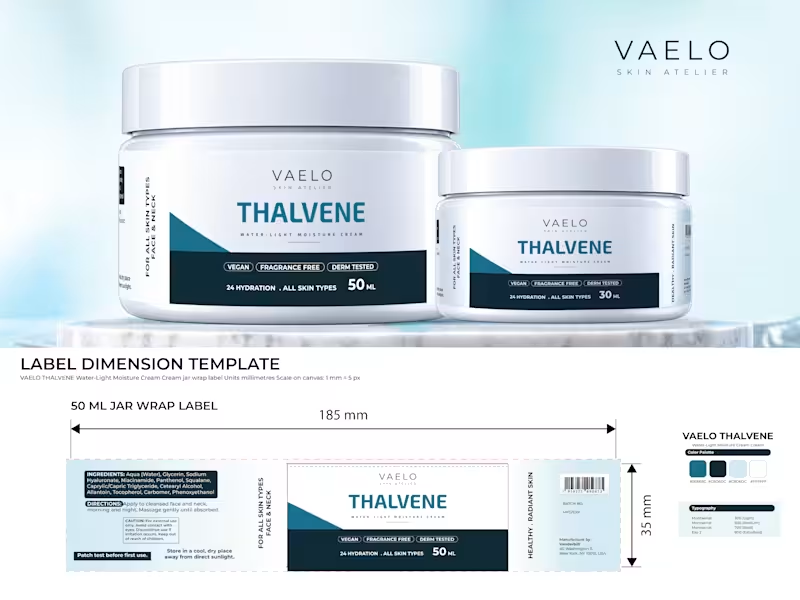
A client once sent me a dieline with the wrong measurements. I finished the design and sent it, and the printer returned the file. I fixed it and sent it again. Since then, I check the dieline before I start.
After 8 years of designing packaging and labels, I made THALVENE, a skincare jar and label concept, to show how I work: 50 ml and 30 ml jars, a lid label, a back label, and print-ready files with bleed and safe margins.
Has a printer ever sent your label file back? If you own a skincare or private label brand in the US or Europe and sell in online stores or on your own site, see the full case study (https://www.behance.net/gallery/258204397/Skincare-Jar-and-Label-Design-for-a-Moisturizing-Cream) in the first comment.
#SkincarePackaging #PrivateLabel #LabelDesign
1
2
180
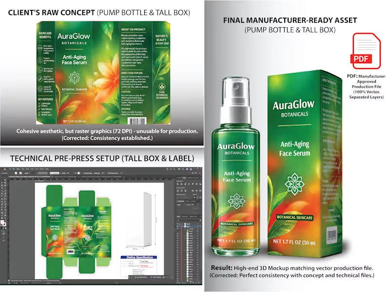
Selling skincare on Amazon with an AI-generated package design? Read this before you order your boxes.
A skincare brand came to me with a great-looking AI concept for a serum bottle and box. But it was a low-resolution image with messy text, no delineation, and no CMYK colors. Printed as-is, it would have looked blurry, and a blurry box is hard to trust when shoppers can’t touch the product.
Here’s how I fixed it:
Rebuilt the artwork as clean, print-ready vector files
Built a custom dieline with 3 mm bleed
Replaced the messy text with clear directions, caution notes, net content, and a barcode.
Converted RGB to CMYK for accurate print colors
Created 3D mockups for the Amazon listing images
One design, ready for both your printer and your product page.
Private label seller with an AI design? Send it over and I’ll make it print-ready.
👉 The full case study (https://www.behance.net/gallery/257972045/AI-to-Print-Packaging-Design-Print-Ready-Vector-Files) is available in the comments; visit now to explore Behance's portfolio (https://www.behance.net/tania4328) and see how this service delivers ROI and premium shelf appeal!
#PrivateLabel #SkincarePackaging #PackagingDesign #PrintReady
1
1
209
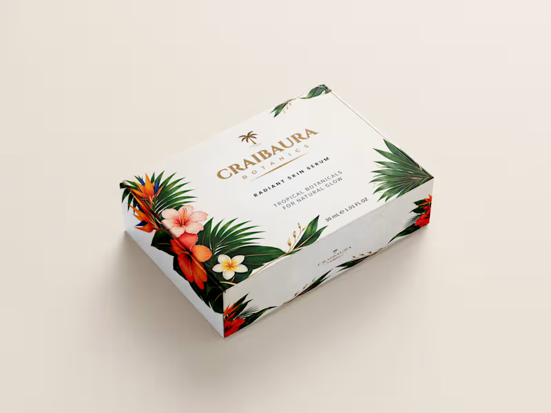
Are you a US or EU skincare or DTC brand founder tired of packaging files failing at the print press?
I engineer 100% print-ready mailer boxes, product labels, and structural dielines (such as 220x150x60 mm E-Flute boards) with exact CMYK color profiles and matte lamination specs.
Stop risking thousands in manufacturing losses and secure production-ready files that pass factory checks on day one.
Hire me (https://www.behance.net/gallery/257866147/Skincare-Mailer-Box-Design-Structural-Dieline) remotely on Contra (https://contra.com/s/vPEmlLrQ-print-ready-packaging-design-custom-dieline-and-3-d-mockups?r=visiolancestudio)for zero-defect packaging design!
1
1
261
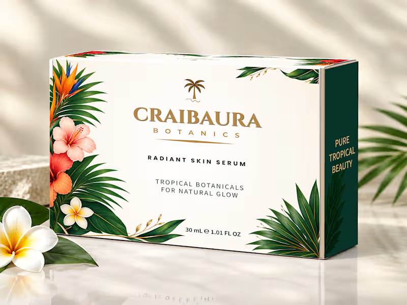
Print-Ready Skincare Mailer Box & Structural Dieline Design
One 2 mm dieline error or wrong color profile can ruin a $10,000 packaging print run. Pretty visuals mean nothing if your files fail at the press.
Problem & Solution:
US and EU skincare founders hiring a remote packaging designer need press-ready precision. For Craibaura Botanics Radiant Skin Serum (30 mL / 1.01 FL OZ), I engineered a custom mailer box system for zero-defect global production.
Technical Image Breakdown:
Hero 3D Presentation: Styled view with US/EU dual net-weight formatting that builds instant DTC buyer trust.
Prepress Artwork Sheet: Full dieline layout with the EU e-mark, bleed zones, and exact CMYK ink values ready for press approval.
Open Box Interior: The double-sided layout accounts for 3 mm board folding so the dark green interior and flaps align without ink cracking.
3D Exterior Mockup: Calibrated CMYK color profiles for matte lamination ensure tropical botanicals print cleanly without muddy shifts.
Top-View Layout: Clean top-panel view of the Craibaura Botanics logo on isolated vector layers for accurate Spot UV or foil plate creation.
Structural Dieline: Drawn at 100% scale (220x150x60 mm) for a 3 mm E-flute board with exact cut lines, fold lines, and glue areas to prevent machine jamming.
Available for remote projects; hire me on Contra for packaging files that pass prepress checks on day one.
0
112

Graphic & Brand Designer | Logos, Packaging & Marketing
New to Contra
Graphic & Brand Designer | Logos, Packaging & Marketing
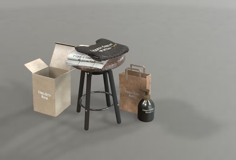
Warrior Fitness – Merchandise & Packaging Design
A premium merchandise and packaging collection created for the Warrior Fitness brand, designed to deliver a consistent and recognizable brand experience across physical touchpoints. This project includes branded fitness towels, retail packaging, shopping bags, and promotional products, all developed with a clean, modern, and performance-driven aesthetic.
The focus was on creating a cohesive visual identity that reflects the brand's strength, professionalism, and attention to detail. Realistic 3D mockups were used to demonstrate how the branding translates into real-world applications, ensuring a polished and engaging presentation.
Adobe Illustrator, Adobe Photoshop, Blender, Adobe Dimension
0
273


The Warrior Fitness Hand Cream is a branded skincare concept designed as an extension of the Warrior identity. Created for active individuals, it combines functionality with a bold visual aesthetic, representing care, discipline, and performance beyond the gym. The design focuses on turning an everyday essential into a cohesive part of a fitness lifestyle brand.
2
5
340


Expert Packaging and Logo Designer, Illustrator
Expert Packaging and Logo Designer, Illustrator


UI/UX | Product | Communication | Brand Designer
UI/UX | Product | Communication | Brand Designer


Brand designer
Brand designer
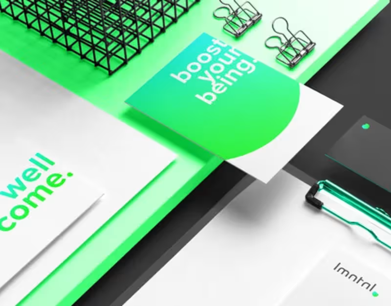
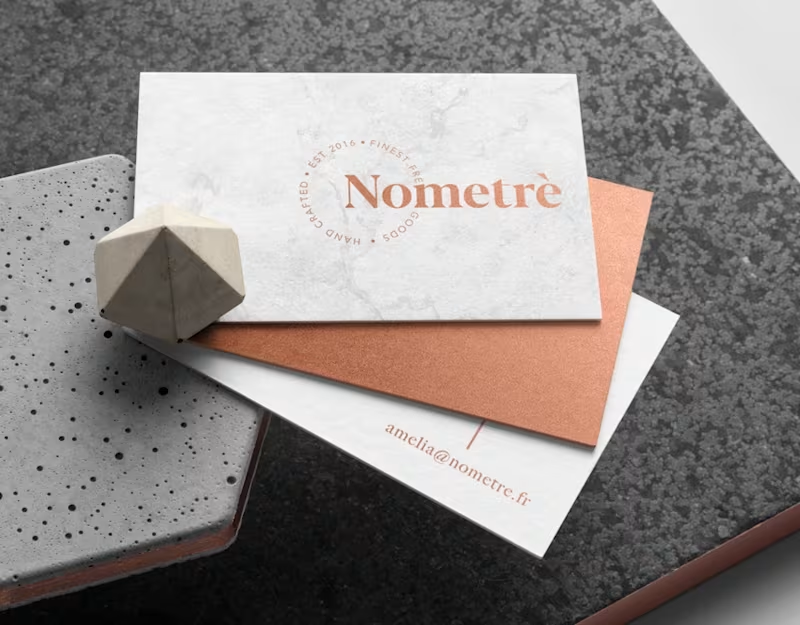


Crafting Visual Solutions for Companies Worldwide.
Crafting Visual Solutions for Companies Worldwide.


Art director / Brand Designer
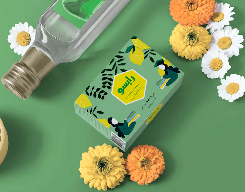
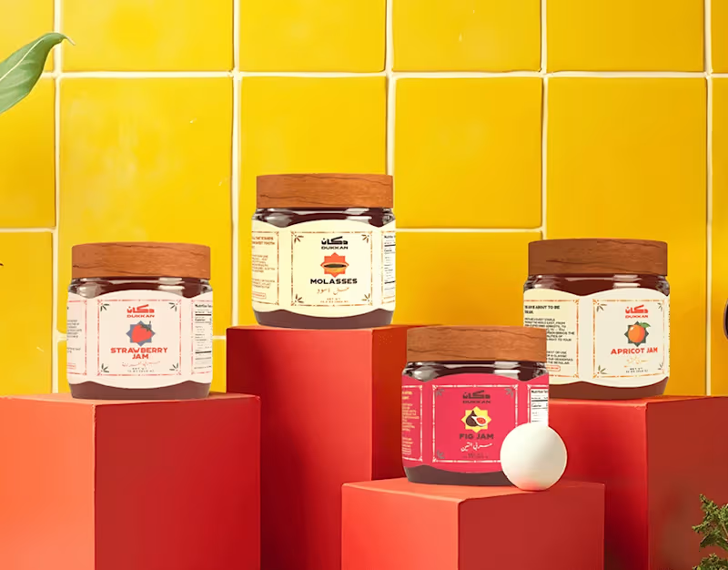
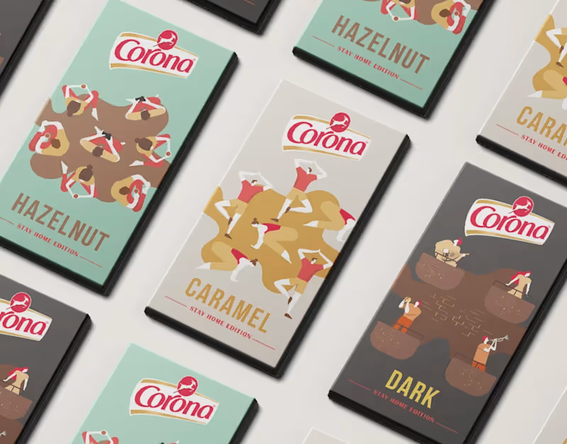
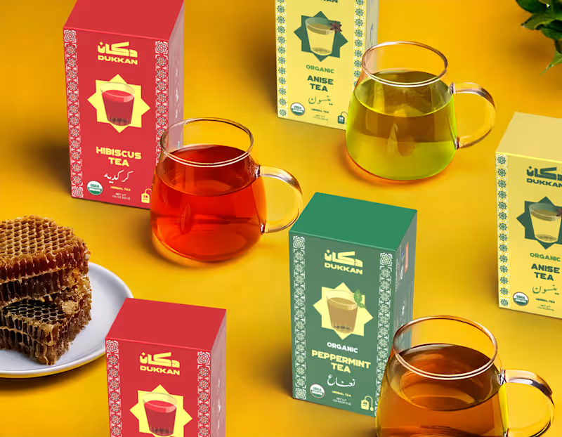
Dukkan Branding & Packaging
Dukkan is an online brand based in New York that aspires to be the ultimate destination for lovers of Arabic cuisine, bringing the essence of the Middle Eastern market ('Dukkan') experience to the heart of a bustling metropolis. We wanted every element of Dukkan's brand to feel like an authentic invitation to step into a place that resonates with the warmth and richness of home, reflecting our culture and culinary heritage. Dukkan is more than just a shop—it's a neighborhood institution, the cornerstone of the community. From quick stops for spices to late-night snack runs, the dukkan has always been there, bridging tradition and convenience. With this project, we aim to bring the authentic spirit of the Arab dukkan to a global audience.
Inspired by the rich patterns and ornaments found in Middle Eastern culture, the design language combines vibrant geometric shapes and intricate details to evoke a sense of warmth, history, and familiarity. These elements create a visual connection to the local culture while celebrating the essence of community, which has always been central to the dukkan.
The overall aesthetic is playful and retro, drawing inspiration from vintage decorations and signage in Egypt. This nod to the past is not just a design choice but a way of celebrating the long-standing tradition of the dukkan. By incorporating nostalgic elements, we aim to create a sense of belonging for both local customers and those experiencing the dukkan for the first time.
Through this project, we are not only introducing quality products but also continuing the legacy of community building that the dukkan represents. Whether you're looking for daily essentials or a taste of home, Dukkan is here to deliver that timeless neighborhood experience.
Challenges
With New York's crowded brand landscape, standing out required a deep cultural connection and vibrant identity to catch the eye amidst the competition. Our design solution was to blend authenticity with visual boldness, showcasing Arabic culture in a way that feels both familiar and distinctive.
Design Solution
For Dukkan's visual language, we chose Kufi script for its bold, traditional form that commands attention on supermarket shelves. The typography is balanced by vibrant colors to draw in the viewer, and complemented by patterns inspired by traditional Arabic art, adding layers of cultural depth and familiarity. Additionally, we utilized a Farsi-inspired Arabic script for a refined accent, and paired it with a clear, bold English font for easy readability.
Impact
The result is a brand that feels rooted and dynamic, where every touchpoint—from packaging to digital presence—invites audiences to experience Arabic culture firsthand, as if they're stepping into a familiar space filled with authentic flavors and stories.
0
82