GoodCBD Shop - Premium Hemp Flower
Martynas Vežbickas
GOODCBD SHOP
PREMIUM HEMP FLOWER
INTRODUCTION: CBD products are becoming increasingly popular throughout the entire world, as they have been proven to provide numerous health benefits, energizing, relaxing and stress relieving effects. In the fall of 2019, Good CBD Shop, manufacturer of exceptional quality CBD products, has introduced a new line of Premium Hemp Flower CBD and CBG Strains.
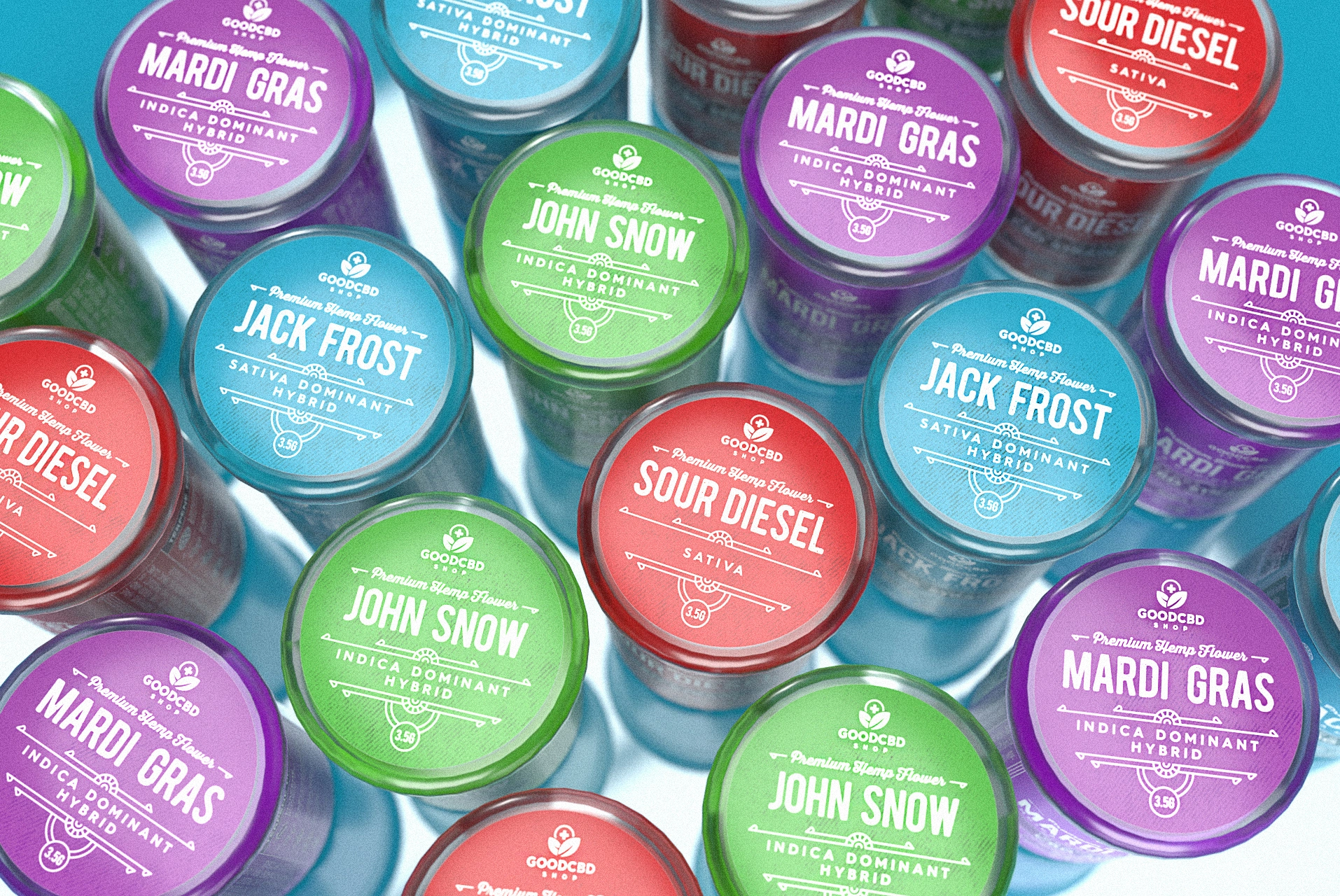
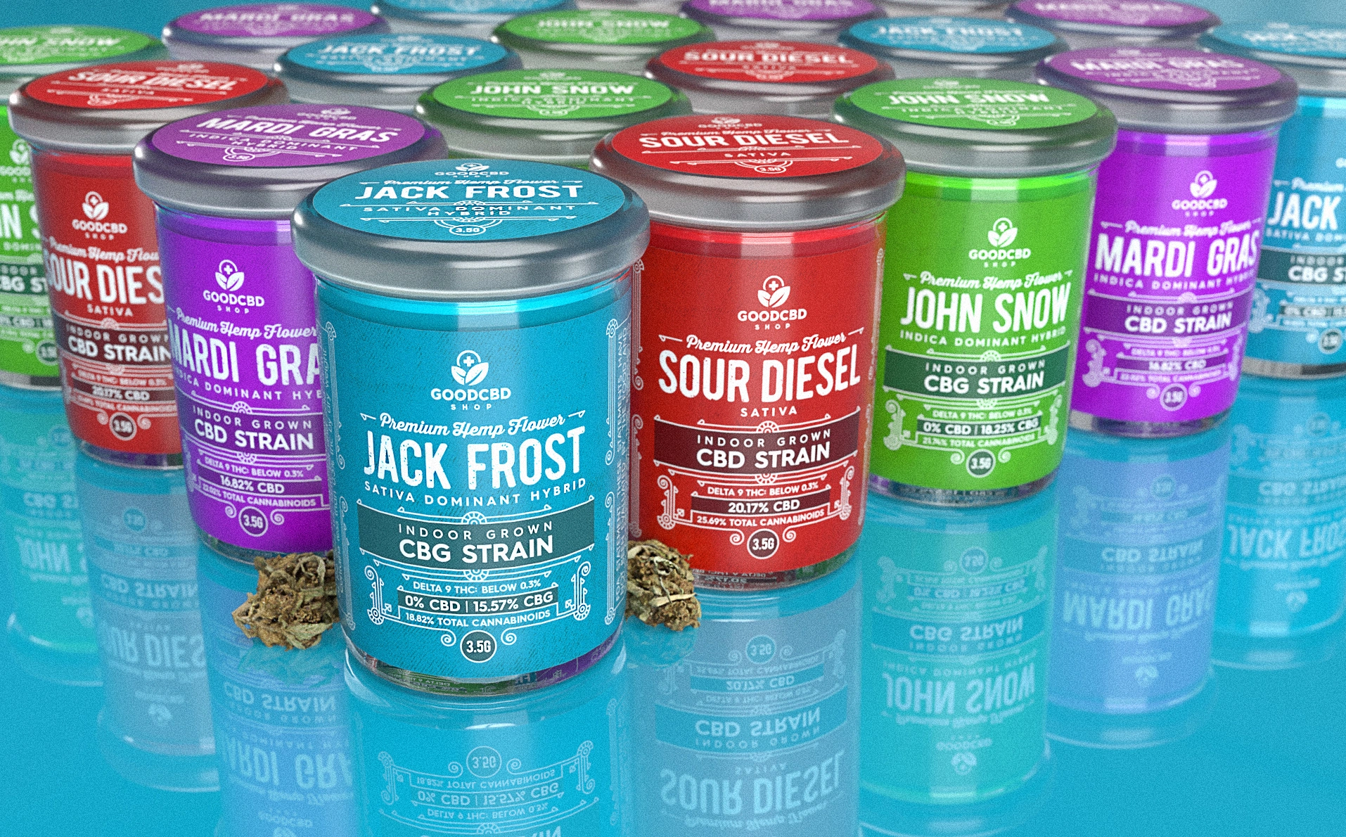
TASK: The line consists of four products with different flavor notes: Mardi Gras (plushberry and sweet berry punch), Sour Diesel (energizing orange), Jack Frost (sweet citrus with woody notes) and John Snow (strong diesel scent with earthy citrus undertones). We sought to develop a powerful and convincing packaging design, clearly representing the premium nature of the products, and revealing the essence of each individual flavor note at the same time.
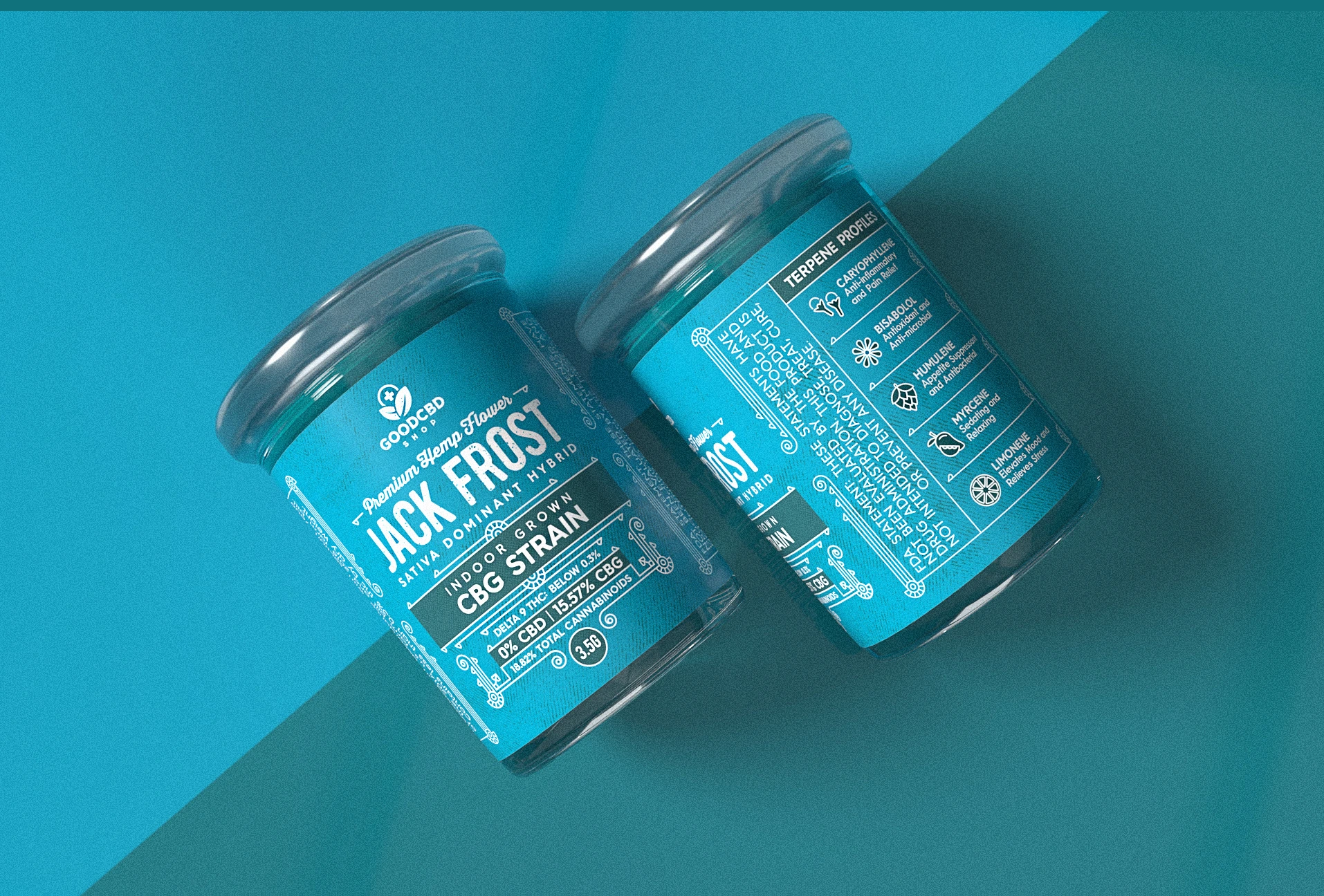
SOLUTION: When it comes to the selection of the package itself, in order to create an upscale and premium vibe, we went for the glass jars. The selection of bright colors (purple, green, blue and red) for the background of the labels, makes the products truly pop out from the shelves and instantly grab everyone’s attention. A subtle label design, with all the spotlight dedicated to the selection of fonts, patterns and minimalistic background details – this is what we have been aiming for. It’s been a nice journey to go through!
FEATURED ON:
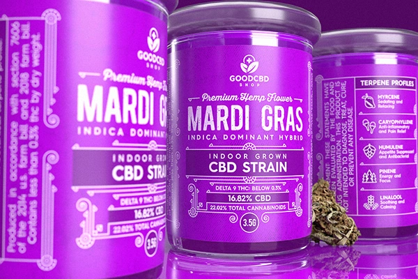
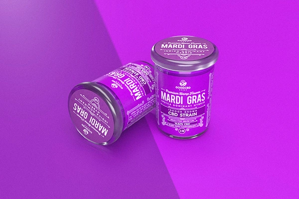
MARDI GRAS
A cross between plushberry and mystery genetics, Mardi Gras gets its robust aroma of sweet berries and earthy undertones from its plushberry parent. This strain packs a punch while offering a strong body buzz. Get your beads and king cakes ready to celebrate all year round with this indica dominant hybrid. Whether the party is over or still going, Mardi Gras is a great companion.
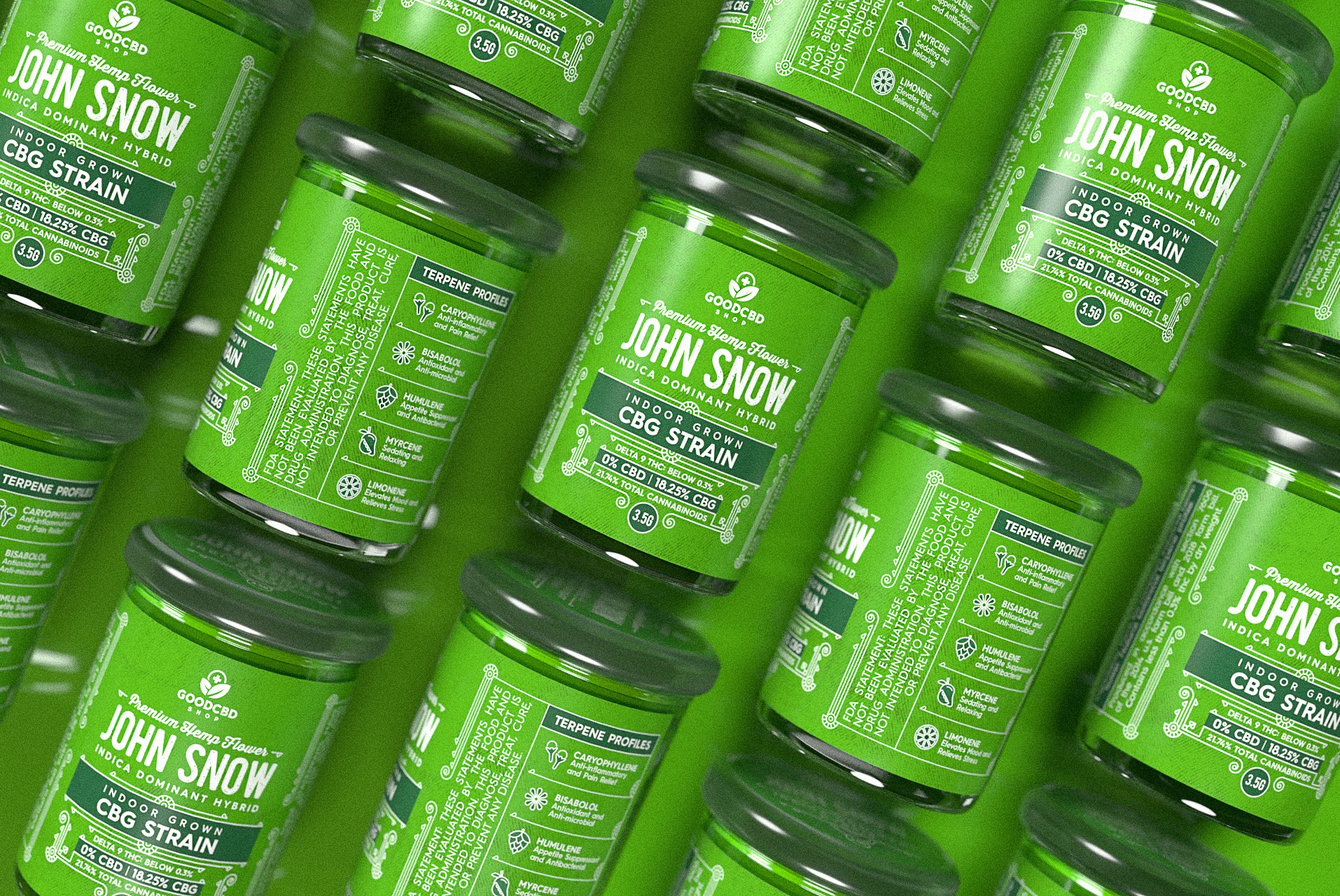
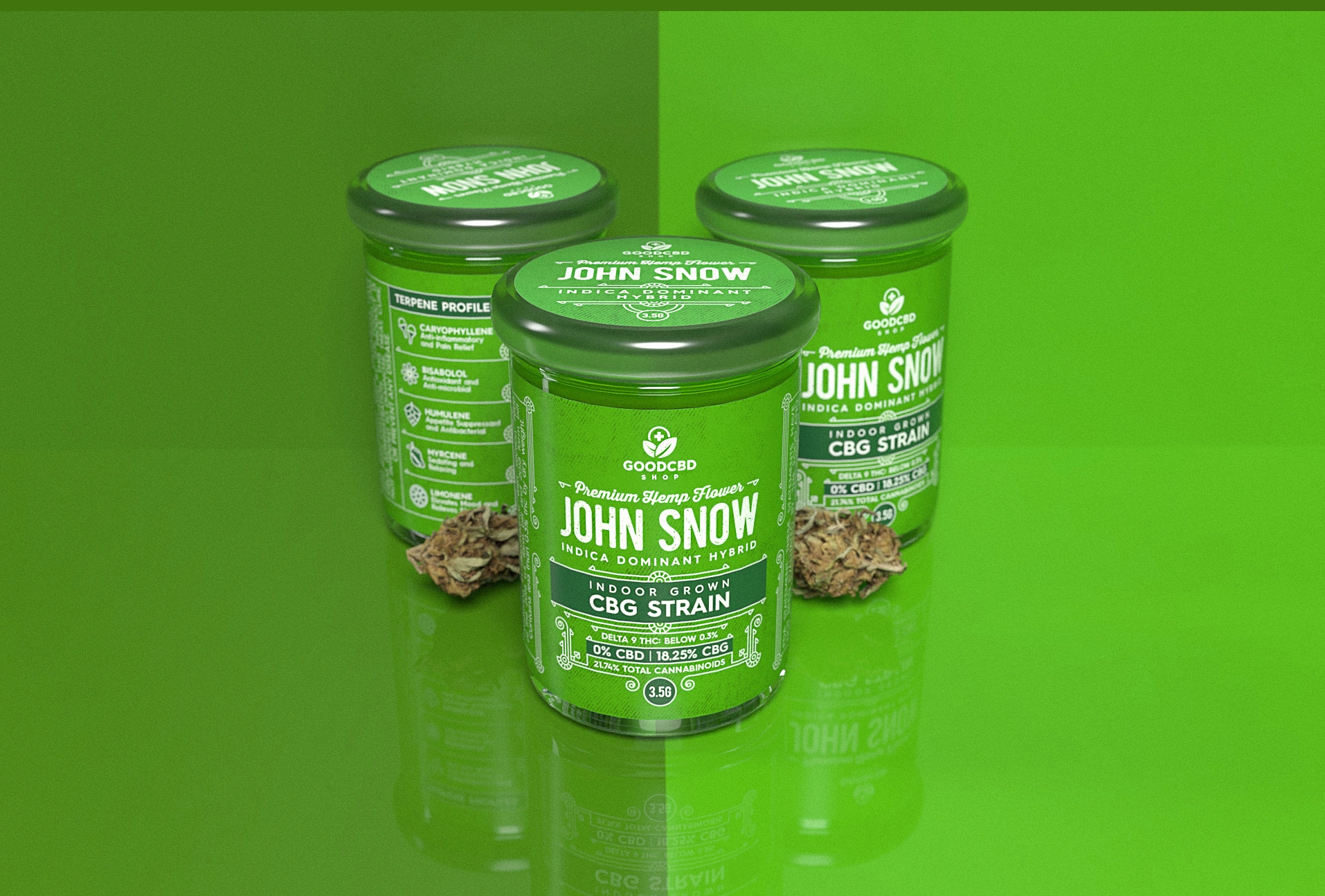
JOHN SNOW
This indica dominant strain packs a strong diesel scent combined with earthy citrus undertones. John Snow originates from its parent strains Jack the Ripper and Philly Sour Diesel. A rush of cerebral effects that launch their way through your brain, smashing any negative or racing thoughts and leaving you with a tingly sense of motivation and creativity.
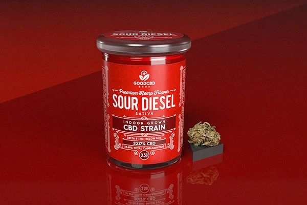
SOUR DIESEL
Sour Diesel, sometimes called Sour D, is an invigorating Sativa-dominant strain named after its pungent, diesel-like aroma with hints of orange. This fast-acting strain delivers energizing, dreamy cerebral effects that have pushed Sour Diesel to its legendary status. Stress, pain, and depression fade away in long-lasting relief that makes Sour Diesel a top choice for a morning pick me up. This strain took root in the early ’90s, and it is believed to have descended from Chemdawg 91 and Super Skunk.
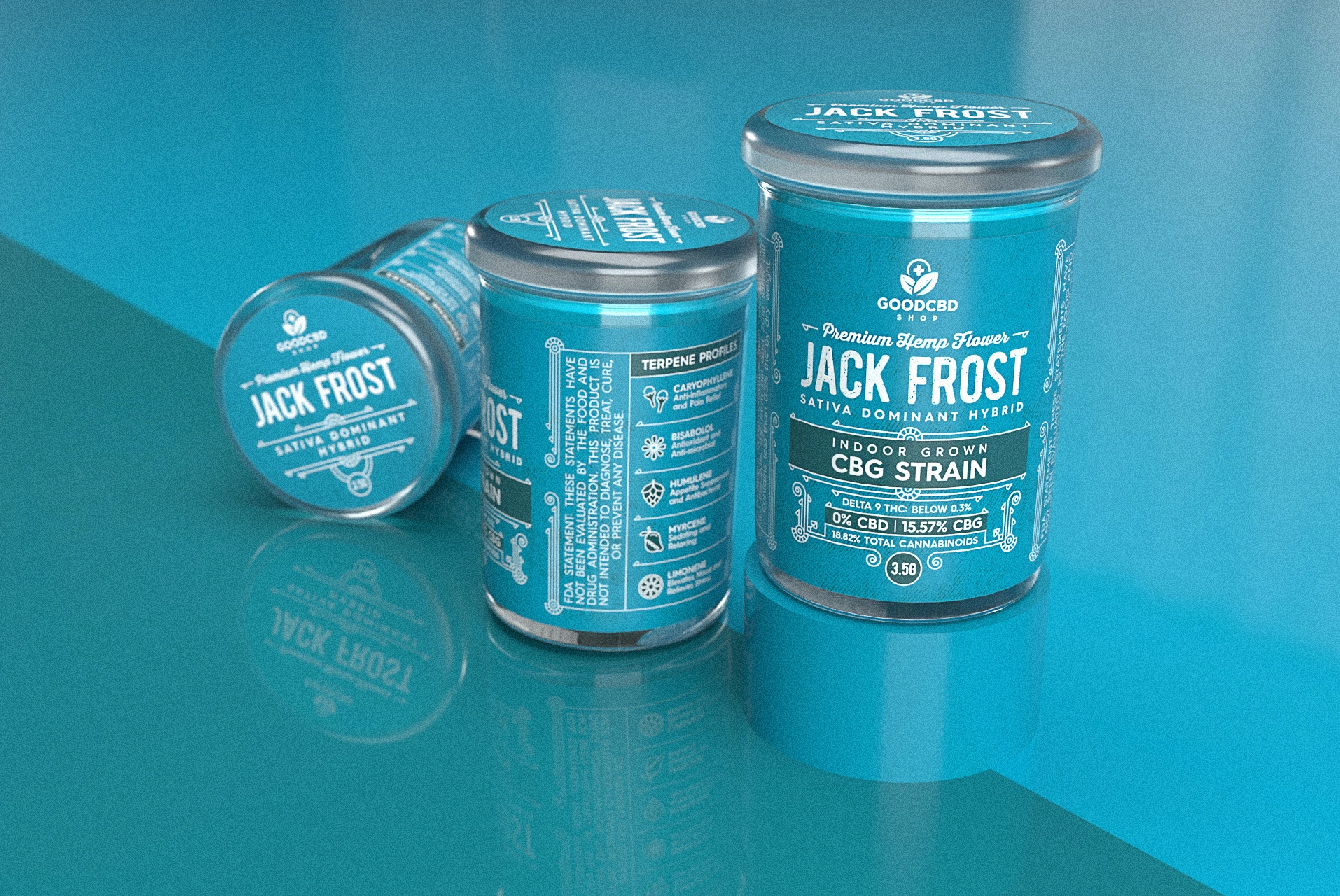
JACK FROST
Jack Frost was developed over 5 years of persistence. Initially with a lineage from the classic Jack Herer sativa strain, along with White Widow hybrid and Northern Lights #5 indica. Jack Frost is a sativa dominant hybrid with a sweet citrus and woody taste making this strain great for users looking for uplifting euphoria or help with pain and anxiety. Breathe in and taste fresh alpine air of mountains and forests with trace amounts of mint, sage, and other herbs lingering on the exhale.
THANK YOU FOR SCROLLING
Client: GoodCBD Shop (Atlanta, USA)
CEO/Project Coordinator: Todd Gano
Product Copy: Shelby Simpson
Graphic Designer: Martynas Vezbickas
Copywriter/Wife/Friend: Neringa Klevaite Vezbickiene
Craft Mark Studio 2019, Lithuania
Like this project
Posted Apr 25, 2025
CBD products are becoming increasingly popular throughout the entire world, as they have been proven to provide numerous health benefits.