
A creative soul shaping visual identities with passion.
- 5.0
- Rating
- 3
- Followers
A creative soul shaping visual identities with passion.


Inner Matter is a premium spa focused on providing treatments that reconnect body and mind.
The objective for the project was to express calmness and luxury with the brand elements in a very simple way. Hence, I created a simple and functional logo accompanied by suitable colours, typography, pattern and imagery.
Altogether, the brand elements come together to give a calm and premium impression of the brand.
0
191


Creative Graphic & Brand Designer | Video Editor
Creative Graphic & Brand Designer | Video Editor

A logo is not just a design — it’s your brand’s first impression.A logo is not just a design — it’s your brand’s first impression.
Today’s concept: BIG SHOW LTD
Strong typography. Balanced spacing. Premium color combinations.
Because a serious brand deserves a serious identity.
Whether you’re launching a startup, event brand, media company, or corporate business — your logo should:
✔ Be simple enough to recognize in 3 seconds
✔ Work in black & white
✔ Look clean on social media, print, and billboard
✔ Reflect your brand personality
Great logos aren’t complicated.
They’re intentional.
If your brand still doesn’t have a professional identity, this is your sign.
Let’s build something powerful. 💼✨
📩 Available for logo and brand identity design
DM me to get started
1
3
85

Here’s a strong, real advice for you as a graphic designer:
Stop designing for other designers. Start designing for results.
Many designers focus too much on trends, effects, and “making it look cool.”
But clients don’t pay for cool — they pay for clarity, sales, and impact.
If a flyer looks beautiful but doesn’t communicate the offer in 3 seconds, it has failed.
Here are 7 solid rules to level up:
Understand the goal first.
Ask: Is this design to sell? inform? attract? build trust?
Hierarchy is everything.
Headline → Subheadline → Details → Call to action.
If everything is bold, nothing is important.
Master typography.
80% of good design is good type.
Use 2–3 fonts max. Control spacing like a pro.
White space is not empty space.
It’s breathing space. It makes your design premium.
Learn
0
66

Graphic design is not just how it looks — it’s how a message feels, speaks, and stays remembered.
0
61

Logo design is the process of creating a unique visual symbol that represents a brand’s identity, values, and personality. A well-designed logo helps a business stand out, builds trust, and creates instant recognition across all platforms—online and offline. A strong logo combines typography, color, and imagery to communicate a clear message in a simple and memorable way. It should be versatile, scalable, and timeless, working perfectly on websites, social media, packaging, and print materials. Professional logo design goes beyond aesthetics—it tells a story, connects with the target audience, and forms the foundation of a brand’s visual identity.
0
43

Kajabi & WordPress Expert | Website Design, Online Courses
- $1k+
- Earned
- 1x
- Hired
- 4.9
- Rating
- 114
- Followers
Kajabi & WordPress Expert | Website Design, Online Courses

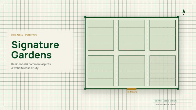
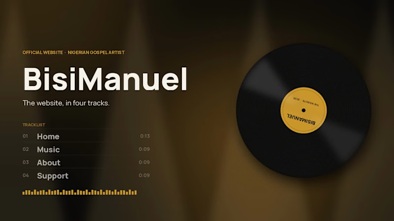
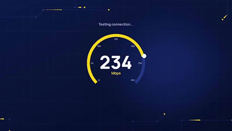

Framer, Kajabi & Figma Designer | Web Developer
- 5.0
- Rating
- 148
- Followers
Framer, Kajabi & Figma Designer | Web Developer

Designed a modern, conversion-focused website for SunkySolutions, a creative web design agency helping businesses establish a professional online presence. The project focused on creating a clean user experience, building trust through strategic content placement, and guiding visitors toward project inquiries.
About the Project
SunkySolutions needed a modern website that would communicate professionalism, showcase its portfolio, and convert visitors into potential clients.
The goal was to balance aesthetics with usability while creating a scalable design system that could grow alongside the business.
The final interface combines clean layouts, bold typography, strategic white space, and strong calls to action to create a seamless browsing experience.
Outcome
The final design presents SunkySolutions as a modern and trustworthy creative agency. By combining thoughtful user experience, strong visual hierarchy, and conversion-focused design, the website effectively communicates the company's services while making it easy for potential clients to explore the portfolio and get in touch.
4
7
577

What if booking pet care felt as comforting as leaving your pet with someone you trust?
That's the feeling I wanted to create with this pet care website concept.
I explored a warm, modern visual direction that combines playful personality with a clear and intuitive user experience—helping pet owners quickly understand the services, connect with the business, and feel confident about their choice.
Soft visuals. Clear messaging. Friendly interactions.
Because great web design isn't just about making a business look good. It's about making people feel something.
🐾 Designed with care. Built for connection.
3
8
588

Making financial services feel simple.
A modern financial services website designed in Figma and brought to life in Framer.
The focus: clear communication, strong visual hierarchy, intuitive navigation, and a digital experience that builds trust from the first interaction.
Designed for clarity. Built for confidence.
What do you think of the direction? 👀
1
5
467
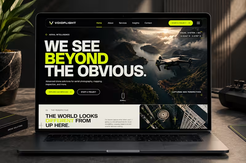
VOIDFLIGHT is a conceptual digital experience for a forward-thinking drone technology brand specializing in aerial cinematography, surveying and mapping, industrial inspections, construction monitoring, and property media.
The goal was to create a distinctive website that communicates precision, innovation, and technical expertise while moving beyond the conventional look of corporate technology websites.
Designed in Framer, the website combines bold typography, cinematic aerial imagery, a high-contrast visual system, and an unconventional editorial layout to create a digital presence that feels as ambitious as the technology behind the brand.
1
5
151

UI/UX & Product Designer | Web Design & Framer

Just wrapped up a real estate landing page concept focused on clarity trust and conversion.
The goal was simple make it easy for users to browse properties speak with advisors schedule inspections and complete transactions with confidence.
This design prioritizes clean navigation mobile first UX and clear call to actions because real estate decisions should feel seamless not stressful.
I would love your feedback
What do you think matters most on a real estate landing page visual appeal or ease of use
#UIUXDesign #RealEstateDesign #LandingPageDesign #ProductDesign #UXUI #WebDesign
0
131
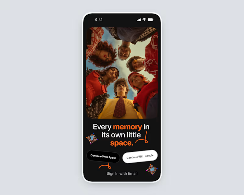
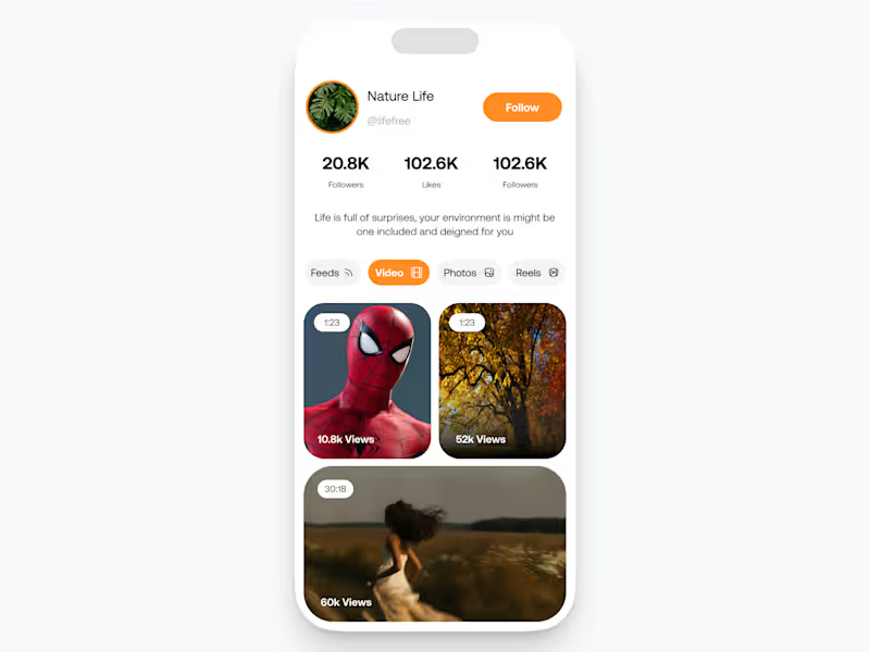
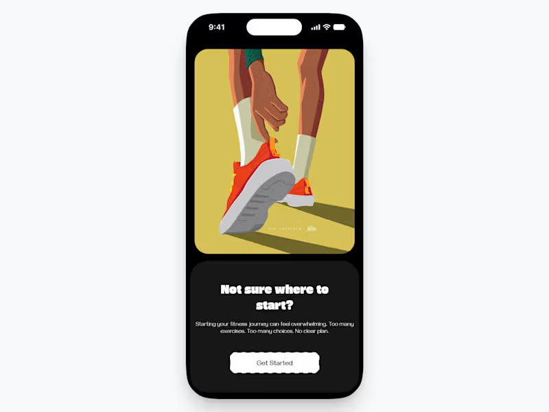
Users don't always know what they want when they download a new app.
For this fitness product I'm working on, this uncertainty is the #1 friction point on Day 1.
The user is overwhelmed by too many choices.
Instead of hitting them with a standard, complex onboarding flow, I focused on immediate value and supportive framing.
Notice the copywriting: "Not sure where to start?" into "We'll figure it out for you."
The goal is to move them from a moment of overwhelm (Screen 1) directly into a value-focused assessment (Screens 2/3), promising a tailored outcome.
When they reach the dashboard (Screen 4), the "Full Body Starter" workout card already shows constraints: 25 minutes, Beginner level, 6 exercises. It’s an easy "yes."
I want to know: For complex services, is it better to demand data upfront to deliver a perfect experience, or prioritize speed to initial value and refine later?
1
105

Product design for Startups | Mobile app | Web app design
- 5.0
- Rating
- 1
- Followers
Product design for Startups | Mobile app | Web app design


Elevating Businesses through tailored Digital Solutions
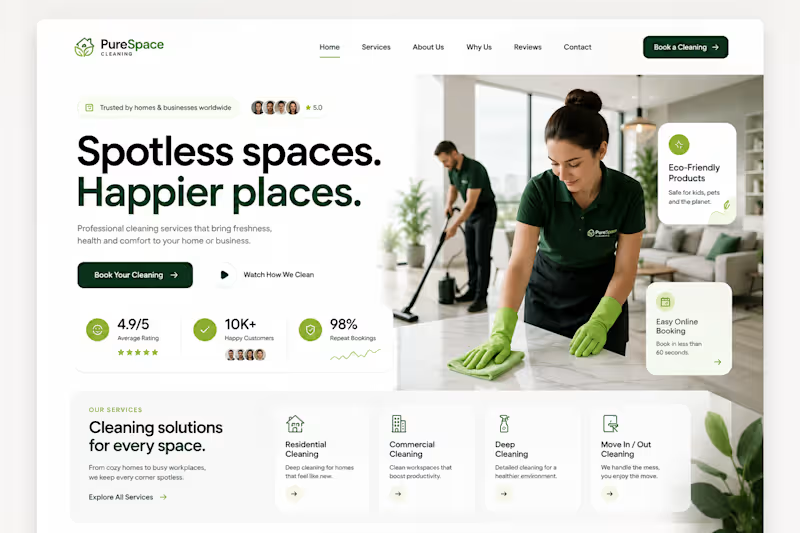
PureSpace Cleaning | Website Concept
A fresh digital experience designed for a modern cleaning company focused on making professional cleaning feel simple, reliable, and effortless.
I explored a clean editorial direction with deep green and lime accents, immersive photography, bold typography, floating trust elements, and a streamlined booking experience. The layout puts the cleaning service and its results at the center while building credibility through reviews, customer metrics, and clearly presented services.
Focus: Web Design • UX/UI • Cleaning Services • Conversion Focused Design
2
79
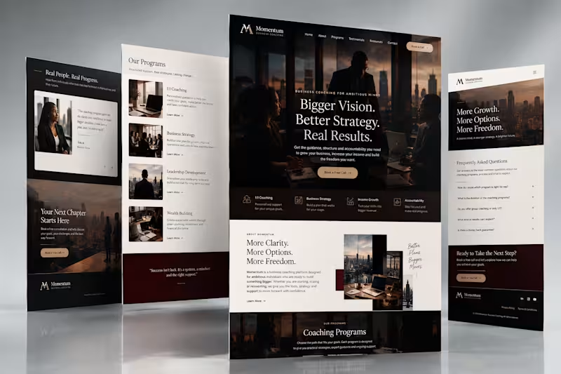
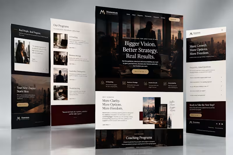
This crossed my mind while I was designing this website:
A lot of business coaches know exactly what they want to say.
More revenue.
More clients.
Better systems.
More freedom.
But sometimes, the website says all of those things at once and the person visiting it still thinks:
“Okay, but how can this person actually help me?”
That was the question behind this concept.
Instead of making the website feel like another motivational business page, I wanted it to feel more like a serious conversation with a coach who understands where the business is and where it needs to go.
Clear positioning.
Strong visual direction.
Room for the coach's personality.
And a simple path from “I'm interested” to “Let's talk.”
Because whether you're selling coaching, consulting, products or a service, people still want to know one thing:
“Can you help me with my problem?”
That question should influence the website more than any fancy animation ever will.
#WebDesign #BusinessCoach #UXDesign #WebsiteDesign #BrandDesign #PersonalBranding #Contra #WebDesigner
4
6
383

Meticulous Brand & Print Designer for Your Business Success
- 11
- Followers
Meticulous Brand & Print Designer for Your Business Success


Four Eyes Media is a contemporary branding and public relations brand developed in response to an increasingly noisy media environment. The brand is rooted in the belief that effective communication is not defined by volume or virality, but by clarity, consistency, and context.
Conceived as a strategy first practice, Four Eyes Media focuses on helping brands articulate who they are, what they represent, and how they are understood across public and media facing platforms. Its approach treats branding, media, and public relations not as separate activities, but as a unified system of identity and perception.
The brand’s work centers on translating complex ideas whether institutional, corporate, or cultural into clear narratives and structured visual expressions.
Through this lens, communication becomes deliberate, measured, and credible, rather than reactive or performative.
Four Eyes Media is positioned as a thinking brand, concerned not only with how brands look, but with how they are interpreted, remembered, and trusted over time.
1
88

