
Helping Brands scale in a competitive Market 📈
- 1x
- Hired
- 4.5
- Rating
- 24
- Followers
Helping Brands scale in a competitive Market 📈


Pitch Deck & Web Developer | Framer, Webflow, Figma, Canva
- 5.0
- Rating
- 9
- Followers
Pitch Deck & Web Developer | Framer, Webflow, Figma, Canva


Canva & Digital Product, Brand, Website & UI/UX Designer
- 5.0
- Rating
- 3
- Followers
Canva & Digital Product, Brand, Website & UI/UX Designer
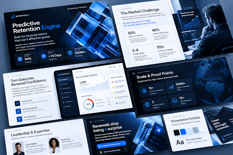
Novais IT - Corporate IT Infrastructure Presentation Redesign
Project Description
A comprehensive corporate presentation redesign for Novais IT, a specialized information technology integration company. This project transformed a standard IT services pitch deck into a modern, visually striking professional presentation that highlights infrastructure solutions, data center management, and advanced security systems.
Project Goal
To modernize and elevate Novais IT's corporate presentation deck, creating an engaging, high-end visual layout that clearly communicates technical IT services and corporate expertise to enterprise clients.
Objectives
Restructure Slide Flow: Organize 9 distinct presentation slides covering company history, sector reach, structured cabling, data center tech, security systems, and client portfolios.
Visual Modernization: Apply a sleek dark-mode aesthetic with deep navy gradients, crisp typography hierarchy, and professional corporate color accents.
Curated Asset Integration: Integrate high-resolution imagery and clear technical icons representing network engineering, server rooms, fiber optics, and biometric access control.
Key Challenges
Translating Technical Data: Structuring complex IT concepts (such as electromechanical infrastructure, active directory setups, and firewall integrations) into clean, digestible slide blocks.
Maintaining Visual Balance: Ensuring heavy technical service lists and step-by-step bullet points fit harmoniously into structured layout grids without looking cluttered.
What I Focused On
Information Architecture: Grouping technical services logically across dedicated slides—such as splitting structured cabling, data center solutions, and surveillance systems into distinct thematic sections.
Brand Professionalism: Highlighting core company metrics (such as 10+ years of experience) and prominent enterprise partnerships (Bridgestone, Chevrolet, Latam, Klabin, etc.) to build immediate authority.
The Solution
By rebuilding the slide architecture with a sophisticated dark-navy theme, clear service breakdown panels, and professional tech imagery, I delivered a cohesive and polished corporate deck. The final presentation successfully establishes Novais IT as an industry leader in IT infrastructure and connectivity solutions.
0
146
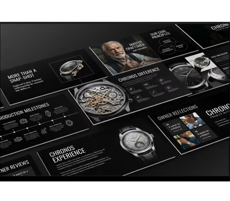
Chronos Luxury Horology Presentation Redesign
Project Description
Chronos is a complete brand presentation transformation that shifts a modern luxury aesthetic into the high-end horology sector. Taking a multi-slide presentation layout originally designed for a beauty brand, this project involved adapting every structural element typography hierarchy, graphic modules, visual accents, and photography into a cohesive, sophisticated deck tailored for a heritage watchmaking brand.
Project Goal
To rebrand a high-contrast presentation template into a luxury watch deck while maintaining 100% layout fidelity, precise structural alignment, and premium visual appeal across all slides.
Objectives
Rebrand all text content, typography styling, and messaging to align with high-end watchmaking and fine craft.
Replace generic imagery with sharp, curated imagery featuring luxury timepieces, intricate mechanical movements, and master watchmakers.
Preserve exact original design attributes, including color balance, grid alignment, geometric shapes, data visualization graphics, and slide-by-slide structure.
Key Challenges
Maintaining Grid Precision: Adapting completely different copy lengths and subject matter without disrupting the tight, original slide layout or visual balance.
Preserving Visual Identity: Ensuring the dark, dramatic aesthetic translated seamlessly from beauty to luxury watchmaking without feeling misplaced or generic.
Image Framing & Scale: Fitting detailed watch mechanics into pre-existing photo containers without losing focus on fine craftsmanship.
What I Focused On
Editorial Copywriting: Crafting compelling, luxury-focused headlines (e.g., "More Than A Snap-Shot," "Chronos Difference," "Master Craftsmen") that match the tone of premier horology brands.
Layout Integrity: Strictly mirroring the original slide-by-slide composition, including Venn diagrams, timeline milestones, image collages, and testimonial quotes.
Visual Cohesion: Harmonizing dark-mode backgrounds, stark typography contrast, and high-resolution product imagery for an elevated brand experience.
The Solution
By systematically swapping brand copy and imagery while keeping every line, shape, and grid coordinate intact, I delivered a sleek, fully realized corporate presentation deck. The final outcome demonstrates how an existing visual framework can be transformed across industries while preserving original design standards.
0
153

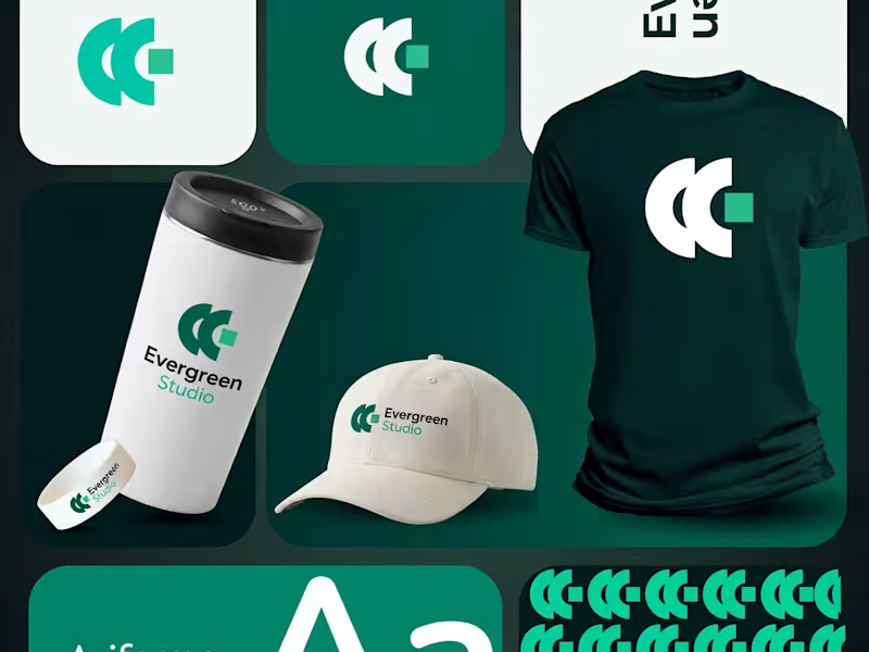

Helping startups and growing businesses elevate their brand.
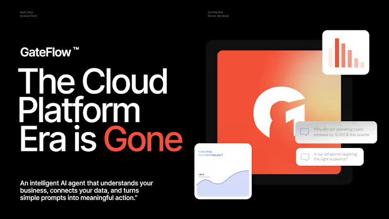
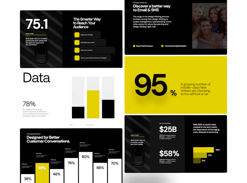
Designed around the idea that data doesn't have to feel dry.
I wanted this presentation to feel more like an editorial publication than a conventional business deck.
Large statistics create the impact.
Typography creates the rhythm.
Data visualizations create the structure.
And the yellow accent gives the system its energy. One of my favourite parts of the presentation design is finding the balance between information and emotion.
This project gave me room to experiment with oversized numbers, structured data, and a restrained colour system.
Nothing unnecessary.
Just enough visual language to guide the story.
3
3
312
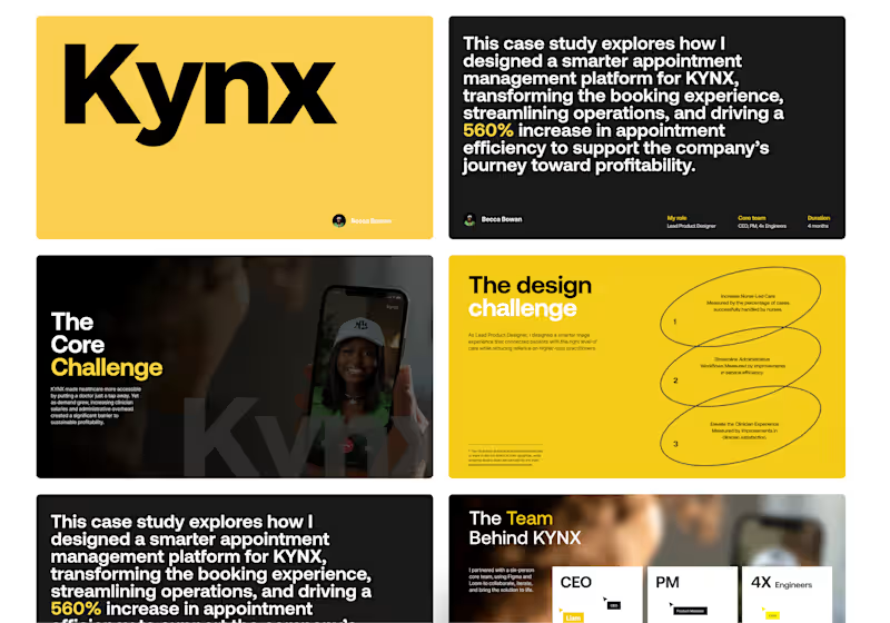
A Rethinking Digital Healthcare presentation deck
KYNX is a digital healthcare platform designed to make access to medical care faster, simpler, and more convenient. By connecting patients with healthcare professionals through a seamless digital experience, KYNX removes friction from the traditional healthcare journey and brings care closer to the people who need it.
For this project, I focused on redesigning the appointment and triage experience around a more efficient care model. The challenge was not only to make the patient journey easier, but also to create a system that could support clinicians and improve the way appointments were managed behind the scenes.
Thanks for checking it out!
Interested in working with me?
2
212

A founder once gave me a deck and said:
“The content is already there. I just need you to make it look better.”
But after going through it, I realized the problem wasn’t the design.
The story was buried.
Important information had the same visual weight as everything else. The strongest numbers were easy to miss. And the deck was asking the audience to work too hard to understand the opportunity.
So instead of simply redesigning the slides, I rebuilt the visual hierarchy around the story.
That’s how I approach presentation design.
I don’t just ask:
“How can I make this slide look better?”
I ask:
“What should the audience understand when they see this?”
That small difference can completely change a deck.
If you're building a pitch deck, investor presentation, or product story, I can help turn the complexity into something clear, compelling, and beautifully structured.
0
135

Creative Pitch Deck & Brand Presentation Specialist
Creative Pitch Deck & Brand Presentation Specialist



Presentation | Brochure | eBook | Editorial | Report | UI/UX
- $•••••
- Earned
- 3x
- Hired
- 5.0
- Rating
- 89
- Followers
Presentation | Brochure | eBook | Editorial | Report | UI/UX
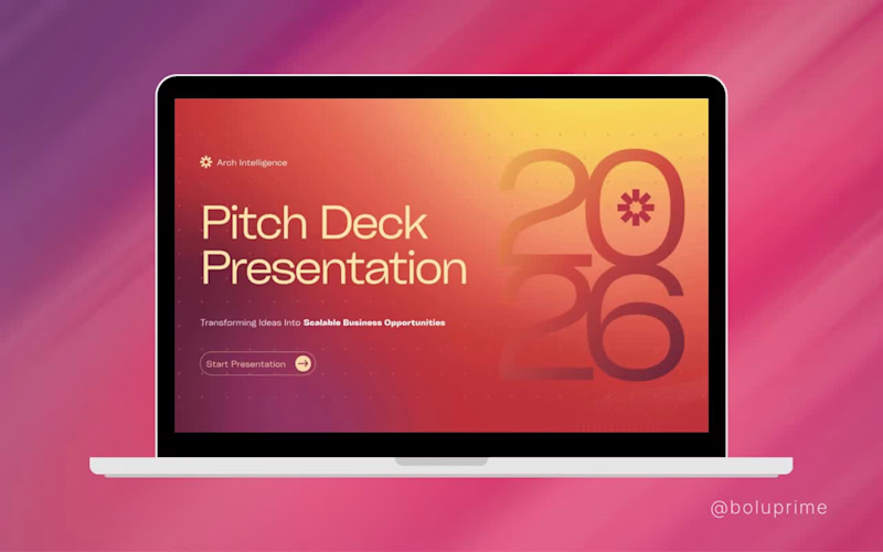
I help consulting firms like Arch Intelligence turn complex research into investor-ready presentations, reports and whitepapers.
1
273

I just wrapped up a presentation design project for Adelaide Luxury Car Hire
Every slide was a chance to reflect the premium experience their brand delivers, with clean layouts, bold visuals, and a look that speaks to luxury.
Design isn't just about making things pretty. It's about telling a story that earns trust before a single word is read.
I am genuinely excited to keep creating work that elevates brands. If your business needs a presentation that truly represents your value, let's connect! Boluwatife Okanlawon
(https://www.linkedin.com/in/boluwatife-okanlawon/)#PresentationDesign (https://www.linkedin.com/search/results/all/?keywords=%23presentationdesign&origin=HASH_TAG_FROM_FEED) #GraphicDesign (https://www.linkedin.com/search/results/all/?keywords=%23graphicdesign&origin=HASH_TAG_FROM_FEED) #LuxuryBranding (https://www.linkedin.com/search/results/all/?keywords=%23luxurybranding&origin=HASH_TAG_FROM_FEED) #Adelaide (https://www.linkedin.com/search/results/all/?keywords=%23adelaide&origin=HASH_TAG_FROM_FEED) #DesignWork (https://www.linkedin.com/search/results/all/?keywords=%23designwork&origin=HASH_TAG_FROM_FEED)
2
264


Research creates knowledge.
But knowledge only creates value when people can understand it, trust it, and act on it.
That's why I enjoyed working on "The Location Vitality Index," a 43-page white paper for PFM Intelligence.
Projects like this remind me that design isn't about decorating information; it's about reducing the distance between insight and decision-making.
Every layout, visual hierarchy, chart, and page structure was intentionally designed to help readers navigate complex research with clarity. Because when decision-makers can absorb information more efficiently, the conversation shifts from "What does this mean?" to "What should we do next?"
For organisations that invest heavily in research and thought leadership, the final document is more than a report. It's a business asset.
A well-crafted white paper can:
• Strengthen credibility with stakeholders.
• Support strategic conversations with clients and partners.
• Reinforce an organisation's expertise in its industry.
• Increase the likelihood that valuable insights are read, shared, and referenced.
As designers, our responsibility goes beyond making documents visually appealing. We help organisations communicate ideas in ways that inspire confidence and enable better decisions.
I am grateful to PFM Intelligence for the opportunity to contribute to a publication that transforms data into meaningful insights.
What stood out to me throughout this project is a simple truth: the value of research isn't just in discovering insights; it's in communicating them effectively & to be honest, I'm getting more excited to build more complex dashboards in Figma.
#WhitePaper #ThoughtLeadership #EditorialDesign #InformationDesign #BusinessCommunication #Research #B2B #GraphicDesign
4
5
361

Senior Creative Designer


