Projects using Google AI Studio in Lagos
Projects using Google AI Studio in Lagos
Sign Up
Post a job
Sign Up
Log In
Filters
2
Projects
People
Message
6
Samson Bojesomo
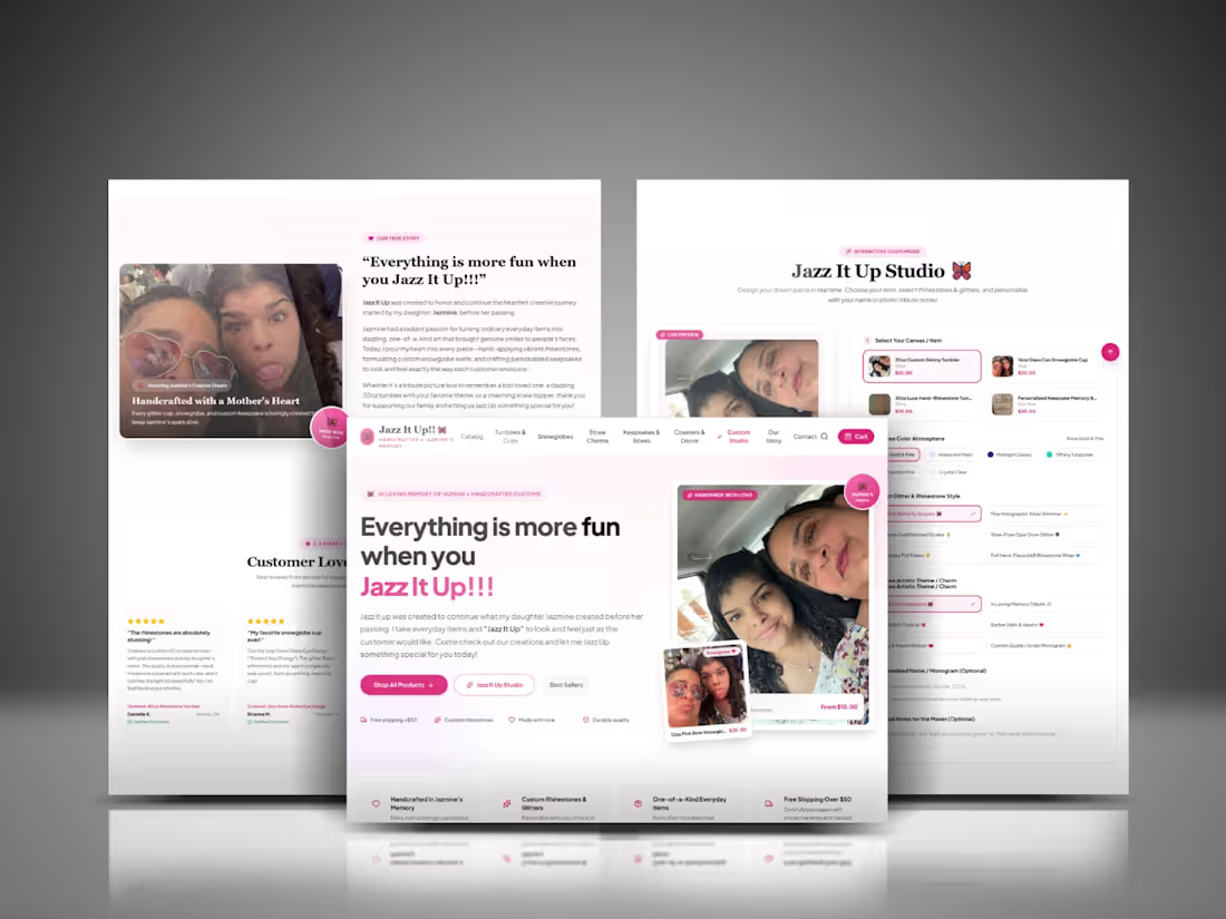
Custom eCommerce Design for Jazz It Up
6
7
Message
0
AJETOMOBI JAMIU EDDIE GARNER
AI-Powered Storytelling & Promotional Video
0
8
Message
2
Alimi Abdulrahman Akin
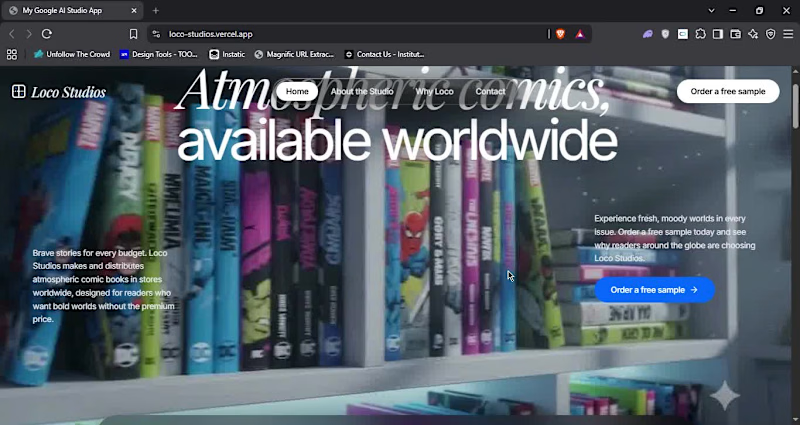
I built loco-studios landing page using @antigravity (https://x.com/antigravity) for rapid UI, @FlowbyGoogle (https://x.com/FlowbyGoogle) for batch asset gen and @GoogleAIStudio (https://x.com/GoogleAIStudio) to generate concept to code Adding AI to my workflow really speed up my work link:https://loco-studios.vercel.app (https://loco-studios.vercel.app)
2
116
Message
0
Olabode Alao
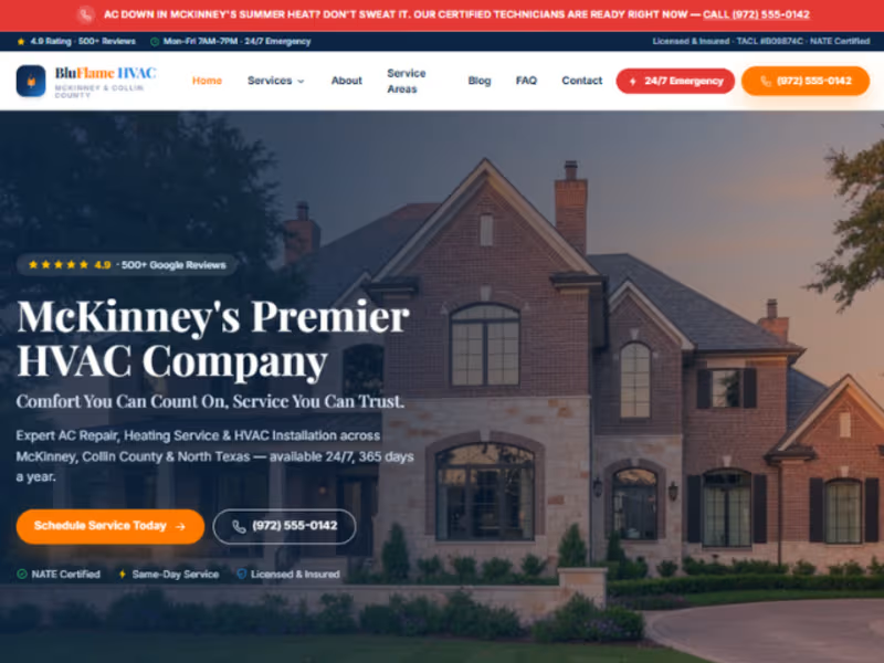
A premium HVAC website designed for BluFlame HVAC, McKinnery.
0
47
Message
0
olaoluwa May
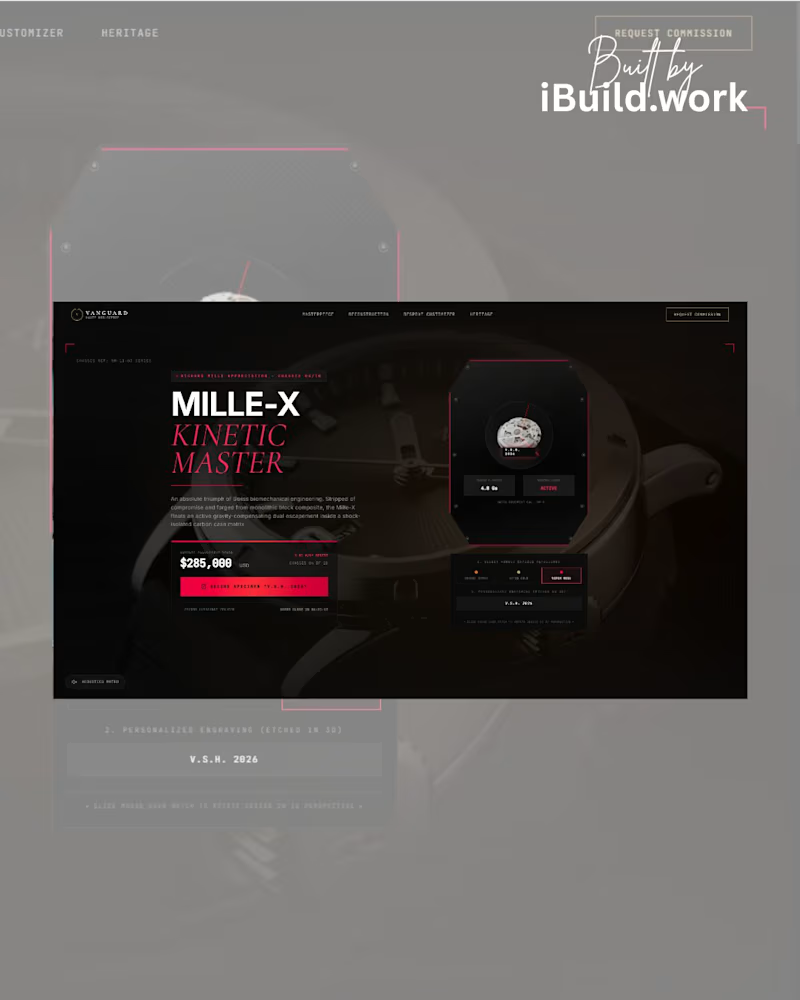
TECH STACK: 🤖 Google Gemini / AI Studio ⚛️ Next.js & React Framework 🎬 Framer Motion (Kinetic Shader Rotations) 🎨 Tailwind CSS (Custom Grids) Drop a 🛠️ below if your e-commerce platform needs a luxury upgrade. DM me "MILLE" to view the live build. #LuxuryWebDesign #RichardMille #UIUXDesign #ThreeJS #FramerMotion #Vercel #GoogleGemini #AIStudio #DailyDesignChallenge #GlobalStatement #NextJS #Horology #CreativeDirector #FrontendDev #HighTicketClient
0
39
Message
0
Joseph Akhatasebhudo
Same UI prompt. Three AI tools. Replit vs Google AI Studio vs Kimi. Same instructions This is where AI coding tools start to separate — not just code, but UI quality and execution. When building with AI, don’t just compare output… Compare design quality, usability, and readiness to ship. More real UI tests coming. #AICode #VibeCoding #AgenticAI #ArtificialIntelligence #UI #Contra #BuildInPublic 🎨⚡
0
33
Message
0
Othniel Anselm
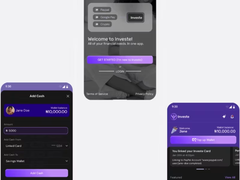
All-in-one mobile and web application design for Investe: a startup fintech company that offers B2C and B2B financial solutions to end users.
0
75
Message
0
Joan Ginika
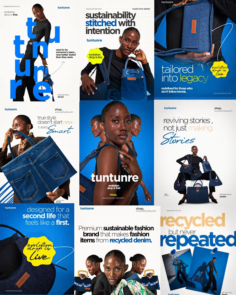
Social media marketing designs
0
29
Message
0
Clarence Aigbuza
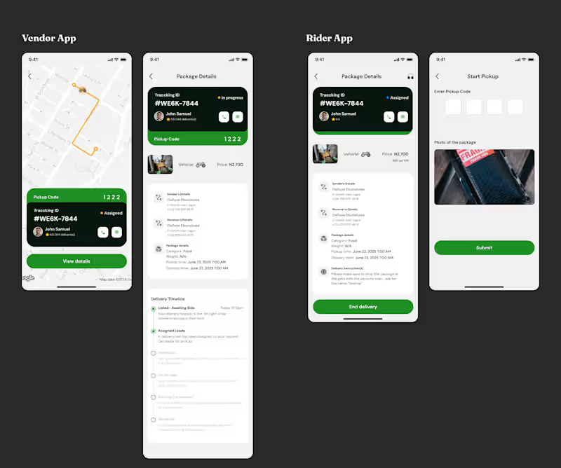
We started building an “Uber for logistics” in Nigeria, then pivoted to B2B logistics management after we hit real constraints: package safety, rider safety, and unreliable tracking. Go Send Am became enterprise software for accepting jobs, monitoring financial leaks, and managing fleets and riders.
0
27
Message
5
Samson Bojesomo
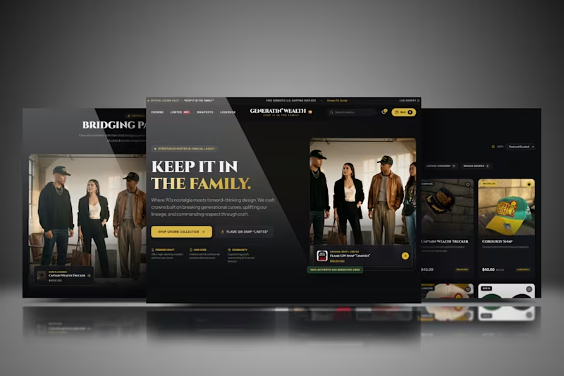
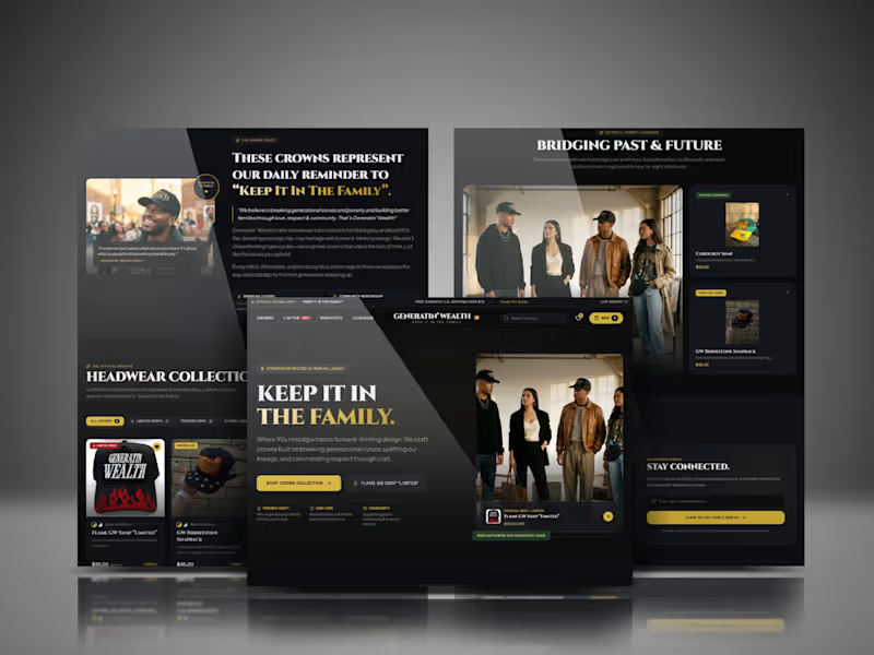
Generatin’ Wealth Shopify Store Design
5
2
Message
1
AJETOMOBI JAMIU EDDIE GARNER
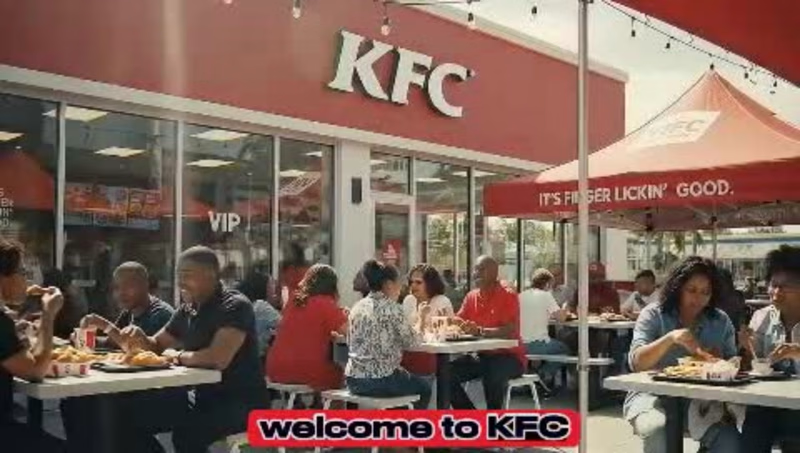
KFC AI Concept Video
1
15
Message
2
olaoluwa May
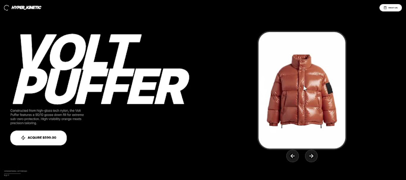
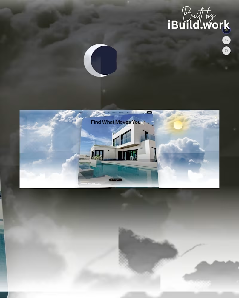
Comment "HERO" to get the Prompt I instructed AI Studio with a strict, Awwwards-level technical prompt focusing on Spatial Depth, Camera Fly-Throughs, and Grid Alignment TECH STACK: 🤖 Google Gemini / AI Studio ⚛️ React & Next.js 🎬 Framer Motion (Camera Fly-Through Logic) 🎨 Tailwind CSS (Grid Layout) 🖌️ Canva & Shots.so (http://Shots.so) (Mockups) The future of digital real estate is here.
2
75
Message
7
Samson Bojesomo
Generatin' Wealth Streetwear Site Concept
7
5
Message
4
Samson Bojesomo
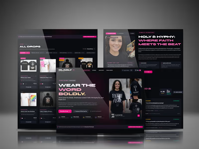
Faith-Based Streetwear Ecommerce Website | Shopify UX/UI & CRO Role: Shopify Ecommerce Designer & Developer | UX/UI & CRO Specialist Description: Designed and developed a premium ecommerce experience for GLADLY, a faith-based streetwear and print-on-demand brand. I created a bold dark-themed interface combining editorial typography, product storytelling, intuitive collection browsing, social proof, founder storytelling, trust signals, and conversion-focused CTAs. The experience was structured to connect brand identity with a frictionless shopping journey across desktop and mobile. Key work included ecommerce UX/UI, product pages, collection design, responsive layouts, CRO strategy, brand storytelling, reviews, and customer journey optimization. Skills / Keywords: Shopify, Shopify Website Design, Shopify Development, Shopify Theme Customization, Ecommerce Development, Ecommerce UX/UI, Conversion Rate Optimization, CRO, Streetwear Website Design, Print on Demand, Product Page Design, Responsive Web Design, Mobile-First Design, Figma, Liquid, Ecommerce Website Development.
1
4
211
Message
3
Samson Bojesomo
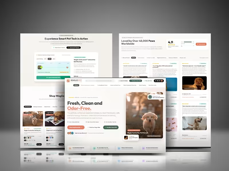
Conversion-Focused Shopify Store for WaglioPet
3
2
Message
4
Samson Bojesomo
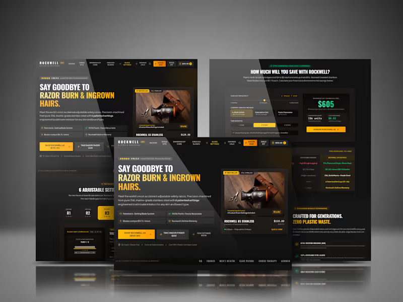
Rockwell Razors: Building a Premium DTC Site That Sells on Logic and Craft Client: Rockwell Razors & Grooming — adjustable safety razors and shave sets, precision-machined from 316L marine-grade stainless steel Role: Website Design & Build, UX Strategy, CRO Result: Newly built and launched — performance data pending The Challenge Rockwell sits in a crowded, skeptical market. Most shoppers arrive already burned by subscription cartridge razors and disposable blades — they've been sold "better shaving" before and didn't get it. So the site couldn't just look premium; it had to earn belief, using specifics: material grade, cost-per-shave math, patented mechanisms, and real customer proof. The brief was to build a from-scratch e-commerce experience that reads less like a marketing page and more like a well-argued case for switching. Research & Discovery Before designing anything, I mapped out the actual decision a Rockwell shopper is making: Is this really better than what I use now, and is it worth the upfront cost? That's a rational, comparison-driven decision, not an impulse buy — which meant the site needed to sell on evidence (cost savings, materials, durability) as much as on aesthetics. Every section of the build was built to answer a specific piece of that skepticism, in the order a shopper would naturally raise it. The Design & Build Process, Section by Section Hero — Leading With the Pain Point, Not the Product The homepage opens with "Say Goodbye to Razor Burn & Ingrown Hairs" rather than a generic product shot. This flips the usual DTC formula: instead of "here's our razor," it's "here's the problem you already have" — which immediately earns attention from anyone who's experienced razor burn. Trust signals (4.96/5.0 rating, 200,000+ shavers) sit directly above the headline, so social proof is visible before any sales copy is even read. The primary CTA ("Shop Rockwell 6S — $120.00") sits beside a secondary, lower-commitment CTA ("Take Razor Finder Quiz") — giving undecided shoppers a way to engage without having to commit to a purchase decision immediately. The Patented System — Turning a Feature Into Proof Rather than listing "6 adjustable settings" as a bullet point, the build gives this its own dedicated, interactive-feeling section (R1–R6 settings with a visual blade-gap indicator). This matters because "adjustable" is an abstract claim until a shopper can see and understand what it adjusts and why it matters for their specific skin/beard type. Turning a spec into an explained mechanism is what makes a premium price feel justified rather than arbitrary. Precision Grooming Catalog — Removing Decision Paralysis The product catalog is filterable (All Products, Adjustable Razors, Complete Shave Kits, Barbershop Care, Swedish Blades & Accs) and every card carries the same visual weight: rating, price, badges (Bestseller, New Release), and a clear "Add" action. For a brand with a wide catalog spanning razors, blades, and grooming accessories, this consistent card structure keeps browsing fast instead of overwhelming — critical for shoppers who came in for one razor and might leave with a full kit. The Savings Calculator — Making the ROI Case Concretely This is the section doing the heaviest persuasive lifting. Rather than telling shoppers "you'll save money," the build lets them input their actual shaving frequency and current method, then outputs a real number — in the mockup, an estimated $605 saved over 3 years, with a $0.03-per-shave cost breakdown. This reframes Rockwell from "an upfront cost" to "an investment that pays for itself in months," which is exactly the objection a rational, price-comparing shopper needs answered before converting. Head-to-Head Comparison Table — Confronting the Competition Directly Immediately following the calculator, a direct comparison table (Rockwell vs. disposable/cartridge razors) lays out razor burn frequency, cost per shave, material, and warranty side-by-side. Placing this right after the calculator was deliberate — once a shopper has just seen the dollar savings, this table reinforces the same argument in a second format (visual/tabular) for shoppers who process comparisons better that way. Sustainability & Craftsmanship — Layering in a Values-Based Reason to Buy The "Crafted for Generations. Zero Plastic Waste." section, paired with real photography, adds an emotional and values-driven layer on top of the rational cost argument — appealing to shoppers who care about durability and plastic waste, without displacing the cost-savings argument that came before it. This section works because it's sequenced after the logical case is made, not before — credibility is earned first, values messaging lands better second. Testimonials — Real Proof at the Point of Highest Consideration Customer reviews ("Razor Burn Vanished in 1 Shave," "The Barbershop Scent is Exceptional") sit alongside a prominent 4.96 rating and "Over 200,000 Shavers Converted Worldwide" banner, placed after the product and comparison sections — right when a shopper has absorbed the pitch and is deciding whether to trust it. Real, specific testimonials (naming exact benefits) do more work here than generic five-star praise would. FAQ — Closing the Remaining Objections The FAQ section (settings differences, beginner guidance, savings from switching, international shipping, and whether the razors work for women/head-shavers) is placed near the bottom specifically to catch the last practical hesitations — for shoppers who are sold on the concept but still have logistics questions before checkout. Newsletter Capture — Recovering Not-Yet-Ready Traffic A "Get 10% Off Your First Order" email capture sits at the very end, giving shoppers who aren't ready to buy today a low-friction way to stay in the funnel rather than leaving for good. Visual & Brand Direction The entire build uses a dark, matte-black palette with high-contrast yellow/gold accents and clean, bold typography — deliberately closer to a premium grooming or tools brand than a typical soft-pastel DTC site. This visual register reinforces the "engineered, durable, marine-grade steel" positioning at a glance, before a shopper reads a single word of copy. The Outcome The site has just launched, so performance data isn't available yet. Structurally, though, it was built to do something most razor DTC sites don't: make a rational, numbers-backed case for switching, sequenced in the exact order a skeptical shopper would need to hear it — pain point, mechanism, proof, cost savings, values, social proof, and logistics — before ever asking for the sale. Tools & Skills Used Website Design & Build · UX Strategy · Conversion-Focused Layout · E-commerce Catalog Design · Interactive Calculator Design · Brand & Visual Design Want a store that makes the case for itself before a customer ever adds to cart? Let's talk.
1
4
149
Explore projects