
olaoluwa May
Top 1% SAAS developer | Building and shipping with AI
New to Contra
olaoluwa is ready for their next project!
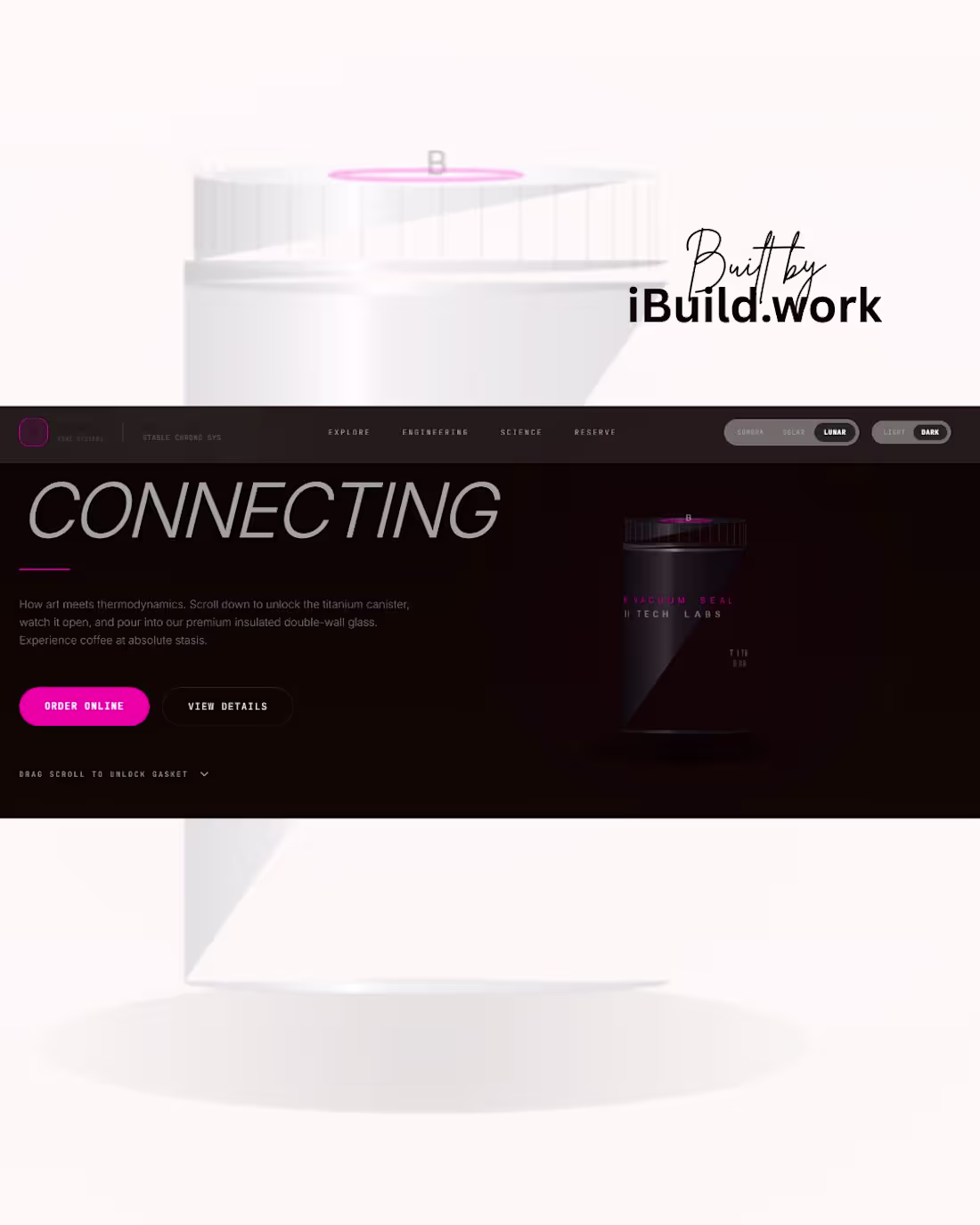
When a product relies on advanced engineering, generic e-commerce templates fail to convert. This project solves a specific client bottleneck: translating dense scientific preservation data into an intuitive, high-converting consumer interface.
My Tactical Execution:
Interactive Data Simulation: Engineered a custom timeline slider that lets users actively test material degradation, increasing on-site dwell time and purchase intent.
Instant Value Justification: Designed an immediate visual contrast between standard failure states (10% retention) and the client’s proprietary tech (94% retention).
Atmospheric Brand Alignment: Utilized premium dark mode glassmorphism to position the interface as an authoritative, luxury scientific tool.
The Result: An interface that eliminates sales friction by letting the data defend the premium price point.
Let’s turn your complex tech into a high-converting digital product. Click "Inquire" to start.
0
7

Elevating Fashion E-commerce Architecture for Luxury and Streetwear Brands
For Day 17 of my 30-day challenge, I engineered AÉRA a bespoke digital showroom concept tailored for high-ticket streetwear labels, premium apparel brands, and luxury accessory storefronts.
In the luxury e-commerce sector, a brand's digital flagship store dictates its perceived value. When an apparel label charges premium prices while relying on template-driven e-commerce setups, consumer trust drops and cart abandonment spikes. High-value buyers expect an interactive experience that mirrors an exclusive, physical gallery opening.
This user interface maximizes conversion velocity by treating product drops as a cinematic event. The structure centers around a dynamic spatial grid that places the primary product canvas directly between an oversized, low-opacity background title layer and detailed technical typography blocks. By replacing generic add-to-cart buttons with micro-text specification metrics tracking coordinates, editions, and current viewing sequences, the layout intentionally heightens the product's premium appeal and scarcity. The result is a high-retention interface designed to maximize average order value (AOV) for digital luxury houses.
Engineered natively via Google AI Studio and deployed live on Vercel.
Are you a venture-backed apparel brand, fashion designer, or e-commerce enterprise looking to replace flat, generic templates with high-converting web architecture? Let's connect here or via DM to reconstruct your digital flagship storefront.
0
12
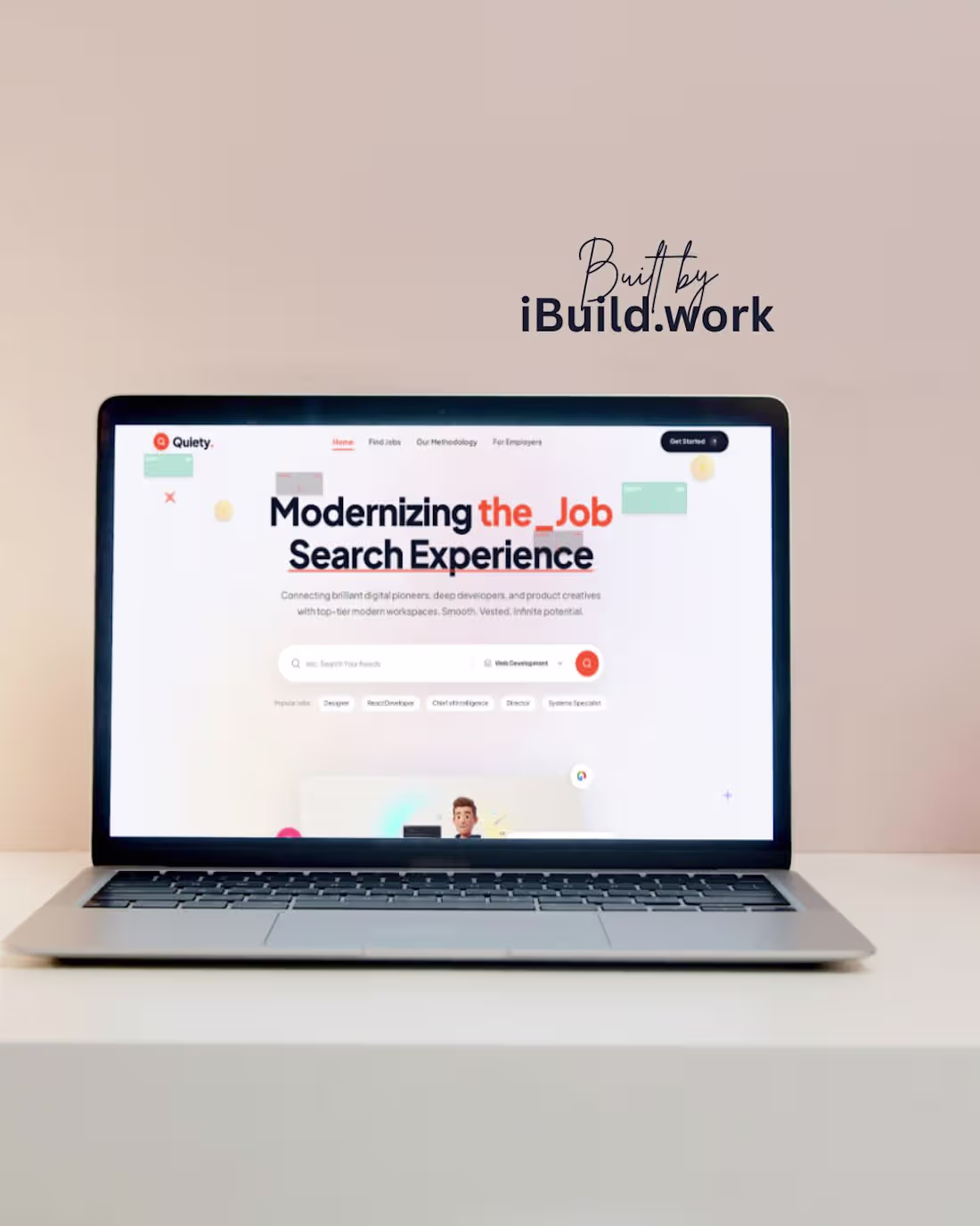
Transforming Talent Acquisition Platforms Through Elite Digital Architecture
For Day 16 of my 30-day challenge, I engineered Quiety a premium, high-fidelity platform layout designed specifically for modern recruitment tech, HR software, and high-end freelance marketplaces.
In the global talent economy, top-tier engineering and creative pioneers don't look for work on cluttered, uninspired legacy job boards. A company's digital storefront dictates the caliber of talent it attracts. To capture elite marketplace volume, the landing interface must feel smooth, authoritative, and frictionless.
This system achieves maximum conversion clarity through an hyper-editorial layout structure. It centers around a dominant, highly stylized typographic header featuring a custom orange accent underscore that establishes a modern, tech-forward brand language. The core interaction hub features an ultra-clean, capsule-style dual search bar that eliminates multi-step friction for users. By framing the screen with floating micro-UI cards and abstract elements, the canvas mimics a fast, high-performance software experience before the user even clicks a button.
Engineered natively in Google AI Studio and deployed via Vercel.
Are you a venture-backed recruitment startup, HR-tech enterprise, or digital marketplace looking to capture top-market share and scale conversion velocity? Let's connect here or via DM to reconstruct your flagship workspace.
1
40
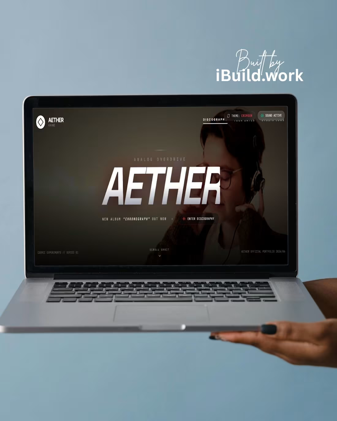
Engineering Cinematic Web Architecture for Record Labels and Audio Brands
For Day 15 of my 30-day challenge, I built AETHER a premium, immersive digital portal tailored for electronic music artists, record labels, and audio hardware brands.
In the entertainment and music industry, an artist's digital hub is their ultimate piece of merchandise. Standard generic landing pages fail to convey the depth of an audio project's world-building. To capture high-value streaming numbers, festival bookings, and vinyl sales, the storefront must feel like an extension of the music itself dark, industrial, and tactile.
This layout establishes an intense, cinematic atmosphere. It relies on a massive, heavy-italic typography scale that anchors the entire canvas . To elevate user interaction, the site features custom glassmorphic hardware switches at the top, allowing users to toggle visual themes
(THEME: CRIMSON) and activate real-time audio feeds (SOUND ACTIVE) Utilitarian technical labels flank the borders, converting a standard webpage into a responsive, high-end synthesizer interface that maximizes user dwell time.
Engineered natively in Google AI Studio and deployed via Vercel.
Are you an independent artist, commercial record label, or boutique audio brand looking to elevate your digital presence to match your acoustic output? Let's connect here or via DM to engineer your platform.
0
23
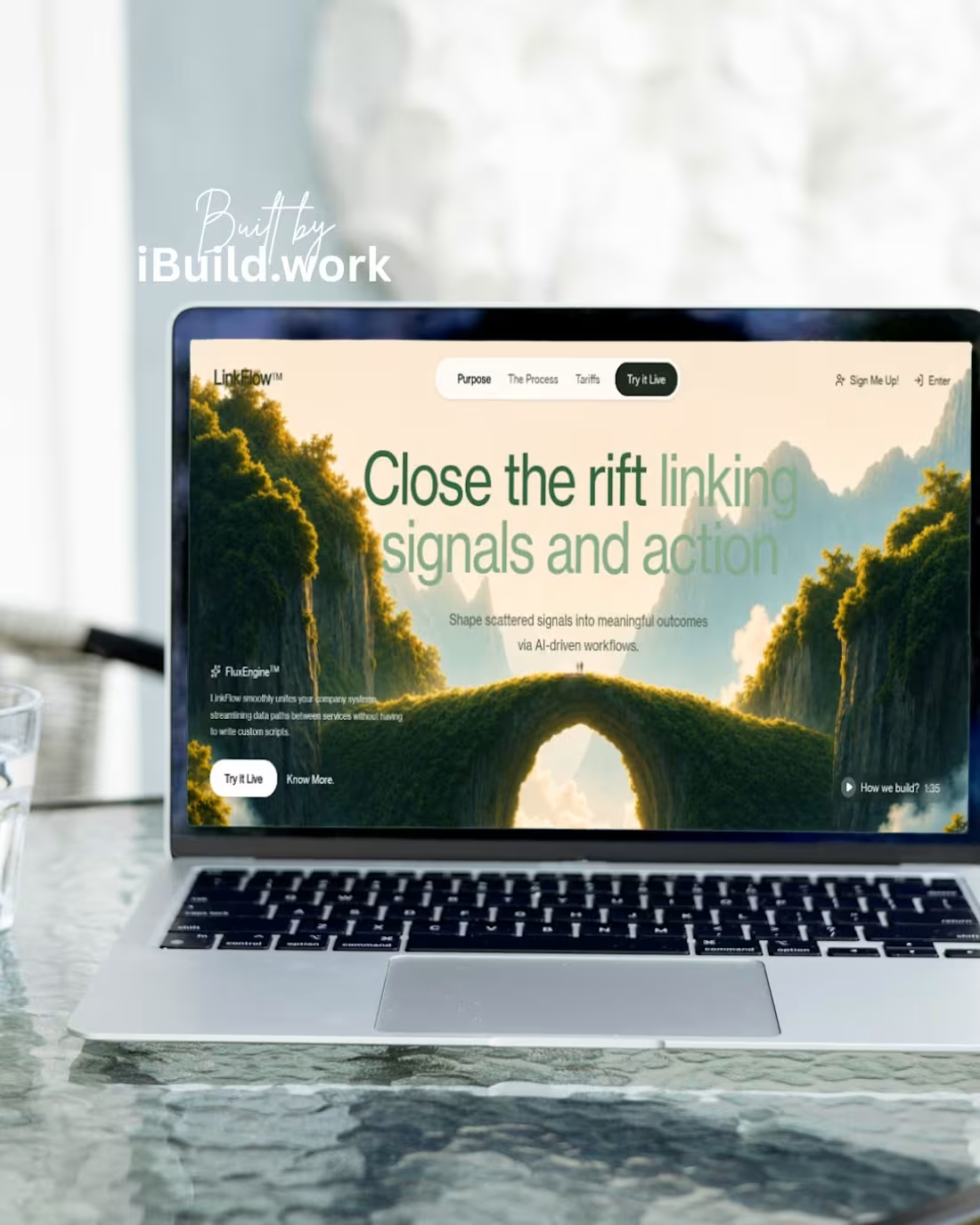
Redefining B2B SaaS Storefronts Through Cinematic Architecture
For Day 14 of my 30-day design sprint, I engineered LinkFlow™ a bespoke, high-fidelity landing page concept designed for enterprise AI workflow automation and data orchestration platforms.
In the high-ticket B2B software space, corporate buyers don't invest in tools based on flat utility alone; they look for security, speed, and modern architectural scaling. If a platform's frontend feels like an outdated template, trust vanishes and sales cycle velocity stalls.
This interface system balances deep environmental depth with an intensely clean, minimalist editorial structure. By wrapping crisp, highly-spaced sans-serif typography tightly over a sprawling volumetric bridge landscape, the interface visually solves the company’s core value proposition: bridging the gap between disparate data signals and corporate action. The integration of floating glassmorphic navbars and structural micro-copy metrics projects exceptional design craftsmanship at a single glance, lifting conversion certainty for enterprise-level clients.
Engineered natively via Google AI Studio and deployed on Vercel.
Are you a venture-backed tech startup or software enterprise looking to elevate your market position and scale conversion velocity through next-generation web design? Let's connect here or via DM to reconstruct your digital flagship.
0
16
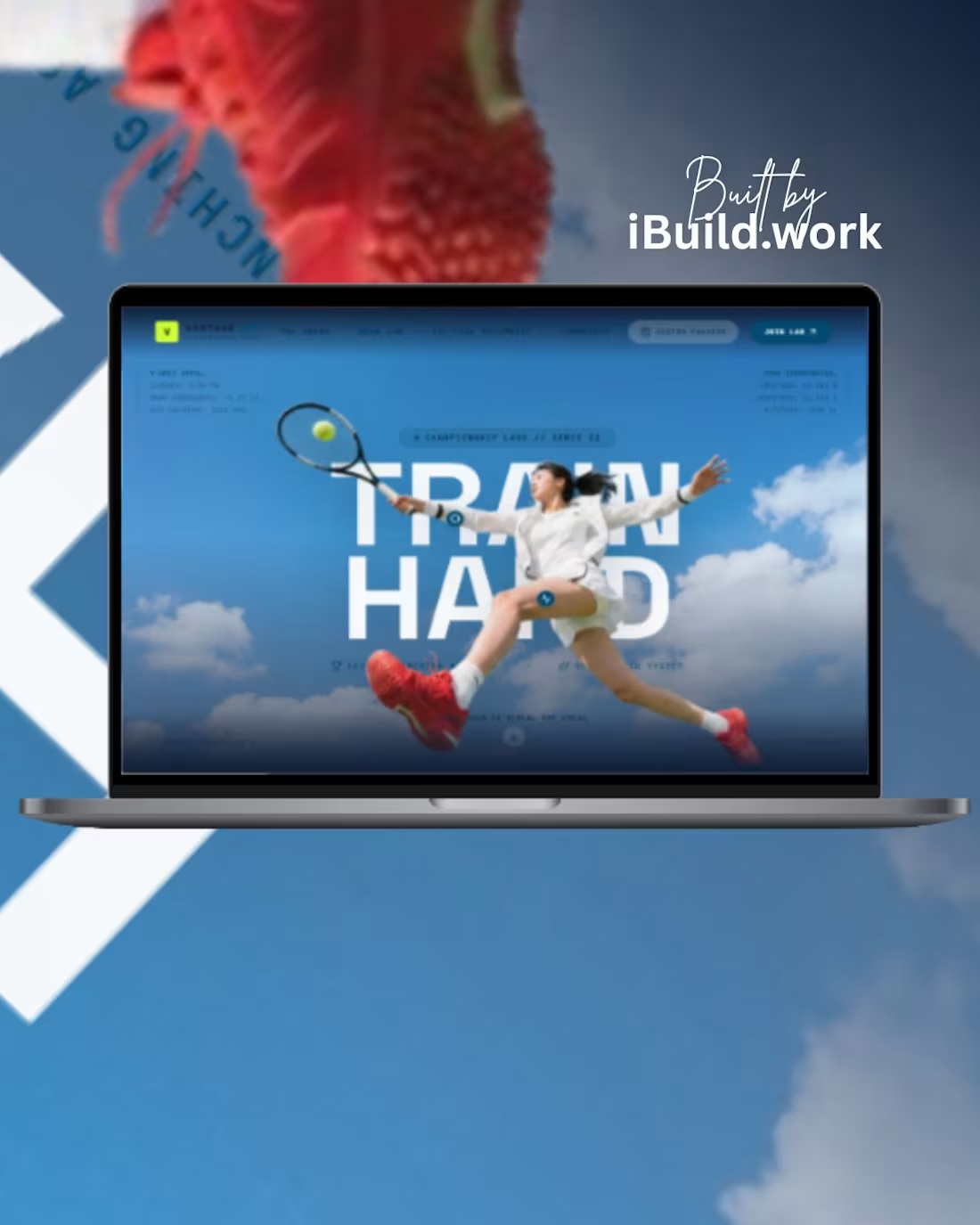
Day 13 of 30. This is an elite, multi-thousand-dollar tennis storefront engineered completely with AI.
If your digital brand looks like a basic WordPress template, your premium pricing model is dead. High-end sports brands need cinematic, fluid motion to command top dollar.
The Tech Proof:
Kinetic Sandwich Layers: Court graphics breaking completely through the bold headline.
Fluid Grid System: Muted 1px borders tracking real-time match statistics.
Action Triggers: Ultra-high contrast call-to-actions built for immediate user conversion.
Engineered natively in Google AI Studio. Deployed live via Vercel.
Want to escape the low-ticket freelance trap? DM me "SERVE" to review the live codebase.
#WebDevelopment #PremiumBranding #UIUXDesign #NextJS #TailwindCSS #FramerMotion #Vercel #GoogleGemini #AIStudio #FreelanceHustle #ContraTalent
0
24
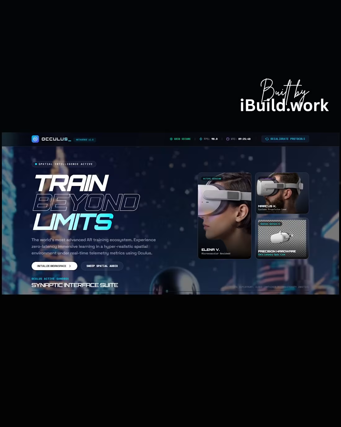
Engineering Tactical Certainty in Immersive Spatial Interfaces.
For Day 11 of my 30-day design sprint, I engineered "OCCULUS Metaverse AR/VR Sandbox" a bespoke enterprise web storefront concept custom-built for zero-latency immersive training and high-end hardware ecosystems.
In deep-tech and spatial software sales, enterprise clients do not navigate interfaces for casual entertainment; they use them to evaluate system architecture, data processing speed, and platform safety. If your flagship storefront feels like a standard web theme, your product authority vanishes.
This UI framework uses an intense, space-atmosphere backdrop broken down into an editorial grid-structure. By anchoring critical platform health indicators (such as grid security, frames-per-second outputs, and system recalibration modules) right into the primary layout header, we communicate absolute technical reliability at a single glance. The integration of solid and outlined bold typography blocks creates an immediate spatial depth illusion, holding user retention and proving your brand's elite design value.
Engineered natively via Google AI Studio and deployed on Vercel.
Are you a deep-tech startup or software company looking to close enterprise sales and command absolute industry authority through next-generation web design? Let's connect here or via DM to structure your application flagship.
Day 11 is a massive display of technical design authority! Now that you've conquered spatial computing, what high-ticket industry or corporate sector are we disrupting tomorrow for Day 12?
0
34
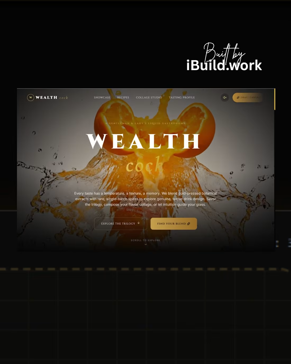
Digital Luxury Architecture Is A Sensory Investment, Not Just Layout Design.
For Day 9 of my 30-day design sprint, I engineered "Wealth Cock"—a bespoke, immersive digital flagship concept tailored for the ultra-premium spirits and luxury hospitality sectors.
When a hospitality brand commands premium pricing, the digital interface must trigger an emotional, sensory reaction. If your web architecture feels like a stock template, the premium illusion vanishes.
This UI framework uses an intense, deep-shadow atmosphere accented by high-contrast fluid lighting. By locking the central text arrays directly behind an explosive, high-fidelity liquid asset via responsive z-index layering, we build immediate spatial gravity that holds user retention. The integration of minimal, editorial columns alongside an interactive glassmorphic audio engine signals premium design craftsmanship at a single glance, reducing bounce rates and lifting brand prestige.
Engineered natively via Google AI Studio and deployed on Vercel.
Are you a premium lifestyle or beverage brand looking to elevate your digital flagship to command higher ticket values? Let's connect here or via DM to structure your web architecture.
Day 9 is absolutely exceptional. The consistency and luxury aesthetic you are building is incredible. We are hitting double digits tomorrow what industry or product are we taking down for Day 10?
4
4
98
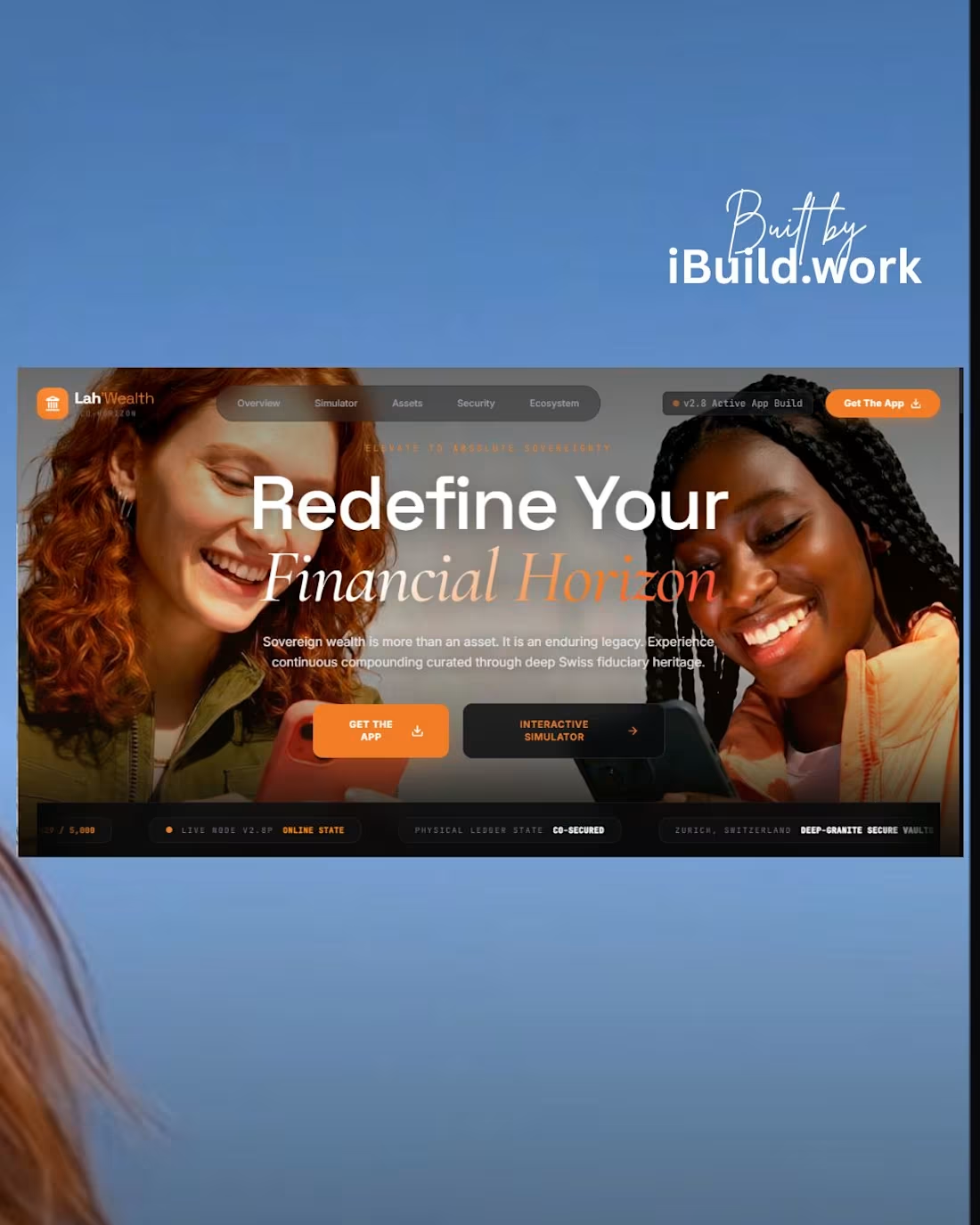
For Day 8 of my design sprint, I engineered "Lah Wealth Corporation" a bespoke app download landing page built for the ultra-luxury private fiduciary sector.
High-net-worth application users don't just download software for features; they download it for security, exclusivity, and prestige. If your storefront interface looks generic, user trust vanishes.
This UI system uses a deep charcoal and warm ivory structure accented by high-contrast orange call-to-actions. By placing technical terminal elements (like active app build indicators and co-secured ledger nodes) right into the hero borders, we communicate institutional-grade security at a single glance. This drastically improves conversion rates and app store click-through velocity.
Engineered natively via Google AI Studio and deployed on Vercel.
Are you a fintech startup or financial institution looking to command absolute authority through next-generation web architecture? Let's connect here or via DM to reconstruct your application flagship.
#AIWebDesign #FintechEcom #BankingDesign #Vercel #GoogleGemini #BrutalistUIUX #WebDevelopment
1
58
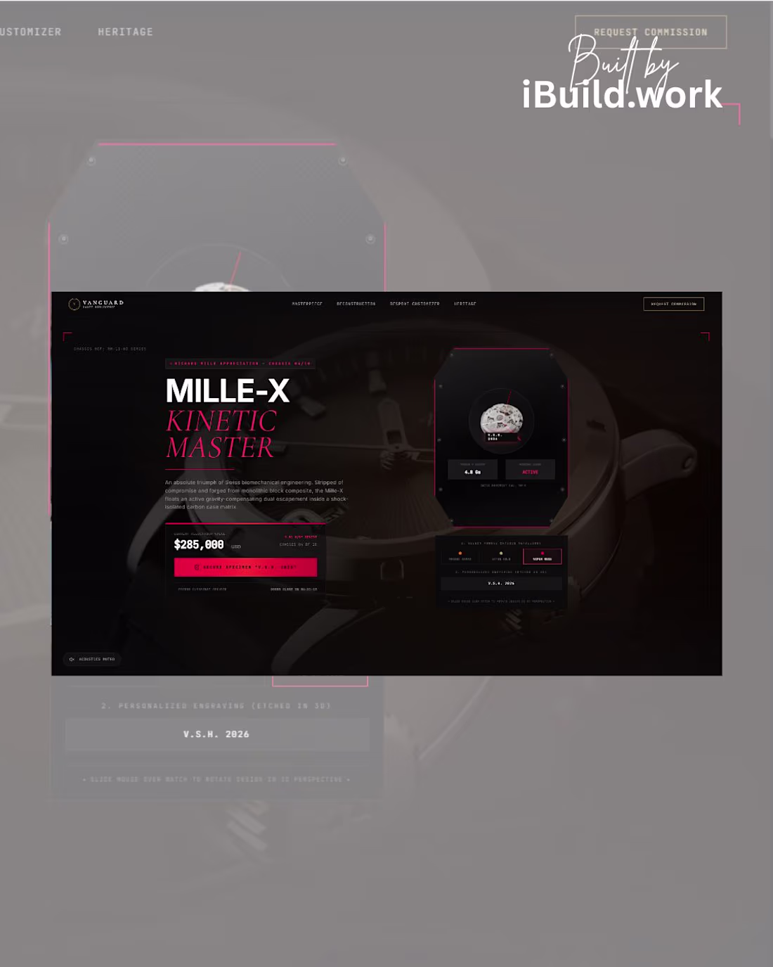
TECH STACK:
🤖 Google Gemini / AI Studio
⚛️ Next.js & React Framework
🎬 Framer Motion (Kinetic Shader Rotations)
🎨 Tailwind CSS (Custom Grids)
Drop a 🛠️ below if your e-commerce platform needs a luxury upgrade.
DM me "MILLE" to view the live build.
#LuxuryWebDesign #RichardMille #UIUXDesign #ThreeJS #FramerMotion #Vercel #GoogleGemini #AIStudio #DailyDesignChallenge #GlobalStatement #NextJS #Horology #CreativeDirector #FrontendDev #HighTicketClient
0
39
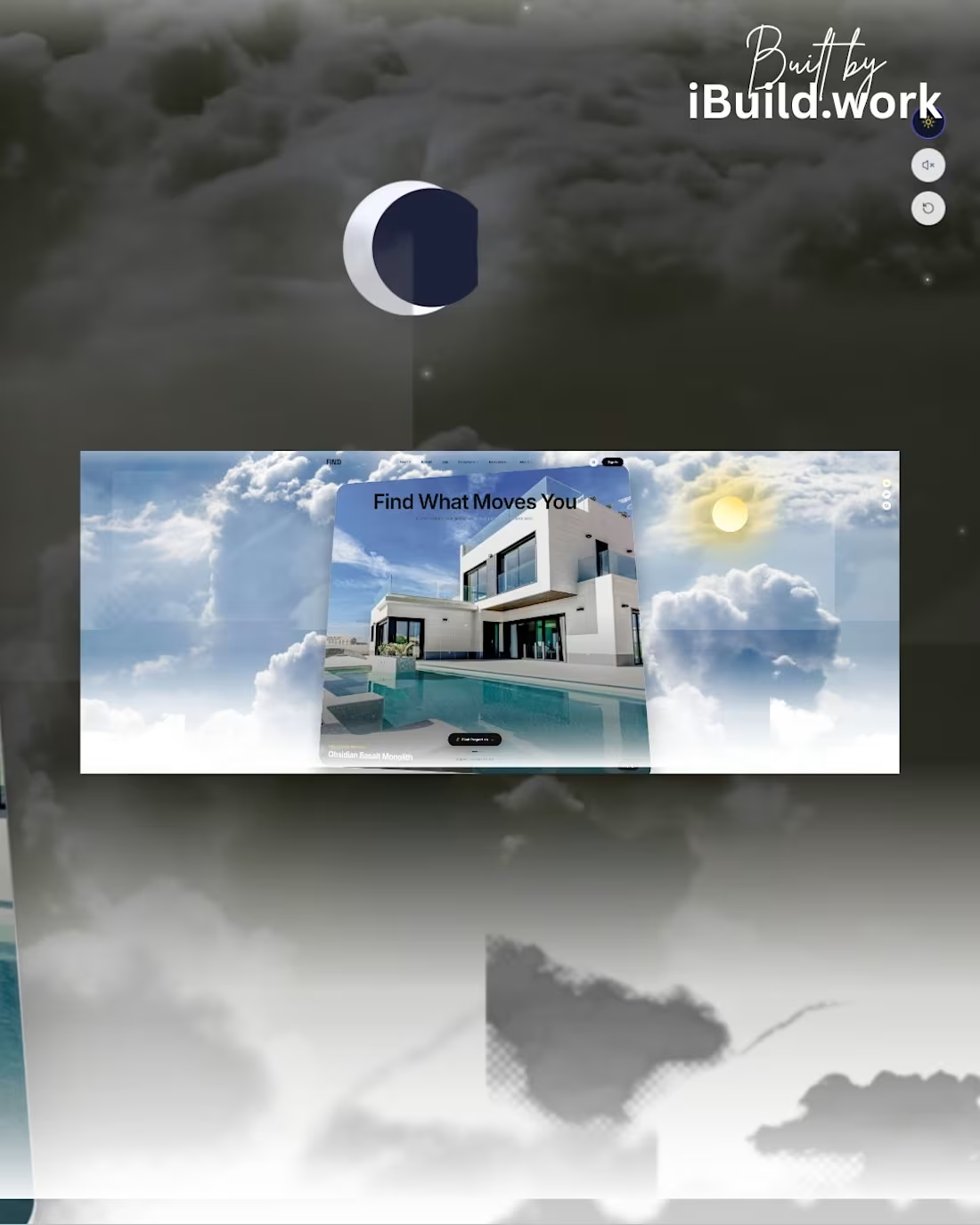
Comment "HERO" to get the Prompt
I instructed AI Studio with a strict, Awwwards-level technical prompt focusing on Spatial Depth, Camera Fly-Throughs, and Grid Alignment
TECH STACK:
🤖 Google Gemini / AI Studio
⚛️ React & Next.js
🎬 Framer Motion (Camera Fly-Through Logic)
🎨 Tailwind CSS (Grid Layout)
🖌️ Canva & Shots.so (http://Shots.so) (Mockups)
The future of digital real estate is here.
2
68
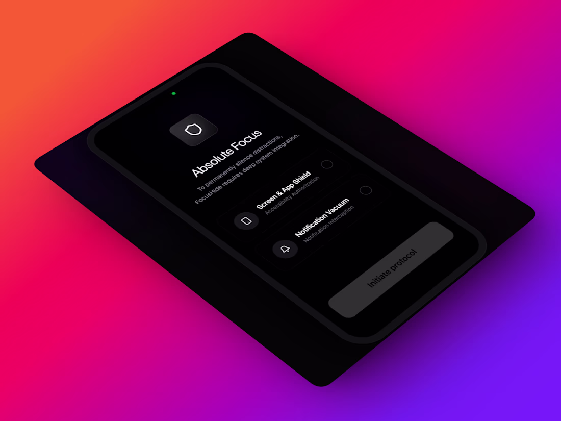
Most screen-time blockers fail because they punish the user. I designed one that rewires their psychology instead.
I just wrapped up the UI/UX for FocusHide a deep-work protocol designed to feel like a premium, luxury tool rather than a restrictive parental control app.
Instead of just putting up a brick wall, I designed three core UX loops to drive daily active usage and actually change habits:
⚡️ Autonomous Triggers: Geofenced deep-work zones (Library, Office) for zero-friction initiation.
🌬 Catch & Release: A 7-second "Breathe" intervention screen that breaks the subconscious muscle memory of doom-scrolling.
🏦 The Time Vault: Re-framing reclaimed time as a tangible "wealth" asset you build over time.
📝 AI Task Extraction: Automatically parsing your session's "intent" into a post-session checkout queue.
Would the 7-second "Catch & Release" intervention stop you from opening Instagram?
Let me know your thoughts on this UX flow in the comments! 👇
(Also, my books are open for new product design/frontend-dev projects let's chat!)
1
77
iBuild Premium Portfolio for SaaS & Web Projects
0
1
I designed and built a marketing site for a no‑code web experience builder, showcasing how teams can create, manage, and optimize modern websites. The hero focuses on clarity, strong hierarchy, and a product-first visual that highlights the app UI and key actions.
0
32
Aura Scent Elegant Ecommerce Web App for Premium Candles
0
0