Graphic Designer & 3D Animator
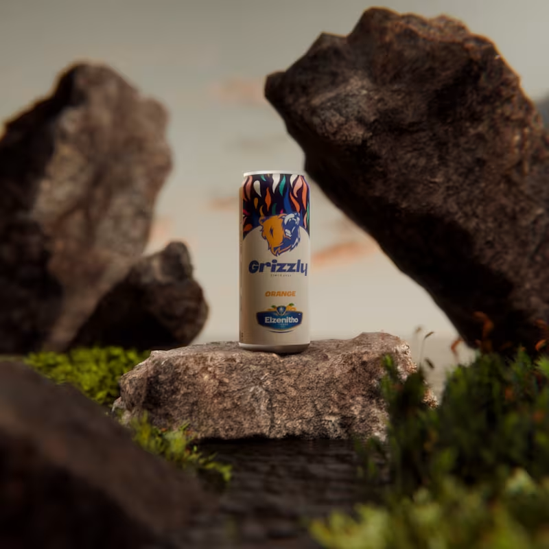
I created this fictional drink brand a while ago and decided to bring it to life inside a Blender scene. The goal was simple. Build a product that feels alive in its world. A drink that belongs in rugged landscapes and quiet moments of strength.
This is Grizzly.
A flavour that hits with confidence.
A design that stands firm in any terrain.
A brand shaped by imagination and craft.
Exploring ideas is one thing. Presenting them in a world where they feel real is another. This scene is a small step toward blending both.
2
3
266
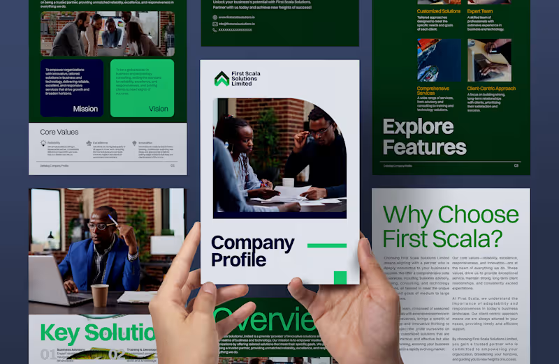
A detailed corporate profile crafted for First Scala Solutions Limited, a business and technology consulting firm.
My role at Mbari HUB was to translate their values: Reliability, Excellence, and Innovation, into a structured, modern, and visually compelling document that reflects their position as a trusted partner for organizations navigating change.
The result: a professional profile that communicates clarity, credibility, and forward-thinking energy.
2
233

While working at Crevtus Studios, we decided to reflect on the things that worked well in 2023 and how we could improve upon them in the 2024 and beyond. Therefore, we compiled a book that encapsulates the highlights of Nigerian branding in 2023.
I worked on the book design, marketing deliverables and social media animations. It was really a fun one. #ShareYourWork
3
214


Brand. Editorial and Motion Designer



Client-focused Logo & Branding
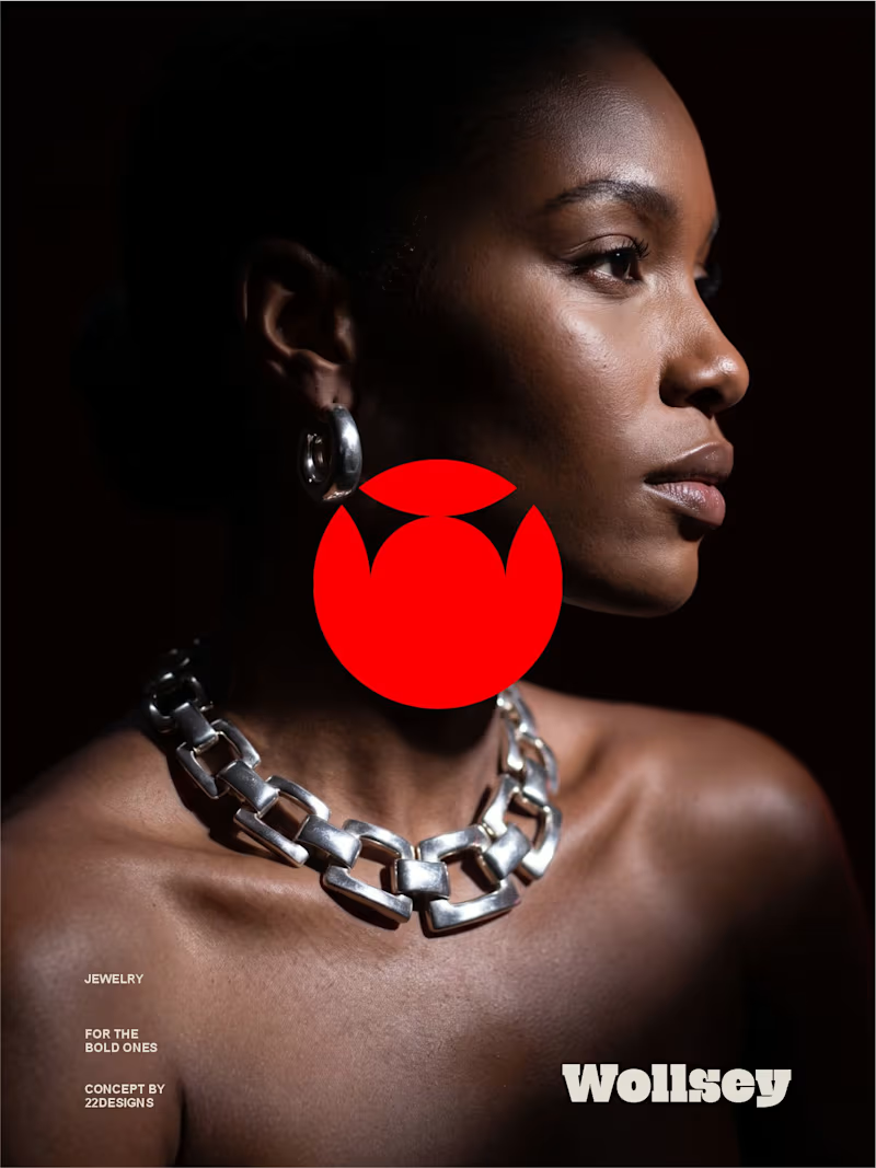
WOLLSEY - Jewelry for the Bold Ones
Wollsey is a jewelry brand built on one idea: bold jewelry should never blend in.
The identity centers on two interconnected principles; presence and permanence. The symbol takes the form of a solid, self-contained mark: a circular silhouette holding a crown-like negative space at its center, representing a piece of jewelry as an object of its own weight and status, not an accessory borrowed from someone else's trend cycle.
This concept carries through the entire visual system. The custom wordmark is built in a bold, condensed sans — compressed, confident letterforms that read as a stamp rather than a script, echoing the same solidity as the symbol itself.
The color palette pairs deep matte black with a controlled, high-impact red, balanced by warm cream and stone tones across packaging and supporting materials — a system built for contrast and attention rather than quiet luxury.
Full casestudy is coming soon
17
20
2.6K
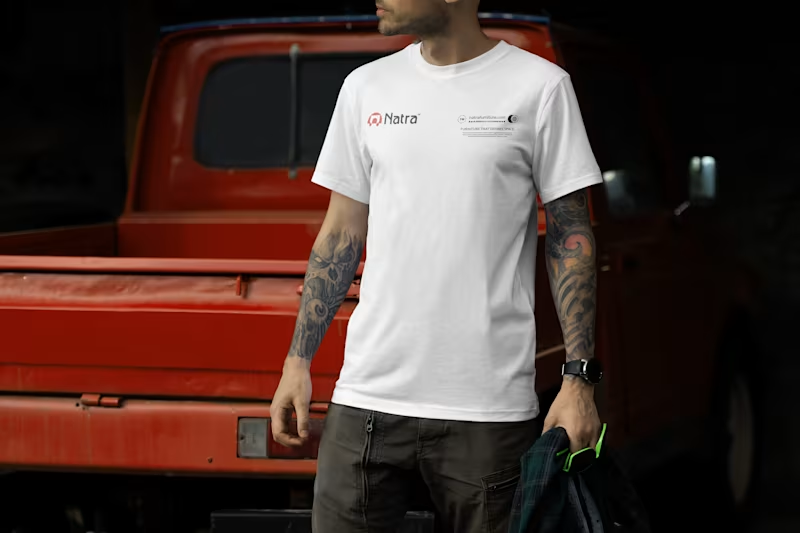
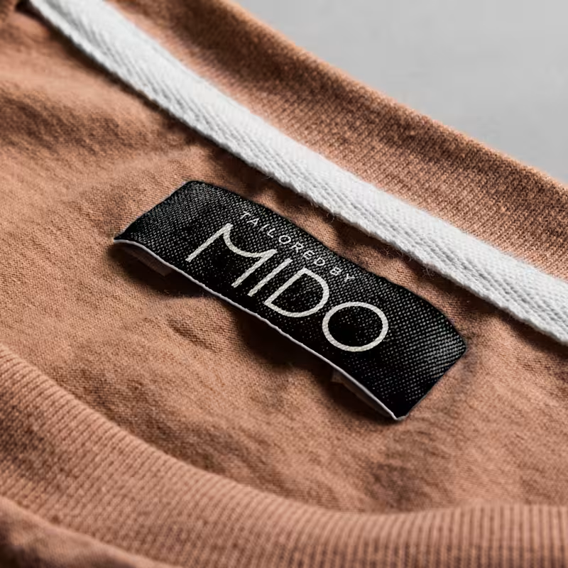
I always have it at the back of my mind that every branded merch should be designed in a way that everyone will want to be part of it, I mean designing it in a way that everyone will want a piece of the merch.
Here are some of my most recent branded shirt design collections.
Frame 1: Blevox Logistics
Frame 2: Natra Furniture
Frame 3: FIREWOX Studios
2
2
455

Blevox is a freight and logistics brand built to move across land, sea, and air without stopping. The brief was straightforward. My approach was not.
I started with a Swift. A bird that spends months in the air without touching the ground once. Scientists have tracked them crossing continents and oceans on a single flight. No layovers. No detours. Just locked-in forward movement until arrival. I did not want a mascot. I wanted a standard. So I reverse-engineered that standard into a brand identity.
The colors came from the three worlds this brand operates in. Dark Knight for the sky it moves through at night. Pastel Blue for the horizon where sky and sea become one body. Apricotta for the earth; warm and human where every shipment finally lands.
The style is dark. Precise. Industrial. Every alphanumeric code, every dock marker, every grid line is a brand decision. Nothing decorative. Nothing arbitrary. A cap, a truck, a drone delivery box, a phone UI, the identity does not break on a single surface because I did not let it.
Most freight companies look like freight companies. I built Blevox to look like the thing freight companies are compared to.
Available for sale. Full project here: https://www.behance.net/gallery/250824121/Blevox-Logistics
2
3
275
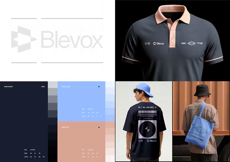
Work in progress for Blevox; a logistics and freight services provider brand.
Every color in this palette has a reason.
Dark Knight: The base. The weight. The authority.
Pastel Blue: The sky and sea the Swift passes through.
Apricotta: The earth it finally lands on.
I picked no color for aesthetics.
This is Blevox. Nature-driven.
2
1
321

Canva & Digital Product, Brand, Website & UI/UX Designer
- 5.0
- Rating
- 3
- Followers
Canva & Digital Product, Brand, Website & UI/UX Designer


Brand Identity & Visual Designer with 11+ Years Experience
New to Contra
Brand Identity & Visual Designer with 11+ Years Experience
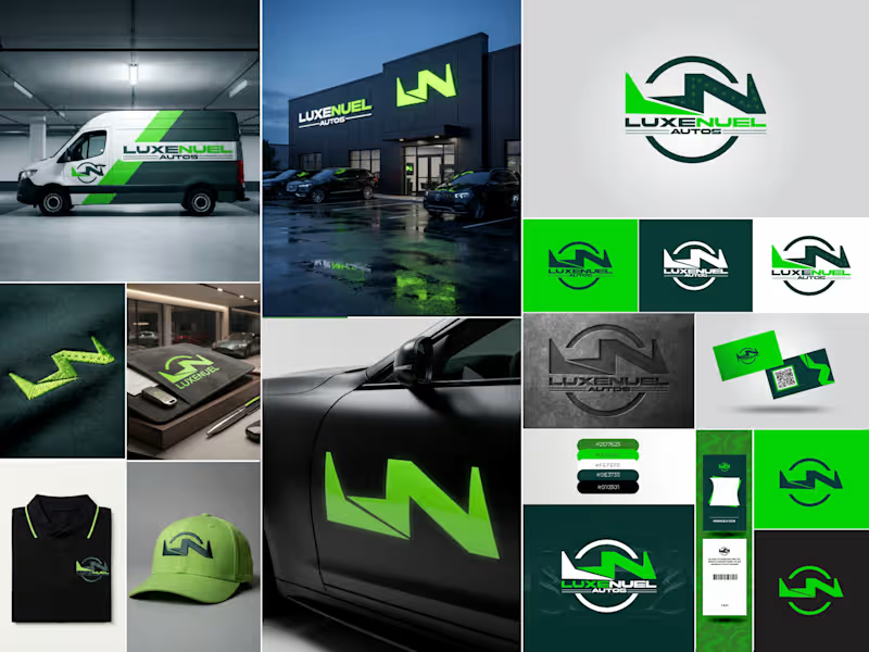
Luxenuel Autos: Brand Identity
Luxenuel Autos needed a brand that felt premium but still had energy, something that would look right on a dealership front and on a work van. I built the identity around a monogram that blends an "L" and "N" into one bold, angular mark. The shape reads like a road turning and a bolt of speed at the same time, and it sits inside a circular badge so it stays strong at any size.
For color, I went with a deep forest green paired with a bright electric green. The dark tone gives it weight and trust, and the bright one gives it that "always moving" feel. Black and white keep everything clean and easy to read.
Then I tested the mark on real touchpoints to make sure it worked outside the logo sheet: a wrapped service van, glowing storefront signage, embroidered polos and caps, business cards, ID badges, a key holder, and a car door decal. The logo also comes in solid, reversed, and embossed versions, so it holds up on light, dark, and textured surfaces.
The result is a complete, ready-to-use identity that makes the business look established from day one.
Deliverables: Primary logo, alternate and icon marks, color palette, brand applications, and mockups.
0
51
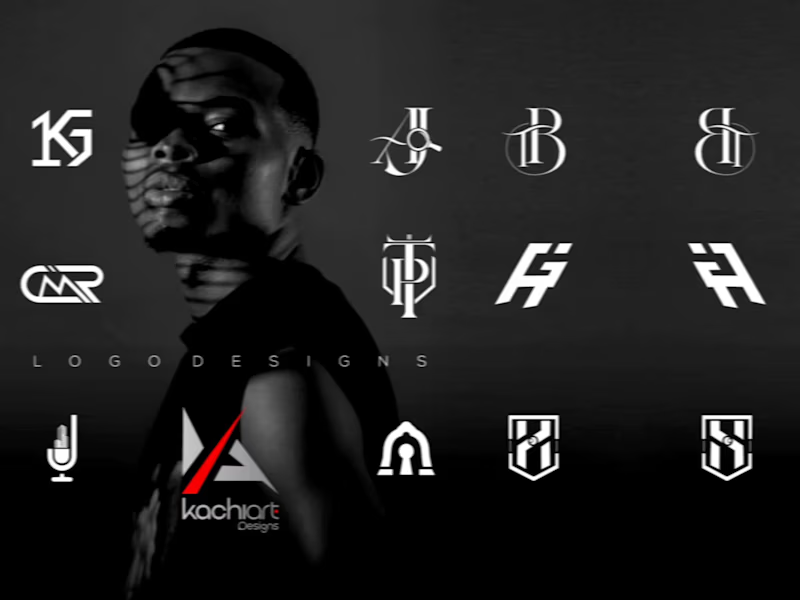
Brand Identity Showcase
This project is a collection of branding work I've created for businesses across different industries. Every logo, color palette, typography choice, and visual element was designed with one goal in mind: helping each brand communicate its personality and leave a lasting impression.
As a brand designer, I believe great design is more than aesthetics—it's about creating an identity that people remember and trust. From modern real estate branding to fashion and lifestyle concepts, each project reflects a strategic approach tailored to the brand's audience and vision.
This collection highlights my ability to build clean, timeless, and impactful visual identities that not only look good but also support business growth.
If you're looking for a designer who pays attention to detail, values consistency, and creates brands with purpose, I'd love to help bring your vision to life.
Thanks for stopping by—I hope you enjoy exploring my work.
0
116
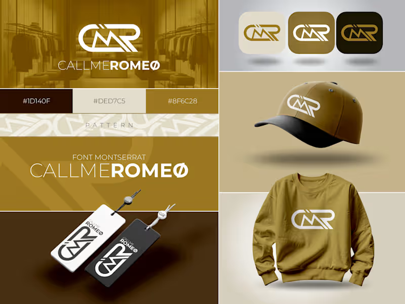
CALLMEROMEØ — Fashion Brand Identity Design
Project Overview
CALLMEROMEØ is a contemporary fashion brand identity designed to embody confidence, individuality, and premium streetwear culture. The goal was to create a visual identity that feels modern, versatile, and instantly recognizable across both digital and physical touchpoints.
Rather than designing just a logo, I focused on building a complete brand system that could seamlessly translate across apparel, packaging, social media, and future brand expansions.
The Challenge
Fashion brands compete in an industry where first impressions matter. The challenge was to develop a logo that was bold enough to stand on its own while remaining clean, timeless, and adaptable to different applications—from clothing labels and swing tags to embroidery and digital platforms.
The identity needed to communicate luxury without feeling overly complicated, striking a balance between minimalism and strong visual presence.
The Concept
The logo is built around a custom monogram that combines the initials of the brand into a distinctive mark. Instead of relying on trends, the design focuses on simplicity, movement, and geometric balance, creating a symbol that can become instantly associated with the brand over time.
Every curve and line was carefully refined to ensure the mark remains legible and visually impactful, whether displayed on a storefront, a clothing tag, or embroidered onto apparel.
The overall identity reflects confidence, creativity, authenticity, and modern fashion culture.
Color Strategy
The selected color palette reinforces the brand's premium positioning.
Deep Brown (#1D140F): Represents strength, sophistication, and heritage.
Warm Gold (#8F6C28): Symbolizes luxury, quality, confidence, and exclusivity.
Soft Cream (#DED7C5): Adds balance, elegance, and warmth while creating visual contrast.
Together, these colors create a refined identity that feels both luxurious and approachable.
Typography
Montserrat was selected for its clean geometry and contemporary character. Its versatility complements the custom logo while ensuring readability across marketing materials, digital content, packaging, and branding assets.
Brand Applications
A strong identity should work consistently across every customer touchpoint. To demonstrate this, the branding was applied to:
Apparel
Caps
Hang tags
Brand patterns
Digital icons
Marketing materials
Future merchandise
These mockups show how the identity maintains its impact regardless of scale or application.
Design Approach
Every branding project I create begins with strategy before aesthetics. My process involves understanding the brand's personality, audience, and long-term vision before translating those insights into a visual identity that feels authentic and memorable.
The objective wasn't simply to create an attractive logo—it was to build a visual language that strengthens recognition, builds trust, and gives the brand room to grow.
Final Outcome
The result is a modern, premium fashion identity that is clean, memorable, and highly adaptable. The system is designed to remain consistent across digital and physical experiences while giving CALLMEROMEØ a distinctive presence in today's competitive fashion market.
This project reflects my approach to brand design: creating identities that are not only visually compelling but also strategically built to help brands stand out, connect with their audience, and leave a lasting impression.
0
117
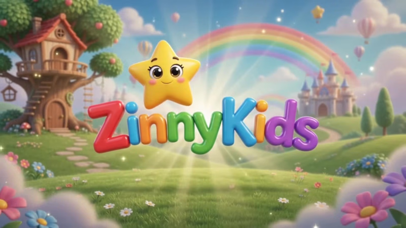
ZinnyKids: AI-Animated Kids’ Story Video
Description
I created this video for ZinnyKids, a kids’ learning and storytelling brand. The goal was to make something that looks warm, colorful and polished, like a real animated studio piece, without a studio budget.
Everything in it was built with AI video tools: the storybook world, the friendly teacher character and the movement, all kept consistent from scene to scene. That consistency is the hard part, and it’s where good prompting makes the difference.
I’m also a brand designer, so I don’t just make clips. I make sure the video matches your brand’s colors, style and voice.
If you need kids’ content, brand films, explainers, ads or social videos, I can build it with you.
0
31

Brand Identity Designer for Fintech, SaaS & Global brands.
- 1x
- Hired
- 3
- Followers
Brand Identity Designer for Fintech, SaaS & Global brands.
Mercent Brand Identity -
Mercent is a corporate fintech brand built to simplify global finance while maintaining the authority and structure expected from a serious financial institution.
The ambition behind the brand was clear from the beginning: create a financial identity that feels established, trustworthy, and internationally scalable. This was not about looking trendy. It was about building a system that could sit confidently alongside traditional banking institutions while still feeling modern and digitally fluent.
1
112

Tailored Visual Designs for Your Brand Success


Product designer, creating designs that drive brand success.
- 10
- Followers
Product designer, creating designs that drive brand success.