Vibe Coder Projects in Lagos
Vibe Coder Projects in Lagos
Sign Up
Post a job
Sign Up
Log In
Filters
2
Projects
People
Message
2
Moses Adebayo
pro
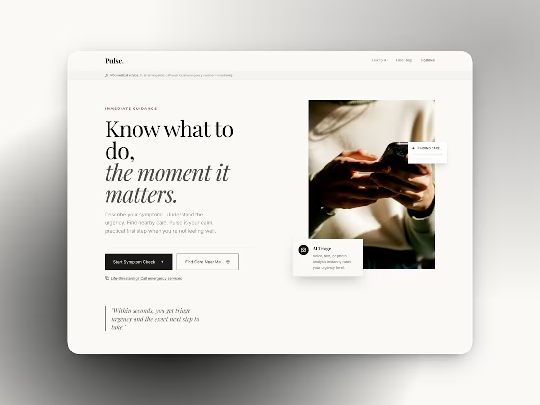
Pulse — AI Health Guidance & Emergency Assistance Platform
2
19
Message
1
Henry Tochukwu
pro
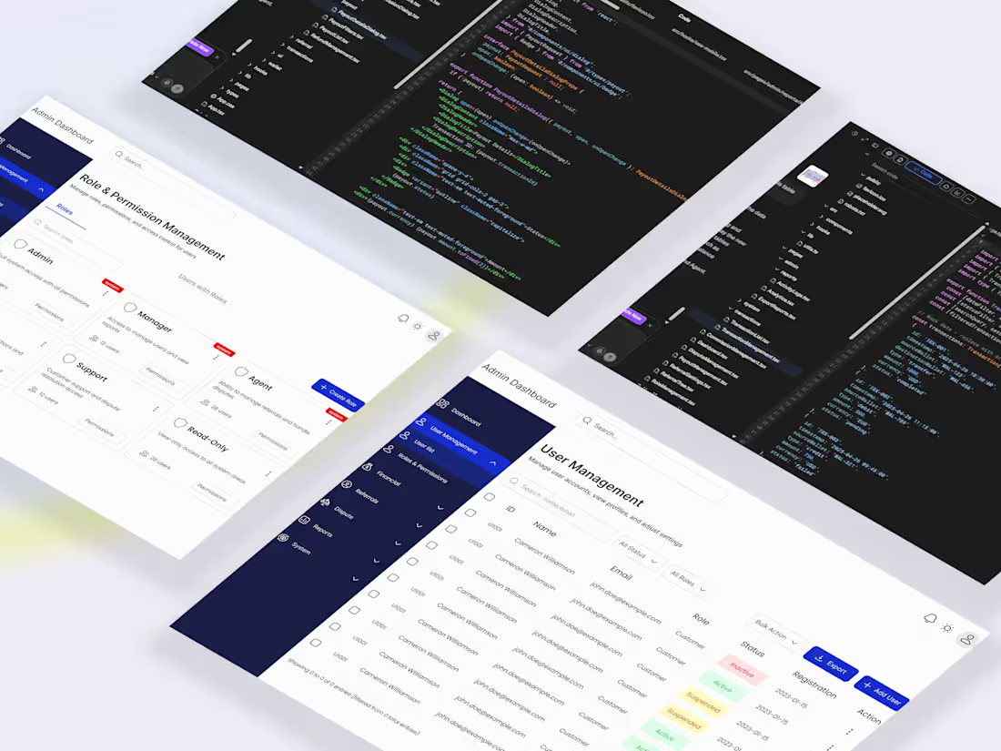
Built a centralized admin dashboard for Sentra to fix a growing operations problem, teams were juggling fragmented tools, which slowed fraud detection, delayed disputes, and limited real time visibility into transactions and financial health. The issue was not data availability, but the lack of a structured system to act on it efficiently. The solution was an interconnected platform that brings users, transactions, disputes, financials, referrals, and reporting into one workflow driven system. Designed in Figma and built using :Lovable with Supabase integration, the platform focuses on speed, clarity, and actionable insights. This led to faster fraud detection, quicker dispute resolution, improved financial tracking, and a major boost in overall team efficiency.
1
725
Message
1
Stephanie Asoegwu
pro
I built this without designing or writing a single line of code.
3
1
509
Message
1
Frankpeter Ani
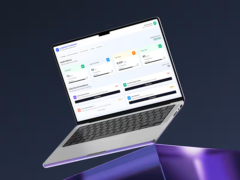
Longevity AI: Personalized Wellness App Concept
1
24
Message
0
Onifade Ifeoluwa
pro
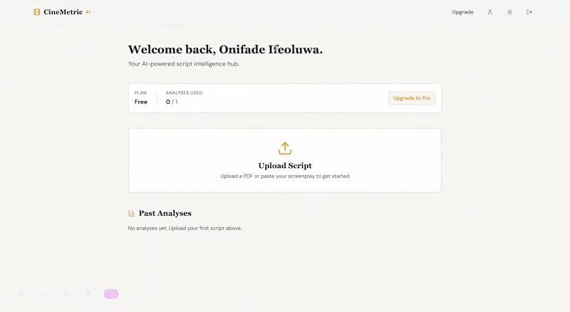
CineMetric AI: Film Industry Analytics Platform
0
14
Message
2
Hamza Abdul
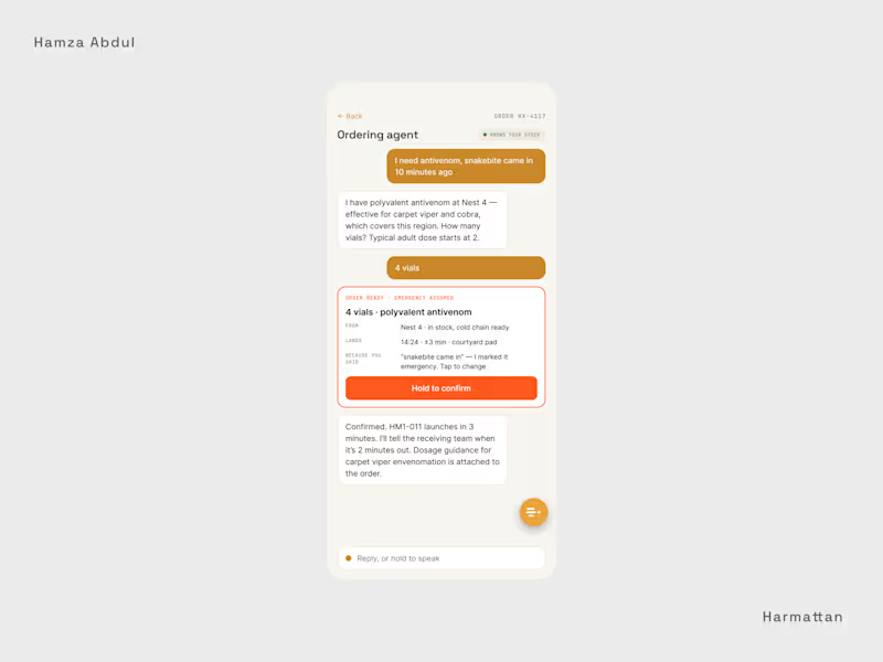
Day 3 of my daily creative challenge. Yesterday I showed Harmattan's health dashboard on desktop. But the person who receives the delivery is rarely at a desk. They're a nurse in a courtyard, a pharmacist between wards. So today: the responsive, mobile version of the same system. You sign in by facility code and role, and every action is signed with your name. It works offline, so orders queue until the signal returns, which matters where the network doesn't. You can order by voice: "I need antivenom, snakebite came in 10 minutes ago." The agent knows your stock, assumes an emergency, and confirms the dose with you. Then you track the flight and follow a simple winch-down guide to receive the pod safely on the pad. The trust thread from the desktop carries over. When the system reroutes around a storm, it says so, and a human checks it. This is a fictional product, designed end to end. Mobile screens below. I design interfaces for AI agents. If you're building one, my inbox is open. #ProductDesign (https://www.linkedin.com/search/results/all/?keywords=%23productdesign&origin=HASH_TAG_FROM_FEED) hashtag#UX (https://www.linkedin.com/search/results/all/?keywords=%23ux&origin=HASH_TAG_FROM_FEED) hashtag#MobileDesign (https://www.linkedin.com/search/results/all/?keywords=%23mobiledesign&origin=HASH_TAG_FROM_FEED) hashtag#HealthTech (https://www.linkedin.com/search/results/all/?keywords=%23healthtech&origin=HASH_TAG_FROM_FEED) hashtag#AIAgents (https://www.linkedin.com/search/results/all/?keywords=%23aiagents&origin=HASH_TAG_FROM_FEED)
2
42
Message
1
Oluwaseun Max
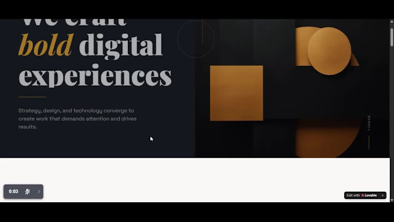
Was vibing, trying to improve my prompt writing skills, so I decide prompt lovable.dev (https://lovable.dev) to build me a basic landing page for EDITE. Look at what it did, man. Indeed, it is a basic setup. But man, AI-Powered Web builders are not going crazy. What do you also thinks of this AI-powered platforms? 😂
1
1
207
Message
1
Orishina Ogunro
pro
[Concept] Send money as a sentence instead of a form. Type an amount and the account blank appears. Fill that in, and the recipient shows up. "I would like to send ₦200,000 from Main Account to @orishina for dinner tonight." Designed in Claude. What do you think?
1
63
Message
0
Dada Damilola
USMI — Nonprofit Creative Infrastructure Platform
0
11
Message
1
Igwe Kenneth 《Framer Dev》
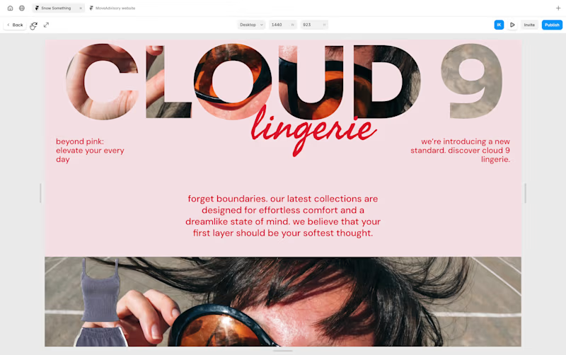
Landing page for an e-commerce website, built in Framer
2
1
66
Message
0
Tosin Peter
pro
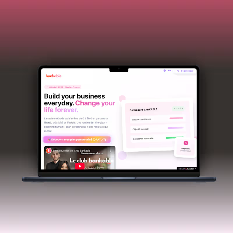
Bankable Lovable Web App Development
0
3
Message
1
ELVIS MOLUNO
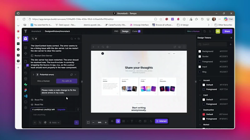
1-minute tutorial on how to change your website landing page title in @Tempo Labs
1
60
Message
1
Cynthia Osi
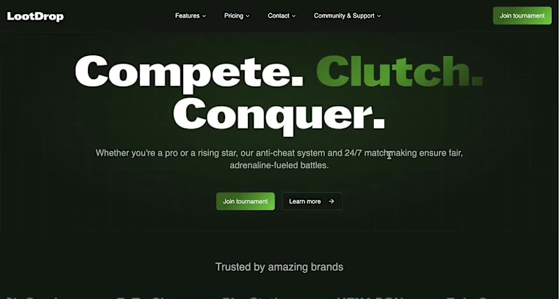
LootDrop: Gamifying Personal Development
1
5
Message
1
Ibrahim Lawal
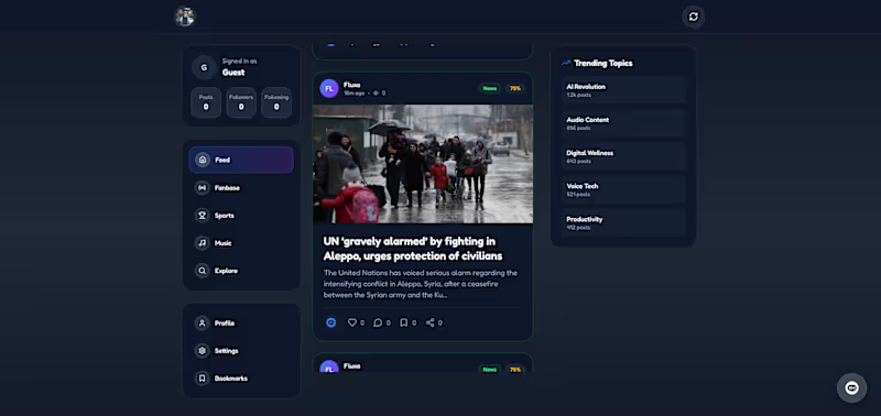
Fluxa — an AI-powered content aggregation app that curates news, sports, and entertainment into personalized feeds:
1
130
Message
93
Dotun Ayoku
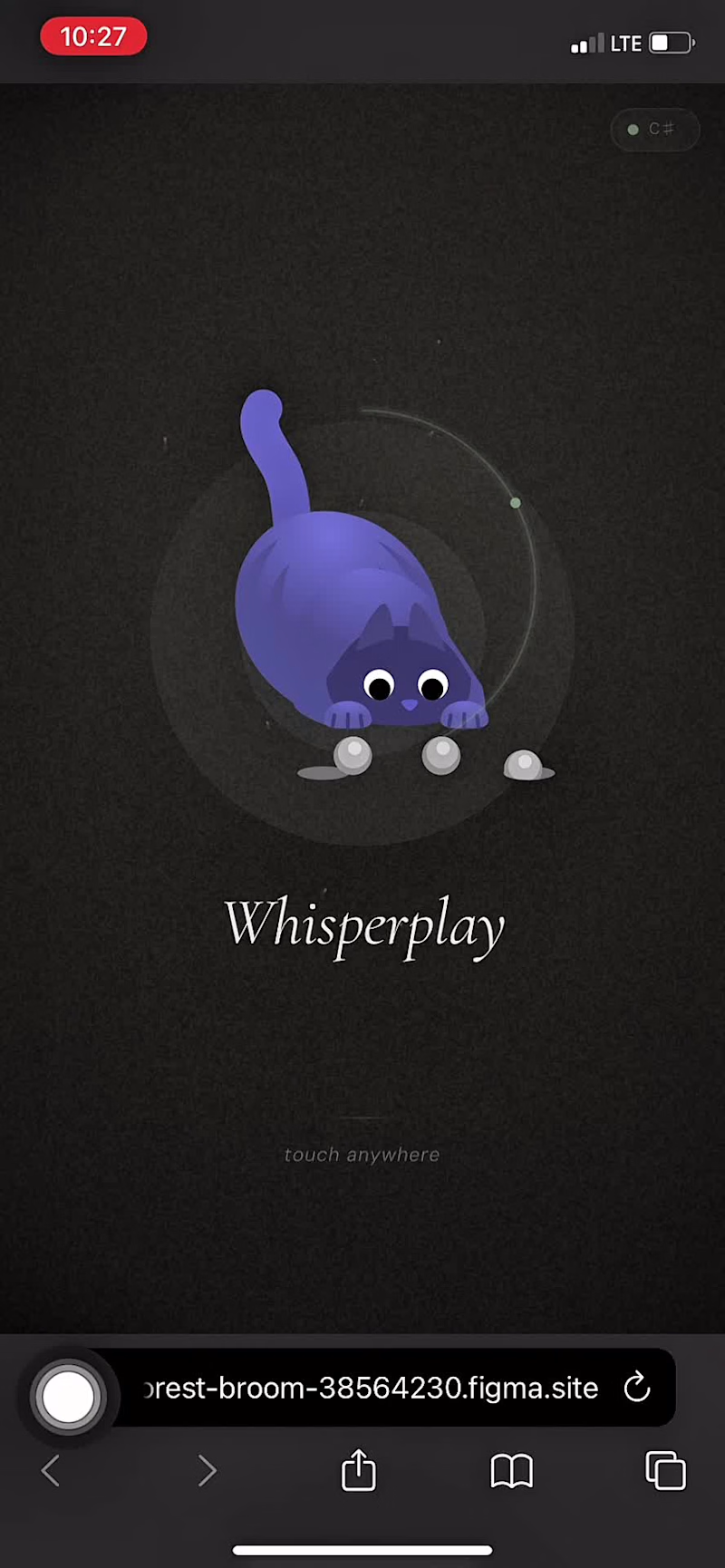
Pure flow state mehn. 😂 Building Whisper Play https://forest-broom-38564230.figma.site/in Figma Make was zero stress, just vibes. 🌀 It’s an elemental playground where you can interact with fire, water, acid, oil, and more to melt away stress. The Impressionist feature even shatters your own photos into these reactive elements. For the sound, I included 13 preset tracks to set your vibe immediately, or you can customize the ambience to your exact taste. 🎧 This is my submission for the #FigmaMakeathon shaping culture through tactile play. 🚀 Try here: https://forest-broom-38564230.figma.site/ The editable figma file https://www.figma.com/make/6iNmhJATsji4lHZmtrqQX3/Whisperplay-web-app?p=f&t=psYb3cnYFslh0wwC-0 Social link: https://x.com/Kuura18199670/status/2028067718344106151
79
93
8.3K
Message
1
Emmanuel Oluwapelumi
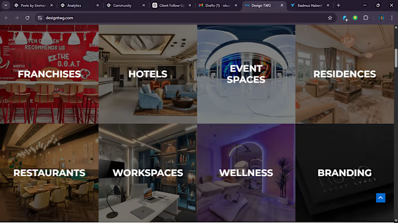
🔥 Your Website Should Deliver Results—Not Just Look Good Many websites look appealing but fail to convert. I design websites that are strategically built to turn visitors into paying clients. Whether you need a landing page, a full business website, or a redesign, I create fast, modern, and growth-focused solutions tailored to your goals. ✨ What You Get: • Clean, professional, conversion-driven design • Fully responsive, mobile-first layout • Optimized speed and performance • Clear user flow that guides visitors to take action • Seamless integrations (forms, automations, APIs) 💡 Best Suited For: • Startups & entrepreneurs • Service-based businesses • Personal brands & creators I don’t just design websites—I build systems that support your business growth. 📩 Let’s transform your online presence.
1
92
Explore projects
![Cover image for [Concept]
Send money as a sentence](https://media.contra.com/video/upload/w_800,so_auto/e3ff4fog6ixo530juny2.avif)