
SaaS & AI Product Video Designer | Demos, Explainers, Promos

SaaS & AI Product Video Designer | Demos, Explainers, Promos


Brand transformation agency for gamechanging tech businesses

Advanced Manufacturing Website Production—TRIOL
The primary challenge was translating highly technical engineering systems into a digital experience that feels clear, reliable, and precise—without oversimplifying the product or losing technical depth.
Every design decision was driven by the realities of heavy industry: reliability, accuracy, system control, and engineering logic. The interface prioritizes structured content, strong visual hierarchy, and restrained aesthetics to support fast scanning and confident decision-making.
The final result is a production-ready website that supports TRIOL’s positioning in advanced manufacturing — delivering clarity, trust, and performance for a highly specialized industrial audience.
2
5
163
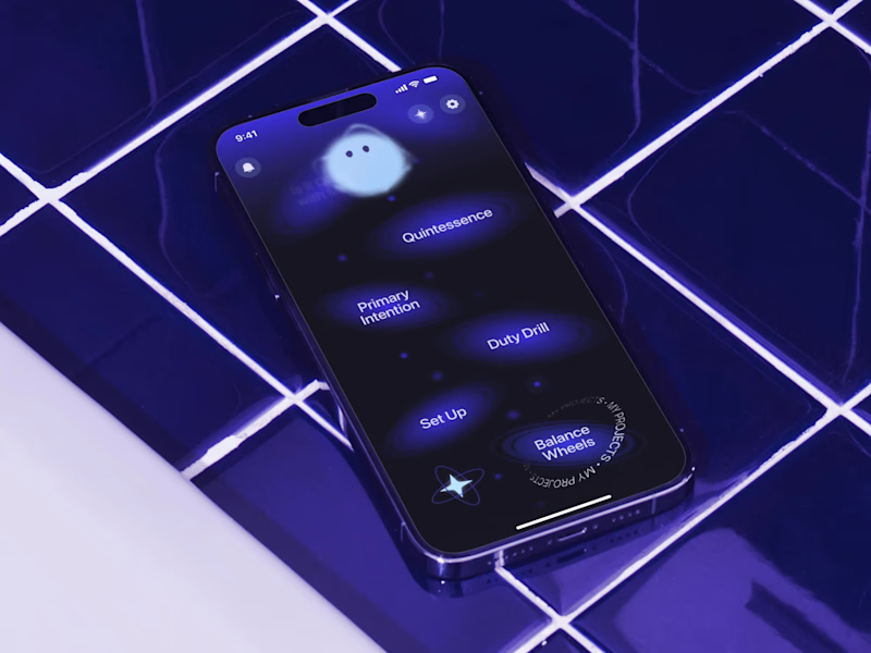
Mascot Animation for Mental Health Brand — SelfApp
We approached animation as part of the product language, not a visual effect.
The mascot animation system was designed to communicate emotional states through form and movement.
Different mascot states represent how the self changes under external influence — becoming constrained, fragmented, or muted over time. Transitions between these states were carefully designed to feel gradual and intentional, mirroring moments of disconnection and reconnection.
From a design perspective, animation acts as a narrative layer that supports the product’s core idea and maintains emotional continuity across the app experience.
13
211
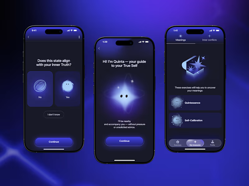
App Design for Mental Health Brand — Self App. Quinta, the Guide.
Quinta was designed as a functional visual element within the app’s system, serving as a consistent point of reference across user flows.
The interface is based on a progression metaphor, expressed through screen transitions, layout rhythm, and color contrast. Dark tones support introspection, while light accents indicate direction and state change.
Quinta does not provide instruction or feedback. Its role is to maintain conceptual alignment — reinforcing the product’s focus on self-awareness without introducing hierarchy or judgment.
1
1
112

"Finally, it’s time to be me."
"Shed your extra layers."
This video explores the shift between two inner states—realization and release.
Raw photography captures honest emotion, while restrained typography keeps the focus on meaning rather than decoration.
The contrast between the two frames reflects the brand’s core belief:
authenticity isn’t created through effort or performance—it emerges when unnecessary layers fall away.
1
4
170

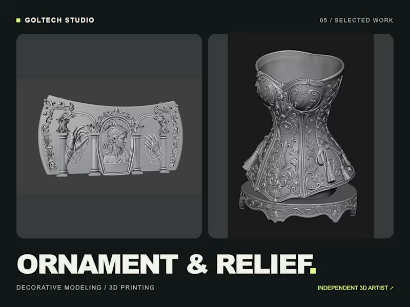
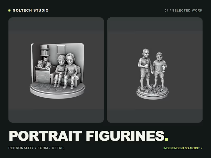
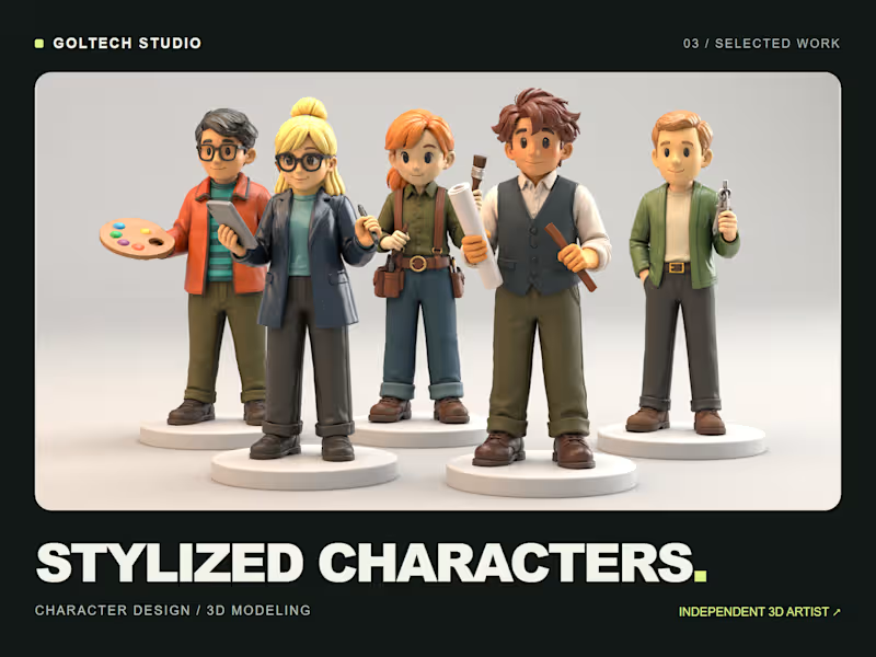
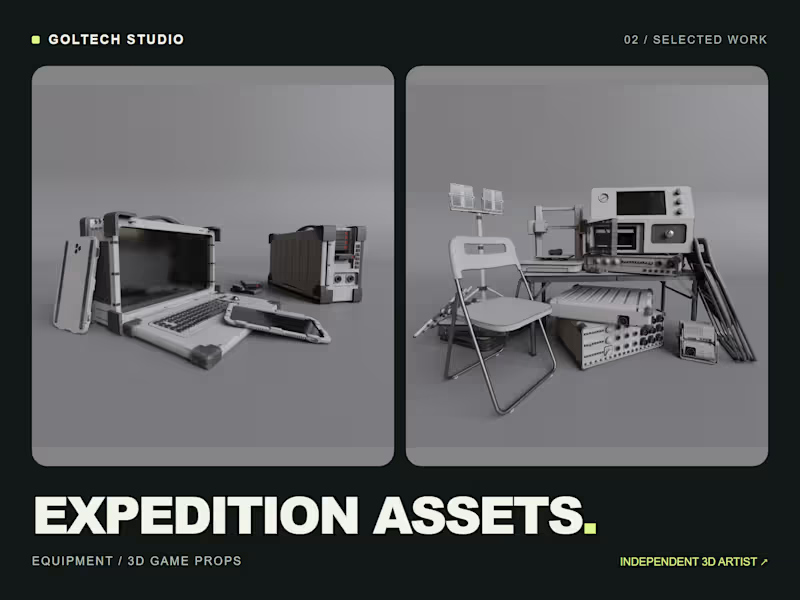
Independent 3D artist behind Goltech Studio

I create cinematic AI videos and visual campaigns for brands
I create cinematic AI videos and visual campaigns for brands


Professional video editor: Youtube, Documentary
Professional video editor: Youtube, Documentary


Framer Expert for bold, fast and beautiful sites

Framer Expert for bold, fast and beautiful sites


View more →

Webflow Dev & Brand Designer
Webflow Dev & Brand Designer


View more →

3D Models for AR/VR & Games
3D Models for AR/VR & Games


View more →