Freelance Brand Designers in Kuala LumpurFreelance Brand Designers in Kuala Lumpur
End-to-end branding solutions for B2B brands
$1k+
Earned
5x
Hired
34
Followers
End-to-end branding solutions for B2B brands
20 Years of Designing Desirable Products for Startups & SMBs
New to Contra
20 Years of Designing Desirable Products for Startups & SMBs
Cover image for 🔔 Contra's display options are
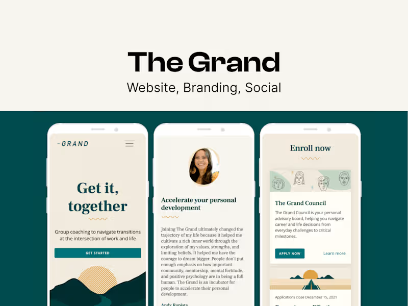
🔔 Contra's display options are a bit limited, so I've linked direct previews below to give you a full view of my ux research, branding, and web design work at The Grand: https://miracelso.webflow.io/works/the-grand Research & Ideation: It all started with user research. To guide our design decisions, I dove deep into understanding the primary personas who used our legacy products. I analyzed user feedback and observed how people were interacting with these tools in real-world settings. Collaborating with the product team, I led the ideation and development of what would become The Grand Council. We kicked things off with a brainstorming workshop that sparked some great ideas, and I carefully mapped out the user journey to make sure the experience was intuitive and seamless. Marketing & Design: I also played a key role in the lead-up to our big product launch. Partnering closely with a marketing team, we rolled out a comprehensive social media campaign designed to drive potential users to our freshly updated website that I had spearheaded. Our efforts paid off. We converted an impressive 30% of members within the first month of launch. It was a powerful reminder of how effective product design not only enhances usability but can also amplify marketing impact. Beta Launch: To validate our approach, we ran extensive testing with two small user groups, and the feedback was incredibly encouraging. Those insights helped us refine the product and ultimately led to the successful launch of The Grand Council. Design System: Before we started scoping out the Member Platform and Coach Platform, I strongly advocated for creating a design system. The goal was to standardize components and design patterns to create a cohesive and high-quality user experience. This evolution aimed to make the platform more adaptable, scalable, and user-friendly, ensuring it meets the needs of both current and future product developments.
0
19
Cover image for 🔔 Contra's display options are
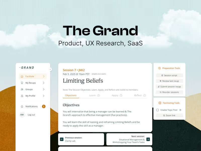
🔔 Contra's display options are a bit limited, so I've linked direct examples below to give you a full view of my product design work of SaaS at The Grand: https://miracelso.webflow.io/works/the-grand Member Platform: I led the design of our Member Digital Platform with a focus on connection, growth, and ease of use. The platform supports group coaching by giving members the tools to reflect, track their progress, and engage meaningfully with their cohorts. Designed to foster vulnerability and community, it ensures the right resources reach the right people at the right time. Digital Platform: I focused on creating experiences that feel smooth and intuitive, making it easy for users to navigate every step of their journey. The user flow, based on our extensive user interviews' insights, shows how I’ve mapped out the signup process and dashboard interactions to keep things clear and straightforward. The wireframes break down each stage — from pre-session prep to in-session interactions and post-session follow-ups — so members and coaches have a consistent, easy-to-use experience. My goal was to reduce friction, make things feel effortless, and ensure people stay engaged. I think through every detail, making sure the design supports users at every point and aligns with business goals. Ultimately, I want to create products that feel helpful, supportive, and simple to use. Coach Platform: The goal of the Coach Platform is to make it easy for coaches to deliver great group sessions and stay organized. It helps them access session content, track member progress, rearrange their session modules, and document 1:1 recap sessions. With streamlined dashboards and navigation, coaches can spend less time on admin tasks and more time fostering connection and growth. This supports key product goals like engagement, continuous improvement, and personalization for both coaches and members. Similar to how I mapped out the Member Platform where I’ve outlined the coach’s journey with user flows and wireframes. Now, I’m excited to show you the high-fidelity screens, which are set to be built by the end of Q1 2025.
0
24
Cover image for ❣️ Contra's display options are
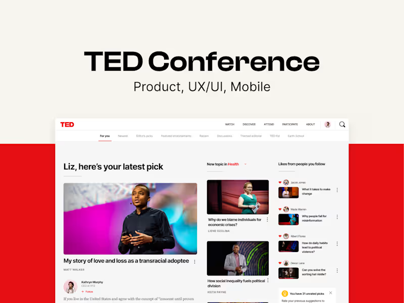
❣️ Contra's display options are a bit restrictive, so I've linked direct previews of my work at TED Conference: https://miracelso.webflow.io/works/ted I had the incredible opportunity to work as a senior product designer on the redesign of the TED Talk page in collaboration with engineers, product manager, and ux designer and the TED Design System which I had spearheaded. During that time, I also got to contribute to the mini player feature for the TED mobile app, helping to bring TED’s inspiring content to life in new and engaging ways. TED Talk Page Redesign: The goal of the TED Talk page redesign was to transform it from a one-time viewing experience into an engaging platform where users return regularly to participate and share ideas. We wanted TED.com (http://TED.com) to stand out from other video platforms like YouTube by encouraging meaningful conversations and active community involvement. To achieve this, we focused on enhancing interactivity—highlighting user discussions, thoughts, and recommendations—to inspire more participation and idea exchange. We also prioritized performance improvements, ensuring faster load times and efficiency by adopting newer technologies and meeting standards like the Google Lighthouse Score. Lastly, we created an updated guide for the talk page’s functionality to make future updates and management smoother. The result was a more dynamic, interactive hub that reflects TED’s mission of spreading and exchanging ideas. Design System: In redesigning TED.com (http://TED.com), we blended old features with new, like user-driven discussions, under a modern design system I led. Data-driven decision-making refined essential elements and removed outdated ones, enhancing the site's interactivity and appeal.We also had conducted user testing our prototypes throughout our iterations. More Than Just a Face Lift: We ran over 20 user tests to make sure our designs were as intuitive as we hoped. I iterated and refined the UI multiple times, using insights from these tests to guide each improvement. Along the way, I incorporated new design system components to keep everything consistent and seamless. The result? A more user-friendly experience that not only meets our goals for ease of use but also feels cohesive and polished — making sure users stay engaged and find real value in what we’ve built. TED Mobile iOS Mini Player: There has been a significant demand to enhance the browsing and video-watching experience for viewers on the TED mobile iOS app. In order to align with the current YouTube viewership standards, it has been crucial for us to deliver what our users truly need — a miniplayer for videos, audio-only functionality, and podcasts. Throughout this 3-month project, my responsibilities included analyzing the scope and requirements, designing the flow and UI, conducting user testing, and gathering valuable feedback. Working as a senior product designer at TED was a true privilege. I learned so much from our users by gathering their feedback during testing of the new Talk page, Homepage redesign concepts (built with the design system I had spearheaded), and the mobile mini player. While there were mixed reactions on whether these changes would boost user engagement on the site, every step of the process was a valuable learning experience.
0
30
Building your sexy SaaS and help take it to market