
Investor-Ready Framer Sites for B2B & Healthtech

Investor-Ready Framer Sites for B2B & Healthtech



Building brands and visual worlds with personality & purpose
- 5.0
- Rating
- 7
- Followers
Building brands and visual worlds with personality & purpose
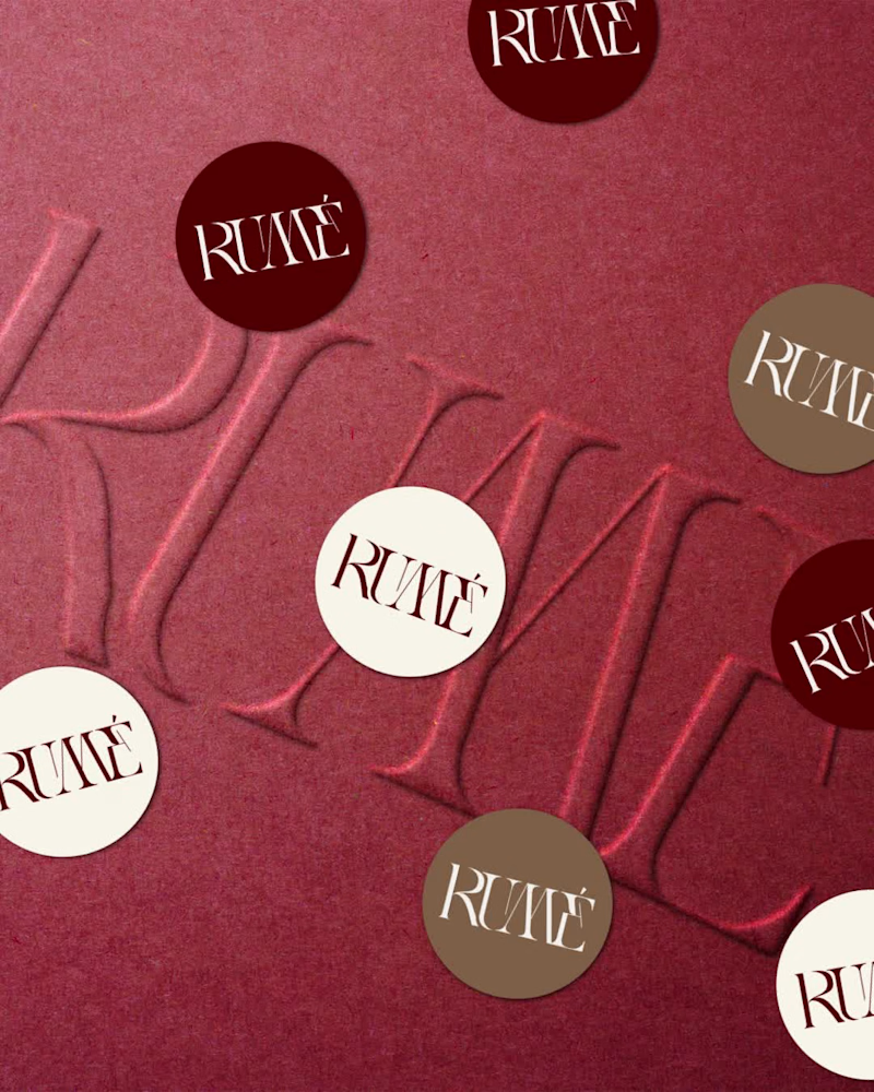
brand refinement & packaging design for @wearerume (https://www.instagram.com/wearerume/?hl=en) 🤎 a dubai-based modest clothing brand creating timeless abayas and dresses for women worldwide.
rume already had the foundation - its logo. the goal was to build the visual language around it and make it work beyond the screen.
a considered colour palette and typography system were developed alongside a custom floral pattern, bringing the visual language across the physical brand experience through shopping bags, packaging boxes, wrapping paper, stickers and thank-you cards.
the result is a design system that feels cohesive, refined and built to extend beyond the logo.
working on a new brand or thinking about a brand refresh? say hi at 📩 collabnuhr@gmail.com
(mailto:collabnuhr@gmail.com)view full project here (https://www.instagram.com/p/DdoP0QmGYdS/?utm_source=ig_web_copy_link&cplk=NTc4MTIwNjQ2YQ==)
2
1
329
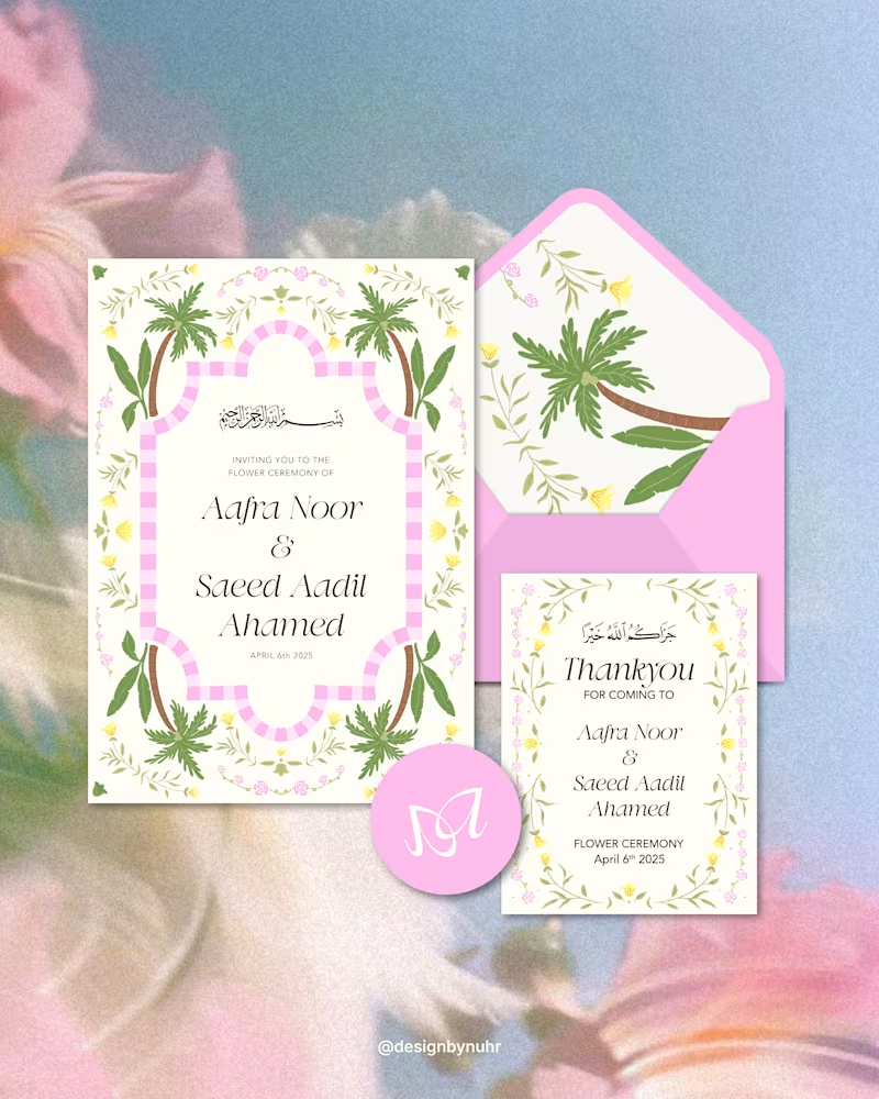
Custom wedding stationery designed around a bespoke illustration and a cohesive visual language.
The illustration was extended across the invitation, thank-you cards, welcome card, e-invite and itinerary, creating a considered and cohesive suite across both print and digital touchpoints.
Swipe to see the moodboard →
View the full project here (https://www.instagram.com/p/DYcMpQTGZ3O/?utm_source=ig_web_copy_link&stkn=NTc4MTIwNjQ2YQ==)
#WeddingStationery #InvitationDesign #WeddingBranding #CustomIllustration #StationeryDesign
0
290

Multidisciplinary Designer | Jitter Expert | Framer Expert
Multidisciplinary Designer | Jitter Expert | Framer Expert


Unique Branding & Graphic Design Solutions
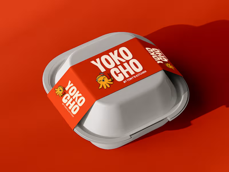
Inspired by the Japanese word "Yokocho (横丁)", meaning the lively side streets lined with small eateries and hidden food spots, this identity was designed to capture the warmth, energy, and charm of Asian street food culture.
The visual identity combines bold typography, a playful octopus mascot with a ramen bowl hat, and vibrant colors to create a brand that's approachable, memorable, and full of personality.
Every element was crafted to make Yokocho feel like more than just a place to eat, it's an experience that brings people together over comforting food and bold flavors.
5
4
544


Logo & Brand Design: Make Your Mark Memorable
Logo & Brand Design: Make Your Mark Memorable


Brand Identity Designer and Advertising Director
Brand Identity Designer and Advertising Director


View more →

Collaborate with me for eye-catching creative stuff
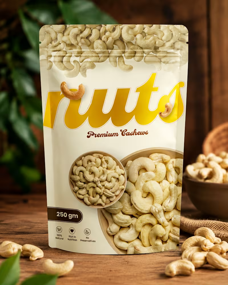
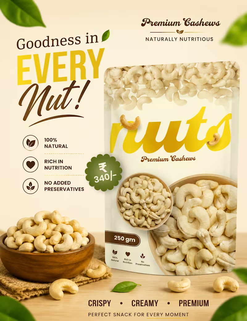
Packaging Design — From Concept to Shelf
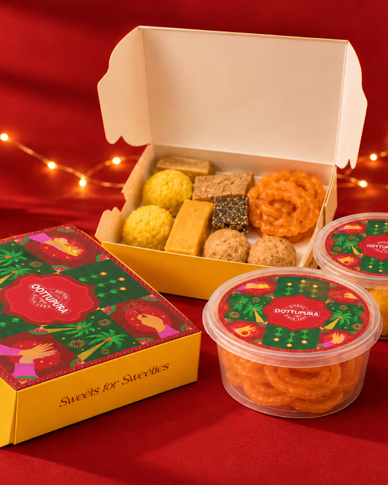
Creating packaging that not only looks good, but also communicates the product and connects with the right audience.
This project focused on visual direction, typography, colors, layout, and print-ready packaging artwork, bringing the brand together into a clean and memorable package.
Designed with a balance of creativity, functionality, and brand personality.
#PackagingDesign #Packaging #GraphicDesign #Branding #BrandIdentity #ProductDesign #VisualDesign #CreativeDesign #PrintDesign #PackagingArtwork #Designer #GraphicDesigner #DesignPortfolio #ContraDesigner #Pixa9
0
52
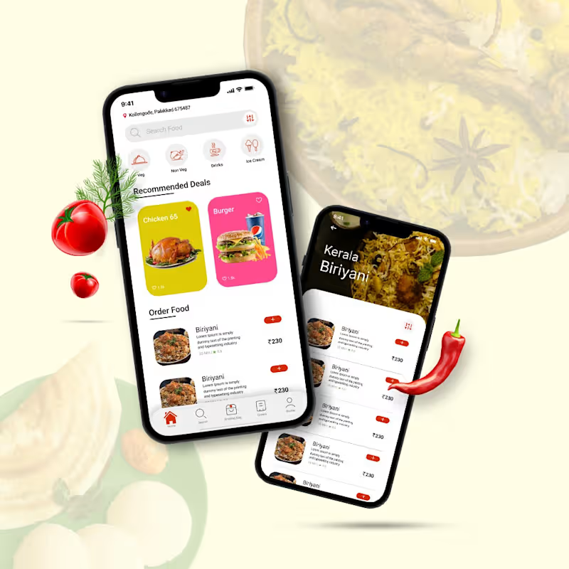

Designs that speak for your brand, crafted with purpose
Designs that speak for your brand, crafted with purpose


View more →