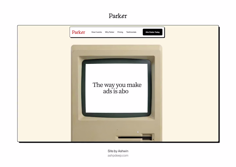
Web Designer & Developer
Web Designer & Developer
View more →
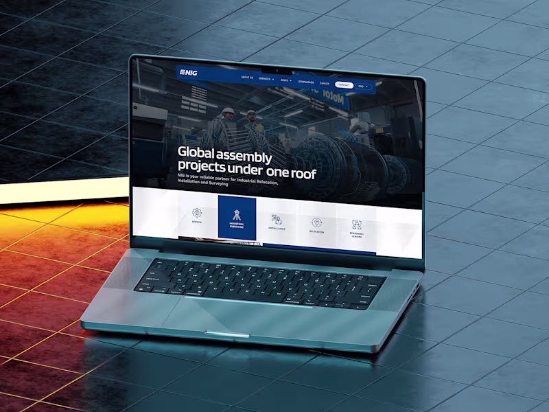
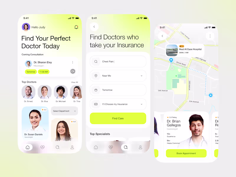
Fullstack Developer | Mobile Apps, Web, UI/UX & No-Code Pro
- $1k+
- Earned
- 2x
- Hired
- 5.0
- Rating
- 23
- Followers
Fullstack Developer | Mobile Apps, Web, UI/UX & No-Code Pro
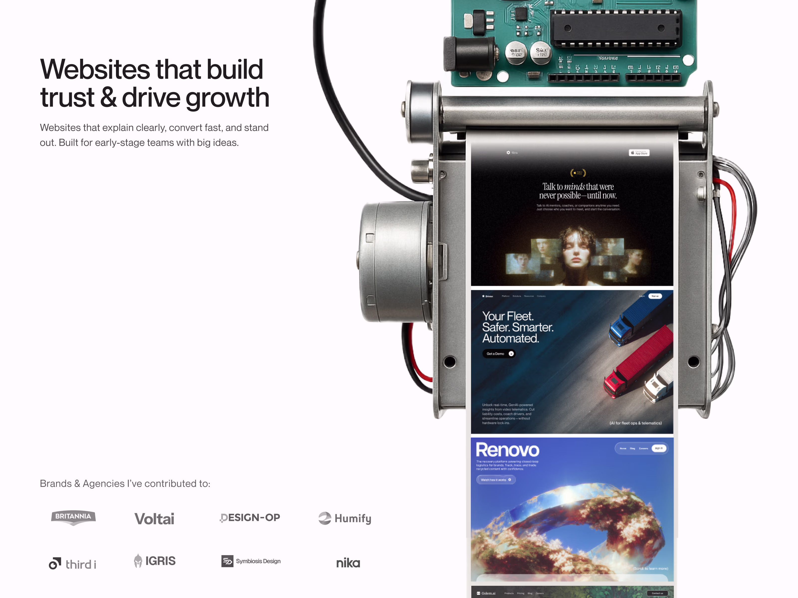
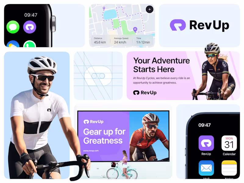
Creative Design for Impactful Brands
Creative Design for Impactful Brands

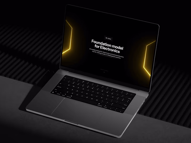
Product & UI/UX designer building with Framer


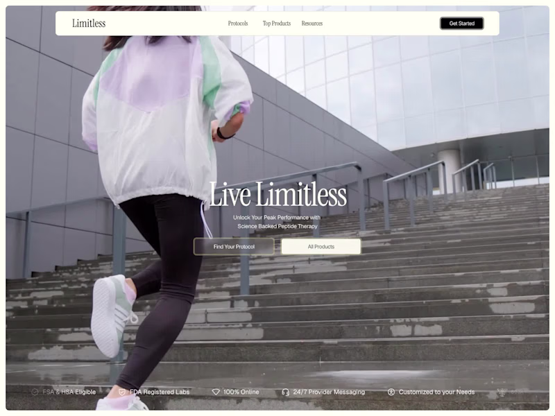
UI Designs & Framer Sites that Convert Fast

Brand and UIUX Designer with 11 years of Experience.


Framer Developer+Design for early stage startups & Founders.

UX/UI Designer creating intuitive & engaging experiences.
UX/UI Designer creating intuitive & engaging experiences.