Built with Framer
Limitless Website Design and Development.
Vara Creative

Introduction
Limitless is a next-generation digital health and wellness platform specializing in personalized clinical protocols, advanced medical treatments (including GLP-1 formulations like Tirzepatide and Semaglutide), and precision supplement stacks. Operating at the modern intersection of healthcare, biotechnology, and direct-to-consumer (D2C) wellness, Limitless provides highly tailored solutions designed to optimize longevity, cognitive focus, weight management, and physical performance.
The Challenge
The online medical and telehealth landscape is crowded with platforms that feel clinical, cold, and intimidating. Conversely, traditional fitness and supplement websites often lack scientific legitimacy and fail to establish clinical trust.
Limitless approached us to bridge this massive gap. The challenge was twofold:
Design a premium, editorial-grade e-commerce ecosystem that feels aspirational, premium, and human—resembling a high-end luxury lifestyle brand.
Engineer a bulletproof, high-converting UX architecture that breaks down complex medical jargon, answers stringent medical compliance queries implicitly through the UI, and guides users seamlessly from symptom identification to custom prescription checkouts without friction.
The Landing Page: Crafting the Narrative Arc
The Landing Page serves as the primary funnel entrance. It introduces the "Limitless Protocol" workflow, highlights trending products, establishes credibility through trust badges, and concludes with an authoritative FAQ section.
Conversion Catalyst: Right below the fold, we introduced a "Discover Your Protocol" tab switcher. Instead of throwing a massive product list at the user, they can filter by their health goals immediately (e.g., Weight Loss, Longevity, Performance).
Goal-Based "Protocol" Navigation
Right beneath the main hero image, this section shifts the user from passive scrolling to active intent.
The UX Decision:
A horizontal tabbed filtering component based on user symptoms or wellness goals (Longevity, Weight, Focus, Energy).
The "Why":
Medical wellness catalogs can be intimidating due to clinical names. By letting users self-select their goals, the page dynamically updates the product cards below it. This reduces cognitive load and bypasses choice paralysis right at the top of the funnel.
"How This Works" Step-by-Step Flow
This component breaks down the onboarding journey using a split screen: lifestyle imagery on the left, and a structured vertical timeline on the right.
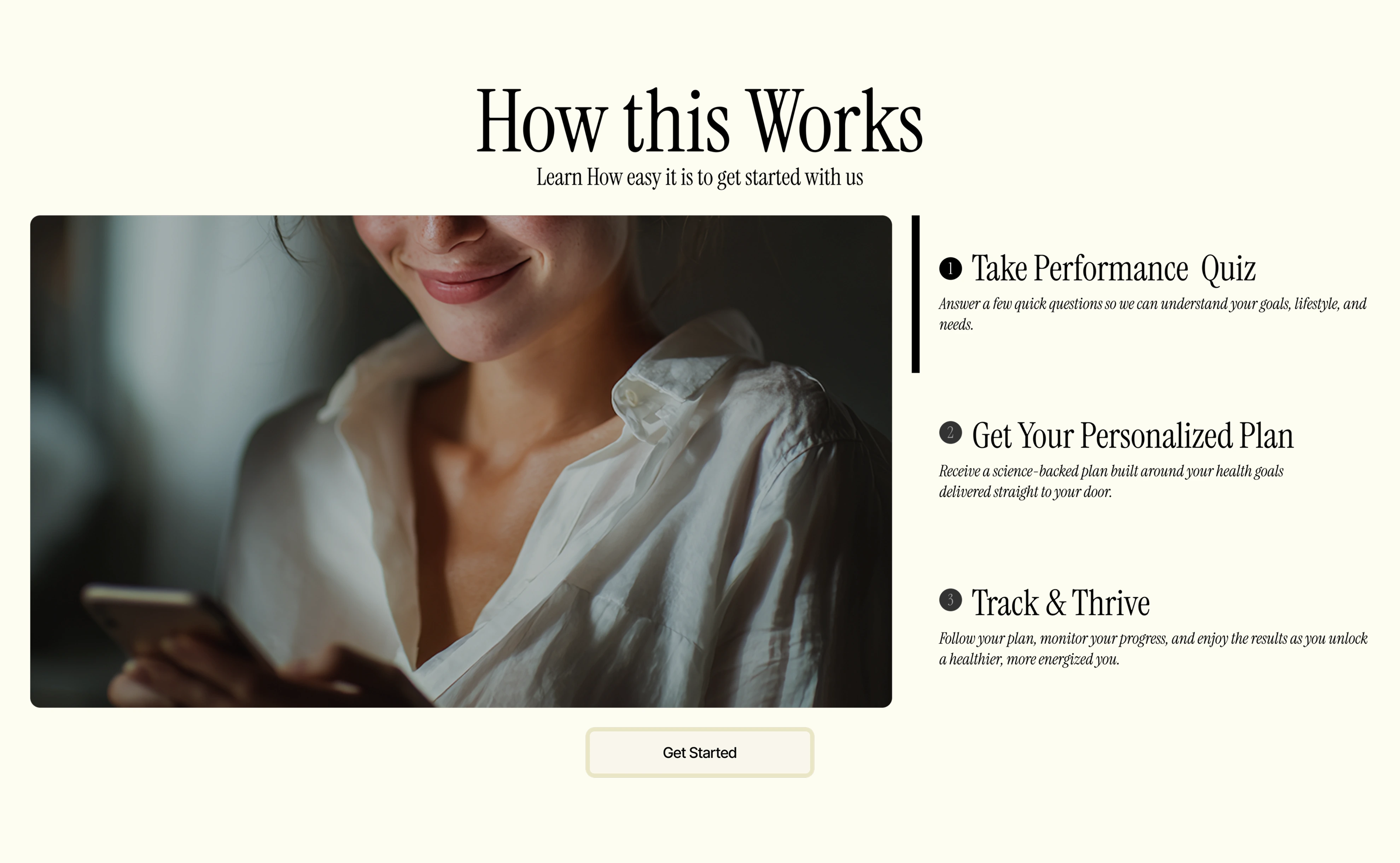
The UX Decision:
A clear 3-step linear sequence mapping out the transition from digital visitor to clinical prescription recipient.
The "Why":
Since these products involve medical-grade components or personalized setups, consumers need reassurance that the regulatory process is safe, simple, and legitimate before they are willing to click "Get Started."
Interactive Health Toolkits
Positioned lower on the category landing page, this zone moves away from retail selling into personalized utility by offering functional diagnostic tools.
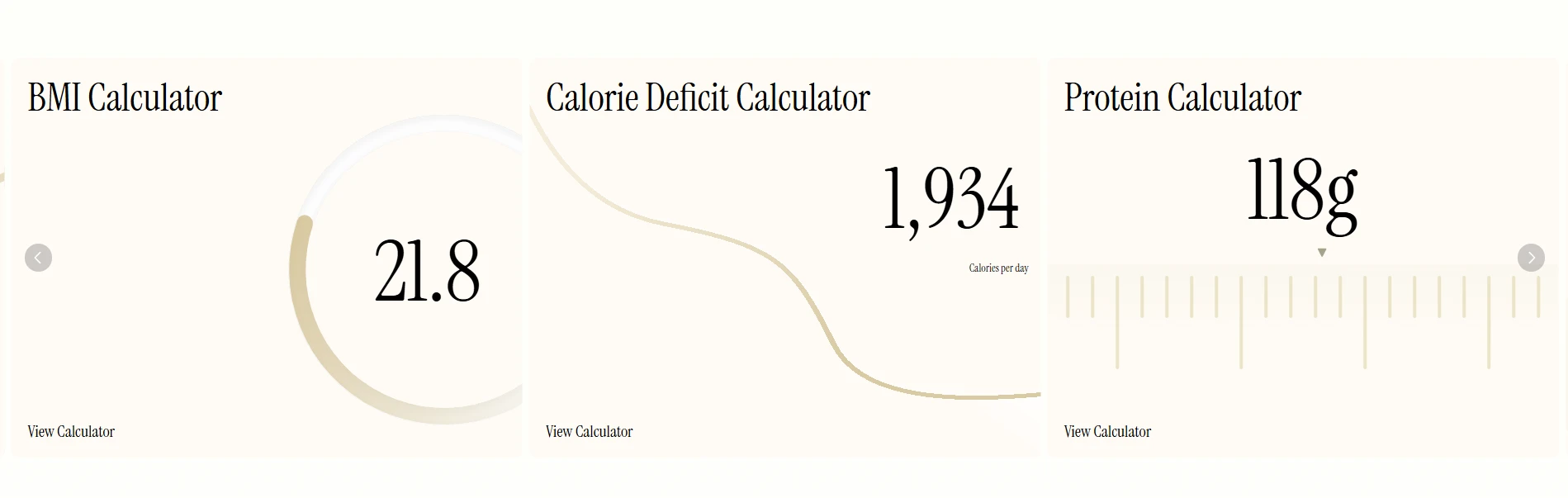
The UX Decision:
Minimalist card interfaces displaying real-time data calculations (BMR, deficit limits, macro targets) using massive typography values.
The "Why":
Embedding tools directly onto the category page changes the digital environment from a basic e-commerce store to an interactive health dashboard. It demonstrates that the brand values scientific optimization, which subtly primes the user to trust and purchase the paired medical solutions.
Linear Process Demystification & Reduction of Clinical Anxiety
Medical testing and digital prescriptions can cause cognitive friction or hesitation for users who aren't sure what to expect.
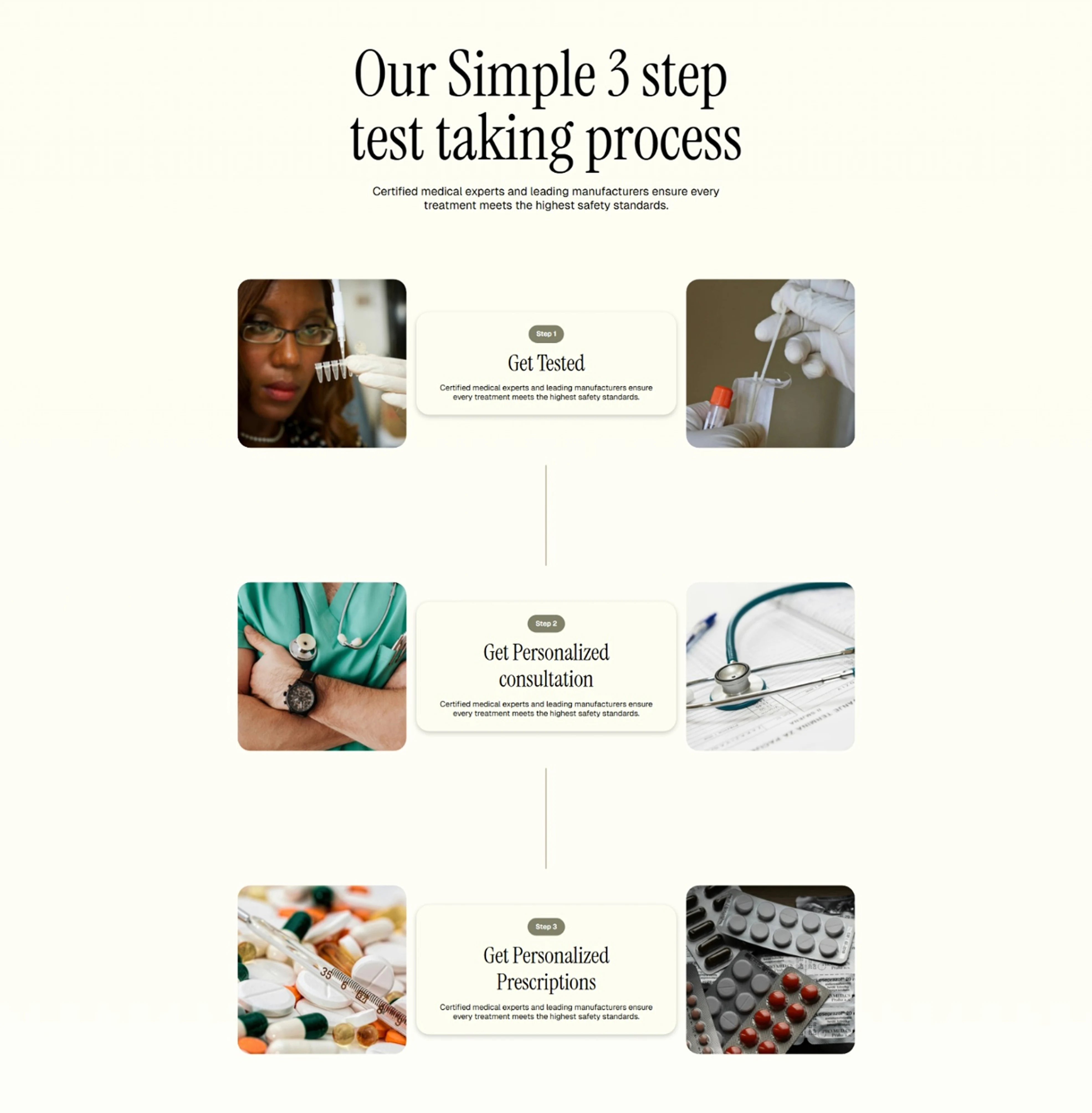
The UX Strategy:
The interface utilizes a centralized, vertical timeline connector layout titled "Our Simple 3 step test taking process". It balances text blocks perfectly between staggered lifestyle imagery (left and right), drawing the eye downward in a controlled, natural reading path.
The “Why”:
By structuring the journey as a finite, 3-step checklist, the platform transforms an ambiguous clinical workflow into a highly predictable, manageable retail experience. This drastically lowers barrier-to-entry anxieties.
High-Ticket Transparent Comparison Pricing
When users are evaluating premium testing services that range into thousands of dollars, hiding prices behind consultation walls destroys conversion trust.
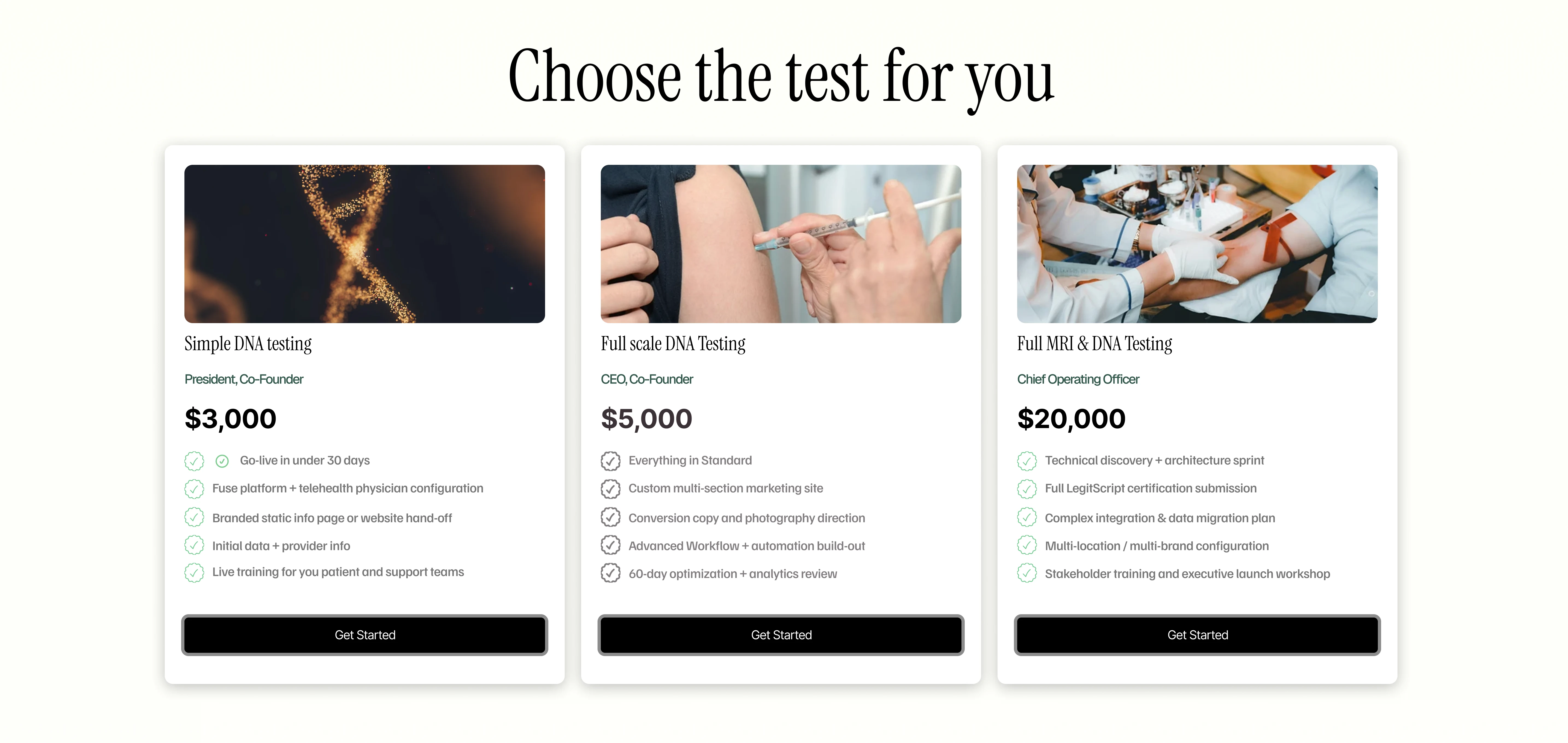
The UX Strategy:
A uniform, three-column product comparison grid titled "Choose the test for you". Each vertical card uses strict typographic hierarchy:
A concrete header image anchor.
A clear tier title.
A large, high-contrast bolded price tag (e.g., $3,000, $5,000, $20,000).
A clean checklist of exactly what is included (e.g., "Results delivered in days"), anchored by a prominent, dark [ Get Started ] CTA button.
The “Why”:
Grouping choices side-by-side allows for instant feature mapping. It targets user segments based on budget upfront, eliminating checkout surprises.
Asymmetrical Visual Chunking & Segmented Treatment Filtering
Telehealth storefronts often struggle to organize completely different treatment categories (e.g., Weight Loss vs. Hair Regrowth) without making the user feel overwhelmed by options.
The UX Strategy:
The platform uses a modular block layout where each treatment pillar receives its own self-contained micro-dashboard. Each block splits horizontally: an editorial introductory text and sub-product cards fill the broader left pane, balanced against a rich lifestyle image on the right.
The “Why”:
This avoids a monolithic, boring grid of bottles. It creates distinct visual "chapters" as the user scrolls, allowing a customer interested solely in "Hair regrowth that works" or "Better Skin" to quickly locate their destination block without getting distracted by unrelated products.
Gradated Color Coding for Product Categorization
On a master collection page displaying a wide variety of medical formulations, users can quickly experience cognitive fatigue trying to differentiate between items based on packaging alone.
The UX Strategy:
In the long product catalog view, the layout implements a subtle, highly intentional background color gradation strategy. As the user scrolls through the inventory, the individual product card containers transition down from a soft, off-white cream tone into deeper, earthier clay-brown shades.
The “Why”:
This acts as a silent, subconscious visual anchor. It visually categorizes groups of formulas or product types by color depth, giving the eye structural breaks and keeping the user engaged through a long scroll sequence.
Conclusion:
Setting the New Standard for Clinical E-Commerce. The redesign of the Limitless platform successfully synthesized the rigor of medical science with the elegance of a premium lifestyle brand. By moving away from the cold, intimidating aesthetic typical of telehealth, we created a digital space where users feel both clinically safe and personally inspired.
Key Project Takeaways
The success of the platform was built on four foundational pillars:
Demystified Complexity: By utilizing a structured, 3-step process overview, we transformed a complex medical workflow into a transparent, manageable journey.
Segmented Discovery: The asymmetrical visual chunking strategy allowed users to navigate diverse treatment categories—from weight loss to hair regrowth—without experiencing choice paralysis.
Subconscious Organization: The application of gradated color coding across the product catalog provided a silent navigation aid, helping users differentiate between various formulations through visual depth.
Radical Transparency: Implementing side-by-side pricing grids for high-ticket testing packages established immediate trust and eliminated the friction often associated with hidden medical costs.
Outcome
Through the strategic deployment of trust-building layers—such as the persistent FAQ blocks and manufacturing transparency sections—Limitless now stands as a blueprint for the future of digital health. The final product does more than sell a service; it provides a frictionless gateway to health optimization, ensuring that the user's journey to wellness is as limitless as the name implies.
Thanks for reading.
Let’s launch your next project.
Grab a free 30-minute slot on our calendar to talk ideas, timelines, and deliverables.
Like this project
Posted Jun 1, 2026
Website Design and Development done for the Medical Brand Limitless.