Built with Framer
FUSEHealth Telehealth Website Design and Development
Vara Creative

FuseHealth
Website Design & Brand Experience Case Study
Project Overview
FuseHealth is a healthcare infrastructure platform built for peptide and telehealth businesses. The platform enables entrepreneurs and wellness brands to launch and scale compliant healthcare operations with integrated telehealth workflows, patient management, and branded experiences.
The goal of this project was to create a website experience that clearly communicates FuseHealth’s value proposition while making a highly technical healthcare infrastructure feel approachable, trustworthy, and conversion-focused.
The design focused on:
Clarifying complex healthcare workflows
Improving information hierarchy
Creating stronger trust signals
Making the product feel modern and premium
Driving more demo requests and conversions
The Challenge
FuseHealth operates in a niche space where users often struggle to understand:
How the platform works
What services are included
Whether the system is compliant and trustworthy
How quickly they can launch their business

Goals & Objectives
Business Goals
Increase user trust and credibility
Improve lead generation
Position FuseHealth as a premium healthcare infrastructure partner
Differentiate from generic telehealth platforms
User Goals
Understand the platform quickly
Learn how the workflow operates
Explore features without confusion
Feel confident enough to book a demo or get started
UX Strategy
The design focused on reducing cognitive load and making the product easier to understand within the first few seconds of landing on the website.
Key UX Decisions
1. Simplified Messaging Hierarchy
The hero section was designed to communicate:
What FuseHealth does
Who it is for
Why it matters
The messaging became shorter, clearer, and more outcome-driven.

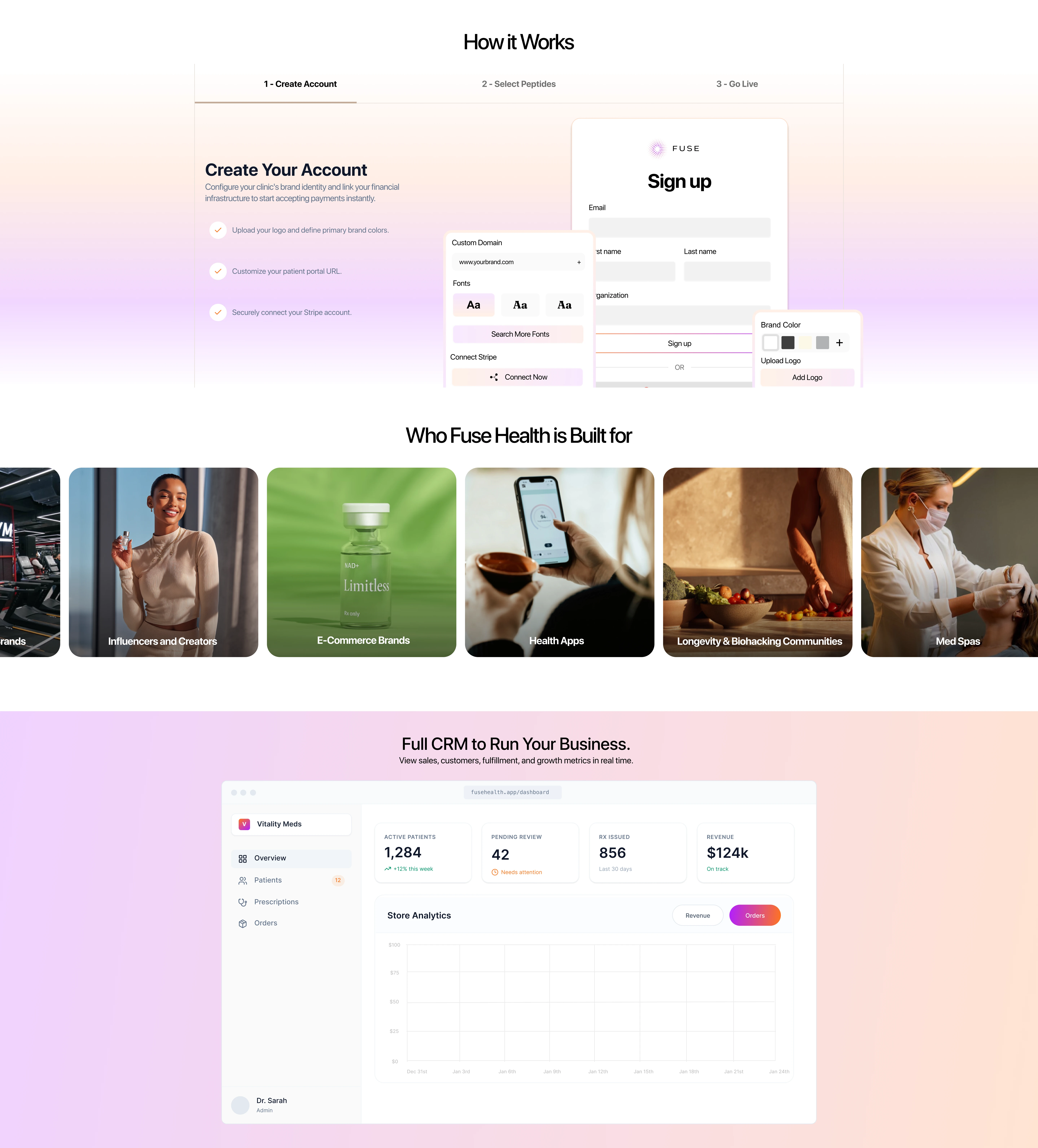
2. Modular Content Structure
Large blocks of information were organized into modular sections with:
Clear visual separation
Scannable layouts
Progressive information disclosure
This helped users understand the platform step-by-step instead of being overwhelmed upfront.
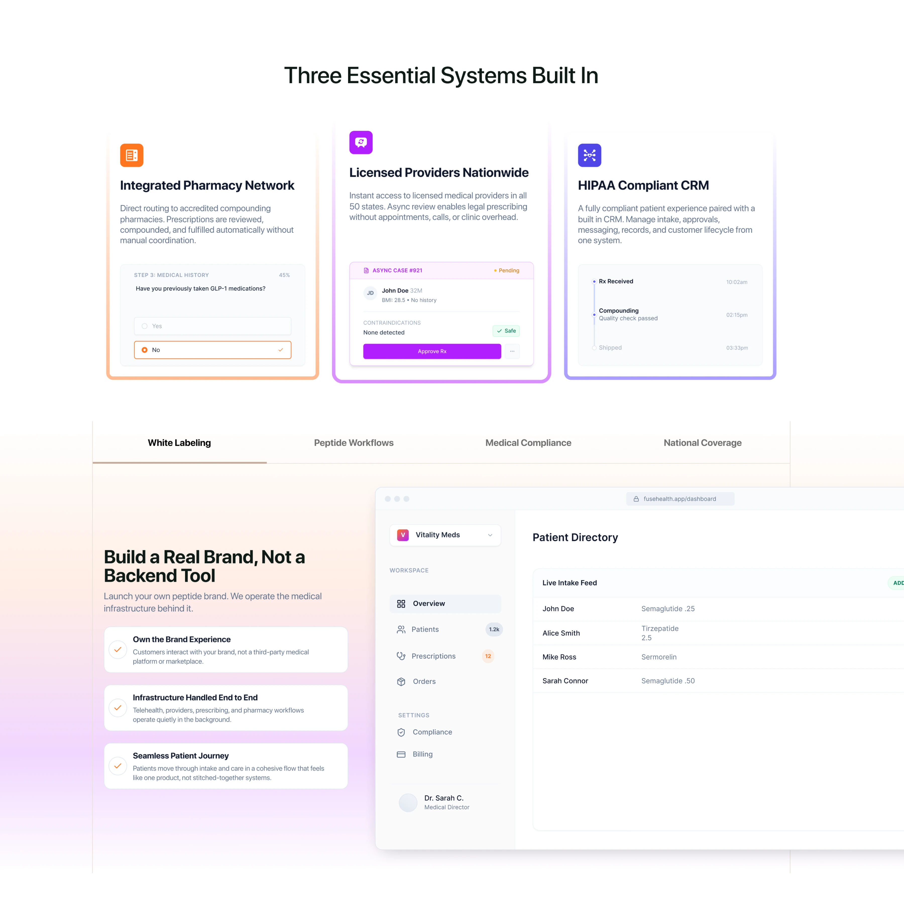
3. Stronger Trust Signals
Healthcare platforms require a high level of trust.
To reinforce credibility, the design emphasized:
Compliance-focused messaging
Platform dashboards
Structured workflows
Consistent visual hierarchy
Premium UI patterns
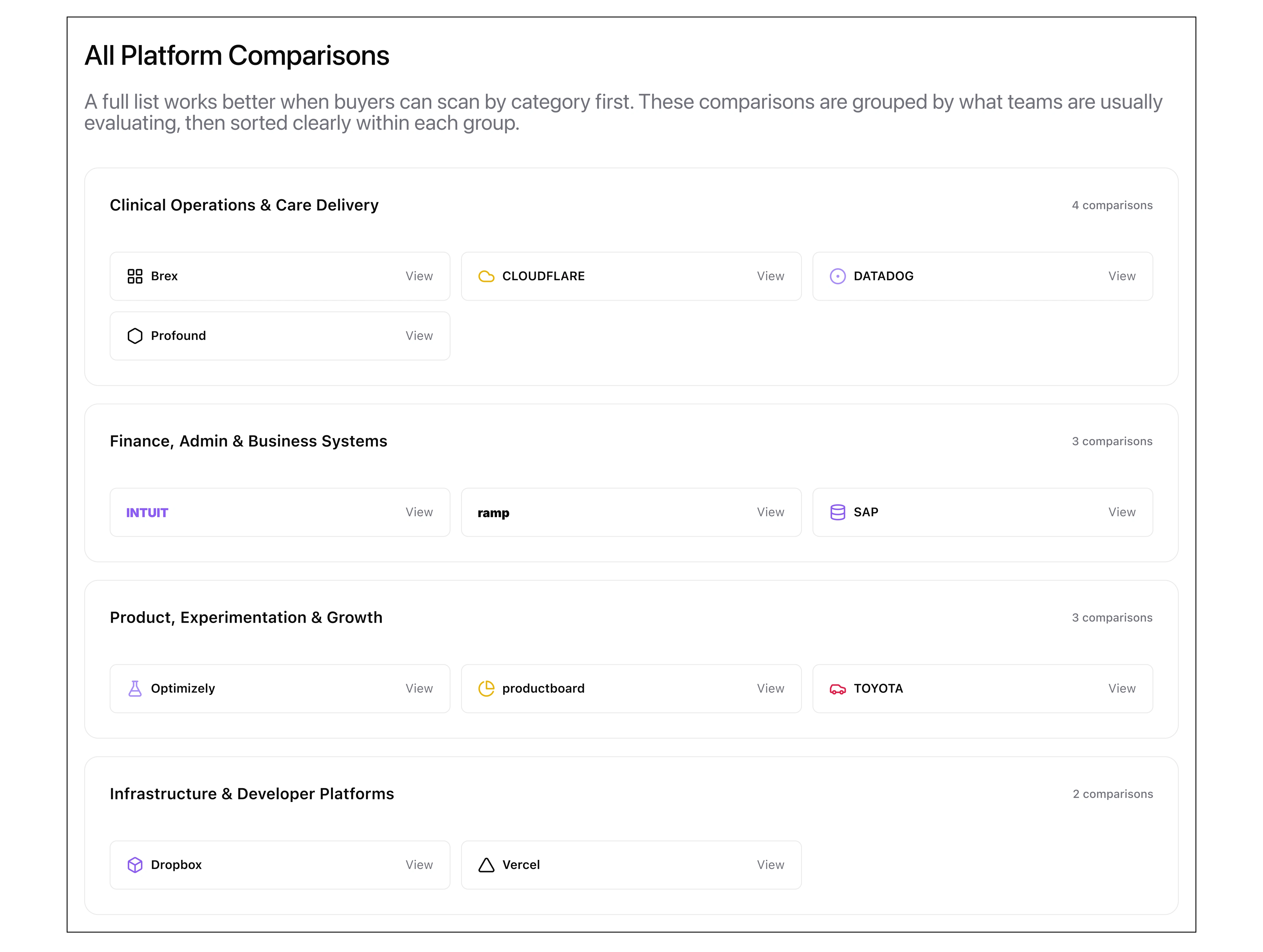
Progressive Disclosure for Complex Data
Large blocks of competitor data were organized into operational categories with:
Structured data chunking
Persona-aligned taxonomies
Minimized information density
This helped users evaluate technical specifications step-by-step instead of being overwhelmed by a massive spreadsheet.
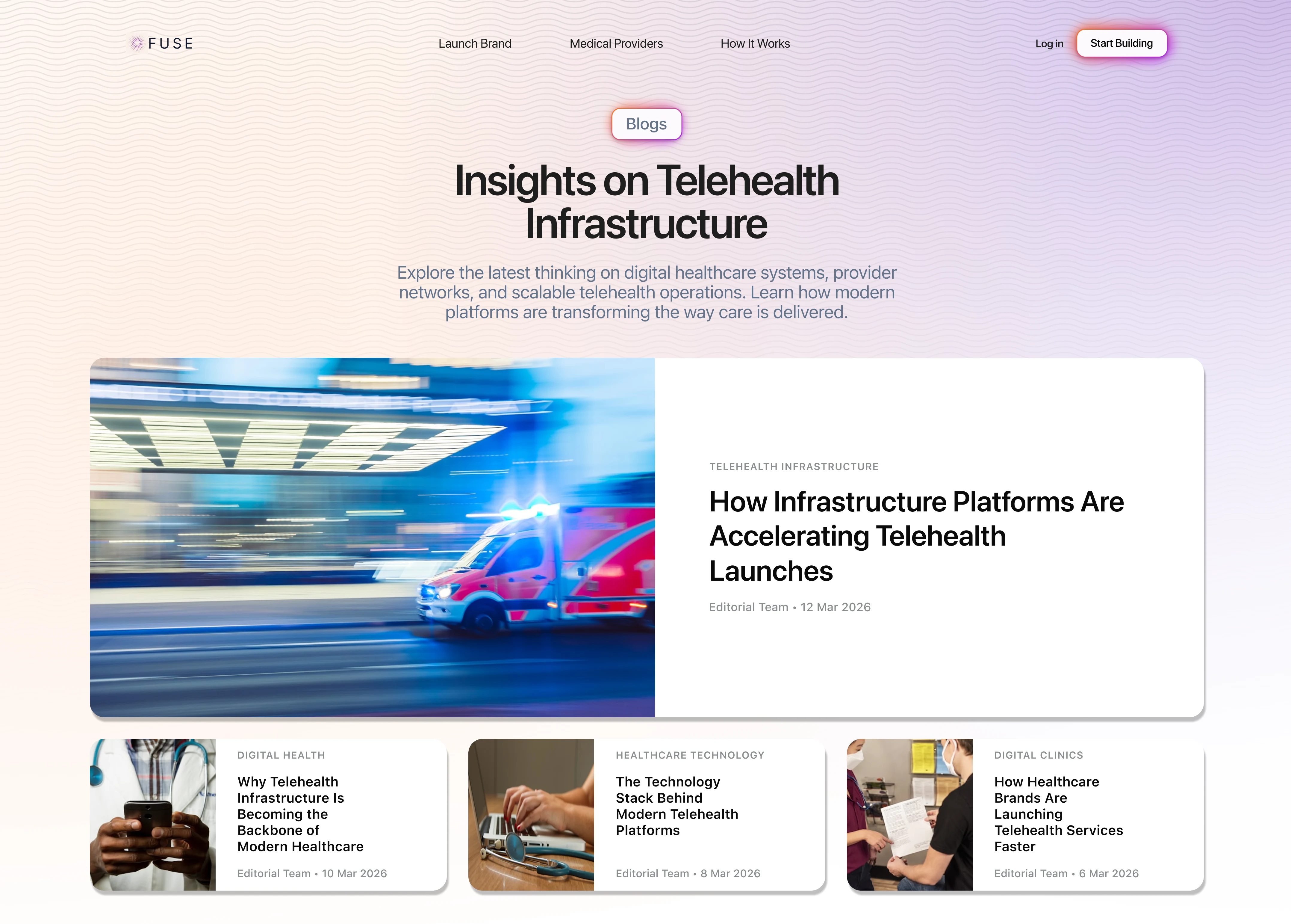
Asymmetrical Hero Hierarchy
The primary content index was given an intentional, split-screen layout with:
Dominant visual anchoring
Guided reading paths
Optimized above-the-fold density
This helped drive immediate attention to primary cornerstone content instead of letting it get lost in secondary links.
Contextual Inline Lead Generation
Conversion triggers were integrated smoothly into long-form resources with:
High-intent placement
Vibrant focal anchors
Frictionless layout integration
This helped capture passive readers at peak moments of interest instead of disrupting their content consumption.
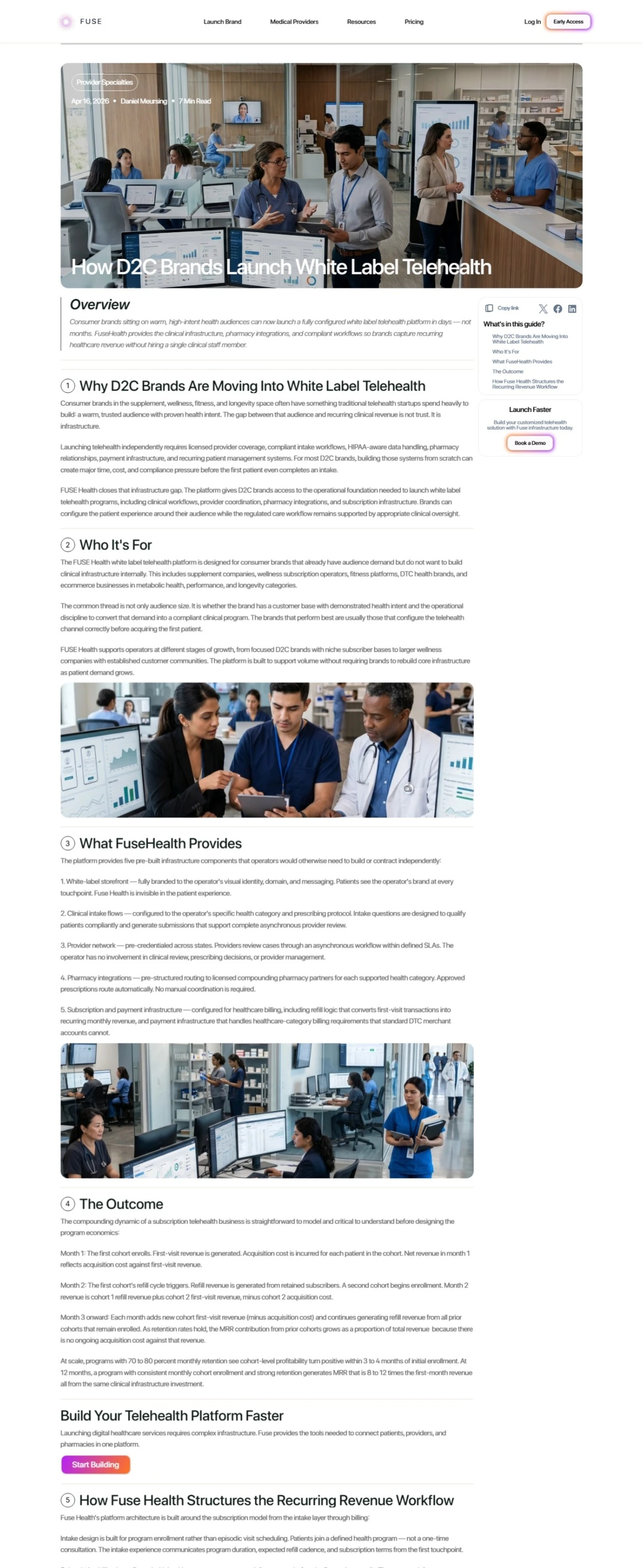
Both inline and floating CTA
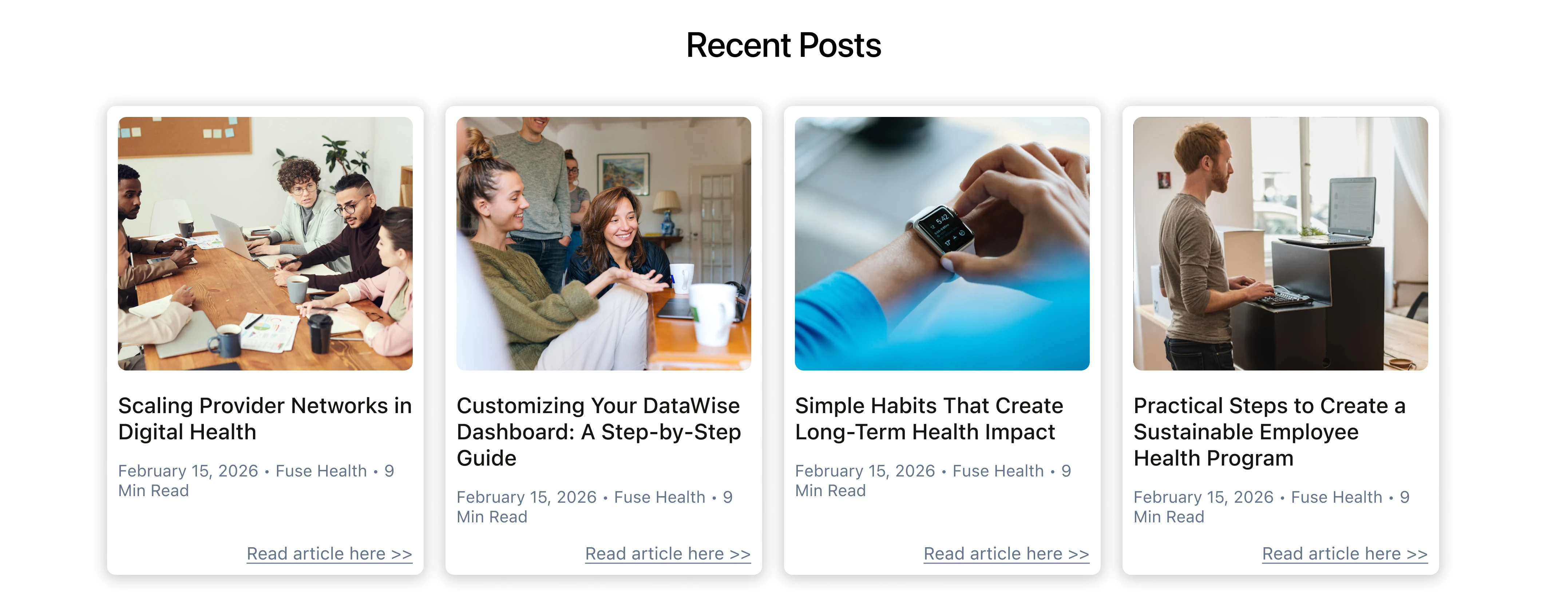
Recirculation & Engagement Loops
Dynamic content feeds were positioned at natural reading termination points with:
Consistent design system components
Strategic article cross-linking
Predictable visual layouts
This helped keep readers engaged within the learning loop instead of bouncing from the site after one article.
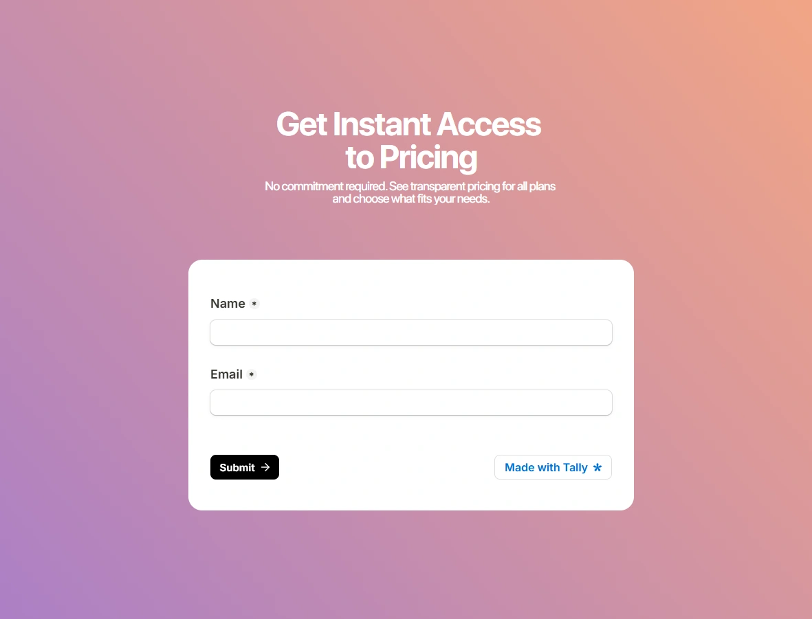
Gated Pricing for Lead Capture
The entry point to financial details was structured as a minimal conversion gate with:
Low-friction gating using only two essential input fields
Value-based incentives promising immediate transparency
Psychological safety copy explicitly removing commitment friction
This helped transform passive pricing curiosity into highly qualified marketing leads before users reached the cost tables.
Comparative Feature Matrix
A comprehensive line-by-line plan breakdown was designed for granular evaluation with:
High-contrast Boolean indicators utilizing distinct checkmarks and close icons
Direct variable exposing to layout transaction differences openly
Persistent header tracking maintaining product context alongside CTAs
This helped technical stakeholders rapidly validate feature-level nuances without needing a sales call.
Visual Design Approach
The visual direction focused on creating a balance between:
Clinical trust
Startup energy
Modern SaaS aesthetics
Design Principles
Minimal but high-impact layouts
Spacious section spacing
Large typography for clarity
Product-focused storytelling
The interface was designed to feel polished and premium while still remaining accessible and easy to navigate.
Outcome
The designed experience helped position FuseHealth as:
More credible
Easier to understand
More visually refined
Better aligned with modern healthcare SaaS expectations
The final result was a website experience focused not only on aesthetics, but on communication, usability, and conversion strategy.
Designing for healthcare infrastructure required balancing clarity, compliance, and conversion within a single experience.
FuseHealth became an opportunity to create a product narrative that feels modern, trustworthy, and scalable — while helping emerging healthcare brands launch with confidence.
Thanks for reading.
Let’s launch your next project.
Grab a free 30-minute slot on our calendar to talk ideas, timelines, and deliverables.
Like this project
Posted May 27, 2026
This project focused on simplifying complex healthcare workflows through strategic UX, modern SaaS design patterns, and conversion-focused storytelling.
Likes
1
Views
4