The network for creativity
Join 1.25M professional creatives like you
Connect with clients, get discovered, and run your business 100% commission-free
Creatives on Contra have earned over $150M and we are just getting started
Back to feedPost
#FigmaMakeathon
What if we could understand the world like a simple dashboard?
EarthPulse 🌍 reimagines a SaaS dashboard to visualize conflict, hunger, poverty, and disaster risk in a clear, human-centered way.
In its ideal form, each region explains:
• Why the issue is happening
• Who is working to solve it
• How everyday people can contribute
Every insight highlights its source, last updated time, and confidence level to build trust.
Built using Figma free plan and an existing Figma Make template as a starting point. I explored a 3D Earth experience but reached my daily AI limit before expanding it further.


I’ve been seeing many global crisis stories on social media, but I often question how genuine and accurate they are. I’ve always wondered how to support the right causes in the right way. After recently volunteering in Europe under SDG 4, I realized there’s also a gap in...
this is published project: https://earthpulse.figma.site/
The network for creativity
Join 1.25M professional creatives like you
Connect with clients, get discovered, and run your business 100% commission-free
Creatives on Contra have earned over $150M and we are just getting started











Related posts

A clean and modern food delivery app concept designed with a focus on simple navigation, clear layouts, and a smooth user experience.
Designed in Figma.

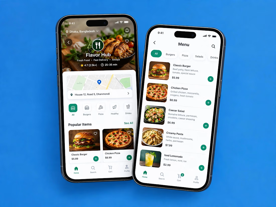

Love how clean and intuitive this feels, the navigation looks super smooth and the layout is really well balanced


SES AI is a battery technology company accelerating the energy transition through AI-powered material discovery, battery development, manufacturing, and management.
SES AI approached us with a website redesign driven by its new “All-in on AI” strategy. As AI became central to the company’s work across safety, manufacturing, and science, the existing website still focused primarily on its battery-hardware side. We redesigned the experience to clearly communicate the three AI pillars, while making the website simpler, more direct, and easier to navigate.

This looks insane. The robotic arm with the battery cell is such a strong visual. Love how clean you kept it despite it being AI heavy.

📱 The whole employee experience, right on the phone. Scheduling that goes wherever the team goes.


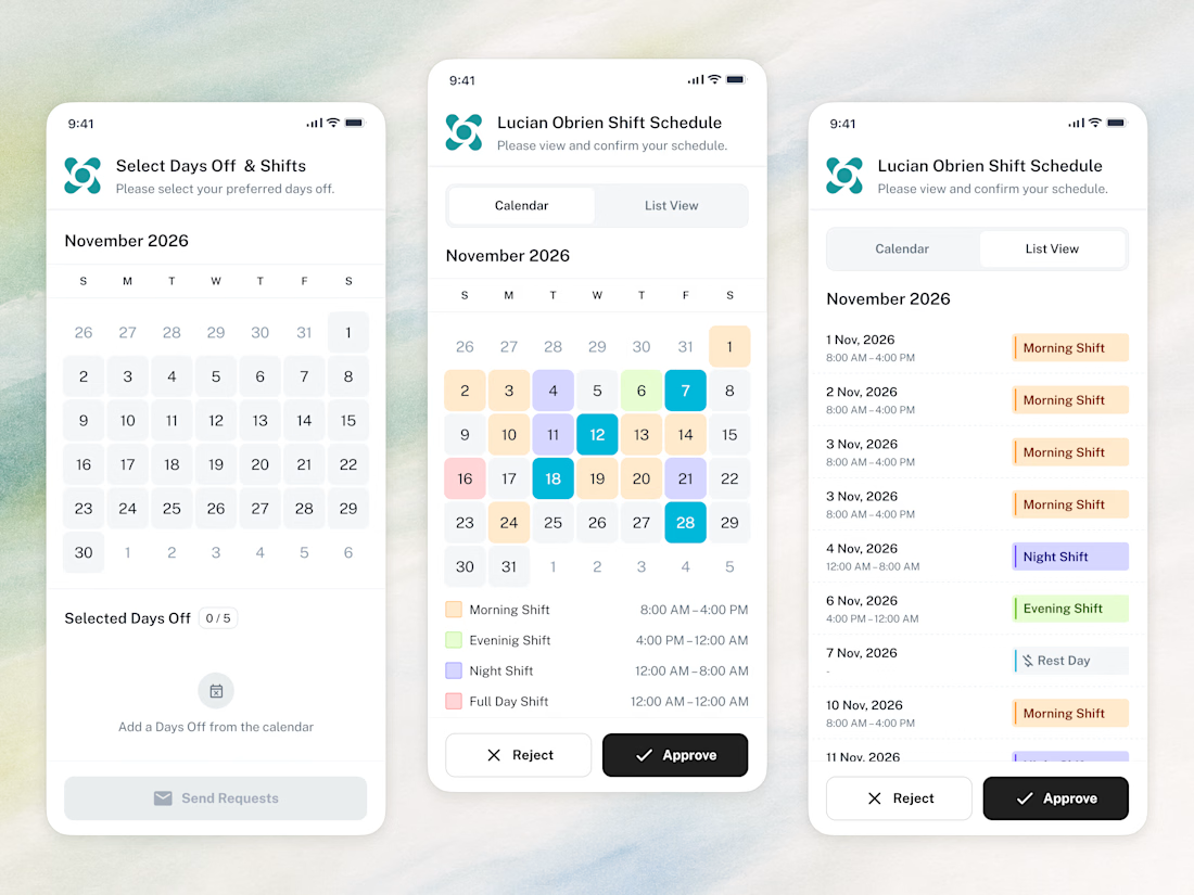

Amazing work