
We craft brands, uiux, design & dev, & digital products

We craft brands, uiux, design & dev, & digital products
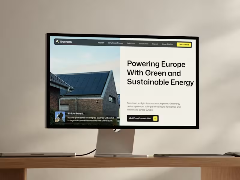
Greenergy — Sustainable Energy Website Design
A website experience designed around clean energy, sustainable solutions, and a more accessible renewable future.
The concept combines nature-inspired visuals, clear information, and a refined interface to help people explore solar energy solutions and understand their impact.
Clean energy. Thoughtful design. A greener future.
1
3
240


Professional layout geek!
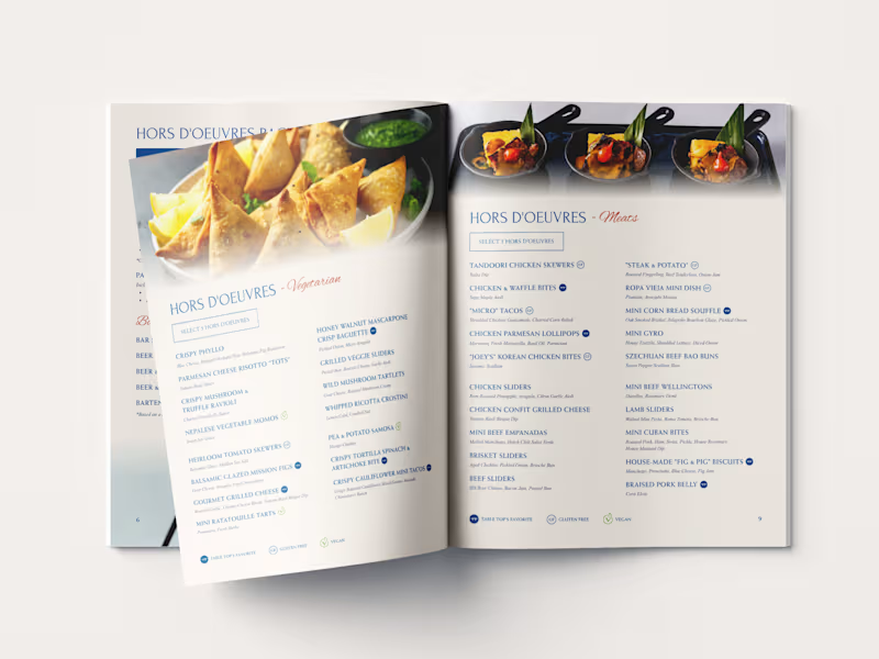

WIP of the day! Just shared the sample pages with the client and now we wait...
Once I get the green lights, I’ll continue building out the rest of the guide.
Note: The text shown here is placeholder content to keep the client’s materials confidential.
1
7
961


Figma · Framer · Webflow · Next.js

Figma · Framer · Webflow · Next.js


Graphic Designer, Brand Designer & Logo Designer.
- $•••••
- Earned
- 1x
- Hired
- 21
- Followers
Graphic Designer, Brand Designer & Logo Designer.

New Identity for Uncle Wire
Uncle Wire is an alternative-rock band from Jakarta, Indonesia.
Uncle Wire’s new identity blends the precision of origami with the wild spirit of a cowboy, guided by the good fortune of a horseshoe. Origami represents patience, discipline, and meaningful transformation, while the horseshoe symbolizes luck, protection, strength, and prosperity.
Together, these elements shape Uncle Wire’s visual identity. A reflection of a cowboy’s wild spirit evolving into something more meaningful, positive, and wise. Bringing luck and optimism to everyone who listens to its music.
See the full preview of Uncle Wire's new identity (https://www.instagram.com/p/DThvCDoEyHK/?hl=en&img_index=1)
1
409

Brand Refreshment for Seca Works
Seca Works is an Indonesian accessories brand that crafts unique accessories from denim, rugged fabrics, and Japanese boro textiles. Their signature boro tie with concho blends heritage and modern style.
For this rebranding project, the main focus is on creating a logogram that represents the Seca Works brand, while the logotype remains unchanged, as the brand owner prefers to retain the existing logotype.
The logogram is inspired by a sunflower transformed into a concho, symbolizing resilience, craftsmanship, and the beauty of imperfection, hallmarks of every Seca Works creation.
1
367

Rebranding and Visual Identity for SFE (Sound From Everywhere)
SFE (Sound From Everywhere) is a Jakarta-based platform that celebrates music, culture, lifestyle, and community both online and offline.
The new identity is designed to reflect SFE’s ongoing journey, moving forward in harmony, growth, and connection.
'S' stands for Sound, representing the vibrant waves that bring us together.
'F' stands for From, symbolizing SFE roots and the diverse paths that shaped.
'E' stands for Everywhere, expressing unity and inclusivity across cultures.
Together, these elements capture SFE’s spirit of connection and shared experiences through music and community.
2
2
445


Creative Content Editor


Brand Designer and Art Director



Strategic Brand Identities, Built to Stand Out.
- 5.0
- Rating
- 17
- Followers
Strategic Brand Identities, Built to Stand Out.

Full-Stack Web Developer & Designers


