


This is why SaaS founders pay $3k+ for a landing page.
Not "better design" —
better decision making.
Same product. Same features.
Completely different user journey.
Before → scattered, unclear, no obvious next step
After → focused, purposeful, guides you to act
What actually changed?
Unified the visual language → coherent professional feel
Created clear hierarchy → eyes follow the right path
Added strategic space → decision feels natural not forced
That's it.
Clear journey = confident visitor
Confident visitor = easier decision
Easier decision = more conversions
Most people think conversion optimization is about CTAs.
It starts way before the CTA.
Design isn't decoration.
It's the journey between landing and converting.
Before → After 👇
Which one guides you better?
#SaaS #WebDesign #UXDesign #Conversion #Startups
0
45

AI-generated 3D character concepts using my Flora node pipeline.
Pipeline: Reference images → GPT-5.2 prompt definition → Nano Banana 2 → Recraft V4 → Magnific Precision upscale
Styles covered:
— Sci-fi mech characters
— Streetwear fashion figures
— Stylized mascots
— Futuristic humanoids
Each character generated in under 10 minutes. Total cost per concept: under $10.
Use cases: game design, animation pre-production, NFT collections, concept art exploration.
Full pipeline available as a product on my profile.
0
181
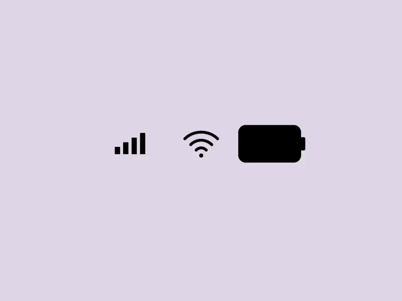
iPhone Duo — UI Motion Design Study
Overview
An independent UI motion design experiment exploring minimalist interface elements through geometric shapes, circular motion, and smooth transitions.
The Concept
This project explores how simple interface components can become visually engaging through motion. The visual system includes Wi-Fi symbols, circular dots, cellular signal elements, and battery-inspired shapes
Design Focus
Minimalist UI composition
Circular dot animation
Wi-Fi symbol and battery icon design
Geometric transformations
Motion timing and transitions
Clean visual hierarchy
My Role
UI Design and Motion Design Experimentation
Tools
Figma and
Project Type
Independent concept project created for portfolio development and creative exploration.
Objective
To explore the relationship between simple interface elements and motion, creating a clean, cohesive visual experience.
This is a self-initiated concept project and is not affiliated with or endorsed by Apple.
2
1
77
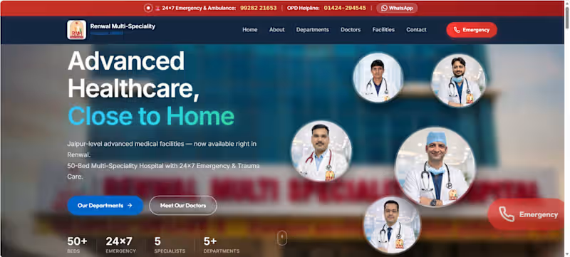
Thrilled to share my recent Front-End Project: RMH (Renwal Multi-Speciality Hospital)!
I recently developed a complete, modern, and highly responsive website interface for a multi-speciality hospital. My main focus was on creating a fast, trust-building, and "app-like" experience for patients, especially during emergencies.
✨ Key Features I Implemented: 🔹 App-Like Mobile Navigation: Fixed bottom action bars for 1-click Emergency Calls & WhatsApp. 🔹 Smooth Interactions: Custom Modal popups for Doctor profiles and Swiper carousels. 🔹 Infinite Marquee: Seamless scrolling banners for Cashless TPAs using Vanilla JS. 🔹 Performance Focused: Built using pure HTML, CSS, and Vanilla JavaScript with IntersectionObserver for scroll animations!
Building a healthcare website requires a perfect balance of clean UI and quick accessibility, and I really enjoyed bringing this to life!
Let me know what you think in the comments! If you need a premium, fast-loading website for your business, feel free to DM me. 📩
1
0
115


Rently — Tenant Screening Web App (repeat / alternate view)
🏠 I designed the Tenant Web App for Rently, helping letting agents screen prospective tenants on auto-pilot.
What I designed:
⭐ Hero — "Screen prospective tenants on auto-pilot"
⭐ Tenant info cards (search requirements, viewing availability)
⭐ "Why Rently" benefit cards — time savings, efficiency
⭐ Clean, friendly blue + yellow brand system
⭐ Conversion-focused layout
🎨 Designed in Figma — clean, time-saving proptech UI.
#UIUX #WebDesign #WebApp #ProductDesign #FigmaDesign #PropTech
0
111